
Note
Go to the end to download the full example code.
From calibrated forecasts to action-first zones#
This application shows how GeoPriorSubsNet can be used after the forecasting stage to answer a planning question that is much closer to deployment than to model fitting:
If intervention capacity is limited, where should action start first?
The page is intentionally decision-oriented. It does not stop at a hotspot map. Instead, it walks through the full logic of spatial prioritization:
compare future forecasts against a baseline year,
estimate exceedance probability from calibrated quantiles,
combine anomaly magnitude, probability, and optional exposure into a risk score,
convert pixel-level alerts into hotspot clusters,
read persistence so that persistent risk is not confused with a short-lived pulse.
Why this matters#
Forecasting alone is not yet prioritization. Planners still need a screening rule that turns continuous surfaces into a short list of places where field checks, groundwater controls, or infrastructure reinforcement should begin.
This page rebuilds that logic as a compact case study using illustrative city snapshots for Nansha and Zhongshan, together with a self-contained synthetic spatial reconstruction that teaches how the analytics should be read.
from __future__ import annotations

import numpy as np
import pandas as pd
import matplotlib as mpl
import matplotlib.pyplot as plt
from matplotlib.patches import FancyBboxPatch

BASE_YEAR = 2022
FOCUS_YEAR = 2026
RISK_THRESHOLD = 50.0
GRID_SHAPE = (180, 240)

CITY_COLORS = {
    "Nansha": "#1f77b4",
    "Zhongshan": "#e41a1c",
}


def build_priority_tables() -> tuple[pd.DataFrame, pd.DataFrame]:
    """Return compact application tables.

    The cluster values are reference-style application numbers
    chosen to match the qualitative scale and ranking of the
    decision figure used for hotspot prioritization.
    """
    clusters = pd.DataFrame(
        [
            {
                "city": "Nansha",
                "cluster": "C696",
                "rank": 1,
                "risk_mean": 99.4,
            },
            {
                "city": "Nansha",
                "cluster": "C697",
                "rank": 2,
                "risk_mean": 89.4,
            },
            {
                "city": "Nansha",
                "cluster": "C1125",
                "rank": 3,
                "risk_mean": 72.3,
            },
            {
                "city": "Nansha",
                "cluster": "C700",
                "rank": 4,
                "risk_mean": 70.5,
            },
            {
                "city": "Nansha",
                "cluster": "C689",
                "rank": 5,
                "risk_mean": 51.8,
            },
            {
                "city": "Nansha",
                "cluster": "C662",
                "rank": 6,
                "risk_mean": 51.1,
            },
            {
                "city": "Zhongshan",
                "cluster": "C495",
                "rank": 1,
                "risk_mean": 21.4,
            },
            {
                "city": "Zhongshan",
                "cluster": "C676",
                "rank": 2,
                "risk_mean": 9.2,
            },
            {
                "city": "Zhongshan",
                "cluster": "C445",
                "rank": 3,
                "risk_mean": 7.5,
            },
            {
                "city": "Zhongshan",
                "cluster": "C459",
                "rank": 4,
                "risk_mean": 6.3,
            },
            {
                "city": "Zhongshan",
                "cluster": "C453",
                "rank": 5,
                "risk_mean": 5.5,
            },
            {
                "city": "Zhongshan",
                "cluster": "C283",
                "rank": 6,
                "risk_mean": 4.6,
            },
        ]
    )

    years = pd.DataFrame(
        [
            {
                "city": "Nansha",
                "year": 2024,
                "n_hotspots_ever": 18320,
                "n_hotspots_current": 5300,
                "trigger_ratio": 0.96,
            },
            {
                "city": "Nansha",
                "year": 2025,
                "n_hotspots_ever": 18320,
                "n_hotspots_current": 5750,
                "trigger_ratio": 0.15,
            },
            {
                "city": "Nansha",
                "year": 2026,
                "n_hotspots_ever": 18320,
                "n_hotspots_current": 5650,
                "trigger_ratio": 0.14,
            },
            {
                "city": "Zhongshan",
                "year": 2024,
                "n_hotspots_ever": 35200,
                "n_hotspots_current": 7600,
                "trigger_ratio": 0.46,
            },
            {
                "city": "Zhongshan",
                "year": 2025,
                "n_hotspots_ever": 35200,
                "n_hotspots_current": 3600,
                "trigger_ratio": 0.19,
            },
            {
                "city": "Zhongshan",
                "year": 2026,
                "n_hotspots_ever": 35600,
                "n_hotspots_current": 1900,
                "trigger_ratio": 0.08,
            },
        ]
    )
    return clusters, years


def build_cluster_diagnostics(
    clusters: pd.DataFrame,
) -> pd.DataFrame:
    """Add readable cluster-level diagnostics."""
    out = clusters.copy()
    out["severity_bin"] = pd.cut(
        out["risk_mean"],
        bins=[-np.inf, 10, 30, 60, np.inf],
        labels=[
            "screen",
            "monitor",
            "priority",
            "critical",
        ],
    )
    out["risk_share_city_pct"] = (
        100.0
        * out["risk_mean"]
        / out.groupby("city")["risk_mean"].transform("sum")
    )
    out["rank_weight"] = 1.0 / out["rank"]
    return out


def city_cluster_centers() -> dict[str, list[tuple[float, float]]]:
    """Approximate ranked cluster centroids in map coordinates."""
    return {
        "Nansha": [
            (0.34, 0.50),
            (0.44, 0.55),
            (0.53, 0.83),
            (0.88, 0.22),
            (0.66, 0.20),
            (0.66, 0.34),
        ],
        "Zhongshan": [
            (0.32, 0.57),
            (0.74, 0.66),
            (0.54, 0.54),
            (0.26, 0.40),
            (0.57, 0.13),
            (0.70, 0.39),
        ],
    }


def _make_mask(
    yy: np.ndarray,
    xx: np.ndarray,
    *,
    city: str,
) -> np.ndarray:
    """Return a crude domain mask for visual realism."""
    if city == "Nansha":
        term1 = ((xx - 0.55) / 0.40) ** 2
        term2 = ((yy - 0.50) / 0.22) ** 2
        spine = term1 + term2 <= 1.0
        bite = ((xx - 0.18) / 0.18) ** 2 + (
            (yy - 0.83) / 0.12
        ) ** 2 <= 1.0
        tail = ((xx - 0.84) / 0.12) ** 2 + (
            (yy - 0.22) / 0.18
        ) ** 2 <= 1.0
        return (spine | tail) & (~bite)

    term1 = ((xx - 0.52) / 0.42) ** 2
    term2 = ((yy - 0.50) / 0.40) ** 2
    body = term1 + term2 <= 1.0
    south = ((xx - 0.62) / 0.16) ** 2 + (
        (yy - 0.08) / 0.14
    ) ** 2 <= 1.0
    void = ((xx - 0.50) / 0.12) ** 2 + (
        (yy - 0.28) / 0.18
    ) ** 2 <= 1.0
    return (body | south) & (~void)


def synthetic_city_layers(
    city: str,
    *,
    seed: int,
) -> dict[str, np.ndarray]:
    """Create a self-contained hotspot teaching raster.

    The fields are illustrative and are only meant to teach the
    reading of hotspot analytics.  They follow the same logic as
    the production script: anomaly magnitude, exceedance
    probability, optional persistence, and a hotspot mask.
    """
    rng = np.random.default_rng(seed)
    h, w = GRID_SHAPE
    y = np.linspace(0.0, 1.0, h)
    x = np.linspace(0.0, 1.0, w)
    xx, yy = np.meshgrid(x, y)

    mask = _make_mask(yy, xx, city=city)
    anomaly = np.zeros_like(xx, dtype=float)
    probability = np.zeros_like(xx, dtype=float)
    persistence = np.zeros_like(xx, dtype=float)

    centers = city_cluster_centers()[city]
    cluster_weights = np.linspace(1.0, 0.45, len(centers))

    for i, ((cx, cy), wt) in enumerate(
        zip(centers, cluster_weights, strict=False)
    ):
        sx = 0.045 + 0.01 * (i % 3)
        sy = 0.050 + 0.012 * (i % 2)
        blob = np.exp(
            -0.5 * (((xx - cx) / sx) ** 2 + ((yy - cy) / sy) ** 2)
        )
        anomaly += wt * blob
        probability += (0.85 - 0.05 * i) * blob
        persistence += (0.92 - 0.07 * i) * blob

    background = 0.06 * rng.normal(size=anomaly.shape)
    anomaly = anomaly + background
    anomaly = np.clip(anomaly, 0.0, None)

    anomaly = 15.0 + 160.0 * anomaly / np.nanmax(anomaly)
    probability = np.clip(
        0.05 + 0.95 * probability / np.nanmax(probability),
        0.0,
        1.0,
    )
    persistence = np.clip(
        0.02 + 0.98 * persistence / np.nanmax(persistence),
        0.0,
        1.0,
    )

    hotspot_mask = (
        anomaly >= np.nanquantile(anomaly[mask], 0.90)
    ) & (probability >= 0.55)

    anomaly = np.where(mask, anomaly, np.nan)
    probability = np.where(mask, probability, np.nan)
    persistence = np.where(mask, persistence, np.nan)
    hotspot_mask = np.where(mask, hotspot_mask, False)

    return {
        "x": x,
        "y": y,
        "anomaly": anomaly,
        "probability": probability,
        "persistence": persistence,
        "mask": hotspot_mask,
    }


def application_summary(
    clusters: pd.DataFrame,
    years: pd.DataFrame,
) -> pd.DataFrame:
    """Return one row per city for quick planning readout."""
    rows: list[dict[str, float | str]] = []
    for city in ["Nansha", "Zhongshan"]:
        csub = clusters[clusters["city"] == city]
        ysub = years[years["city"] == city]
        rows.append(
            {
                "city": city,
                "top_cluster": csub.iloc[0]["cluster"],
                "top_risk": csub.iloc[0]["risk_mean"],
                "top3_risk_share_pct": csub.head(3)[
                    "risk_mean"
                ].sum()
                / csub["risk_mean"].sum()
                * 100.0,
                "focus_year_hotspots": ysub.iloc[-1][
                    "n_hotspots_current"
                ],
                "ever_hotspots": ysub.iloc[-1]["n_hotspots_ever"],
                "trigger_ratio_2026": ysub.iloc[-1][
                    "trigger_ratio"
                ],
            }
        )
    return pd.DataFrame(rows)


def add_step_box(
    ax: plt.Axes,
    xy: tuple[float, float],
    text: str,
    *,
    width: float = 0.20,
    height: float = 0.18,
    fc: str = "#f8fafc",
    ec: str = "#475569",
) -> None:
    """Draw a rounded flowchart box."""
    x0, y0 = xy
    patch = FancyBboxPatch(
        (x0, y0),
        width,
        height,
        boxstyle="round,pad=0.02,rounding_size=0.03",
        fc=fc,
        ec=ec,
        lw=1.2,
    )
    ax.add_patch(patch)
    ax.text(
        x0 + width / 2.0,
        y0 + height / 2.0,
        text,
        ha="center",
        va="center",
        fontsize=10,
        wrap=True,
    )


clusters, yearly = build_priority_tables()
cluster_diag = build_cluster_diagnostics(clusters)
summary = application_summary(cluster_diag, yearly)
ns_layers = synthetic_city_layers("Nansha", seed=3)
zh_layers = synthetic_city_layers("Zhongshan", seed=9)
Problem framing#
The production hotspot workflow starts from calibrated forecast quantiles rather than from a single deterministic surface. For each pixel and year, the analytics combine three signals:
anomaly magnitude relative to a baseline year,
exceedance probability for a planning threshold,
optional exposure weighting.
The script-level risk score follows the compact rule
which is then turned into hotspot masks, cluster rankings, and persistence summaries.
print("Application summary:\n")
print(summary.round(2).to_string(index=False))

print("\nTop clusters by city:\n")
print(
    cluster_diag[
        [
            "city",
            "rank",
            "cluster",
            "risk_mean",
            "risk_share_city_pct",
            "severity_bin",
        ]
    ]
    .round(2)
    .to_string(index=False)
)
Application summary:

     city top_cluster  top_risk  top3_risk_share_pct  focus_year_hotspots  ever_hotspots  trigger_ratio_2026
   Nansha        C696      99.4                60.09                 5650          18320                0.14
Zhongshan        C495      21.4                69.91                 1900          35600                0.08

Top clusters by city:

     city  rank cluster  risk_mean  risk_share_city_pct severity_bin
   Nansha     1    C696       99.4                22.88     critical
   Nansha     2    C697       89.4                20.58     critical
   Nansha     3   C1125       72.3                16.64     critical
   Nansha     4    C700       70.5                16.23     critical
   Nansha     5    C689       51.8                11.92     priority
   Nansha     6    C662       51.1                11.76     priority
Zhongshan     1    C495       21.4                39.27      monitor
Zhongshan     2    C676        9.2                16.88       screen
Zhongshan     3    C445        7.5                13.76       screen
Zhongshan     4    C459        6.3                11.56       screen
Zhongshan     5    C453        5.5                10.09       screen
Zhongshan     6    C283        4.6                 8.44       screen
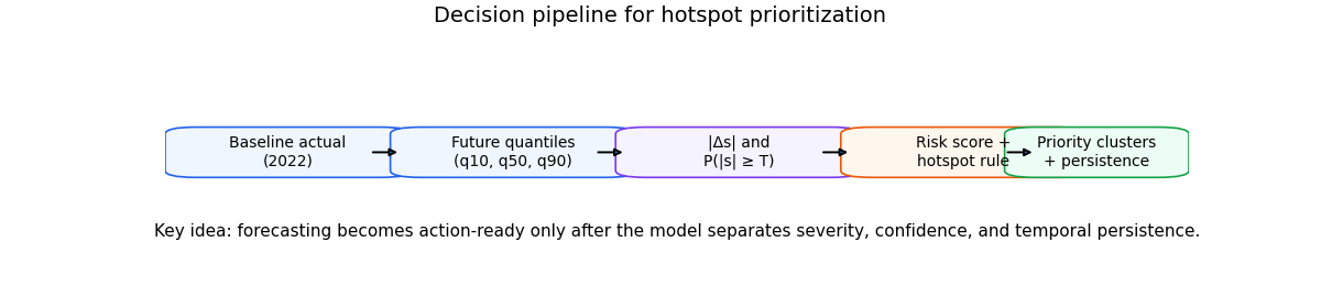
The prioritization pipeline#
Before looking at maps, it helps to make the logic explicit. The pipeline below is the operational bridge between forecast products and intervention queues.
fig, ax = plt.subplots(figsize=(12.0, 2.7))
ax.set_axis_off()
ax.set_xlim(0.0, 1.0)
ax.set_ylim(0.0, 1.0)

add_step_box(
    ax,
    (0.02, 0.40),
    "Baseline actual\n(2022)",
    fc="#eff6ff",
    ec="#2563eb",
)
add_step_box(
    ax,
    (0.24, 0.40),
    "Future quantiles\n(q10, q50, q90)",
    fc="#eff6ff",
    ec="#2563eb",
)
add_step_box(
    ax,
    (0.46, 0.40),
    "|Δs| and\nP(|s| ≥ T)",
    fc="#f5f3ff",
    ec="#7c3aed",
)
add_step_box(
    ax,
    (0.68, 0.40),
    "Risk score +\nhotspot rule",
    fc="#fff7ed",
    ec="#ea580c",
)
add_step_box(
    ax,
    (0.84, 0.40),
    "Priority clusters\n+ persistence",
    width=0.14,
    fc="#ecfdf5",
    ec="#16a34a",
)

for x0 in [0.20, 0.42, 0.64, 0.82]:
    ax.annotate(
        "",
        xy=(x0 + 0.03, 0.49),
        xytext=(x0, 0.49),
        arrowprops={"arrowstyle": "-|>", "lw": 1.4},
    )

ax.text(
    0.50,
    0.12,
    (
        "Key idea: forecasting becomes action-ready only after the "
        "model separates severity, confidence, and temporal "
        "persistence."
    ),
    ha="center",
    fontsize=11,
)

fig.suptitle(
    "Decision pipeline for hotspot prioritization",
    y=0.98,
    fontsize=14,
)
Text(0.5, 0.98, 'Decision pipeline for hotspot prioritization')
Rebuild the hotspot analytics view#
The main application figure mirrors the production reading path: anomaly map, probability map, hotspot evolution, cluster ranking, and persistence. The spatial layers below are synthetic teaching layers, but the organization matches the real hotspot workflow.
fig = plt.figure(figsize=(15.8, 8.4))
grid = fig.add_gridspec(2, 5, wspace=0.28, hspace=0.32)

city_layers = {
    "Nansha": ns_layers,
    "Zhongshan": zh_layers,
}

letters = iter(list("abcdefghij"))
for row, city in enumerate(["Nansha", "Zhongshan"]):
    color = CITY_COLORS[city]
    layers = city_layers[city]
    years_city = yearly[yearly["city"] == city]
    clusters_city = cluster_diag[cluster_diag["city"] == city]
    centers = city_cluster_centers()[city]

    # (1) anomaly map
    ax0 = fig.add_subplot(grid[row, 0])
    im0 = ax0.imshow(
        layers["anomaly"],
        origin="lower",
        cmap="magma",
        vmin=0,
        vmax=170,
    )
    ax0.contour(
        layers["mask"].astype(float),
        levels=[0.5],
        colors="k",
        linewidths=0.75,
    )
    for rank, (cx, cy) in enumerate(centers, start=1):
        ax0.text(
            cx * (GRID_SHAPE[1] - 1),
            cy * (GRID_SHAPE[0] - 1),
            str(rank),
            ha="center",
            va="center",
            fontsize=10,
            fontweight="bold",
            color=color,
            bbox={
                "boxstyle": "circle,pad=0.18",
                "fc": "white",
                "ec": color,
                "lw": 0.9,
                "alpha": 0.95,
            },
        )
    ax0.set_title(
        f"{city} • {FOCUS_YEAR} |Δs| vs {BASE_YEAR}",
        loc="left",
        fontweight="bold",
        pad=4,
    )
    ax0.set_xticks([])
    ax0.set_yticks([])
    ax0.text(
        -0.12,
        1.03,
        next(letters),
        transform=ax0.transAxes,
        fontsize=16,
        fontweight="bold",
    )

    # (2) probability map
    ax1 = fig.add_subplot(grid[row, 1])
    im1 = ax1.imshow(
        layers["probability"],
        origin="lower",
        cmap="viridis",
        vmin=0.0,
        vmax=1.0,
    )
    ax1.contour(
        layers["mask"].astype(float),
        levels=[0.5],
        colors="w",
        linewidths=0.65,
        alpha=0.65,
    )
    ax1.set_title(
        f"{city} • P(|s|≥{RISK_THRESHOLD:.0f})",
        loc="left",
        fontweight="bold",
        pad=4,
    )
    ax1.set_xticks([])
    ax1.set_yticks([])
    ax1.text(
        -0.12,
        1.03,
        next(letters),
        transform=ax1.transAxes,
        fontsize=16,
        fontweight="bold",
    )

    # (3) evolution bars + trigger line
    ax2 = fig.add_subplot(grid[row, 2])
    yrs = years_city["year"].to_numpy(int)
    ever = years_city["n_hotspots_ever"].to_numpy(float)
    current = years_city["n_hotspots_current"].to_numpy(float)
    trigger = years_city["trigger_ratio"].to_numpy(float)

    ax2.bar(yrs, ever, color=mpl.colors.to_rgba(color, 0.28))
    ax2.plot(
        yrs,
        current,
        marker="o",
        linestyle="--",
        linewidth=1.7,
        color=color,
        label="current",
    )
    ax2.set_title(
        f"{city} • hotspot evolution (ever)",
        loc="left",
        fontweight="bold",
        pad=4,
    )
    ax2.set_ylabel("# hotspots (ever)")
    ax2.set_xlabel("Year")
    ax2.grid(True, axis="y", alpha=0.25)
    ax2b = ax2.twinx()
    ax2b.plot(
        yrs,
        trigger,
        marker="s",
        linewidth=1.4,
        color="#ff7f0e",
    )
    ax2b.set_ylabel(r"T$_{0.9}$/max|Δs|")
    ax2b.set_ylim(0.0, 1.05)
    ax2.text(
        -0.08,
        1.03,
        next(letters),
        transform=ax2.transAxes,
        fontsize=16,
        fontweight="bold",
    )

    # (4) priority clusters
    ax3 = fig.add_subplot(grid[row, 3])
    yk = np.arange(len(clusters_city))
    vals = clusters_city["risk_mean"].to_numpy(float)
    labs = [
        f"{int(r)}. {c}"
        for r, c in zip(
            clusters_city["rank"],
            clusters_city["cluster"],
            strict=False,
        )
    ]
    bars = ax3.barh(
        yk,
        vals,
        color=mpl.colors.to_rgba(color, 0.75),
        edgecolor=color,
        linewidth=1.0,
    )
    ax3.set_yticks(yk)
    ax3.set_yticklabels(labs)
    ax3.invert_yaxis()
    ax3.grid(True, axis="x", alpha=0.18)
    ax3.set_axisbelow(True)
    ax3.set_xlabel("mean risk score")
    ax3.set_title(
        f"{city} • priority clusters",
        loc="left",
        fontweight="bold",
        pad=4,
    )
    for b, v in zip(bars, vals, strict=False):
        ax3.text(
            v + 0.6,
            b.get_y() + 0.5 * b.get_height(),
            f"{v:.1f}",
            va="center",
            fontsize=9,
        )
    ax3.text(
        -0.12,
        1.03,
        next(letters),
        transform=ax3.transAxes,
        fontsize=16,
        fontweight="bold",
    )

    # (5) persistence
    ax4 = fig.add_subplot(grid[row, 4])
    im4 = ax4.imshow(
        layers["persistence"],
        origin="lower",
        cmap="viridis",
        vmin=0.0,
        vmax=1.0,
    )
    ax4.set_title(
        f"{city} • persistence (fraction)",
        loc="left",
        fontweight="bold",
        pad=4,
    )
    ax4.set_xticks([])
    ax4.set_yticks([])
    ax4.text(
        -0.12,
        1.03,
        next(letters),
        transform=ax4.transAxes,
        fontsize=16,
        fontweight="bold",
    )

cax1 = fig.add_axes([0.11, 0.06, 0.18, 0.025])
cb1 = fig.colorbar(im0, cax=cax1, orientation="horizontal")
cb1.set_label(r"|Δs| (mm yr$^{-1}$)")

cax2 = fig.add_axes([0.42, 0.06, 0.18, 0.025])
cb2 = fig.colorbar(im1, cax=cax2, orientation="horizontal")
cb2.set_label(r"P(|s| ≥ T)")

cax3 = fig.add_axes([0.73, 0.06, 0.18, 0.025])
cb3 = fig.colorbar(im4, cax=cax3, orientation="horizontal")
cb3.set_label("Hotspot persistence")

fig.suptitle(
    "Hotspot prioritization — where action should start first",
    x=0.02,
    ha="left",
    fontsize=17,
)
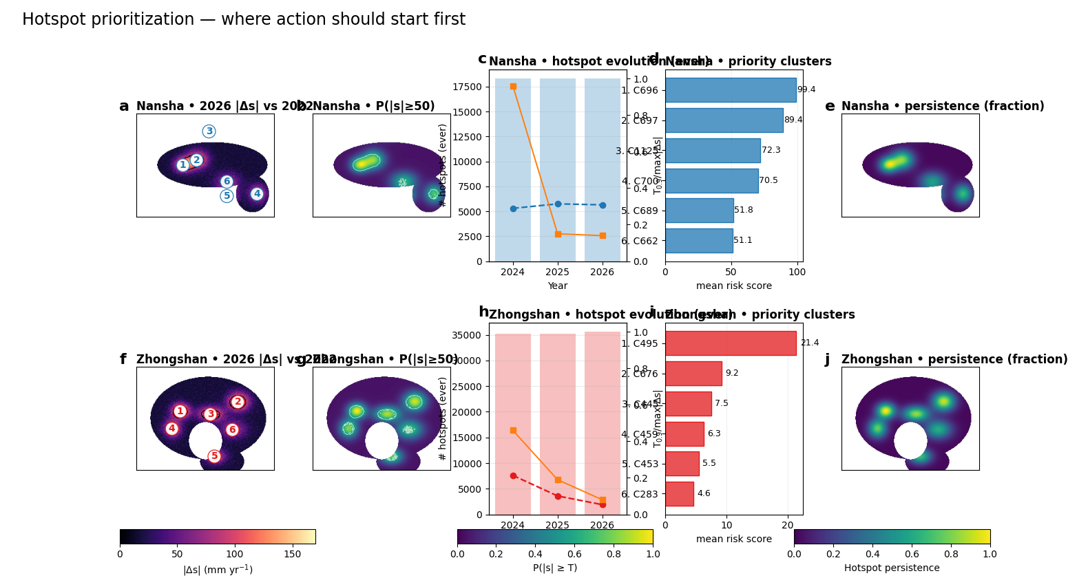
Text(0.02, 0.98, 'Hotspot prioritization — where action should start first')
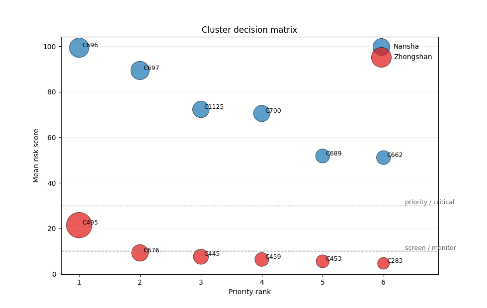
Supporting view: the decision matrix#
Cluster rankings are easier to defend when severity and city-level concentration are both visible. The bubble chart below is a second planning view: it separates moderate watch-list clusters from true action-first clusters.
fig, ax = plt.subplots(figsize=(9.8, 6.2))
for city in ["Nansha", "Zhongshan"]:
    sub = cluster_diag[cluster_diag["city"] == city]
    ax.scatter(
        sub["rank"],
        sub["risk_mean"],
        s=35.0 * sub["risk_share_city_pct"],
        alpha=0.72,
        color=CITY_COLORS[city],
        label=city,
        edgecolor="black",
        linewidth=0.6,
    )
    for _, row in sub.iterrows():
        ax.text(
            row["rank"] + 0.05,
            row["risk_mean"] + 0.3,
            row["cluster"],
            fontsize=9,
        )

ax.axhline(10.0, color="0.5", linestyle="--", linewidth=1.0)
ax.axhline(30.0, color="0.5", linestyle=":", linewidth=1.0)
ax.text(6.35, 10.7, "screen / monitor", fontsize=9, color="0.4")
ax.text(6.35, 30.7, "priority / critical", fontsize=9, color="0.4")
ax.set_xlim(0.7, 6.9)
ax.set_xticks(np.arange(1, 7))
ax.set_xlabel("Priority rank")
ax.set_ylabel("Mean risk score")
ax.set_title("Cluster decision matrix")
ax.grid(True, axis="y", alpha=0.22)
ax.legend(frameon=False)
plt.show()
Interpretation guide#
A strong hotspot application should tell the reader what to do with the outputs. The guide below translates anomaly, exceedance probability, and persistence into a practical reading protocol.
The goal is not to collapse the analytics into a binary map of “safe” versus “unsafe” space. It is to clarify which hotspot patterns deserve immediate action, which ones should stay on a watch list, and which ones should be validated further before escalation.
Priority level |
Reading rule |
Operational meaning |
|---|---|---|
Act first |
High anomaly, high exceedance probability, and strong persistence all point in the same direction. |
These clusters deserve immediate site checks, stronger monitoring, or policy attention because severity, confidence, and recurrence are aligned. |
Monitor closely |
Moderate anomaly but recurrent persistence suggests a zone that is not yet the top intervention target, but remains structurally active across forecast years. |
Keep these zones on the watch list. They can become action-first areas if the next forecast cycle shows stronger anomaly or higher exceedance probability. |
Validate before escalating |
Large anomaly with weaker persistence or weaker confidence signals a plausible risk area, but not yet one that should be treated as a fully confirmed priority hotspot. |
Use these zones for targeted field validation, additional sensor checks, or local review before escalating them into the main intervention queue. |
Note
Operational takeaway: hotspot analytics do not replace field judgment. They organize limited intervention capacity by separating immediate-priority zones from watch-list zones and from locations that first need confirmation.
Practical reading#
The main value of this application is not simply that it produces another forecast map. Its real contribution is that it converts a calibrated probabilistic forecast into a ranked intervention logic.
That distinction matters. A high forecast median alone is not enough to justify action, because severity, confidence, spatial coherence, and persistence do not always peak in the same places. The hotspot workflow is useful precisely because it separates those ingredients and then recombines them into a decision-oriented reading.
The anomaly panels answer where change is strongest relative to the baseline. The exceedance panels answer where the forecast is strong enough to matter against an operational threshold. The cluster view then aggregates those local signals into components that can be ranked, compared, and communicated. Finally, the persistence view distinguishes transient hotspots from locations that remain active across forecast years.
This means the application should not be read as a binary map of “safe” versus “unsafe” space. It is better understood as a prioritization study under uncertainty. The highest-priority zones are those where multiple signals align: large anomaly magnitude, non-trivial exceedance probability, coherent clustering, and repeated presence across years.
That reading is also scientifically important. It keeps the page from over-promising direct validation where no harmonized external archive of flood, maintenance, or distress reports was available. Instead, the hotspot ranking is justified internally through forecast consistency, exceedance risk, cluster structure, persistence, and transfer stability. In other words, the application is strongest when it is read as a disciplined decision screen rather than as a final causal map.
In practice, that is exactly what makes the workflow useful. It helps planners decide where field attention should begin, which areas deserve earlier monitoring, and which zones remain persistently elevated even when the city-wide picture is more mixed.
From case study to real artifacts#
The miniature case study above is self-contained, which is ideal for a gallery page. In production, the same prioritization logic should be run from the existing hotspot backend so that the figure and the tabular products remain aligned on the same calibrated forecast package.
geoprior plot hotspot-analytics \
  --ns-eval results/nansha_eval_calibrated.csv \
  --ns-future results/nansha_future_forecast.csv \
  --zh-eval results/zhongshan_eval_calibrated.csv \
  --zh-future results/zhongshan_future_forecast.csv \
  --base-year 2022 \
  --years 2024 2025 2026 \
  --focus-year 2026 \
  --risk-threshold 50 \
  --cluster-rank risk \
  --timeline-mode ever \
  --add-persistence \
  --out hotspot_analytics.png
from geoprior.scripts.plot_hotspot_analytics import (
    plot_hotspot_analytics,
)

plot_hotspot_analytics(
    ns_eval="results/nansha_eval_calibrated.csv",
    ns_future="results/nansha_future_forecast.csv",
    zh_eval="results/zhongshan_eval_calibrated.csv",
    zh_future="results/zhongshan_future_forecast.csv",
    base_year=2022,
    years=[2024, 2025, 2026],
    focus_year=2026,
    risk_threshold=50.0,
    cluster_rank="risk",
    timeline_mode="ever",
    add_persistence=True,
    out="hotspot_analytics.png",
)
That production call is what turns the gallery lesson into a reusable prioritization workflow. A good reading order for the exported products is:
hotspot_points.csvfor pixel-level anomaly and exceedance,hotspot_years.csvfor footprint evolution through time,hotspot_clusters.csvfor the ranked intervention list.
That sequence moves from local signal, to temporal evolution, to action-ready aggregation. It is the most faithful way to turn the hotspot figure into a field-facing planning workflow for new cities, updated forecasts, or revised policy thresholds.
Total running time of the script: (0 minutes 0.771 seconds)