
Note
Go to the end to download the full example code.
Understand regression agreement with plot_r2#
This lesson explains how to use
geoprior.plot.r2.plot_r2() to compare one reference target
series against several competing prediction series.
Why this plot matters#
A single scalar R² value in a table is useful, but it hides the shape of the agreement between predictions and observations. Two models can have similar R² values while behaving quite differently:
one may follow the 1:1 line closely with a small spread,
one may systematically under-predict large values,
one may have a few extreme outliers that dominate the score.
The plot_r2 helper turns that abstract score into a visual
comparison. It is especially useful when you want to compare several
models or configurations against the same truth array.
What this function is designed to do#
plot_r2 takes:
one
y_truearray,one or more
y_predarrays,and then draws one subplot per prediction.
Each subplot contains:
a scatter cloud of actual versus predicted values,
a perfect-fit diagonal,
an R² annotation,
and optional extra metrics such as RMSE or MAE.
This makes the helper a natural model-comparison diagnostic when all candidates share the same target vector.
from __future__ import annotations

import matplotlib.pyplot as plt
import numpy as np

from geoprior.plot.r2 import plot_r2
Build one truth series and three different prediction behaviors#
A good teaching example should not use three models that all look the same. Here we intentionally create:
a strong model,
a noisier model,
and a biased model.
That way the R² annotations and the scatter geometry tell different stories.
rng = np.random.default_rng(42)

n = 120
x = np.linspace(0.0, 1.0, n)
y_true = 15.0 + 55.0 * x + 6.0 * np.sin(4.0 * np.pi * x)

y_pred_strong = y_true + rng.normal(0.0, 2.2, n)
y_pred_noisy = y_true + rng.normal(0.0, 5.0, n)
y_pred_biased = 0.88 * y_true + 4.5 + rng.normal(0.0, 3.2, n)
Start with the simplest reading pattern#
The most natural first use of plot_r2 is to compare several
prediction vectors against the same reference truth.
A strong reading habit is:
look at how tightly the points cluster around the diagonal,
compare the annotated R² values,
check whether the scatter widens for large values,
look for consistent upward or downward bias.
In practice, the best subplot is not only the one with the highest R². It is also the one whose scatter pattern looks believable and balanced around the perfect-fit line.
fig = plot_r2(
    y_true,
    y_pred_strong,
    y_pred_noisy,
    y_pred_biased,
    titles=["Strong model", "Noisy model", "Biased model"],
    xlabel="Observed subsidence",
    ylabel="Predicted subsidence",
    scatter_colors=["#1f77b4", "#ff7f0e", "#d62728"],
    line_colors=["#2f2f2f", "#2f2f2f", "#2f2f2f"],
    line_styles=["--", "--", "--"],
    annotate=True,
    show_grid=True,
    max_cols=2,
)
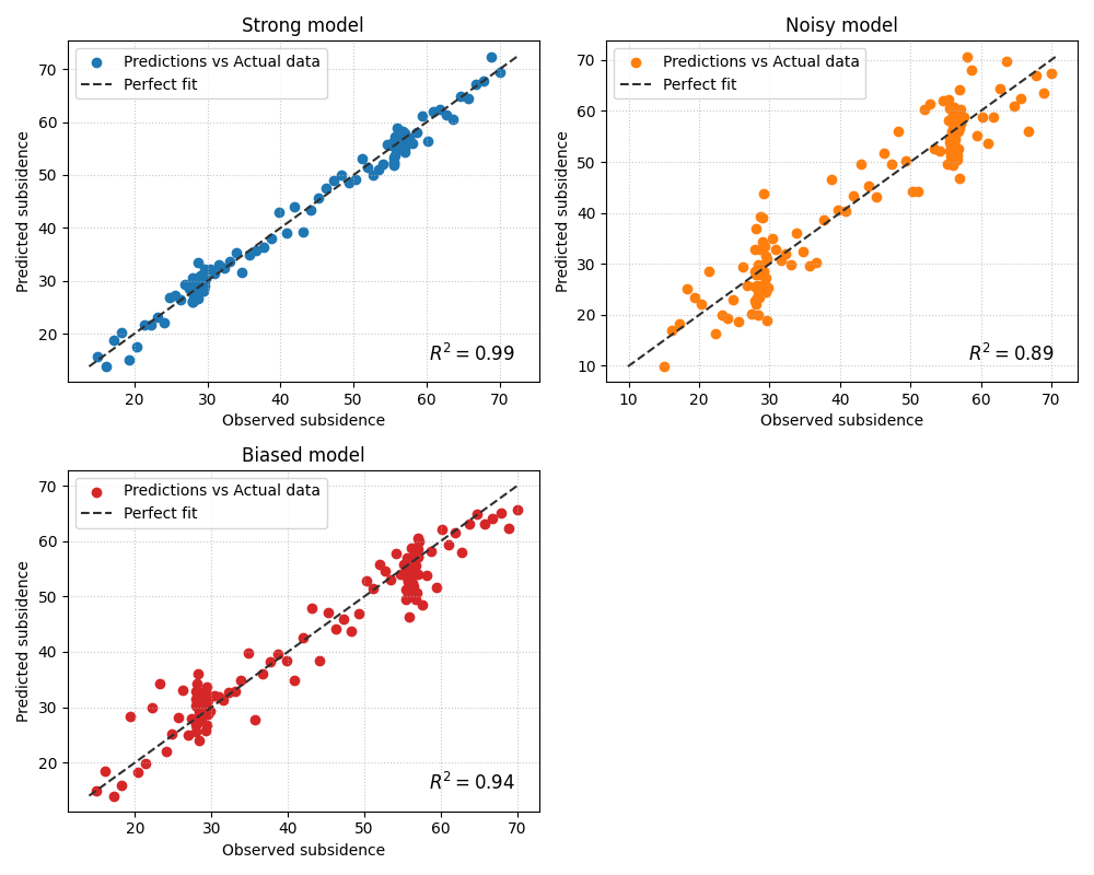
How to interpret the three panels#
In this example, the difference is not only the R² annotation. The geometry matters too:
- Strong model
The point cloud stays fairly close to the diagonal. That means the model is not only scoring well, but also preserving the amplitude of the target values.
- Noisy model
The cloud is wider around the diagonal. That typically means the model preserves the general trend but has weaker precision.
- Biased model
The cloud may still align roughly with the diagonal direction, but it is shifted. This is a useful reminder that R² alone does not tell the whole story about calibration or systematic bias.
Add complementary scalar metrics on each subplot#
plot_r2 also accepts other_metrics. This is helpful when the
user wants each subplot to carry more than one signal.
A practical pattern is to show:
R² for explained variance,
RMSE for larger errors,
MAE for average absolute deviation.
This makes each panel a compact diagnostic card.
fig = plot_r2(
    y_true,
    y_pred_strong,
    y_pred_noisy,
    y_pred_biased,
    titles=["Strong model", "Noisy model", "Biased model"],
    xlabel="Observed subsidence",
    ylabel="Predicted subsidence",
    scatter_colors=["#2ca02c", "#9467bd", "#8c564b"],
    line_colors=["#4d4d4d", "#4d4d4d", "#4d4d4d"],
    line_styles=[":", ":", ":"],
    other_metrics=["rmse", "mae"],
    annotate=True,
    show_grid=True,
    max_cols=3,
)
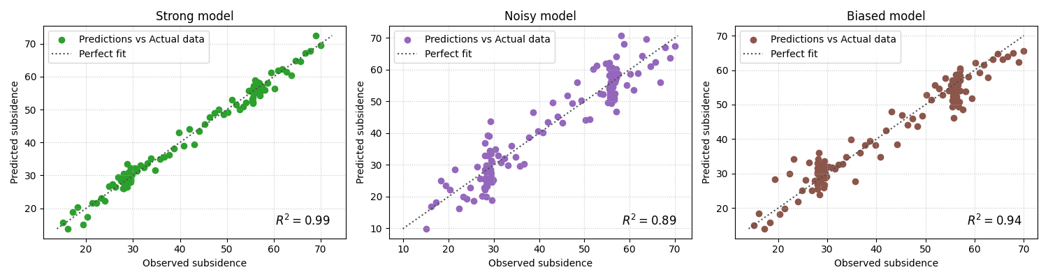
Why this matters for model selection#
In many workflows, a ranking table tells you which model scored highest, but this plot helps explain why.
For example:
a model with slightly worse R² but tighter structure and fewer obvious outliers may still be the safer choice,
a model with a strong R² but clear bias may require recalibration,
and a model with weak R² and a broad cloud is usually not ready for reporting.
This is why plot_r2 belongs in diagnostics rather than in a pure
metrics table.
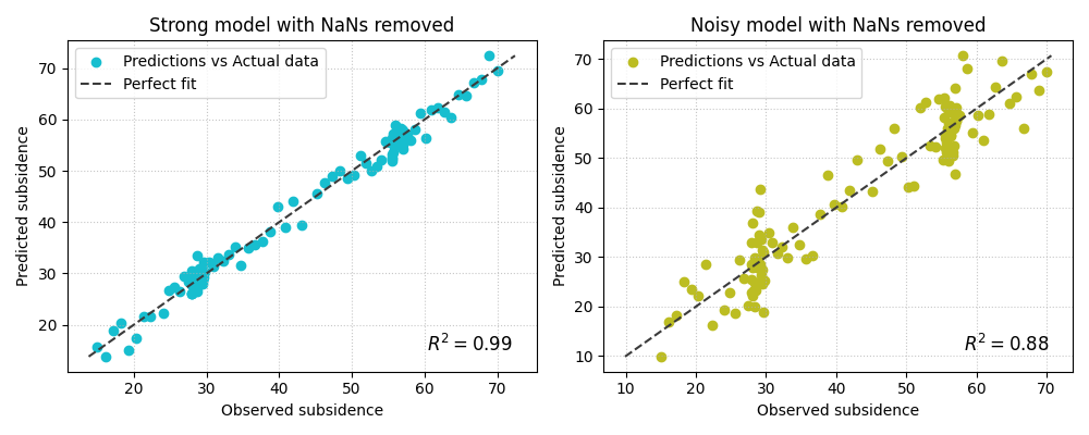
Demonstrate NaN handling implicitly#
The implementation removes NaNs jointly from y_true and all
prediction arrays before plotting. This is useful in real workflows,
because one missing value should not force the entire comparison to
fail as long as enough valid rows remain.
Here we insert a few NaNs to mimic imperfect evaluation exports.
y_true_nan = y_true.copy()
y_pred_strong_nan = y_pred_strong.copy()
y_pred_noisy_nan = y_pred_noisy.copy()

y_true_nan[[8, 33]] = np.nan
y_pred_strong_nan[[8, 61]] = np.nan
y_pred_noisy_nan[[33, 61]] = np.nan

fig = plot_r2(
    y_true_nan,
    y_pred_strong_nan,
    y_pred_noisy_nan,
    titles=["Strong model with NaNs removed", "Noisy model with NaNs removed"],
    xlabel="Observed subsidence",
    ylabel="Predicted subsidence",
    scatter_colors=["#17becf", "#bcbd22"],
    line_colors=["#3b3b3b", "#3b3b3b"],
    line_styles=["--", "--"],
    other_metrics=["rmse"],
    annotate=True,
    show_grid=True,
    max_cols=2,
)
How to use this function on your own data#
plot_r2 is the right choice when you have one truth vector and
several competing predictions for that same target.
A typical workflow looks like this:
extract one observed vector,
extract several model prediction vectors aligned to the same rows,
call
plot_r2(y_true, pred_a, pred_b, pred_c, ...).
For example:
y_true = df_eval["subsidence_actual"].to_numpy()
pred_xtft = df_eval["subsidence_xtft_q50"].to_numpy()
pred_pinn = df_eval["subsidence_pinn_q50"].to_numpy()
pred_tft = df_eval["subsidence_tft_q50"].to_numpy()

plot_r2(
    y_true,
    pred_xtft,
    pred_pinn,
    pred_tft,
    titles=["XTFT", "GeoPriorSubsNet", "TFT"],
    other_metrics=["rmse", "mae"],
    max_cols=2,
)
A good rule is to use plot_r2 when the comparison question is:
“How do several prediction series compare against the same truth?”
If instead you want to compare several independent
(y_true, y_pred) pairs, the better helper is
geoprior.plot.r2.plot_r2_in().
A compact reading checklist#
When reading a plot_r2 figure, ask:
Which panel has the tightest cloud around the diagonal?
Which panel shows obvious bias or amplitude compression?
Does the R² ranking agree with the visual impression?
Do RMSE and MAE support the same conclusion?
Are outliers rare, or are they driving the score?
That sequence turns the plot from a decorative scatter figure into a real diagnostic tool.
plt.show()
Total running time of the script: (0 minutes 1.050 seconds)