
Note
Go to the end to download the full example code.
Read nearest-observation spatial influence with Voronoi maps#
This lesson explains how to use
geoprior.plot.spatial.plot_spatial_voronoi().
Why this plot matters#
A scatter map shows the sampled values themselves, but it does not show how the domain is partitioned by those observations. A Voronoi map does. Each polygon answers a simple spatial question:
Which observation is the closest one here?
That makes this view especially useful when you want to:
see the local zone of influence of each sampled point,
avoid interpolation when you do not want to invent a smooth surface,
understand uneven sampling density,
inspect where a strong or weak value is dominating surrounding space.
This page is therefore not just an API demo. It is a reading lesson. It explains when a Voronoi map is more honest than a contour or heatmap, how to prepare the table, and how to interpret the resulting polygons.
from __future__ import annotations

import matplotlib.pyplot as plt
import numpy as np
import pandas as pd

from geoprior.plot.spatial import plot_spatial_voronoi

pd.set_option("display.max_columns", 20)
pd.set_option("display.width", 100)
pd.set_option("display.float_format", lambda v: f"{v:0.4f}")
Build a compact spatial demo table#
plot_spatial_voronoi expects a DataFrame with:
two spatial columns,
one value column to color the cells,
and either a time column
dt_color an explicit list ofdt_values.
The helper computes a Voronoi tessellation independently for each time slice, lays the subplots out in a grid, fills each polygon according to the sample value, and optionally shares one colorbar across all panels.
In this lesson we create a small but irregular point pattern so the partitioning effect is easy to see.
rng = np.random.default_rng(14)

stations = pd.DataFrame(
    {
        "coord_x": [113.55, 113.60, 113.64, 113.69, 113.73, 113.76],
        "coord_y": [22.48, 22.54, 22.61, 22.50, 22.58, 22.65],
        "station_id": [f"S{i}" for i in range(1, 7)],
    }
)

years = [2024, 2025, 2026]
records: list[dict[str, float | int | str]] = []

for year in years:
    shift = (year - 2024) * 1.6
    for i, row in stations.iterrows():
        base = 10 + 1.8 * i + 2.0 * np.sin(i)
        records.append(
            {
                "coord_x": row["coord_x"],
                "coord_y": row["coord_y"],
                "station_id": row["station_id"],
                "year": year,
                "subsidence_q50": base + shift + rng.normal(0, 0.35),
                "risk_index": 0.45 + 0.07 * i + 0.04 * shift,
            }
        )

df = pd.DataFrame.from_records(records)

print("Input table")
print(df.head(12))
Input table
    coord_x  coord_y station_id  year  subsidence_q50  risk_index
0  113.5500  22.4800         S1  2024         10.2434      0.4500
1  113.6000  22.5400         S2  2024         13.1401      0.5200
2  113.6400  22.6100         S3  2024         14.8679      0.5900
3  113.6900  22.5000         S4  2024         14.6585      0.6600
4  113.7300  22.5800         S5  2024         15.5628      0.7300
5  113.7600  22.6500         S6  2024         17.5188      0.8000
6  113.5500  22.4800         S1  2025         11.6116      0.5140
7  113.6000  22.5400         S2  2025         15.2621      0.5840
8  113.6400  22.6100         S3  2025         17.3767      0.6540
9  113.6900  22.5000         S4  2025         16.9735      0.7240
10 113.7300  22.5800         S5  2025         18.2147      0.7940
11 113.7600  22.6500         S6  2025         18.3752      0.8640
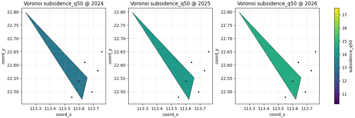
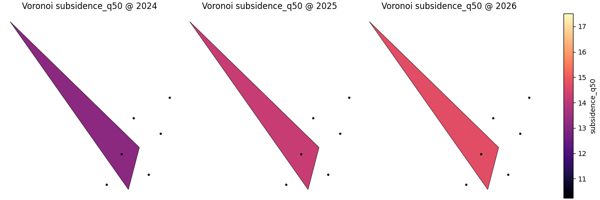
Start with the simplest Voronoi reading#
The first good question is:
How is space partitioned by the nearest sampled locations at each time slice?
Unlike contour or heatmap views, this plot does not smooth values between points. Each polygon inherits the value of one observation. That makes it a strong exploratory choice when:
the number of points is still moderate,
you want to respect sampling support,
and you do not want interpolation to suggest structure that was not directly observed.
The helper returns a list of figures. With only three years and the
default max_cols=3, the list contains one figure.
Returned figure count
1
How to read the polygons correctly#
A Voronoi cell is not an estimate of a smooth field. It is the region for which one sample point is the nearest site. So the visual reading order is usually:
locate unusually large or small cells,
identify whether those cells come from sparse sampling,
inspect whether high values dominate large areas because of the measurement itself or simply because nearby observations are absent.
This is one reason the helper overlays the original points in black. The point locations anchor the polygons and make it harder to confuse the tessellation with a continuous raster.
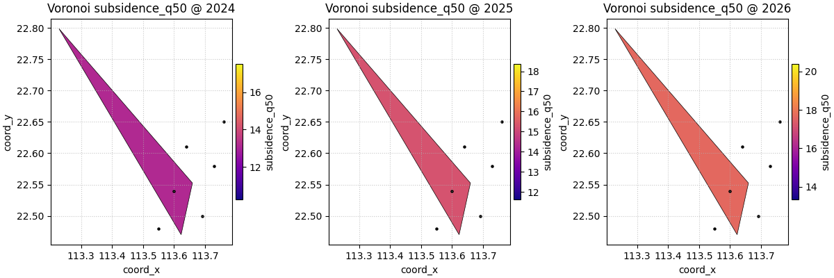
Compare colorbar strategies#
cbar='uniform' shares one colorbar across the plotted slices.
This is the best choice when the user wants to compare years directly.
cbar='individual' gives each panel its own scale. That is useful
when the absolute range changes a lot and the user wants to emphasise
within-year contrast instead of direct year-to-year comparison.
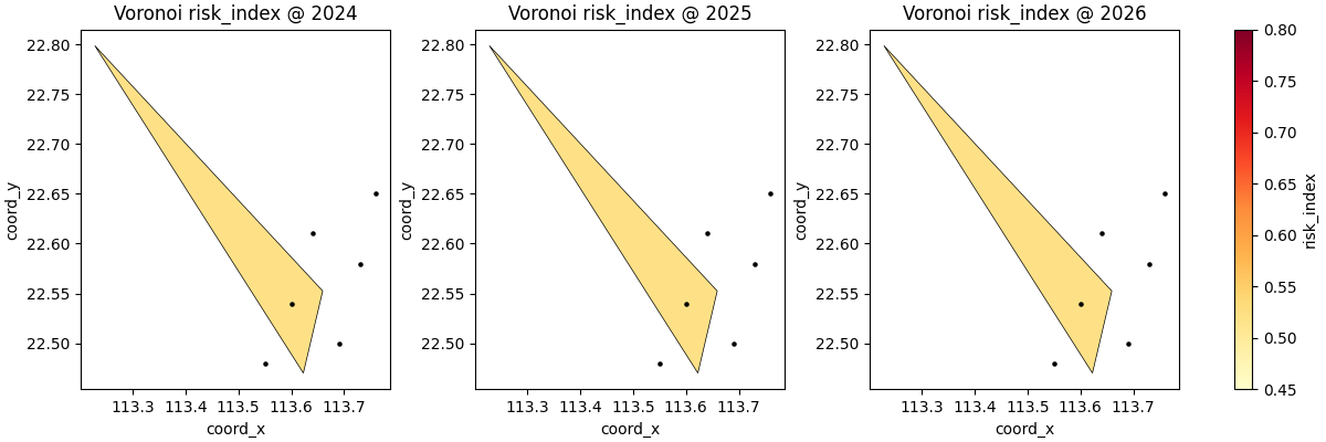
Use a different mapped variable#
The Voronoi logic does not depend on the meaning of the mapped value. Any numeric column can be used.
This is especially useful when the same station geometry is reused to inspect several quantities, for example:
median subsidence,
uncertainty score,
exceedance probability,
or a composite risk indicator.
Here we switch from subsidence_q50 to a compact risk index.
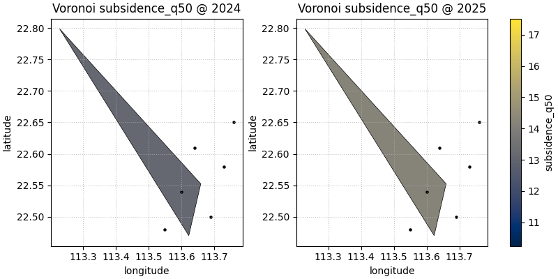
Custom coordinate names also work#
Many real forecast tables do not use coord_x and coord_y.
The helper lets you pass your own coordinate names through
spatial_cols as long as those columns exist in the DataFrame.
When hiding axes helps#
For exploratory work, axes are often useful. But for compact report
figures, especially when every panel shares the same coordinate frame,
show_axis='off' can make the spatial partitioning easier to read.
When this plot is the right choice#
plot_spatial_voronoi is strongest when you want to preserve the
idea of nearest-observation influence instead of smoothing the field.
It is usually a better choice than contours or heatmaps when:
the sample count is modest,
the geometry is irregular,
interpolation would look overconfident,
or the user wants to see data support very explicitly.
It is usually not the final presentation plot when:
the number of points is very large,
polygon clutter becomes hard to read,
or the scientific question is about smooth spatial gradients rather than local zones of influence.
How to adapt this lesson to your own data#
A simple checklist:
prepare one row per sampled location and time slice,
make sure the two spatial columns are numeric,
choose one numeric
value_colto color the cells,pass
dt_colif the table contains several years or steps,use
cbar='uniform'for cross-time comparison,use
cbar='individual'when within-panel contrast matters more,prefer Voronoi when you want an honest nearest-site partition, not a smoothed field.
In many forecast settings, the direct mapping is as simple as:
spatial_cols=('coord_x', 'coord_y')dt_col='coord_t'ordt_col='forecast_year'value_col='subsidence_q50'or another forecast summary column.
Total running time of the script: (0 minutes 1.810 seconds)