
Note
Go to the end to download the full example code.
Physics maps: turning pointwise payloads into readable spatial fields#
This example teaches you how to read the GeoPrior physics-maps figure.
Unlike a training loss plot or a scalar metric table, this page answers a spatial question:
What does the inferred physical system look like across the city, and where does the learned timescale depart from the closure-based expectation?
This plotting script builds a regular-grid spatial summary from pointwise payload values. It is therefore especially useful when you want a clean publication-style map from a physics payload export.
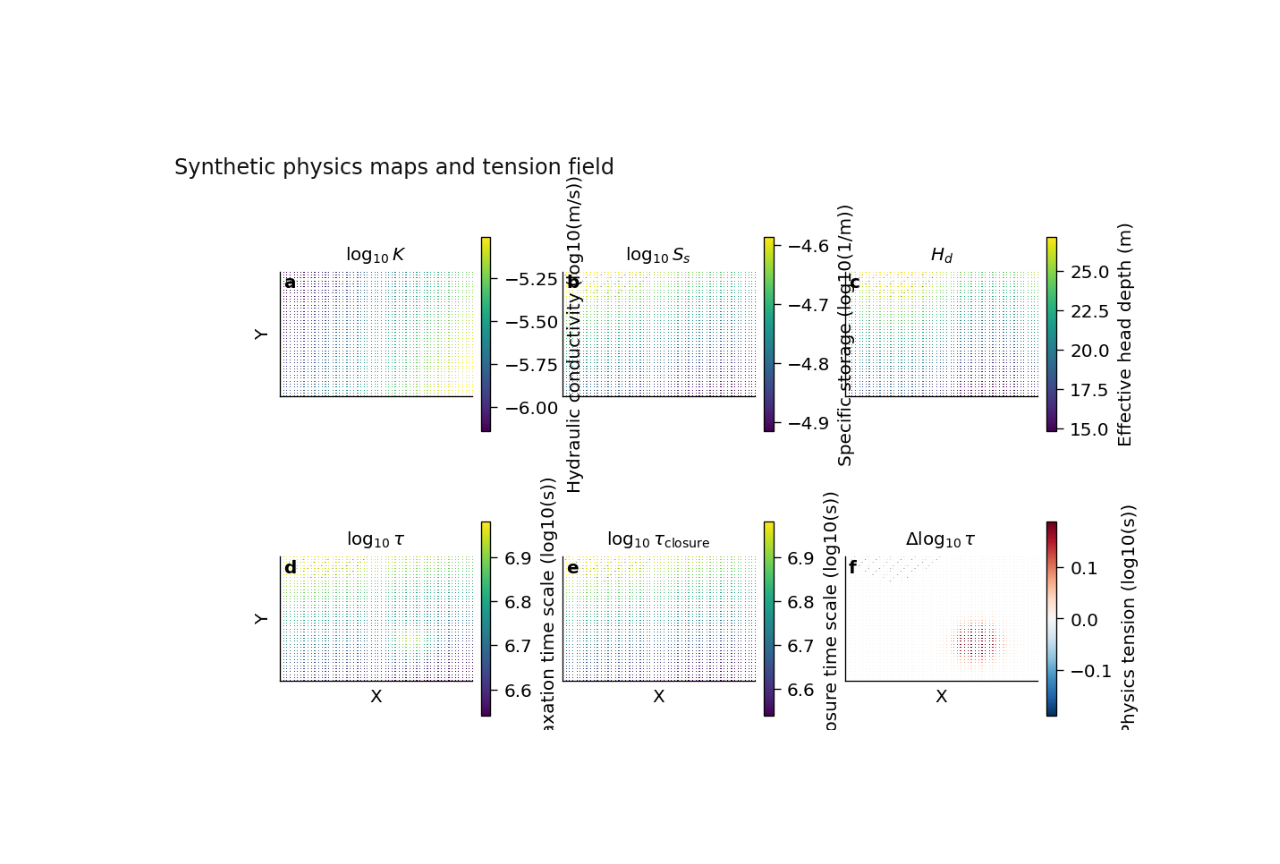
What the figure shows#
The plotting backend renders a 2×3 panel for one city:
\(\log_{10} K\)
\(\log_{10} S_s\)
\(H_d\)
\(\log_{10} \tau\)
\(\log_{10} \tau_p\)
\(\Delta \log_{10}(\tau)\)
where the last panel is the physics-tension map:
Why this matters#
A physics payload is often exported as 1D arrays attached to locations. That is useful for computation, but harder to read scientifically.
This figure does the translation from:
pointwise payload arrays
to:
a coherent spatial story.
It helps the reader ask:
Where is hydraulic conductivity high or low?
Where does specific storage vary smoothly or abruptly?
Where is the relaxation timescale consistent with the prior?
Where does the learned system pull away from the closure?
This gallery page uses a compact synthetic payload so the lesson is fully executable during the documentation build.
Imports#
We import the real plotting backend from the project script. This page teaches the actual function used by the CLI.
import tempfile
from pathlib import Path
import matplotlib.image as mpimg
import matplotlib.pyplot as plt

import numpy as np

from geoprior.scripts.plot_physics_maps import (
    plot_physics_maps,
)
Step 1 - Build a compact synthetic city#
We create one small synthetic city domain with scattered point locations. The plotting backend will later turn these pointwise arrays into gridded maps.
This is an important lesson:
the payload itself is not a raster image. it is a set of values attached to coordinates.
The plotting function performs the gridding step for us.
Step 2 - Create smooth physical fields#
We now synthesize the five fields the plotting backend needs:
K
Ss
Hd
tau
tau_prior
The code in the real script accepts aliases too, but for a teaching page it is better to use the clearest field names.
# Hydraulic conductivity K [m/s]
K = 10.0 ** (-5.9 + 1.0 * xn - 0.35 * yn)

# Specific storage Ss [1/m]
Ss = 10.0 ** (-4.8 + 0.25 * yn - 0.15 * xn)

# Effective head depth Hd [m]
Hd = 16.0 + 10.0 * yn + 2.0 * np.sin(2.0 * np.pi * xn)

# Prior / closure time scale tau_prior [s]
tau_prior = 10.0 ** (
    6.5 + 0.40 * yn + 0.12 * (1.0 - xn)
)
Step 3 - Insert one tension zone#
A lesson page becomes much more useful when it includes a recognizable anomaly.
We therefore create one compact region where the learned tau is larger than tau_prior. This will appear clearly in the final Δlog10(tau) panel.
Step 4 - Add an optional censored mask#
The real plotting script can overlay a hatched mask when a
payload contains a censored field and
hatch_censored=True.
This is useful for showing a flagged or less trusted region.
censored = (
    Hd > np.quantile(Hd, 0.93)
).astype(float)
Step 5 - Build the payload and metadata#
The plotting backend checks for these key arrays and then computes the map panels internally, including the log10 transforms and the tension map.
Step 6 - Render the regular-grid physics maps#
The real function grids the pointwise arrays onto a regular map.
A few arguments are especially important:
aggchooses mean or median gridding,gridcontrols the map resolution,clip_qsets percentile clipping for the individual fields,delta_qsets the symmetric percentile range for the tension panel.
The function writes PNG and SVG outputs and returns their paths.
tmp_dir = Path(
    tempfile.mkdtemp(prefix="gp_sg_phys_maps_")
)
out_base = str(
    tmp_dir / "physics_maps_gallery"
)

out_paths = plot_physics_maps(
    payload,
    meta,
    x=x,
    y=y,
    city="Synthetic Basin",
    out=out_base,
    agg="mean",
    grid=180,
    clip_q=(2.0, 98.0),
    delta_q=98.0,
    cmap="viridis",
    cmap_div="RdBu_r",
    coord_kind="xy",
    dpi=160,
    font=9,
    show_legend=True,
    show_labels=True,
    show_ticklabels=False,
    show_title=True,
    show_panel_titles=True,
    show_panel_labels=True,
    hatch_censored=True,
    title="Synthetic physics maps and tension field",
    out_json=None,
)


print("Written files:")
for path in out_paths:
    print(" -", path)
Written files:
 - /tmp/gp_sg_phys_maps_y73z_xyd/physics_maps_gallery.png
 - /tmp/gp_sg_phys_maps_y73z_xyd/physics_maps_gallery.svg
Show the saved figure inside the gallery page#
The backend writes PNG/SVG outputs. We load the PNG back into a small display figure so Sphinx-Gallery always shows the rendered result on the page.
(np.float64(-0.5), np.float64(1108.5), np.float64(655.5), np.float64(-0.5))
Step 7 - Quantify the strongest tension location#
The most diagnostic panel is the last one. Let us compute the maximum absolute tension explicitly so the reader connects the image to a simple numerical summary.
delta_log_tau = np.log10(
    tau.ravel()
) - np.log10(
    tau_prior.ravel()
)

imax = int(
    np.argmax(np.abs(delta_log_tau))
)

print("")
print("Largest |Δlog10(tau)| occurs near:")
print(f"  x = {x[imax]:.0f} m")
print(f"  y = {y[imax]:.0f} m")
print(
    f"  Δlog10(tau) = {delta_log_tau[imax]:.3f}"
)
Largest |Δlog10(tau)| occurs near:
  x = 9418 m
  y = 2854 m
  Δlog10(tau) = 0.266
Step 8 - Learn how to read each panel#
A careful reader should not jump straight to the last panel. A better reading order is:
Panel (a): log10(K)#
This panel shows how easily water moves through the effective medium. Broad gradients are usually easier to trust scientifically than isolated salt-and-pepper patches.
Panel (b): log10(Ss)#
This panel describes storage or compressibility structure. Coherent variation suggests a physically interpretable field.
Panel (c): Hd#
This panel is often the easiest one to interpret directly because it remains in ordinary spatial units. It helps connect the inferred system to an effective depth or thickness scale.
Panel (d): log10(tau)#
This is the learned relaxation timescale. Spatially, it tells us where the system responds more slowly or more rapidly.
Panel (e): log10(tau_p)#
This is the prior or closure timescale. It is not the final learned answer. It is the physics-guided expectation.
Panel (f): Δlog10(tau)#
This is the tension map. Values near zero indicate broad agreement between learned and prior timescales. Strong departures show where the learned system is pulling away from the closure expectation.
In this synthetic example, the inserted anomaly creates a localized tension patch. In a real application, such a region might suggest:
a distinct hydrogeological compartment,
a local mismatch between data and prior closure,
or a place where the physics fields deserve closer validation.
Step 9 - Why the gridding step matters#
The real script does not require the payload to arrive already as an image. It starts from scattered values at coordinates and bins them onto a regular grid.
That is very useful in practice because many GeoPrior artifacts are naturally stored as arrays attached to sequence locations rather than as ready-made rasters.
This also explains why:
the grid resolution matters,
the aggregation rule matters,
and percentile clipping matters.
A coarse grid smooths the story. A finer grid preserves more local variation. Mean and median aggregation can differ when local values are noisy or skewed.
Step 10 - Practical takeaway#
This figure is best used when you want a clean spatial summary of the physics payload itself.
It is especially useful for:
publication figures,
qualitative field interpretation,
and locating regions where learned and closure timescales disagree.
It is therefore a bridge between raw payload arrays and a scientific spatial narrative.
Command-line version#
The same figure can be produced from the CLI.
The real script supports:
--payloadfor an explicit payload file,--srcfor artifact auto-detection,--coords-npzwhen the payload lacks coordinates,optional
--x-keyand--y-key,--coord-kindwithauto,xy, orlonlat,gridding controls such as
--aggand--grid,percentile controls
--clip-qand--delta-q,styling controls such as
--cmapand--cmap-div,censored overlay via
--hatch-censored,and the shared plot text / output options.
Legacy dispatcher:
python -m scripts plot-physics-maps \
  --payload results/example/physics_payload.npz \
  --coords-npz results/example/coords.npz \
  --city Nansha \
  --coord-kind xy \
  --agg mean \
  --grid 200 \
  --clip-q 2 98 \
  --delta-q 98 \
  --cmap viridis \
  --cmap-div RdBu_r \
  --hatch-censored true \
  --show-title true \
  --show-panel-titles true \
  --show-panel-labels true \
  --out fig_physics_maps \
  --out-json fig_physics_maps.json
Modern CLI:
geoprior plot physics-maps \
  --payload results/example/physics_payload.npz \
  --coords-npz results/example/coords.npz \
  --city Nansha \
  --out fig_physics_maps
The gallery page teaches the figure. The command line reproduces it in a workflow.
Total running time of the script: (0 minutes 0.906 seconds)