
Note
Go to the end to download the full example code.
Read spatial forecast patterns with plot_spatial#
This lesson explains how to use
geoprior.plot.spatial.plot_spatial when you want to inspect a
numeric field on a map-like coordinate plane across one or more time
slices.
Why this function matters#
A forecast table is often easiest to trust once you can see where the values are happening. A global summary may tell you the mean error or mean interval width, but it cannot show whether high values cluster in one corner, whether the spatial pattern shifts with time, or whether an apparent anomaly is only one isolated point.
This helper answers practical questions such as:
Where are the high and low values located in the study area?
Does the same spatial pattern persist across years or forecast steps?
Should all subplots share one color scale, or should each map use its own?
When there are many time slices, how does the helper break them into rows of figures?
This page is therefore written as a teaching guide, not only as an API demo. We will build a realistic spatial table, inspect the required columns, start with the simplest time-slice view, then compare colorbar choices and layout options, and end with a checklist for using the function on your own data.
from __future__ import annotations

import matplotlib.pyplot as plt
import numpy as np
import pandas as pd

from geoprior.plot.spatial import plot_spatial

pd.set_option("display.max_columns", 20)
pd.set_option("display.width", 110)
pd.set_option(
    "display.float_format",
    lambda v: f"{v:0.4f}",
)
What this function expects#
plot_spatial expects a tidy DataFrame with:
one numeric column to color,
two spatial coordinate columns,
and either
dt_color an explicitdt_valueslist.
The default spatial column names are coord_x and coord_y.
That means the quickest path is to keep those names when building or
exporting your forecast table. If your project uses longitude and
latitude or projected coordinates, you can pass them through
spatial_cols=(x_name, y_name).
The function returns a list of figures, not a single figure. This matters because when you request many time slices, the helper creates multiple rows of subplots and stores each row as a separate figure.
Build a realistic demo spatial table#
A gallery lesson should behave like a real mapping table without requiring a full pipeline run. Here we create:
a 2D coordinate grid,
4 yearly slices,
one main value column
subsidence_q50,and one extra column
interval_width_80that could also be mapped later with the same helper.
We intentionally create a drifting hotspot so the lesson teaches a useful spatial reading pattern rather than random noise.
rng = np.random.default_rng(7)

x_coords = np.linspace(0.0, 8.0, 13)
y_coords = np.linspace(0.0, 6.0, 10)
years = [2023, 2024, 2025, 2026]

rows: list[dict[str, float | int]] = []

for year in years:
    shift_x = 0.35 * (year - 2023)
    shift_y = 0.18 * (year - 2023)

    for x in x_coords:
        for y in y_coords:
            base_surface = 4.8 + 0.30 * x + 0.12 * y
            hotspot = 6.5 * np.exp(
                -((x - (5.0 + shift_x)) ** 2) / 3.6
                -((y - (3.1 + shift_y)) ** 2) / 2.2
            )
            broad_wave = 0.75 * np.sin(x / 1.7) + 0.55 * np.cos(y / 1.4)
            noise = rng.normal(0.0, 0.22)

            value = base_surface + hotspot + broad_wave + noise
            width80 = 1.0 + 0.18 * value + 0.08 * (year - 2023)

            rows.append(
                {
                    "coord_x": x,
                    "coord_y": y,
                    "year": year,
                    "subsidence_q50": value,
                    "interval_width_80": width80,
                }
            )

spatial_df = pd.DataFrame(rows)

print("Demo spatial table")
print(spatial_df.head(10))
Demo spatial table
   coord_x  coord_y  year  subsidence_q50  interval_width_80
0   0.0000   0.0000  2023          5.3504             1.9631
1   0.0000   0.6667  2023          5.4350             1.9783
2   0.0000   1.3333  2023          5.2201             1.9396
3   0.0000   2.0000  2023          4.9256             1.8866
4   0.0000   2.6667  2023          4.8454             1.8722
5   0.0000   3.3333  2023          4.5895             1.8261
6   0.0000   4.0000  2023          4.7697             1.8585
7   0.0000   4.6667  2023          5.1170             1.9211
8   0.0000   5.3333  2023          4.9006             1.8821
9   0.0000   6.0000  2023          5.1560             1.9281
Read the structure before plotting#
A good first habit is to confirm:
the coordinate names,
the time column,
the value column you want to map,
and the number of rows per time slice.
This keeps the plotting lesson close to how users really work with saved CSV or parquet outputs.
print("\nColumns")
print(list(spatial_df.columns))

print("\nRows per year")
print(spatial_df.groupby("year").size())

print("\nValue summary by year")
print(
    spatial_df.groupby("year")["subsidence_q50"].agg(
        ["min", "mean", "max"]
    )
)
Columns
['coord_x', 'coord_y', 'year', 'subsidence_q50', 'interval_width_80']

Rows per year
year
2023    130
2024    130
2025    130
2026    130
dtype: int64

Value summary by year
        min   mean     max
year
2023 4.5895 7.3383 12.7913
2024 4.7394 7.3381 12.9057
2025 4.6023 7.3663 12.6767
2026 4.6270 7.2883 12.3131
Start with the most direct reading: one mapped variable over time#
The simplest and most common use case is:
Take one variable and inspect its spatial pattern across a sequence of time slices.
Here we map subsidence_q50 over the four yearly slices. We use a
single shared color scale with cbar='uniform' because we want the
color itself to mean the same thing in every panel.
This is usually the best first view when the goal is comparison across years or forecast horizons.
figs_uniform = plot_spatial(
    df=spatial_df,
    value_col="subsidence_q50",
    dt_col="year",
    dt_values=years,
    cmap="cividis",
    marker_size=52,
    alpha=0.90,
    max_cols=3,
    cbar="uniform",
    grid_props={"linestyle": ":", "alpha": 0.35},
)

print("\nNumber of figures returned with max_cols=3:", len(figs_uniform))
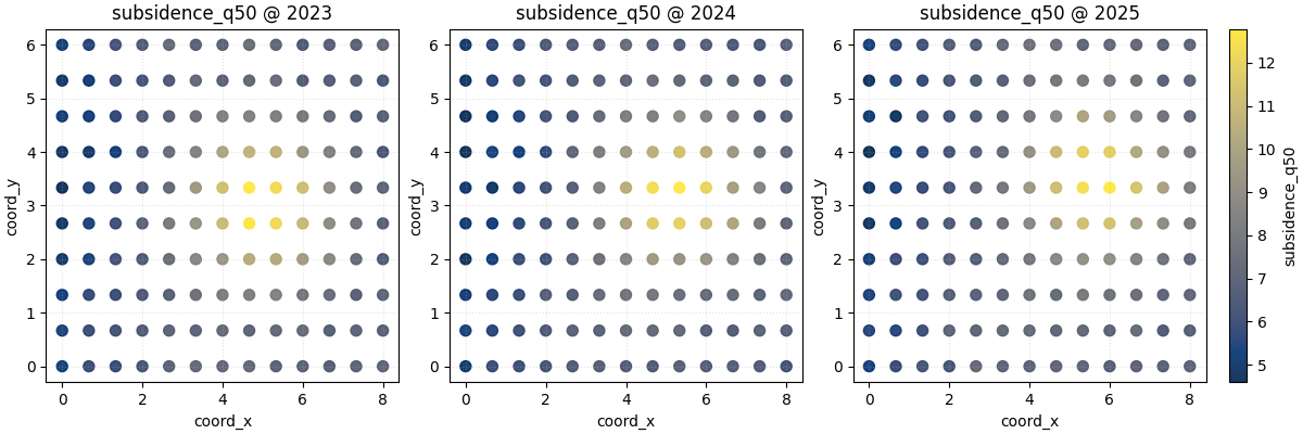
Number of figures returned with max_cols=3: 2
How to read this first map sequence#
Read the panels in this order:
locate the highest-value region,
check whether it stays fixed or drifts,
look for widening or contraction of the hotspot,
compare edge regions to see whether the whole field is rising or whether change is local.
In this demo, the hotspot shifts gradually through space. That makes a good teaching case because it shows why a table alone is not enough. A long table can tell you the values changed, but it cannot show the direction of the spatial movement nearly as clearly as the map.
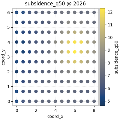
Why the return value is a list of figures#
Because we asked for four time slices and set max_cols=3, the
helper creates:
one figure for the first three years,
one second figure for the remaining year.
This is an important design choice to teach users early. The helper is meant to stay readable even when the time list is longer than a single row can support.
for idx, fig in enumerate(figs_uniform, start=1):
    print(f"Figure {idx}: {len(fig.axes)} axes including colorbars")
Figure 1: 4 axes including colorbars
Figure 2: 2 axes including colorbars
Compare uniform and per-panel colorbars#
The cbar argument changes the comparison logic of the plot.
cbar='uniform'is better when you want colors to be directly comparable across panels.non-uniform mode gives each subplot its own colorbar, which can make within-panel structure easier to see when ranges differ strongly.
Neither choice is universally correct. It depends on the question. Here we plot the same data again with one colorbar per panel so the local contrast becomes easier to inspect.
figs_panel_cbar = plot_spatial(
    df=spatial_df,
    value_col="subsidence_q50",
    dt_col="year",
    dt_values=years,
    cmap="magma",
    marker_size=46,
    alpha=0.92,
    max_cols=4,
    cbar="panel",
    grid_props={"linestyle": "--", "alpha": 0.20},
)
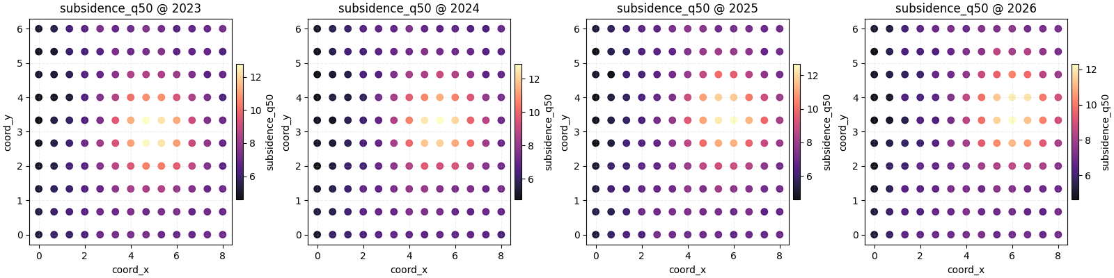
Teach the user how to choose between the two colorbar modes#
A practical rule is:
choose a uniform colorbar when the story is about temporal or cross-horizon comparison,
choose per-panel colorbars when the story is about pattern shape inside each map and the ranges differ enough that a shared scale hides detail.
In real forecasting work, many users start with the uniform version, then only switch to panel-specific colorbars when the later years are much wider or more extreme.
Use fixed color limits when consistency matters most#
Another strong habit is to set vmin and vmax explicitly when
you prepare a report. That makes the visual comparison deterministic.
Here we compute global limits once, then use them directly.
global_vmin = float(spatial_df["subsidence_q50"].min())
global_vmax = float(spatial_df["subsidence_q50"].max())

plot_spatial(
    df=spatial_df,
    value_col="subsidence_q50",
    dt_col="year",
    dt_values=[2023, 2025, 2026],
    cmap="viridis",
    marker_size=58,
    alpha=0.88,
    vmin=global_vmin,
    vmax=global_vmax,
    max_cols=3,
    cbar="uniform",
)
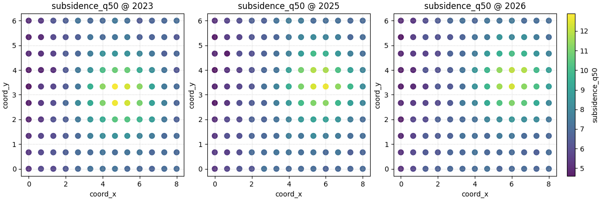
[<Figure size 1200x400 with 4 Axes>]
Use a different spatial column naming scheme#
Many real files do not use coord_x and coord_y. They may use
names like longitude and latitude or projected coordinates such
as utm_e and utm_n.
The helper supports that directly through spatial_cols. We rename
the columns only to demonstrate the idea.
geo_df = spatial_df.rename(
    columns={
        "coord_x": "longitude",
        "coord_y": "latitude",
    }
)

plot_spatial(
    df=geo_df.loc[geo_df["year"].isin([2024, 2026])].copy(),
    value_col="interval_width_80",
    spatial_cols=("longitude", "latitude"),
    dt_col="year",
    dt_values=[2024, 2026],
    cmap="plasma",
    marker_size=60,
    alpha=0.90,
    cbar="uniform",
    max_cols=2,
)
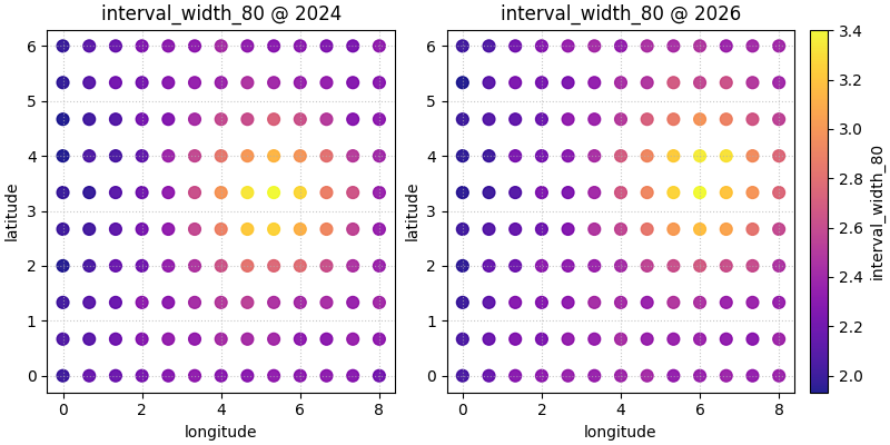
[<Figure size 800x400 with 3 Axes>]
Hide the axes when the map itself is the message#
For exploratory work, axes are useful. For presentation panels, especially when the coordinate system is already familiar, users often prefer a cleaner visual.
show_axis='off' keeps the focus on the spatial field itself.
plot_spatial(
    df=spatial_df,
    value_col="subsidence_q50",
    dt_col="year",
    dt_values=[2023, 2024, 2025],
    cmap="cubehelix",
    marker_size=54,
    alpha=0.95,
    cbar="uniform",
    show_axis="off",
    max_cols=3,
)
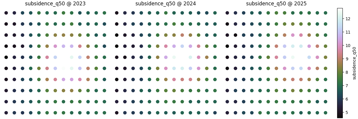
[<Figure size 1200x400 with 4 Axes>]
What this function does best#
plot_spatial is strongest when the user wants a quick spatial
scatter reading across time slices. It is especially useful when:
the points are already sampled on observation or forecast locations,
interpolation is not yet desired,
and the goal is to preserve point-wise structure.
Later helpers such as contour, Voronoi, hotspot, ROI, or heatmap plots answer different spatial questions. This first helper is the clean entry point because it keeps the data closest to the original sampled positions.
How to adapt this lesson to your own data#
In a real project, the workflow is usually:
load a forecast or evaluation table,
choose one numeric column to map,
identify the coordinate columns,
identify the time or horizon column,
decide whether all subplots should share one colorbar.
A practical checklist is:
Keep one row per location and per time slice.
Use
dt_colfor automatic slicing when possible.Use
cbar='uniform'for honest cross-panel comparison.Set
vminandvmaxexplicitly for report-ready figures.Keep
max_colssmall enough that labels remain readable.Switch to ROI, contour, Voronoi, or heatmap helpers only when the question becomes more specific than a direct point map.
Once that basic map-reading habit is established, the next lessons in the spatial gallery become much easier to understand.
plt.show()
Total running time of the script: (0 minutes 2.146 seconds)