
Note
Go to the end to download the full example code.
Learn how horizon emphasis changes the score with plot_time_weighted_metric#
This lesson explains how to use
geoprior.plot.evaluation.plot_time_weighted_metric
when you want to answer a practical question that many forecast users
forget to ask:
Should every forecast horizon matter equally?
Why this function matters#
A model can look good on average while still failing where your real use case matters most.
For example:
in early-warning systems, short-horizon accuracy may matter more,
in strategic planning, long-horizon behavior may deserve more weight,
in uncertainty reporting, interval quality may matter more than point error alone,
and in multi-output forecasting, one target may degrade faster than another.
That is exactly why time-weighted metrics are useful. They let you define which part of the horizon matters more, then show the result either as:
one weighted summary score, or
a per-horizon profile with the weights shown alongside it.
This page is written as a teaching guide, not only as an API demo. We will build realistic arrays, explain the accepted shapes, compare inverse-time and custom weights, inspect a multi-output case, and end with a checklist for using the helper on your own data.
from __future__ import annotations

import matplotlib.pyplot as plt
import numpy as np
import pandas as pd

from geoprior.plot.evaluation import plot_time_weighted_metric

pd.set_option("display.max_columns", 20)
pd.set_option("display.width", 110)
pd.set_option(
    "display.float_format",
    lambda v: f"{v:0.4f}",
)
What this function really expects#
plot_time_weighted_metric works directly on arrays, not on a tidy
forecast DataFrame. That makes it a good companion to the table-based
helpers in geoprior.plot.evaluation:
plot_metric_over_horizonis great when you already have a long evaluation table,plot_time_weighted_metricis great when you still have arrays and want to control how each forecast horizon contributes.
The function supports three metric families:
metric_type='mae'metric_type='accuracy'metric_type='interval_score'
It also accepts three common shape styles for y_true:
(T,)for one series,(N, T)for many samples of one output,(N, O, T)for many samples and many outputs.
The weighting logic is separate from the plotting style:
kind='summary_bar'gives the final weighted score,kind='time_profile'shows the metric across time steps.
One very important interpretation rule:
the profile line shows the per-timestep metric values.
The optional weight bars are shown beside that profile so the user can visually connect the per-step behavior to the weighting scheme used in the final overall score.
Build a realistic point-forecast example#
We start with a standard regression setting:
N = 48forecast cases,T = 5forecast horizons,one output variable.
We intentionally make later horizons noisier so the lesson shows a common forecasting pattern: short-range predictions are better than long-range predictions.
rng = np.random.default_rng(2026)

n_samples = 48
n_steps = 5

base_level = rng.normal(loc=21.0, scale=2.8, size=(n_samples, 1))
shared_trend = np.linspace(0.8, 6.2, n_steps).reshape(1, -1)
local_pattern = rng.normal(loc=0.0, scale=0.35, size=(n_samples, n_steps))

y_true = base_level + shared_trend + local_pattern

# Make later horizons harder.
step_noise = np.array([0.35, 0.55, 0.85, 1.25, 1.75]).reshape(1, -1)
y_pred = y_true + rng.normal(loc=0.12, scale=step_noise, size=(n_samples, n_steps))

preview = pd.DataFrame(
    {
        "sample_idx": np.repeat(np.arange(4), n_steps),
        "forecast_step": np.tile(np.arange(1, n_steps + 1), 4),
        "y_true": y_true[:4].reshape(-1),
        "y_pred": y_pred[:4].reshape(-1),
    }
)

print("Point-forecast preview")
print(preview)

print("\nArray shapes used in this lesson")
print({
    "y_true": y_true.shape,
    "y_pred": y_pred.shape,
})
Point-forecast preview
    sample_idx  forecast_step  y_true  y_pred
0            0              1 20.4751 20.7529
1            0              2 22.0321 21.7939
2            0              3 22.8457 23.2065
3            0              4 23.9187 22.8843
4            0              5 24.7469 25.7372
5            1              1 22.8217 22.7043
6            1              2 23.6687 24.2812
7            1              3 25.1660 25.1837
8            1              4 26.4219 26.8779
9            1              5 27.9729 33.2745
10           2              1 16.9411 17.3426
11           2              2 17.6458 17.9131
12           2              3 18.8454 19.0031
13           2              4 20.1893 19.0103
14           2              5 21.5514 23.5688
15           3              1 25.2073 25.8881
16           3              2 26.7386 26.8940
17           3              3 28.8608 30.4060
18           3              4 29.5505 29.5302
19           3              5 31.1981 28.2153

Array shapes used in this lesson
{'y_true': (48, 5), 'y_pred': (48, 5)}
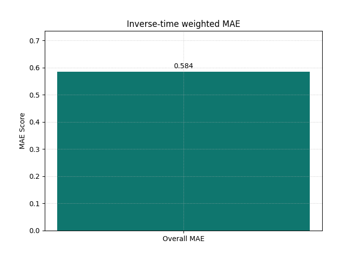
Start with the default weighting idea: inverse time#
The built-in default is time_weights='inverse_time'.
That means early horizons receive more influence than later ones.
Conceptually, the weight pattern behaves like:
so step 1 matters more than step 5.
This is a strong first choice when your main question is:
Is the model reliably useful at the near horizon?
We begin with the most compact view: a single weighted MAE bar.
<Axes: title={'center': 'Inverse-time weighted MAE'}, ylabel='MAE Score'>
Why the first bar matters#
A plain MAE averages all horizons equally. That is not always what you want.
This weighted bar instead answers a narrower question:
How good is the model when earlier horizons matter more?
If you compare several models with the same weighting scheme, the bar becomes a decision score aligned with your operational priority.
This is one of the main teaching ideas of this helper:
the weighting scheme is part of the evaluation question.
It should therefore be chosen deliberately, not treated as an incidental plotting option.
Make the weight pattern visible with a time profile#
A summary bar is useful, but it hides where the error comes from. The profile mode solves that problem.
Here we keep the same metric and the same inverse-time weighting, but we also draw the normalized time weights on a second axis.
This makes the lesson much easier to read because the user sees both:
how MAE changes with horizon,
and how much weight each horizon receives in the overall score.
plot_time_weighted_metric(
    metric_type="mae",
    y_true=y_true,
    y_pred=y_pred,
    time_weights="inverse_time",
    kind="time_profile",
    figsize=(9.0, 5.6),
    title="MAE profile with inverse-time weights",
    profile_line_color="#1D4ED8",
    profile_line_style="-",
    profile_marker="o",
    time_weights_color="#94A3B8",
    show_time_weights_on_profile=True,
    show_score_on_title=True,
)
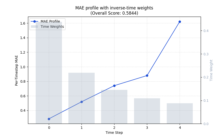
<Axes: title={'center': 'MAE profile with inverse-time weights\n(Overall Score: 0.5844)'}, xlabel='Time Step', ylabel='Per-Timestep MAE'>
How to read the profile correctly#
This is the most important interpretation step on the page.
The blue line is the per-horizon MAE. It is not the weighted score itself.
The gray bars show the normalized horizon weights used when the final weighted score is aggregated.
Read the figure in this order:
inspect whether the line rises with horizon,
inspect whether the larger errors happen where the weights are high or low,
then interpret the overall weighted score shown in the title.
In this demo, later horizons are worse, but they are also down-weighted. So the final inverse-time score is more forgiving than an equal-weight average would be.
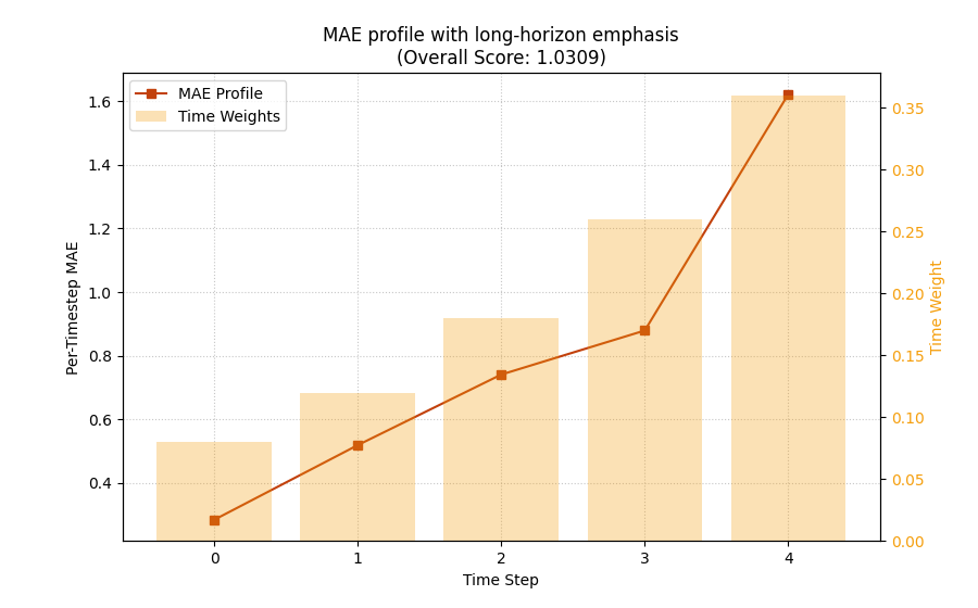
Switch from implicit weights to explicit business weights#
Real projects often need a custom policy. For example, maybe your stakeholders care most about the far horizon because that is where strategic planning becomes difficult.
In that case, you should not use inverse-time weights. You should pass your own array.
Below we create a simple long-horizon emphasis where the last step matters most.
custom_weights = np.array([0.08, 0.12, 0.18, 0.26, 0.36], dtype=float)
custom_weights = custom_weights / custom_weights.sum()

weights_frame = pd.DataFrame(
    {
        "forecast_step": np.arange(1, n_steps + 1),
        "custom_weight": custom_weights,
    }
)
print("\nCustom weight profile")
print(weights_frame)

plot_time_weighted_metric(
    metric_type="mae",
    y_true=y_true,
    y_pred=y_pred,
    time_weights=custom_weights,
    kind="time_profile",
    figsize=(9.0, 5.6),
    title="MAE profile with long-horizon emphasis",
    profile_line_color="#C2410C",
    profile_line_style="-",
    profile_marker="s",
    time_weights_color="#F59E0B",
    show_time_weights_on_profile=True,
    show_score_on_title=True,
)
Custom weight profile
   forecast_step  custom_weight
0              1         0.0800
1              2         0.1200
2              3         0.1800
3              4         0.2600
4              5         0.3600

<Axes: title={'center': 'MAE profile with long-horizon emphasis\n(Overall Score: 1.0309)'}, xlabel='Time Step', ylabel='Per-Timestep MAE'>
Compare the weighted decision question, not only the line shape#
The per-step MAE line is the same dataset, so the line shape is still driven by the same forecast errors.
What changes is the decision emphasis. The final score now penalizes the late-horizon degradation much more.
A strong usage pattern is therefore to compare several weighting schemes deliberately:
uniform if all horizons should matter equally,
inverse-time if near-term behavior matters more,
custom if the project has a specific operational priority.
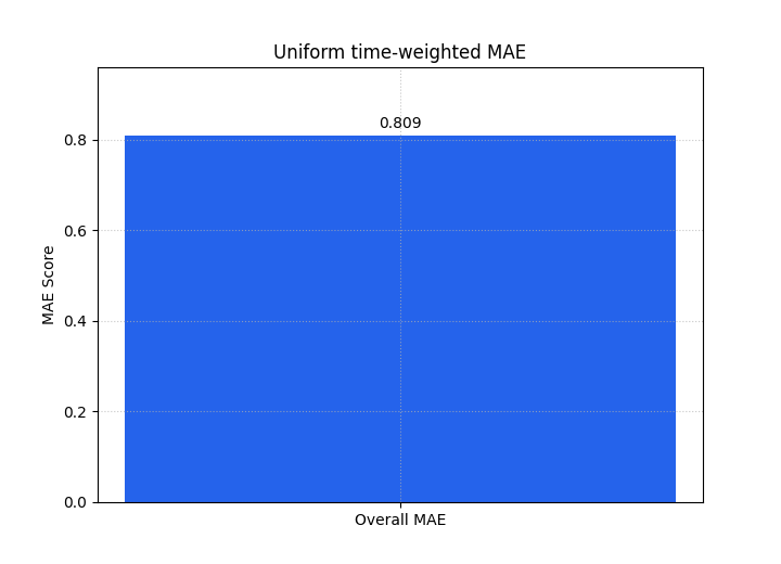
The next two summary bars show how the headline score changes once the weighting policy changes.
plot_time_weighted_metric(
    metric_type="mae",
    y_true=y_true,
    y_pred=y_pred,
    time_weights=None,
    kind="summary_bar",
    figsize=(7.2, 5.2),
    title="Uniform time-weighted MAE",
    bar_color="#2563EB",
    score_annotation_format="{:.3f}",
)

plot_time_weighted_metric(
    metric_type="mae",
    y_true=y_true,
    y_pred=y_pred,
    time_weights=custom_weights,
    kind="summary_bar",
    figsize=(7.2, 5.2),
    title="Custom long-horizon weighted MAE",
    bar_color="#EA580C",
    score_annotation_format="{:.3f}",
)
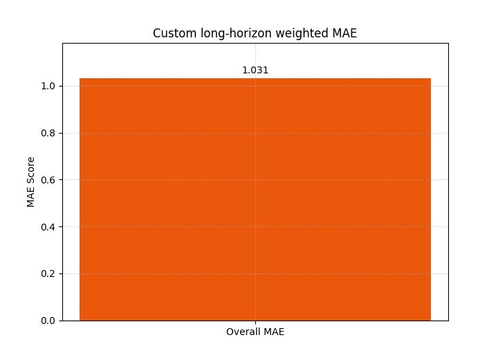
<Axes: title={'center': 'Custom long-horizon weighted MAE'}, ylabel='MAE Score'>
Extend the lesson to a multi-output forecast#
Many GeoPrior workflows forecast more than one target or evaluate more than one output channel.
The helper accepts that case through the shape (N, O, T).
Here we build two outputs:
output 0 behaves like a subsidence-like target,
output 1 behaves like a groundwater-like target with slightly larger far-horizon degradation.
We then ask for per-output weighted MAE values by using
metric_kws={'multioutput': 'raw_values'}.
second_output_true = (
    8.0
    + 0.55 * shared_trend
    + rng.normal(loc=0.0, scale=0.45, size=(n_samples, n_steps))
)
second_output_pred = second_output_true + rng.normal(
    loc=-0.08,
    scale=np.array([0.30, 0.45, 0.75, 1.20, 1.65]).reshape(1, -1),
    size=(n_samples, n_steps),
)

y_true_multi = np.stack([y_true, second_output_true], axis=1)
y_pred_multi = np.stack([y_pred, second_output_pred], axis=1)

print("\nMulti-output shapes")
print({
    "y_true_multi": y_true_multi.shape,
    "y_pred_multi": y_pred_multi.shape,
})

plot_time_weighted_metric(
    metric_type="mae",
    y_true=y_true_multi,
    y_pred=y_pred_multi,
    time_weights="inverse_time",
    metric_kws={"multioutput": "raw_values"},
    kind="summary_bar",
    figsize=(7.6, 5.2),
    title="Per-output inverse-time weighted MAE",
    bar_color=["#0F766E", "#7C3AED"],
    score_annotation_format="{:.3f}",
)
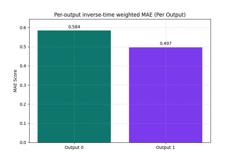
Multi-output shapes
{'y_true_multi': (48, 2, 5), 'y_pred_multi': (48, 2, 5)}

<Axes: title={'center': 'Per-output inverse-time weighted MAE (Per Output)'}, ylabel='MAE Score'>
Why the multi-output bar view is useful#
This view answers a different question from the single-output case:
Which output channel is responsible for the weighted forecast burden?
That is valuable when one target looks acceptable in isolation while a second target becomes unstable or inaccurate at the far horizon.
In practice, this is often a faster diagnostic than reading two separate figures.
Move from point error to interval quality#
The same helper can also teach uncertainty quality through
metric_type='interval_score'.
This is important because forecast evaluation is not only about point error. A model can have a reasonable median forecast while still producing poor uncertainty bands.
We construct q10 / q50 / q90-like intervals for the same example. The bounds widen with forecast step, which is realistic.
alphas = np.array([0.2])
spread = np.array([0.90, 1.10, 1.45, 1.95, 2.45]).reshape(1, -1)
y_median = y_pred.copy()
y_lower = (y_median - spread)[:, np.newaxis, :]
y_upper = (y_median + spread)[:, np.newaxis, :]

print("\nInterval-score shapes")
print({
    "y_true": y_true.shape,
    "y_median": y_median.shape,
    "y_lower": y_lower.shape,
    "y_upper": y_upper.shape,
    "alphas": alphas.shape,
})

plot_time_weighted_metric(
    metric_type="interval_score",
    y_true=y_true,
    y_median=y_median,
    y_lower=y_lower,
    y_upper=y_upper,
    alphas=alphas,
    time_weights="inverse_time",
    kind="time_profile",
    figsize=(9.0, 5.6),
    title="Time-weighted interval score profile",
    profile_line_color="#B91C1C",
    profile_line_style="-",
    profile_marker="D",
    time_weights_color="#CBD5E1",
    show_time_weights_on_profile=True,
)
Interval-score shapes
{'y_true': (48, 5), 'y_median': (48, 5), 'y_lower': (48, 1, 5), 'y_upper': (48, 1, 5), 'alphas': (1,)}

<Axes: title={'center': 'Time-weighted interval score profile\n(Overall Score: 0.4396)'}, xlabel='Time Step', ylabel='Per-Timestep INTERVAL_SCORE'>
Interpret the interval-score profile carefully#
This profile is not simply another MAE view. It combines:
the median error,
interval width,
under-coverage penalties,
and over-coverage penalties.
That means a larger interval score can come from several causes:
the center forecast is wrong,
the intervals are too narrow,
the intervals are too wide,
or the coverage penalty appears at later horizons.
This is why the interval-score profile is a strong bridge between point-evaluation thinking and uncertainty-evaluation thinking.
Inspect one case instead of the sample average#
By default, kind='time_profile' averages over samples.
That is usually the right first view.
But sometimes you need to inspect a single forecast case. The
sample_idx option does exactly that.
This is especially helpful when you already know one location, one panel row, or one validation case looks unusual.
plot_time_weighted_metric(
    metric_type="mae",
    y_true=y_true,
    y_pred=y_pred,
    time_weights=custom_weights,
    kind="time_profile",
    sample_idx=7,
    figsize=(9.0, 5.4),
    title="Single-case MAE profile with custom weights",
    profile_line_color="#047857",
    profile_line_style="-",
    profile_marker="o",
    time_weights_color="#A3A3A3",
    show_time_weights_on_profile=True,
)
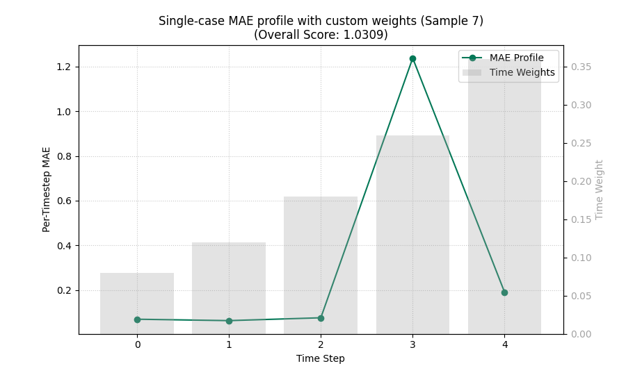
<Axes: title={'center': 'Single-case MAE profile with custom weights (Sample 7)\n(Overall Score: 1.0309)'}, xlabel='Time Step', ylabel='Per-Timestep MAE'>
A practical checklist for your own data#
Use this checklist when moving from the demo arrays to a real project:
Decide the evaluation question first.
Near-term reliability? Use
'inverse_time'.Equal importance across horizon? Use
None.Project-specific policy? Pass your own array.
Check your shapes before plotting.
one output across many samples:
(N, T)multiple outputs:
(N, O, T)interval bounds for one-output interval score:
(N, K, T)
Match the metric to the task.
'mae'for point-regression readability,'accuracy'for classification,'interval_score'for probabilistic forecast quality.
Choose the plot kind deliberately.
summary_barwhen you want a weighted decision score,time_profilewhen you want to explain why that score looks the way it does.
Use companions wisely.
Use
plot_metric_over_horizonwhen your evaluation is already in a tidy DataFrame,use
plot_time_weighted_metricwhen you want direct control of horizon weights from arrays.
The main lesson to keep is simple:
time weighting is not decoration. It is part of the evaluation question itself.
plt.show()
Total running time of the script: (0 minutes 0.710 seconds)