
Note
Go to the end to download the full example code.
Learn how to read forecast sharpness with plot_mean_interval_width#
This lesson explains how to use
geoprior.plot.evaluation.plot_mean_interval_width
when you want to answer a practical uncertainty question:
How wide are my prediction intervals, and are they becoming so wide that they stop being useful?
Why this function matters#
Coverage tells you whether the truth falls inside the interval. Width tells you how much uncertainty the interval is claiming.
That makes mean interval width one of the simplest sharpness checks in forecast evaluation.
It is tempting to think that narrower is always better, but that is not correct.
extremely narrow intervals may look impressive but miss the truth,
extremely wide intervals may cover almost everything while being too vague for decisions,
and two models can have similar coverage while offering very different practical usefulness because their widths differ a lot.
That is exactly why this helper is valuable. It gives two complementary views:
a histogram of individual interval widths,
and a summary bar for the mean width.
This page is written as a teaching guide, not only as an API demo. We will build realistic interval arrays, inspect the full width distribution, compare narrower and wider regimes, look at multi-output behavior, and finish with a checklist for applying the function to your own forecast tables.
from __future__ import annotations

import matplotlib.pyplot as plt
import numpy as np
import pandas as pd

from geoprior.plot.evaluation import plot_mean_interval_width

pd.set_option("display.max_columns", 20)
pd.set_option("display.width", 110)
pd.set_option(
    "display.float_format",
    lambda v: f"{v:0.4f}",
)
What this function really expects#
plot_mean_interval_width works directly with two aligned arrays:
y_lowery_upper
The arrays must have the same shape, and the implementation accepts only:
(N,)for one output,(N, O)for multiple outputs.
This helper does not need y_true because it is not checking
coverage or error. It is checking sharpness only.
It offers two viewing modes:
kind='widths_histogram'kind='summary_bar'
The histogram answers:
How are the individual interval widths distributed?
The summary bar answers:
What is the mean interval width overall?
For multi-output data, one important rule matters:
output_idxis required for the histogram,while the summary bar can show one overall mean or one bar per output when
metric_kws={'multioutput': 'raw_values'}is used.
This is helpful because sharpness questions are often different at different outputs. A subsidence interval and a groundwater interval rarely live on the same scale.
Build a realistic one-output interval example#
We begin with a single output and 80 forecast cases. The intervals will be narrower in the early part of the sample axis and wider later on. This creates a realistic width distribution instead of one flat repeated value.
The helper computes width simply as:
y_upper - y_lower
so the most important thing for a lesson example is to make the width pattern visible and interpretable.
rng = np.random.default_rng(2026)

n_samples = 80
center = 20.0 + 1.6 * np.sin(np.linspace(0, 4 * np.pi, n_samples))
base_width = np.linspace(0.9, 3.1, n_samples)
noise = rng.normal(0.0, 0.12, n_samples)
width = np.clip(base_width + noise, 0.4, None)

y_lower = center - 0.5 * width
y_upper = center + 0.5 * width

preview = pd.DataFrame(
    {
        "center": center,
        "y_lower": y_lower,
        "y_upper": y_upper,
        "interval_width": y_upper - y_lower,
    }
)

print("One-output preview")
print(preview.head(10))

print("\nWidth summary")
print(preview["interval_width"].describe())
One-output preview
   center  y_lower  y_upper  interval_width
0 20.0000  19.5976  20.4024          0.8048
1 20.2534  19.7751  20.7318          0.9567
2 20.5005  20.1364  20.8645          0.7281
3 20.7349  20.1594  21.3104          1.1510
4 20.9507  20.4067  21.4947          1.0880
5 21.1426  20.6405  21.6447          1.0042
6 21.3056  20.7907  21.8204          1.0297
7 21.4356  20.8699  22.0013          1.1314
8 21.5294  20.9840  22.0747          1.0907
9 21.5845  21.0228  22.1463          1.1235

Width summary
count   80.0000
mean     2.0144
std      0.6611
min      0.7281
25%      1.4293
50%      1.9948
75%      2.5131
max      3.2266
Name: interval_width, dtype: float64
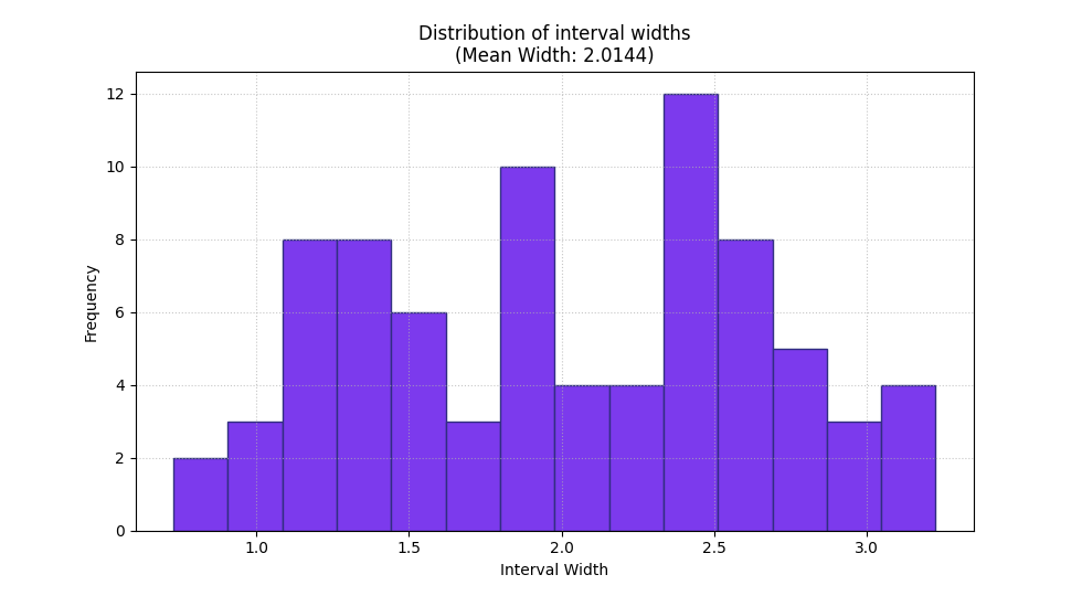
Start with the width histogram#
The histogram is the best first plot when you want to understand the distribution of sharpness rather than only its average.
This matters because two forecasting systems can have the same mean width while behaving differently:
one may keep widths tightly concentrated,
another may mix very narrow and very wide intervals,
and a third may have a long right tail only at difficult cases.
In this example the right tail is expected because later cases were deliberately given wider intervals.
<Axes: title={'center': 'Distribution of interval widths\n(Mean Width: 2.0144)'}, xlabel='Interval Width', ylabel='Frequency'>
How to read the histogram correctly#
A good reading order is:
check where the bulk of the widths sits,
inspect whether there is a long tail of much wider intervals,
then compare that picture with the mean width.
In this demo, the histogram is not symmetric. That is a useful warning sign for real projects because it means the model is not expressing uncertainty uniformly across cases.
That is not automatically bad, but it tells you uncertainty is being concentrated in some parts of the forecast set.
The summary bar gives the compact sharpness number#
Once you understand the distribution, the summary bar gives the compact value you would compare in a table or across competing runs.
This is the simplest sharpness statistic for quick reporting.
A smaller mean interval width indicates sharper forecasts, but that only becomes a positive result when coverage or calibration remains acceptable as well.
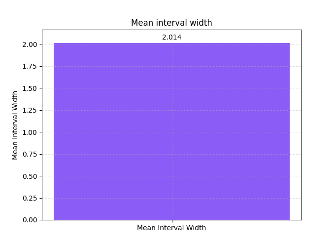
<Axes: title={'center': 'Mean interval width'}, ylabel='Mean Interval Width'>
Why width must never be read alone#
A low width score may come from genuinely sharp forecasts, but it may also come from intervals that are too narrow and therefore unreliable.
A high width score may indicate proper caution, but it may also signal overly diffuse uncertainty that is not operationally useful.
So the best habit is:
use
plot_mean_interval_widthto study sharpness,then read it together with coverage, WIS, or calibration plots.
In practice, width is one side of the reliability–sharpness trade-off.
Compare a narrower regime and a wider regime#
A helpful teaching trick is to split the same forecast set into two regimes. Here we compare the first half and the second half of the sample axis.
This answers a very practical question:
Is the forecast becoming less sharp in one part of the evaluation set?
In many real workflows that split could represent:
early vs late horizons,
dry vs wet seasons,
urban core vs peripheral cells,
or one city vs another.
fig, axes = plt.subplots(
    1,
    2,
    figsize=(12.2, 4.9),
    constrained_layout=True,
)

plot_mean_interval_width(
    y_lower=y_lower[:40],
    y_upper=y_upper[:40],
    kind="summary_bar",
    ax=axes[0],
    title="Earlier regime: narrower intervals",
    bar_color="#0EA5E9",
    score_annotation_format="{:.3f}",
)

plot_mean_interval_width(
    y_lower=y_lower[40:],
    y_upper=y_upper[40:],
    kind="summary_bar",
    ax=axes[1],
    title="Later regime: wider intervals",
    bar_color="#F97316",
    score_annotation_format="{:.3f}",
)

plt.show()
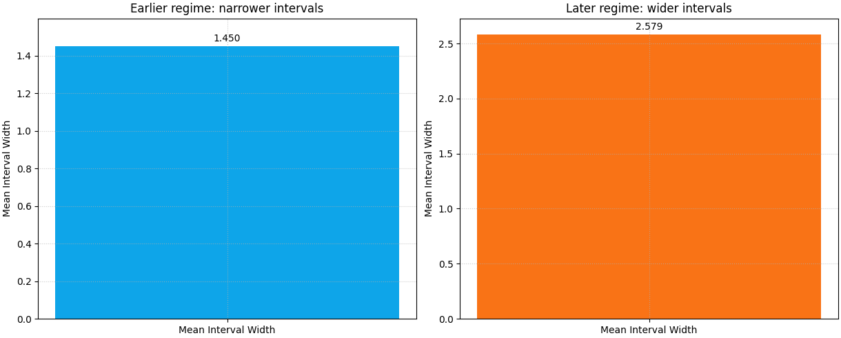
What this regime comparison teaches#
The second half should show a visibly larger mean width. That is exactly what we encoded in the synthetic data.
The lesson is important for real evaluations:
a single average width can hide regime drift.
If your intervals widen sharply only at late horizons, difficult geologies, or a single study area, you need to know that before you report one global sharpness number.
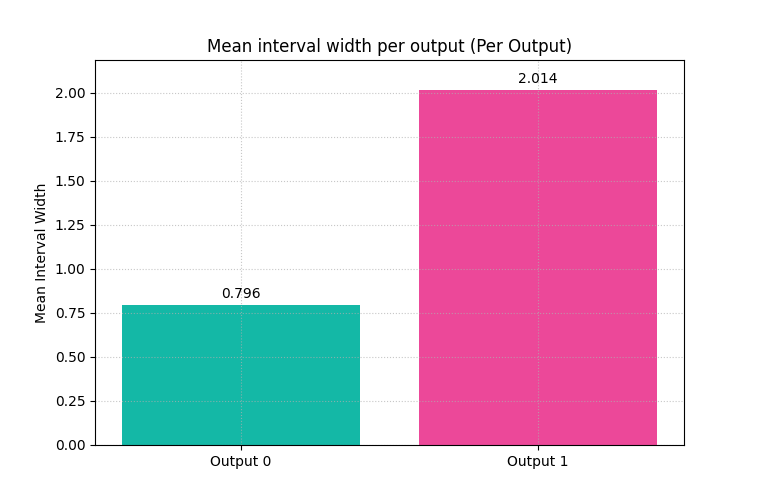
Multi-output interval widths are often the most realistic case#
Many GeoPrior workflows evaluate more than one target or more than one
forecast family. The helper accepts 2D arrays of shape (N, O) for
that situation.
Here we create two outputs:
Output 0: relatively sharp intervals,
Output 1: visibly wider intervals.
This is useful because the summary bar can now show one bar per output when we request raw values from the metric.
center_2 = 7.0 + 0.9 * np.cos(np.linspace(0, 3 * np.pi, n_samples))
width_1 = np.clip(0.8 + rng.normal(0.0, 0.08, n_samples), 0.35, None)
width_2 = np.clip(2.0 + 0.45 * np.sin(np.linspace(0, 2 * np.pi, n_samples))
                  + rng.normal(0.0, 0.10, n_samples), 0.8, None)

y_lower_2d = np.column_stack(
    [
        center - 0.5 * width_1,
        center_2 - 0.5 * width_2,
    ]
)
y_upper_2d = np.column_stack(
    [
        center + 0.5 * width_1,
        center_2 + 0.5 * width_2,
    ]
)

multi_preview = pd.DataFrame(
    {
        "output0_width": y_upper_2d[:, 0] - y_lower_2d[:, 0],
        "output1_width": y_upper_2d[:, 1] - y_lower_2d[:, 1],
    }
)

print("\nTwo-output width preview")
print(multi_preview.head(10))
Two-output width preview
   output0_width  output1_width
0         0.9222         2.0621
1         0.7425         2.3276
2         0.8046         2.1653
3         0.8372         2.0122
4         0.8299         2.4071
5         0.7013         2.0822
6         0.7469         2.2856
7         0.7843         2.3121
8         0.7317         2.1794
9         0.8542         2.4348
Use one bar per output in the summary view#
This is one of the most useful multi-output patterns. It produces one mean-width bar per output instead of collapsing them into one average.
That is usually the better teaching choice because interval width is scale-sensitive. Different outputs can behave very differently.
plot_mean_interval_width(
    y_lower=y_lower_2d,
    y_upper=y_upper_2d,
    kind="summary_bar",
    metric_kws={"multioutput": "raw_values"},
    figsize=(7.6, 5.0),
    title="Mean interval width per output",
    bar_color=["#14B8A6", "#EC4899"],
    score_annotation_format="{:.3f}",
)
<Axes: title={'center': 'Mean interval width per output (Per Output)'}, ylabel='Mean Interval Width'>
For the histogram, choose the output explicitly#
Histogram mode works on one selected output at a time when the data is
multi-output. That is why output_idx is required.
This makes the reading cleaner: the histogram answers the distribution question for one output without mixing scales.
plot_mean_interval_width(
    y_lower=y_lower_2d,
    y_upper=y_upper_2d,
    kind="widths_histogram",
    output_idx=1,
    hist_bins=12,
    figsize=(9.6, 5.2),
    title="Width distribution for output 1",
    hist_color="#F59E0B",
    hist_edgecolor="#7C2D12",
)
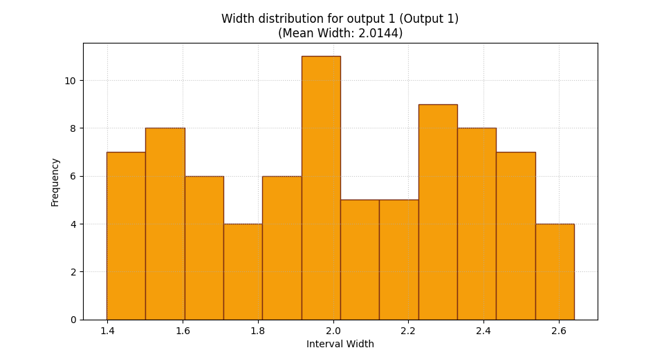
<Axes: title={'center': 'Width distribution for output 1 (Output 1)\n(Mean Width: 2.0144)'}, xlabel='Interval Width', ylabel='Frequency'>
A practical reading rule for your own data#
When you use this helper on real forecast outputs, a good workflow is:
start with the histogram,
check whether widths are tightly concentrated or widely spread,
then read the mean width from the summary bar,
compare outputs or regimes separately if needed,
and finally interpret width together with reliability metrics.
In real forecast evaluation, plot_mean_interval_width is rarely a
final decision plot by itself. It is a sharpness plot that becomes most
useful when paired with coverage, calibration, and weighted interval
score.
How to adapt this lesson to your own forecast results#
In your own project, the key step is simply to provide aligned lower and upper bounds.
Typical sources are:
q10andq90columns for an 80% interval,q05andq95for a 90% interval,or calibrated lower/upper bounds written by a Stage-2 workflow.
A practical adaptation pattern is:
y_lower = df['subsidence_q10'].to_numpy()
y_upper = df['subsidence_q90'].to_numpy()
Then:
use
kind='widths_histogram'to inspect the full spread,use
kind='summary_bar'to report the mean width,use
metric_kws={'multioutput': 'raw_values'}when each column is a separate output,and use
output_idx=...when you want one histogram for one output.
If the result looks extremely narrow, do not celebrate too early. Check coverage next.
If the result looks extremely wide, do not reject it too quickly. Check whether calibration or long-horizon uncertainty genuinely needed that width.
Total running time of the script: (0 minutes 0.498 seconds)