
Note
Go to the end to download the full example code.
Learn how to benchmark a forecast against a naive baseline with plot_theils_u_score#
This lesson explains how to use
geoprior.plot.evaluation.plot_theils_u_score when you want to ask a
very practical forecasting question:
Is my model actually better than a simple naive forecast?
Why this function matters#
A forecast can look good in isolation and still fail one of the most important evaluation tests: outperforming a trivial baseline.
That is why Theil’s U is useful. It compares your model to a naive persistence-style benchmark instead of only reporting absolute error.
A compact interpretation rule is:
U < 1: the model beats the naive baseline,
U = 1: the model performs about the same,
U > 1: the model is worse than the naive baseline.
This makes plot_theils_u_score a strong teaching and reporting tool:
it helps prevent overclaiming forecast quality,
it makes model comparisons easier to communicate,
it is especially helpful when the target has strong persistence,
and it turns a technical metric into a quick visual decision.
This page is written as a teaching guide, not only as an API demo. We will build realistic arrays, interpret the U=1 threshold, compare a strong and weak forecast, inspect a multi-output case, and finish with a checklist for using the helper on your own data.
from __future__ import annotations

import matplotlib.pyplot as plt
import numpy as np
import pandas as pd

from geoprior.plot.evaluation import plot_theils_u_score

pd.set_option("display.max_columns", 20)
pd.set_option("display.width", 110)
pd.set_option(
    "display.float_format",
    lambda v: f"{v:0.4f}",
)
What this function really expects#
plot_theils_u_score works directly on arrays, not on a tidy
forecast DataFrame.
It accepts the same main shape families used by several of the compact evaluation plot helpers:
(T,)for one trajectory,(N, T)for many samples of one output,(N, O, T)for many samples and many outputs.
One implementation detail matters a lot for teaching:
this helper currently supports only ``kind=’summary_bar’``.
In other words, the function is not trying to show a horizon profile or a sample histogram. It is designed to answer one concise question:
How does the model compare to a naive baseline overall?
The horizontal reference line at U = 1 is therefore central to the
plot, not decorative.
Build a simple one-series forecasting example#
We begin with the most intuitive case: one target trajectory observed over time.
To make the lesson easy to read, we generate:
a smooth underlying signal,
one strong forecast that follows it fairly well,
one weak forecast that adds larger noise.
This gives us two contrasting examples for interpreting Theil’s U.
rng = np.random.default_rng(2026)

t = np.arange(1, 31)
y_true = (
    18.0
    + 0.65 * t
    + 1.8 * np.sin(t / 3.8)
    + rng.normal(0.0, 0.18, size=t.size)
)

y_pred_strong = y_true + rng.normal(0.0, 0.55, size=t.size)
y_pred_weak = y_true + rng.normal(0.0, 1.65, size=t.size)

preview = pd.DataFrame(
    {
        "step": t,
        "y_true": y_true,
        "y_pred_strong": y_pred_strong,
        "y_pred_weak": y_pred_weak,
    }
)

print("Trajectory preview")
print(preview.head(10))

print("\nArray shapes used in this first block")
print(
    {
        "y_true": y_true.shape,
        "y_pred_strong": y_pred_strong.shape,
        "y_pred_weak": y_pred_weak.shape,
    }
)
Trajectory preview
   step  y_true  y_pred_strong  y_pred_weak
0     1 18.9755        18.3322      17.3496
1     2 20.2475        20.9908      18.5927
2     3 20.8866        21.3453      19.2890
3     4 22.4150        23.0407      20.0536
4     5 23.1067        22.6196      21.6003
5     6 23.6474        24.0239      25.7813
6     7 24.2280        23.9425      23.2490
7     8 24.8037        24.5521      25.2279
8     9 25.0590        25.3376      23.0511
9    10 25.3381        25.8203      25.6180

Array shapes used in this first block
{'y_true': (30,), 'y_pred_strong': (30,), 'y_pred_weak': (30,)}
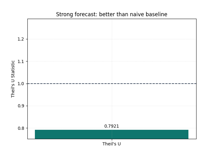
Start with the easier reading case: a model that beats the baseline#
We first plot the stronger forecast.
The goal is not only to obtain one number. It is to train the eye to
read the summary bar against the baseline threshold at U = 1.
If the bar stays clearly below that line, the model is doing something valuable beyond naive persistence.
plot_theils_u_score(
    y_true,
    y_pred_strong,
    figsize=(7.0, 5.0),
    title="Strong forecast: better than naive baseline",
    bar_color="#0F766E",
    reference_line_at_1=True,
    reference_line_props={
        "color": "#334155",
        "linestyle": "--",
        "linewidth": 1.4,
    },
    grid_props={"linestyle": ":", "alpha": 0.45},
)
<Axes: title={'center': 'Strong forecast: better than naive baseline'}, ylabel="Theil's U Statistic">
How to interpret the first bar#
This is the key decision rule of the page.
Read the plot in this order:
locate the bar,
compare it to the reference line at
U = 1,only then interpret the exact numeric annotation.
Why this order matters:
the bar answers the qualitative question,
the annotation refines it,
the threshold keeps the metric practically meaningful.
In this example the bar should land below 1, which means the model
is not just “fairly accurate” in an abstract sense.
It is also better than the naive benchmark.
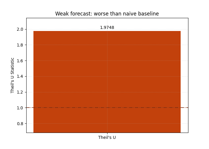
Now inspect a forecast that should lose against the baseline#
A strong lesson needs contrast. So we now evaluate the weaker forecast, which has noticeably more noise. This helps users understand that Theil’s U is not simply an “error bar”; it is a relative performance score.
Even when a forecast still follows the general direction of the target, too much noise can push it above the naive baseline.
plot_theils_u_score(
    y_true,
    y_pred_weak,
    figsize=(7.0, 5.0),
    title="Weak forecast: worse than naive baseline",
    bar_color="#C2410C",
    reference_line_at_1=True,
    reference_line_props={
        "color": "#7C2D12",
        "linestyle": "-.",
        "linewidth": 1.3,
    },
    grid_props={"linestyle": ":", "alpha": 0.45},
)
<Axes: title={'center': 'Weak forecast: worse than naive baseline'}, ylabel="Theil's U Statistic">
Why this second view is important#
This second chart teaches a subtle but important lesson:
forecasting skill is contextual.
A model can still appear plausible on a line plot and yet fail to beat a very simple baseline. That is especially common when the target is persistent over time.
In practical forecasting work, this is one of the most useful reasons to keep Theil’s U in the gallery:
it disciplines model claims,
it protects users from celebrating weak improvements,
and it reminds the reader that a benchmark matters.
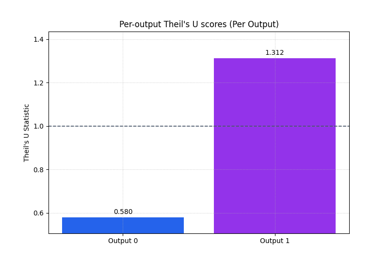
Compare multiple outputs in one figure#
The helper also accepts a three-dimensional layout (N, O, T).
That is useful when you want one Theil’s U score per output.
Here we simulate two outputs across multiple samples:
output 0 is relatively stable and predictable,
output 1 is noisier and therefore harder.
We set multioutput='raw_values' through metric_kws so the plot
displays one bar per output instead of collapsing everything into a
single aggregate score.
n_samples = 36
n_outputs = 2
n_steps = 6

base = rng.normal(loc=24.0, scale=2.2, size=(n_samples, 1, 1))
step_pattern = np.linspace(1.0, 5.0, n_steps).reshape(1, 1, -1)
output_offsets = np.array([0.0, 3.2]).reshape(1, n_outputs, 1)
local_signal = rng.normal(loc=0.0, scale=0.35, size=(n_samples, n_outputs, n_steps))

y_true_multi = base + output_offsets + step_pattern + local_signal

noise = np.stack(
    [
        rng.normal(0.0, 0.55, size=(n_samples, n_steps)),
        rng.normal(0.0, 1.25, size=(n_samples, n_steps)),
    ],
    axis=1,
)

y_pred_multi = y_true_multi + noise

print("\nMulti-output shapes")
print(
    {
        "y_true_multi": y_true_multi.shape,
        "y_pred_multi": y_pred_multi.shape,
    }
)

plot_theils_u_score(
    y_true_multi,
    y_pred_multi,
    metric_kws={"multioutput": "raw_values"},
    figsize=(8.0, 5.4),
    title="Per-output Theil's U scores",
    bar_color=["#2563EB", "#9333EA"],
    reference_line_at_1=True,
    reference_line_props={
        "color": "#475569",
        "linestyle": "--",
        "linewidth": 1.25,
    },
    score_annotation_format="{:.3f}",
)
Multi-output shapes
{'y_true_multi': (36, 2, 6), 'y_pred_multi': (36, 2, 6)}

<Axes: title={'center': "Per-output Theil's U scores (Per Output)"}, ylabel="Theil's U Statistic">
What the per-output bars teach the reader#
This view is very useful when a model serves several targets or output channels.
The main interpretation rule is:
do not trust a good aggregate score if one output still has
U > 1,use the per-output bars to identify where the model truly adds value,
and use the threshold line to see whether each output beats the naive baseline on its own terms.
This helps users avoid a common reporting mistake: averaging away a bad output inside one “overall good” result.
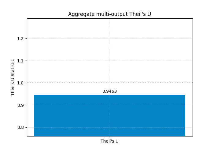
Show the aggregated multi-output view as a compact headline score#
After inspecting the per-output bars, it is often useful to return to a single headline score.
That is the role of the default multioutput='uniform_average'.
It summarizes the average benchmark-relative performance across all
outputs.
This is often the right view for executive reporting, but it should be read after the per-output inspection, not before.
plot_theils_u_score(
    y_true_multi,
    y_pred_multi,
    figsize=(7.0, 5.0),
    title="Aggregate multi-output Theil's U",
    bar_color="#0284C7",
    reference_line_at_1=True,
    reference_line_props={
        "color": "#1E293B",
        "linestyle": ":",
        "linewidth": 1.5,
    },
)
<Axes: title={'center': "Aggregate multi-output Theil's U"}, ylabel="Theil's U Statistic">
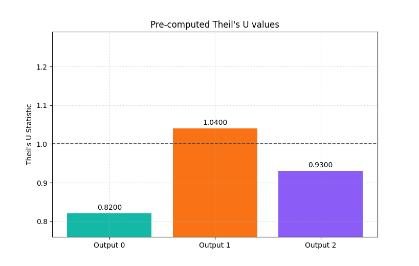
Optional reporting pattern: plot pre-computed values#
Sometimes the metric has already been computed elsewhere in a pipeline and you only want the plotting layer.
plot_theils_u_score allows that through metric_values.
This is useful when the evaluation step is separated from the report
generation step.
Here we simulate that workflow with three pre-computed values.
The labels will be generic (Output 0, Output 1, …), which is
still useful for compact report figures.
precomputed_u = np.array([0.82, 1.04, 0.93])

plot_theils_u_score(
    y_true,
    y_pred_strong,
    metric_values=precomputed_u,
    figsize=(8.2, 5.2),
    title="Pre-computed Theil's U values",
    bar_color=["#14B8A6", "#F97316", "#8B5CF6"],
    reference_line_at_1=True,
    reference_line_props={
        "color": "#374151",
        "linestyle": "--",
        "linewidth": 1.2,
    },
)
<Axes: title={'center': "Pre-computed Theil's U values"}, ylabel="Theil's U Statistic">
What this helper does not try to do#
It is useful to teach one limitation explicitly.
plot_theils_u_score is currently a summary helper.
It does not show:
per-horizon degradation,
per-sample distributions,
or calibration behavior.
That is not a weakness; it is a design choice.
Use this helper when your question is benchmark-relative forecast skill. Use the other evaluation pages when your question is about horizon behavior, uncertainty quality, or temporal stability.
How to adapt this lesson to your own arrays#
A practical workflow for real data is:
start from arrays with matching shapes,
confirm that the last axis is time,
make sure there are at least two time steps,
first inspect the default summary bar,
then use
multioutput='raw_values'if you have several outputs,keep the reference line at
U = 1visible,and interpret the plot as a benchmark comparison, not just as a generic error chart.
If your forecasts come from a DataFrame, the usual path is to reshape or pivot them into one of the accepted array forms first.
Final takeaway#
The real value of this helper is conceptual clarity.
A low MAE or RMSE is useful, but it does not immediately tell the user whether the model is better than a trivial forecast.
Theil’s U answers that question directly.
That is why this plot works well as a compact report figure:
it is easy to read,
it has a meaningful threshold,
and it keeps forecast evaluation honest.
plt.show()
Total running time of the script: (0 minutes 0.295 seconds)