
Note
Go to the end to download the full example code.
Compare forecast quality across groups with plot_metric_radar#
This lesson explains how to use
geoprior.plot.evaluation.plot_metric_radar
when you want to compare which segment performs best or worst.
Why this function matters#
A forecast can look acceptable overall while hiding uneven behavior across districts, wells, lithologies, cities, model families, or any other grouping variable.
That is exactly the problem this helper is meant to expose. It answers questions such as:
Which segment has the largest error?
Are a few groups driving most of the global failure?
Does one city or district remain consistently harder to predict?
Is the error pattern balanced or highly uneven?
This page is therefore written as a teaching guide, not only as an API demo. We will build a realistic long-format evaluation table, inspect the required columns, compare segments with a radar chart, use custom colors, and finish with a checklist for applying the helper to real evaluation files.
import matplotlib.pyplot as plt
import numpy as np
import pandas as pd

from geoprior.plot.evaluation import plot_metric_radar

pd.set_option("display.max_columns", 24)
pd.set_option("display.width", 108)
pd.set_option(
    "display.float_format",
    lambda v: f"{v:0.4f}",
)
What this function expects#
plot_metric_radar works on a tidy evaluation table and needs one
special idea from the user: what is the segment you want to
compare?
The minimal ingredients are:
one segment column such as
districtorcity,one actual column like
subsidence_actual,one prediction column like
subsidence_pred.
If you pass quantile forecasts, the helper uses the median quantile as the point prediction for metrics such as MAE or RMSE.
The most important interpretation rule is this:
the radar chart compares segments against each other.
It is not the best plot for horizon-by-horizon degradation. For that,
plot_metric_over_horizon is the better companion.
Build a realistic demo table#
A teaching page should behave like a real forecast-evaluation table. Here we build one with:
5 districts,
3 forecast horizons,
one target called
subsidence,point predictions,
and q10 / q50 / q90 columns.
We intentionally make some districts harder than others so the radar shape becomes meaningful. That is important because a radar chart is most useful when the segment differences are not trivial.
rng = np.random.default_rng(123)
rows: list[dict[str, float | int | str]] = []

districts = [
    "North Port",
    "South Wetland",
    "Central Urban",
    "East Industry",
    "West Fringe",
]

# segment-specific difficulty and bias
segment_noise = {
    "North Port": 0.80,
    "South Wetland": 1.10,
    "Central Urban": 0.70,
    "East Industry": 1.35,
    "West Fringe": 0.95,
}
segment_bias = {
    "North Port": 0.10,
    "South Wetland": 0.25,
    "Central Urban": -0.05,
    "East Industry": 0.55,
    "West Fringe": 0.15,
}

horizons = [1, 2, 3]

for district in districts:
    d_noise = segment_noise[district]
    d_bias = segment_bias[district]

    for sample_idx in range(42):
        base = 14.0 + 0.12 * sample_idx
        local_pattern = 0.25 * np.cos(sample_idx / 5.0)

        for step in horizons:
            trend = 1.8 * step
            y_true = base + trend + local_pattern

            err_scale = d_noise * (0.55 + 0.45 * step)
            y_pred = y_true + d_bias + rng.normal(
                loc=0.0,
                scale=err_scale,
            )

            spread = 0.95 + 0.55 * step + 0.20 * d_noise
            q10 = y_pred - spread
            q50 = y_pred
            q90 = y_pred + spread

            rows.append(
                {
                    "sample_idx": sample_idx,
                    "district": district,
                    "forecast_step": step,
                    "subsidence_actual": y_true,
                    "subsidence_pred": y_pred,
                    "subsidence_q10": q10,
                    "subsidence_q50": q50,
                    "subsidence_q90": q90,
                }
            )

forecast_df = pd.DataFrame(rows)

print("Demo evaluation table")
print(forecast_df.head(10))
Demo evaluation table
   sample_idx    district  forecast_step  subsidence_actual  subsidence_pred  subsidence_q10  \
0           0  North Port              1            16.0500          15.3587         13.6987
1           0  North Port              2            17.8500          17.5234         15.3134
2           0  North Port              3            19.6500          21.7076         18.9476
3           1  North Port              1            16.1650          16.4202         14.7602
4           1  North Port              2            17.9650          19.1325         16.9225
5           1  North Port              3            19.7650          20.7422         17.9822
6           2  North Port              1            16.2703          15.8611         14.2011
7           2  North Port              2            18.0703          18.7989         16.5889
8           2  North Port              3            19.8703          19.4890         16.7290
9           3  North Port              1            16.3663          16.2084         14.5484

   subsidence_q50  subsidence_q90
0         15.3587         17.0187
1         17.5234         19.7334
2         21.7076         24.4676
3         16.4202         18.0802
4         19.1325         21.3425
5         20.7422         23.5022
6         15.8611         17.5211
7         18.7989         21.0089
8         19.4890         22.2490
9         16.2084         17.8684
Read the column layout before plotting#
A good lesson should make the table structure explicit.
The target prefix in this example is subsidence and the segment we
want to compare is district.
That is why the function call will later use:
target_name='subsidence'segment_col='district'
print("\nColumns used in this lesson")
print(list(forecast_df.columns))

print("\nRows per district")
print(forecast_df.groupby("district").size())

print("\nRows per district and horizon")
print(
    forecast_df.groupby(["district", "forecast_step"]).size()
)
Columns used in this lesson
['sample_idx', 'district', 'forecast_step', 'subsidence_actual', 'subsidence_pred', 'subsidence_q10', 'subsidence_q50', 'subsidence_q90']

Rows per district
district
Central Urban    126
East Industry    126
North Port       126
South Wetland    126
West Fringe      126
dtype: int64

Rows per district and horizon
district       forecast_step
Central Urban  1                42
               2                42
               3                42
East Industry  1                42
               2                42
               3                42
North Port     1                42
               2                42
               3                42
South Wetland  1                42
               2                42
               3                42
West Fringe    1                42
               2                42
               3                42
dtype: int64
Start with the simplest use: compare district MAE#
The natural first question is:
Which district is easiest or hardest overall?
That is the sweet spot of plot_metric_radar. It computes one score
per segment and maps those scores onto a polar figure.
We also follow your request here and use non-default colors so the figure looks intentional in the gallery.
plot_metric_radar(
    forecast_df=forecast_df,
    segment_col="district",
    metric="mae",
    target_name="subsidence",
    figsize=(8.2, 8.2),
    color="#0E7490",
    fill_color="#22D3EE",
    alpha=0.25,
    linewidth=2.2,
    linestyle="-",
)
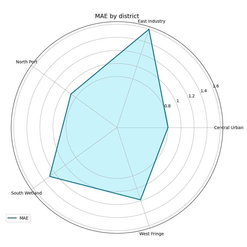
How to read the first radar chart#
Read this plot carefully:
each spoke is one district,
the radius is the metric value,
larger distance from the center means larger error,
the shape tells you whether difficulty is balanced or uneven.
In this demo, East Industry is harder than the others. That makes
the polygon stretch more strongly in that direction.
This is why radar plots are useful: they make relative imbalance visible very quickly.
Compare with a different metric#
A strong reading habit is to change the metric before changing the model. Sometimes a segment looks difficult under MAE but not under MAPE or SMAPE.
Here we switch to RMSE, which reacts more strongly to larger misses. We also change the colors so the gallery does not keep repeating the same visual palette.
plot_metric_radar(
    forecast_df=forecast_df,
    segment_col="district",
    metric="rmse",
    target_name="subsidence",
    figsize=(8.2, 8.2),
    color="#7C3AED",
    fill_color="#C4B5FD",
    alpha=0.28,
    linewidth=2.4,
    linestyle="-",
)
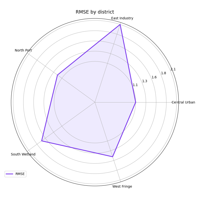
Why metric choice matters#
MAE rewards typical accuracy. RMSE punishes larger mistakes more strongly. SMAPE and MAPE emphasize relative scale.
So the radar shape is not only about the data. It is also about what kind of forecasting failure you want to emphasize.
A robust workflow is often:
start with MAE,
check RMSE,
then decide whether a scale-relative metric is also necessary.
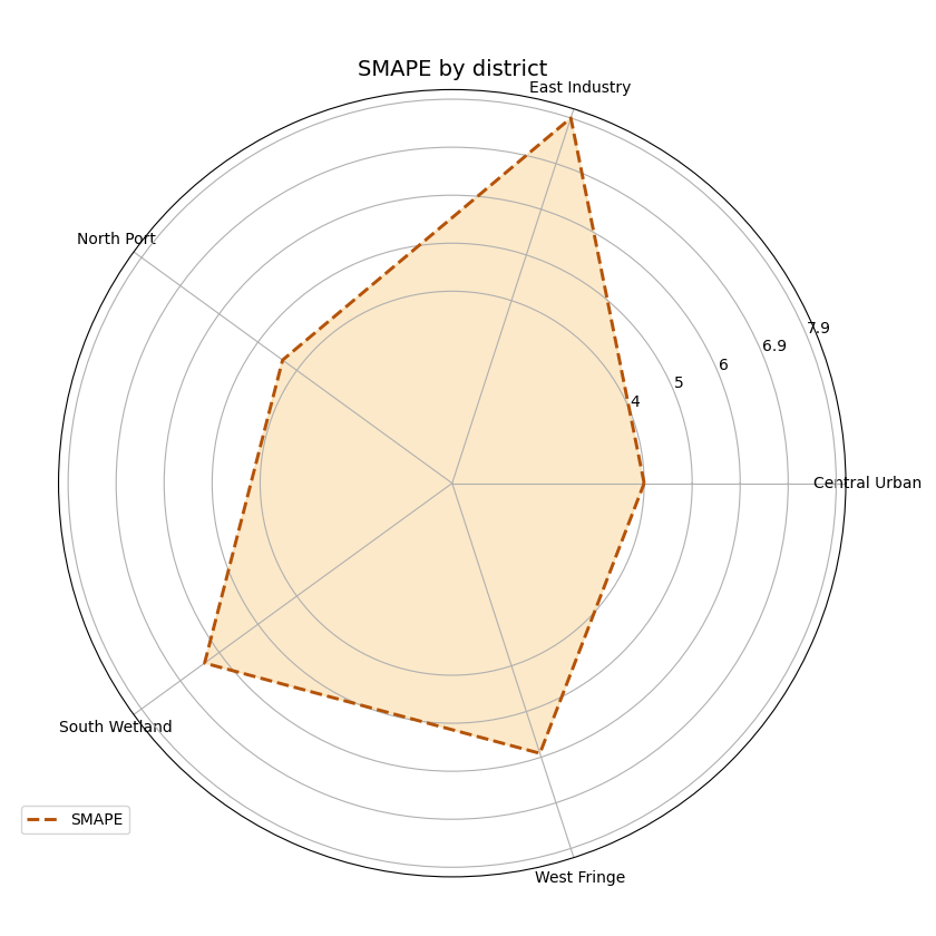
Use quantile forecasts when your table has them#
This helper also accepts quantile-style forecast tables. When
quantiles is provided, the function chooses the median quantile as
the point forecast for metrics such as MAE or RMSE.
In our demo, that means it uses subsidence_q50.
This is useful when your saved evaluation table contains only quantile outputs and you still want a segment-wise point-error summary.
plot_metric_radar(
    forecast_df=forecast_df,
    segment_col="district",
    metric="smape",
    target_name="subsidence",
    quantiles=[0.10, 0.50, 0.90],
    figsize=(8.4, 8.4),
    color="#B45309",
    fill_color="#F59E0B",
    alpha=0.22,
    linewidth=2.1,
    linestyle="--",
)
Filter first if you want one horizon only#
This point is very important for users.
plot_metric_radar is best understood as a segment-comparison
summary over the rows you pass into it. So if you want to compare
only horizon 3 across districts, filter the table first and then call
the helper.
That pattern is often more transparent than trying to force one figure to do both segment comparison and horizon comparison at the same time.
h3_only = forecast_df.loc[
    forecast_df["forecast_step"] == 3
].copy()

plot_metric_radar(
    forecast_df=h3_only,
    segment_col="district",
    metric="mae",
    target_name="subsidence",
    figsize=(8.0, 8.0),
    color="#BE123C",
    fill_color="#FDA4AF",
    alpha=0.24,
    linewidth=2.3,
)
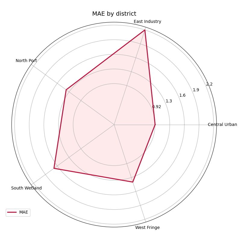
Why filtering before plotting is a good habit#
This filtered view answers a sharper question:
At the hardest forecast horizon, which districts remain most fragile?
That question is often more operational than an all-horizon average, especially when late-horizon decisions matter most.
In practice, a strong workflow is to combine:
plot_metric_over_horizonfor degradation across lead time,plot_metric_radarfor unevenness across segments.
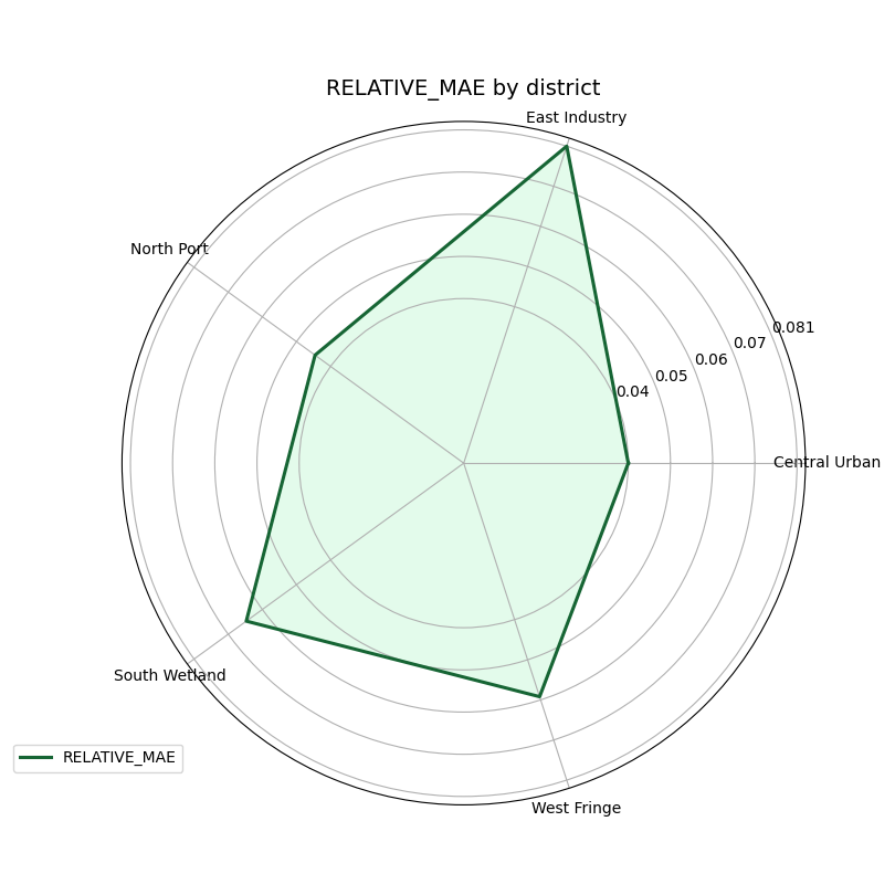
You can also pass a custom metric#
The helper is not limited to the built-in metric strings. It also
accepts a callable with the usual (y_true, y_pred) signature.
Below we create a small custom score: the mean absolute error divided by the mean absolute signal magnitude. This is not meant to replace a standard metric. It is only here to show that users can inject their own segment-level summary logic.
def relative_mae(y_true: np.ndarray, y_pred: np.ndarray) -> float:
    denom = np.mean(np.abs(y_true)) + 1e-8
    return float(np.mean(np.abs(y_true - y_pred)) / denom)


plot_metric_radar(
    forecast_df=forecast_df,
    segment_col="district",
    metric=relative_mae,
    target_name="subsidence",
    figsize=(8.1, 8.1),
    color="#166534",
    fill_color="#86EFAC",
    alpha=0.23,
    linewidth=2.2,
)
Practical reading advice#
A radar chart is expressive, but it should be used with discipline. Here is a good interpretation order:
check whether the number of segments is still readable,
identify the worst spoke,
compare whether one metric changes the ranking,
filter by horizon if the operational question is specific,
confirm the conclusion later with a table if needed.
Radar plots are best for pattern recognition, not for reporting many precise decimal values.
Checklist for applying this helper to your own data#
Before using plot_metric_radar on your own saved files, confirm
the following points:
your table is long-format,
it contains one true-value column such as
subsidence_actual,it contains either
subsidence_predor median quantiles,your chosen
segment_colreally represents a meaningful group,you have at least three unique segment values,
you filter first if your question is only about one horizon,
you keep the number of segments modest so the radar remains readable.
Two final practical tips:
if you have many segments, first aggregate or select the most important ones,
if you care about horizon evolution more than segment imbalance, switch to
plot_metric_over_horizon.
plt.close("all")
Total running time of the script: (0 minutes 0.797 seconds)