
Note
Go to the end to download the full example code.
Evaluate forecast tables with evaluate_forecast#
This lesson teaches how to use
geoprior.utils.forecast_utils.evaluate_forecast()
to turn an evaluation forecast table into a set of
readable diagnostics.
Why this page matters#
A forecast table is useful, but it is still only an
intermediate object. After formatting predictions into
df_eval, the next question is:
How good is the forecast, and where does it become less reliable?
That is the role of evaluate_forecast.
The function consumes the df_eval output produced
by format_and_forecast() (or any compatible
evaluation DataFrame), then computes:
deterministic accuracy metrics,
interval coverage and sharpness in quantile mode,
optional per-horizon diagnostics,
optional user-defined extra metrics.
When a time column such as coord_t is present, the
function groups by time and returns one metric block per
time value, plus an optional "__overall__" block for
the complete evaluation set. It can also save JSON or a
flattened CSV representation.
What this lesson teaches#
We will:
create a synthetic spatial evaluation dataset,
convert raw model-like outputs into
df_eval,call the real
evaluate_forecasthelper,inspect the nested result structure,
add a custom metric,
build a small explanatory figure from the returned metrics.
The figure is important here because it shows why this helper is useful: it makes horizon-wise and time-wise forecast quality visible.
Imports#
We use the real forecast formatting and evaluation utilities from GeoPrior.
import numpy as np
import pandas as pd
import matplotlib.pyplot as plt

from geoprior.utils.forecast_utils import (
    evaluate_forecast,
    format_and_forecast,
)
Step 1 - Build a compact synthetic spatial forecast#
We mimic a small city-like grid. Each spatial location becomes one sample, and the model produces a forecast for three horizon steps.
We create raw arrays in the same style used by the forecast formatter:
y_pred["subs_pred"]with shape(B, H, Q, O)y_true["subsidence"]with shape(B, H, O)coordswith shape(B, H, 3)
This keeps the lesson aligned with the actual workflow.
rng = np.random.default_rng(123)

nx = 8
ny = 6
xv = np.linspace(0.0, 12_000.0, nx)
yv = np.linspace(0.0, 8_000.0, ny)

X, Y = np.meshgrid(xv, yv)
x_flat = X.ravel()
y_flat = Y.ravel()

B = x_flat.size
H = 3
Q = 3
O = 1

quantiles = [0.1, 0.5, 0.9]
future_years = np.array([2023, 2024, 2025], dtype=int)
train_end_year = 2022

xn = (x_flat - x_flat.min()) / (x_flat.max() - x_flat.min())
yn = (y_flat - y_flat.min()) / (y_flat.max() - y_flat.min())

hotspot = np.exp(
    -(
        ((xn - 0.72) ** 2) / 0.022
        + ((yn - 0.36) ** 2) / 0.032
    )
)
ridge = 0.50 * np.exp(
    -(
        ((xn - 0.30) ** 2) / 0.030
        + ((yn - 0.74) ** 2) / 0.050
    )
)
gradient = 0.45 * xn + 0.24 * (1.0 - yn)

coords = np.zeros((B, H, 3), dtype=float)
for i in range(B):
    for h in range(H):
        coords[i, h, 0] = h + 1
        coords[i, h, 1] = x_flat[i]
        coords[i, h, 2] = y_flat[i]

y_true_subs = np.zeros((B, H, O), dtype=float)
y_pred_subs = np.zeros((B, H, Q, O), dtype=float)

for h in range(H):
    lead_scale = [1.00, 1.18, 1.42][h]
    median = (
        2.0
        + 1.3 * gradient
        + 2.2 * hotspot
        + 0.9 * ridge
    ) * lead_scale

    width = (
        0.30
        + 0.08 * xn
        + 0.05 * hotspot
        + 0.06 * (h + 1)
    )

    q10 = median - width
    q50 = median
    q90 = median + width

    actual = median + rng.normal(0.0, 0.16, size=B)

    y_true_subs[:, h, 0] = actual
    y_pred_subs[:, h, 0, 0] = q10
    y_pred_subs[:, h, 1, 0] = q50
    y_pred_subs[:, h, 2, 0] = q90

y_pred = {"subs_pred": y_pred_subs}
y_true = {"subsidence": y_true_subs}

print("Prediction shape:", y_pred["subs_pred"].shape)
print("Truth shape:", y_true["subsidence"].shape)
print("Coordinate shape:", coords.shape)
Prediction shape: (48, 3, 3, 1)
Truth shape: (48, 3, 1)
Coordinate shape: (48, 3, 3)
Step 2 - Format the raw outputs into df_eval#
evaluate_forecast works on an evaluation DataFrame,
not directly on raw tensors. So we first create that
table using the real formatting helper.
We use eval_export="all" so the evaluation table
contains all horizons rather than only the last one.
This makes the later per-horizon diagnostics much more
informative.
df_eval, df_future = format_and_forecast(
    y_pred=y_pred,
    y_true=y_true,
    coords=coords,
    quantiles=quantiles,
    target_name="subsidence",
    train_end_time=train_end_year,
    future_time_grid=future_years,
    eval_export="all",
    value_mode="rate",
    city_name="SyntheticCity",
    model_name="GeoPrior-demo",
    dataset_name="synthetic-eval-demo",
    verbose=0,
)

print("df_eval shape:", df_eval.shape)
print("")
print(df_eval.head(8).to_string(index=False))
df_eval shape: (144, 9)

 sample_idx  forecast_step   coord_t  subsidence_actual  subsidence_q10  subsidence_q50  subsidence_q90   coord_x  coord_y
          0              1 2020.0000             2.1537          1.9520          2.3120          2.6720    0.0000   0.0000
          0              2 2021.0000             3.0945          2.3082          2.7282          3.1482    0.0000   0.0000
          0              3 2022.0000             3.2345          2.8030          3.2830          3.7630    0.0000   0.0000
          1              1 2020.0000             2.3367          2.0241          2.3956          2.7670 1714.2857   0.0000
          1              2 2021.0000             2.7119          2.3953          2.8268          3.2582 1714.2857   0.0000
          1              3 2022.0000             3.2139          2.9103          3.4017          3.8931 1714.2857   0.0000
          2              1 2020.0000             2.6852          2.0963          2.4792          2.8620 3428.5714   0.0000
          2              2 2021.0000             2.9306          2.4825          2.9254          3.3683 3428.5714   0.0000
Step 3 - Run the real forecast evaluator#
We now call the actual helper.
Important settings:
per_horizon=True: compute MAE, MSE, RMSE, and R² by forecast step;quantile_interval=(0.1, 0.9): evaluate interval coverage and sharpness using the q10-q90 band.
In quantile mode, the helper uses the median
forecast as the deterministic prediction and adds
interval metrics when lower and upper quantiles are
available. It also groups by coord_t when that
column is present.
Returned object type: dict

Top-level keys:
['2020.0', '2021.0', '2022.0', '__overall__']
Step 4 - Understand the result structure#
Because our df_eval contains multiple time values in
coord_t, the helper returns a nested dictionary.
Typical structure:
one key per time value,
plus
"__overall__"for the whole evaluation set.
Each block contains overall metrics, and the overall block also contains the merged per-horizon summaries.
Overall metrics block
overall_mae: 0.11841463887587696
overall_mse: 0.02232009503193533
overall_rmse: 0.14939911322339008
overall_r2: 0.9577081394557485
coverage80: 1.0
sharpness80: 0.9260785235305219
per_horizon_mae: {1: 0.12583531038681153, 2: 0.10452059872115223, 3: 0.12488800751966711}
per_horizon_mse: {1: 0.02347620407777981, 2: 0.018069552126142144, 3: 0.02541452889188403}
per_horizon_rmse: {1: 0.1532194637693913, 2: 0.1344230342096999, 3: 0.15941934917657904}
per_horizon_r2: {1: 0.9026842779970629, 2: 0.9358584695856399, 3: 0.9426421737377303}
We can also inspect one time-specific block. This is useful when we want to know whether performance differs from one evaluation year to another.
year_keys = [k for k in metrics.keys() if k != "__overall__"]
first_year = sorted(year_keys, key=lambda x: float(x))[0]

print("")
print(f"Metrics for year {first_year}")
for key, value in metrics[first_year].items():
    print(f"{key}: {value}")
Metrics for year 2020.0
overall_mae: 0.12583531038681153
overall_mse: 0.02347620407777981
overall_rmse: 0.1532194637693913
overall_r2: 0.9026842779970629
coverage80: 1.0
sharpness80: 0.8060785235305218
per_horizon_mae: {1: 0.12583531038681153}
per_horizon_mse: {1: 0.02347620407777981}
per_horizon_rmse: {1: 0.1532194637693913}
per_horizon_r2: {1: 0.9026842779970629}
What these keys mean#
In quantile mode, the helper returns:
overall_maeoverall_mseoverall_rmseoverall_r2coverage80sharpness80
and, with per_horizon=True:
per_horizon_maeper_horizon_mseper_horizon_rmseper_horizon_r2
The __overall__ block is especially useful because it
merges all time groups into one complete summary, which is
often the easiest way to compare horizon behavior across the
full evaluation split.
Step 5 - Turn the nested dictionary into small tables#
For interpretation, it helps to convert the nested result into compact DataFrames.
def _as_int_label(x):
    try:
        return int(float(x))
    except Exception:
        return x

year_rows = []
for key in sorted(year_keys, key=lambda x: float(x)):
    m = metrics[key]
    year_rows.append(
        {
            "year": _as_int_label(key),
            "overall_mae": m["overall_mae"],
            "overall_rmse": m["overall_rmse"],
            "overall_r2": m["overall_r2"],
            "coverage80": m.get("coverage80", np.nan),
            "sharpness80": m.get("sharpness80", np.nan),
        }
    )

df_year_metrics = pd.DataFrame(year_rows)

horizon_rows = []
for h, mae in overall["per_horizon_mae"].items():
    horizon_rows.append(
        {
            "forecast_step": int(float(h)),
            "mae": float(mae),
            "rmse": float(overall["per_horizon_rmse"][h]),
            "r2": float(overall["per_horizon_r2"][h]),
        }
    )

df_horizon_metrics = pd.DataFrame(horizon_rows).sort_values(
    "forecast_step"
)

print("")
print("Per-year summary")
print(df_year_metrics.to_string(index=False))

print("")
print("Per-horizon summary")
print(df_horizon_metrics.to_string(index=False))
Per-year summary
 year  overall_mae  overall_rmse  overall_r2  coverage80  sharpness80
 2020       0.1258        0.1532      0.9027      1.0000       0.8061
 2021       0.1045        0.1344      0.9359      1.0000       0.9261
 2022       0.1249        0.1594      0.9426      1.0000       1.0461

Per-horizon summary
 forecast_step    mae   rmse     r2
             1 0.1258 0.1532 0.9027
             2 0.1045 0.1344 0.9359
             3 0.1249 0.1594 0.9426
Step 6 - Add a custom extra metric#
The helper can also compute user-defined metrics.
If we pass a mapping {name: func}, the evaluator will
call the function with (y_true, y_pred, **kwargs) when
possible, and it also supports simpler prediction-only
signatures. This makes the helper easy to extend without
modifying the core registry.
def mean_signed_error(y_true, y_pred):
    return float(np.mean(y_pred - y_true))

metrics_extra = evaluate_forecast(
    df_eval,
    target_name="subsidence",
    per_horizon=True,
    extra_metrics={"mse_signed": mean_signed_error},
    verbose=0,
)

print("")
print("Custom metric from '__overall__'")
print(metrics_extra["__overall__"]["mse_signed"])
Custom metric from '__overall__'
-0.017260129542610102
Step 7 - Build an explanatory figure from the metrics#
This is the most important visual step in the lesson.
evaluate_forecast itself returns metrics rather than a plot,
but the returned structure is exactly what we need to build
compact explanation figures.
Here we show two useful views:
left: accuracy degradation across forecast steps,
right: coverage-versus-sharpness evolution by year.
This is why the helper is valuable: it turns a forecast table into diagnostics that can be summarized visually and compared across horizons and times.
fig, axes = plt.subplots(1, 2, figsize=(11, 4.2))

# Left panel: horizon-wise deterministic error
axes[0].plot(
    df_horizon_metrics["forecast_step"],
    df_horizon_metrics["mae"],
    marker="o",
    label="MAE",
)
axes[0].plot(
    df_horizon_metrics["forecast_step"],
    df_horizon_metrics["rmse"],
    marker="s",
    label="RMSE",
)
axes[0].set_xlabel("Forecast step")
axes[0].set_ylabel("Error")
axes[0].set_title("Error grows across the horizon")
axes[0].grid(True, linestyle=":", alpha=0.6)
axes[0].legend()

# Right panel: year-wise coverage and sharpness
ax2 = axes[1]
ax2.plot(
    df_year_metrics["year"],
    df_year_metrics["coverage80"],
    marker="o",
    label="Coverage80",
)
ax2.set_xlabel("Evaluation year")
ax2.set_ylabel("Coverage80")
ax2.set_title("Interval quality by year")
ax2.grid(True, linestyle=":", alpha=0.6)

ax2b = ax2.twinx()
ax2b.plot(
    df_year_metrics["year"],
    df_year_metrics["sharpness80"],
    marker="s",
    linestyle="--",
    label="Sharpness80",
)
ax2b.set_ylabel("Sharpness80")

# merge legends from both y-axes
lines_a, labels_a = ax2.get_legend_handles_labels()
lines_b, labels_b = ax2b.get_legend_handles_labels()
ax2.legend(lines_a + lines_b, labels_a + labels_b, loc="best")

plt.tight_layout()
plt.show()
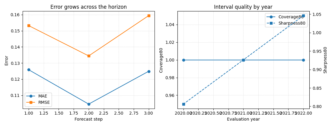
How to read the figure#
Left panel#
This panel answers:
does error increase with forecast step?
In most forecasting systems, later horizons are harder. A gentle rise in MAE and RMSE is usually expected. A sudden jump at one step can indicate instability or a mismatch between how the model handles short and long horizons.
Right panel#
This panel answers:
are the predictive intervals behaving consistently over time?
coverage80 tells us how often the truth falls inside the
q10-q90 band. sharpness80 tells us how wide that band is.
A useful interpretation is:
high coverage with enormous width: safe but not very informative,
low width with poor coverage: sharp but overconfident,
reasonable coverage with moderate width: a better balanced forecast.
Step 8 - Optional export behavior#
evaluate_forecast can also save its outputs.
JSON preserves the nested dictionary structure.
CSV flattens the result into rows with columns like
coord_t,metric,horizon, andvalue.
The helper supports both because dictionary form is convenient in code, while CSV form is convenient for reports, spreadsheets, or later plotting.
# Example (kept commented to avoid writing files during the lesson):
#
# metrics_json = evaluate_forecast(
#     df_eval,
#     target_name="subsidence",
#     per_horizon=True,
#     savefile="generated/eval_metrics.json",
#     save_format="json",
#     verbose=0,
# )
#
# metrics_csv = evaluate_forecast(
#     df_eval,
#     target_name="subsidence",
#     per_horizon=True,
#     savefile="generated/eval_metrics.csv",
#     save_format="csv",
#     verbose=0,
# )
Final takeaway#
evaluate_forecast is the core helper that turns an
evaluation forecast table into readable diagnostics.
Once you have df_eval, this function tells you:
how accurate the median forecast is,
how interval quality behaves,
how performance changes across the horizon,
and how those diagnostics vary by evaluation time.
That makes it one of the most important utility pages in the forecasting section.
Total running time of the script: (0 minutes 0.312 seconds)