
Note
Go to the end to download the full example code.
Forecast uncertainty: learning how calibration behaves across cities and horizons#
This example teaches you how to read the GeoPrior uncertainty figure.
A forecast can look good in median form and still be badly calibrated. That is why point prediction alone is not enough.
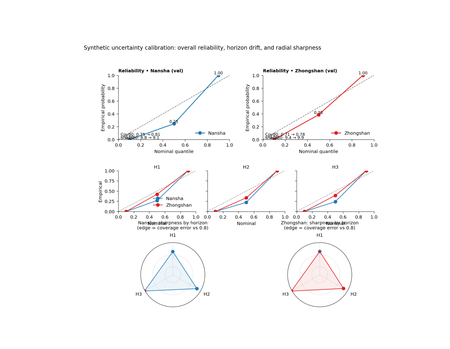
This figure asks three different uncertainty questions at once:
Are the forecast quantiles reliable overall?
Does calibration change with forecast horizon?
How do sharpness and coverage behave together across the horizon steps?
That is exactly what the GeoPrior uncertainty page is designed to show.
What the figure shows#
The real plotting backend builds a 3-row figure.
Top row#
Overall reliability diagram for each city: nominal quantile versus empirical probability.
Middle row#
Mini reliability panels by forecast horizon. These show whether calibration is stable or drifts with lead time.
Bottom row#
A radial horizon summary where the radius represents interval sharpness and the point edge color indicates whether coverage is below or above the 80% target.
Why this matters#
A model can be accurate on average while still being overconfident or underconfident.
This figure helps the reader see:
whether q10, q50, and q90 behave as expected,
whether calibration deteriorates for later horizons,
whether intervals are too wide or too narrow,
and whether uncertainty behavior differs across cities.
This gallery page uses compact synthetic forecast tables and small JSON-like metadata blocks so the example is fully executable during documentation builds.
Imports#
We use the real plotting backend from the project script. For the gallery page, we display the PNG output directly.
from __future__ import annotations

import tempfile
from pathlib import Path

import matplotlib.image as mpimg
import matplotlib.pyplot as plt
import numpy as np
import pandas as pd

from geoprior.scripts import plot_uncertainty as pu
Step 1 - Build compact synthetic forecast tables#
The real script expects forecast tables containing:
forecast_step
subsidence_actual
subsidence_q10
subsidence_q50
subsidence_q90
We create two cities with three horizons. Nansha is designed to be slightly better calibrated; Zhongshan is deliberately a bit wider and a little less centered.
rng = np.random.default_rng(14)


def make_city_forecast(
    *,
    city: str,
    n_per_h: int,
    bias_scale: float,
    spread_scale: float,
    noise_scale: float,
) -> pd.DataFrame:
    rows: list[pd.DataFrame] = []

    for h in [1, 2, 3]:
        # Synthetic "true" behavior.
        base = 8.0 + 5.0 * h
        signal = rng.normal(base, 4.2 + 0.7 * h, size=n_per_h)

        # Predictive median.
        q50 = signal * 0.92 + bias_scale * h + rng.normal(
            0.0,
            1.0,
            size=n_per_h,
        )

        # Forecast interval width widens with horizon.
        width = (
            spread_scale * (4.0 + 1.5 * h)
            + 0.15 * np.abs(q50 - np.median(q50))
        )

        q10 = q50 - width
        q90 = q50 + width

        # Observations.
        y = signal + rng.normal(
            0.0,
            noise_scale * (1.0 + 0.20 * h),
            size=n_per_h,
        )

        rows.append(
            pd.DataFrame(
                {
                    "forecast_step": np.full(n_per_h, h),
                    "subsidence_actual": y,
                    "subsidence_q10": q10,
                    "subsidence_q50": q50,
                    "subsidence_q90": q90,
                    "city": city,
                }
            )
        )

    return pd.concat(rows, ignore_index=True)


ns_df = make_city_forecast(
    city="Nansha",
    n_per_h=170,
    bias_scale=0.15,
    spread_scale=0.92,
    noise_scale=1.00,
)

zh_df = make_city_forecast(
    city="Zhongshan",
    n_per_h=170,
    bias_scale=0.35,
    spread_scale=1.06,
    noise_scale=1.10,
)

print("Synthetic forecast rows")
print(f"  Nansha:    {len(ns_df)}")
print(f"  Zhongshan: {len(zh_df)}")
Synthetic forecast rows
  Nansha:    510
  Zhongshan: 510
Step 2 - Build small JSON-like metadata blocks#
The real script can pull per-horizon coverage and sharpness from GeoPrior physics JSON metadata when available, and it can also annotate top-row panels with before/after interval calibration notes.
We therefore create small metadata dictionaries that mimic those keys.
ns_meta = {
    "per_horizon": {
        "coverage80": {"H1": 0.83, "H2": 0.81, "H3": 0.79},
        "sharpness80": {"H1": 7.8, "H2": 9.4, "H3": 11.0},
    },
    "interval_calibration": {
        "coverage80_uncalibrated": 0.75,
        "coverage80_calibrated": 0.81,
        "sharpness80_uncalibrated": 8.8,
        "sharpness80_calibrated": 9.1,
    },
}

zh_meta = {
    "per_horizon": {
        "coverage80": {"H1": 0.80, "H2": 0.78, "H3": 0.76},
        "sharpness80": {"H1": 8.6, "H2": 10.2, "H3": 12.1},
    },
    "interval_calibration": {
        "coverage80_uncalibrated": 0.71,
        "coverage80_calibrated": 0.78,
        "sharpness80_uncalibrated": 9.4,
        "sharpness80_calibrated": 9.9,
    },
}
Step 3 - Render the real uncertainty figure#
We call the actual plotting backend.
Important note: this script supports show_legend / show_labels / show_ticklabels / show_title / show_panel_titles, plus the uncertainty-specific controls show_point_values, show_mini_titles, show_mini_legend, show_json_notes, and radial_title.
It does not use show_panel_labels, so we do not pass it.
For the gallery page, we save PNG only by temporarily replacing the shared figure saver.
tmp_dir = Path(
    tempfile.mkdtemp(prefix="gp_sg_uncertainty_")
)
out_base = tmp_dir / "uncertainty_gallery"
out_csv = tmp_dir / "uncertainty_gallery_table.csv"

_orig_save_figure = pu.utils.save_figure


def _save_png_only(fig, out, *, dpi):
    p = Path(out)
    if p.suffix:
        p = p.with_suffix("")
    fig.savefig(
        str(p) + ".png",
        dpi=int(dpi),
        bbox_inches="tight",
    )
    plt.close(fig)


pu.utils.save_figure = _save_png_only

try:
    pu.plot_fig5_uncertainty(
        ns_df=ns_df,
        zh_df=zh_df,
        ns_meta=ns_meta,
        zh_meta=zh_meta,
        split_ns="val",
        split_zh="val",
        out=str(out_base),
        out_csv=str(out_csv),
        dpi=160,
        font=9,
        show_legend=True,
        show_labels=True,
        show_ticklabels=True,
        show_title=True,
        show_panel_titles=True,
        show_point_values=True,
        show_mini_titles=True,
        show_mini_legend=True,
        show_json_notes=True,
        radial_title="full",
        title=(
            "Synthetic uncertainty calibration: overall "
            "reliability, horizon drift, and radial sharpness"
        ),
    )
finally:
    pu.utils.save_figure = _orig_save_figure
Step 4 - Show the PNG produced by the backend#
The gallery page displays the real rendered output directly.
img = mpimg.imread(str(out_base) + ".png")

fig, ax = plt.subplots(figsize=(9.8, 7.6))
ax.imshow(img)
ax.axis("off")
(np.float64(-0.5), np.float64(1314.5), np.float64(1172.5), np.float64(-0.5))
Step 5 - Read the exported metrics table#
The plotting backend exports a tidy table containing:
city
split
interval_source
forecast_step
coverage80
sharpness80
emp_q10 / emp_q50 / emp_q90
The overall row uses forecast_step = 0.
tbl = pd.read_csv(out_csv)

print("")
print("Exported metrics table")
print(tbl.to_string(index=False))
Exported metrics table
     city split interval_source  forecast_step  coverage80  sharpness80  emp_q10  emp_q50  emp_q90
   Nansha   val       phys_json              0      1.0000      14.1039   0.0000   0.2451   1.0000
   Nansha   val       phys_json              1      0.8300       7.8000   0.0000   0.2706   1.0000
   Nansha   val       phys_json              2      0.8100       9.4000   0.0000   0.2235   1.0000
   Nansha   val       phys_json              3      0.7900      11.0000   0.0000   0.2412   1.0000
Zhongshan   val       phys_json              0      1.0000      16.0578   0.0000   0.3843   1.0000
Zhongshan   val       phys_json              1      0.8000       8.6000   0.0000   0.4235   1.0000
Zhongshan   val       phys_json              2      0.7800      10.2000   0.0000   0.3353   1.0000
Zhongshan   val       phys_json              3      0.7600      12.1000   0.0000   0.3941   1.0000
Step 6 - Summarize the overall reliability directly#
A compact teaching summary is helpful:
how close is empirical q50 to 0.50?
how close is coverage80 to the 0.80 target?
overall = tbl.loc[tbl["forecast_step"].eq(0)].copy()
overall["q50_abs_error"] = np.abs(overall["emp_q50"] - 0.50)
overall["cov80_abs_error"] = np.abs(overall["coverage80"] - 0.80)

print("")
print("Overall calibration summary")
print(
    overall[
        [
            "city",
            "emp_q10",
            "emp_q50",
            "emp_q90",
            "coverage80",
            "sharpness80",
            "q50_abs_error",
            "cov80_abs_error",
        ]
    ].round(3).to_string(index=False)
)
Overall calibration summary
     city  emp_q10  emp_q50  emp_q90  coverage80  sharpness80  q50_abs_error  cov80_abs_error
   Nansha   0.0000   0.2450   1.0000      1.0000      14.1040         0.2550           0.2000
Zhongshan   0.0000   0.3840   1.0000      1.0000      16.0580         0.1160           0.2000
Step 7 - Learn how to read the top row#
The top row is the overall reliability row.
Each point compares:
nominal quantile
empirical probability
The dashed diagonal is the ideal relationship.
If the points lie close to the diagonal, the quantiles are well calibrated overall. If they lie above or below it, the forecast is underconfident or overconfident at those quantile levels.
The top panels also optionally show interval-calibration notes from the JSON metadata. Those notes help connect the visual reliability curve to the before/after coverage and sharpness adjustments.
Step 8 - Learn how to read the middle row#
The middle row breaks the same reliability idea into individual horizons.
This is important because uncertainty can drift with lead time.
A model might look well calibrated overall while:
early horizons are slightly conservative,
and later horizons become overconfident.
That is why the small H1 / H2 / H3 panels matter. They expose horizon-specific calibration drift that would be hidden in the overall row.
Step 9 - Learn how to read the radial row#
The radial panels summarize horizon behavior in another way.
Radius#
The radius shows sharpness80.
Edge color#
The edge color encodes whether coverage is below the 0.80 target:
red edge -> coverage below target
blue edge -> coverage acceptable or above target
This makes the radial plot a compact horizon-by-horizon uncertainty summary:
wide radius means broad intervals,
red outlines mean the intervals are still not covering enough,
and the city-level pattern can be compared at a glance.
Step 10 - Practical takeaway#
This figure is useful because it combines three uncertainty views in one page:
overall calibration,
horizon-specific calibration,
and the sharpness-versus-coverage balance.
That makes it one of the strongest pages for teaching forecast uncertainty, because it moves from:
“Are the quantiles okay?”
to:
“Are they okay overall, across time, and at a useful interval width?”
Command-line version#
The same figure can be produced from the command line.
The real script supports:
--ns-srcand--zh-srcfor artifact discovery,--ns-forecastand--zh-forecastfor direct CSV overrides,--ns-phys-jsonand--zh-phys-jsonfor metadata overrides,--splitwithauto | val | test,--out-csv,--radial-titlewithfull | city | none,--show-point-values,--show-mini-titles,--show-mini-legend,--show-json-notes,plus the shared plot text arguments added through
utils.add_plot_text_args(..., default_out="fig5-uncertainty").
Legacy dispatcher:
python -m scripts plot-uncertainty \
  --ns-src results/nansha_stage2_run \
  --zh-src results/zhongshan_stage2_run \
  --split auto \
  --radial-title full \
  --show-point-values true \
  --show-mini-titles true \
  --show-mini-legend true \
  --show-json-notes true \
  --out fig5-uncertainty
Manual CSV override:
python -m scripts plot-uncertainty \
  --ns-forecast results/ns_forecast.csv \
  --zh-forecast results/zh_forecast.csv \
  --ns-phys-json results/ns_phys.json \
  --zh-phys-json results/zh_phys.json \
  --split val \
  --out fig5-uncertainty
Modern CLI:
geoprior plot uncertainty \
  --ns-src results/nansha_stage2_run \
  --zh-src results/zhongshan_stage2_run \
  --out fig5-uncertainty
The gallery page teaches the figure. The command line reproduces it in a workflow.
Total running time of the script: (0 minutes 0.820 seconds)