
Note
Go to the end to download the full example code.
Coverage versus sharpness in probabilistic forecasts#
This lesson teaches one of the most important ideas in forecast uncertainty:
a good interval forecast must be both honest and useful.
In practice, that means balancing two competing goals:
coverage: does the interval contain the truth often enough?
sharpness: is the interval still narrow enough to be informative?
Why this page matters#
After interval calibration, the next question is no longer only “can we widen the intervals?” but:
how should we judge whether the resulting uncertainty is actually better?
That is the role of a coverage-versus-sharpness analysis.
In GeoPrior, this lesson naturally combines three pieces:
geoprior.utils.forecast_utils.evaluate_forecast(), which computes coverage and sharpness from an evaluation forecast table in quantile mode;geoprior.utils.calibrate.calibrate_quantile_forecasts(), which can recalibrate under-covered intervals;geoprior.utils.forecast_utils.plot_reliability_diagram(), which visualizes empirical coverage against nominal probability for interval forecasts.
The evaluator reports coverage80 and sharpness80 for a chosen
interval such as q10-q90, and the reliability helper draws the perfect
calibration line against empirical coverage from the forecast
intervals.
What this lesson teaches#
We will:
create one common synthetic truth field,
build several probabilistic forecast variants: overconfident, balanced, conservative,
recalibrate the overconfident forecast,
compare all models in coverage-sharpness space,
inspect how that trade-off changes by horizon,
finish with a reliability diagram.
This page is intentionally synthetic so it remains fully executable during the documentation build.
Imports#
We use the real uncertainty and forecast-evaluation helpers.
from __future__ import annotations

import numpy as np
import pandas as pd
import matplotlib.pyplot as plt

from geoprior.utils.calibrate import calibrate_quantile_forecasts
from geoprior.utils.forecast_utils import (
    evaluate_forecast,
    plot_reliability_diagram,
)
Step 2 - Create forecast tables with different uncertainty behavior#
We now build three forecast styles:
overconfident: intervals too narrow;
balanced: intervals reasonably matched to the data;
conservative: intervals too wide.
All three share the same median forecast so the comparison focuses on uncertainty behavior rather than mean-forecast accuracy.
def make_quantile_df(
    *,
    width_scale: float,
    median_bias: float = 0.0,
) -> pd.DataFrame:
    rows: list[dict[str, float | int]] = []

    for step in steps:
        mu = truth_mean_by_step[step] + median_bias
        actual = truth_actual_by_step[step]
        sigma = base_sigma_by_step[step] * width_scale

        for i in range(n_sites):
            row = {
                "sample_idx": i,
                "forecast_step": step,
                "coord_t": years[step],
                "coord_x": float(x_flat[i]),
                "coord_y": float(y_flat[i]),
                "subsidence_actual": float(actual[i]),
            }

            for q in quantiles:
                col = f"subsidence_q{int(q * 100):02d}"
                row[col] = float(mu[i] + z_map[q] * sigma[i])

            rows.append(row)

    return pd.DataFrame(rows)


df_over = make_quantile_df(width_scale=0.55)
df_bal = make_quantile_df(width_scale=1.00)
df_cons = make_quantile_df(width_scale=1.70)

print("Overconfident rows:", len(df_over))
print("Balanced rows:", len(df_bal))
print("Conservative rows:", len(df_cons))

print("")
print(df_over.head(6).to_string(index=False))
Overconfident rows: 162
Balanced rows: 162
Conservative rows: 162

 sample_idx  forecast_step  coord_t   coord_x  coord_y  subsidence_actual  subsidence_q10  subsidence_q20  subsidence_q30  subsidence_q40  subsidence_q50  subsidence_q60  subsidence_q70  subsidence_q80  subsidence_q90
          0              1     2024    0.0000   0.0000             2.6087          2.3428          2.4033          2.4469          2.4842          2.5190          2.5538          2.5911          2.6347          2.6952
          1              1     2024 1500.0000   0.0000             2.9896          2.4164          2.4790          2.5241          2.5627          2.5988          2.6348          2.6734          2.7185          2.7811
          2              1     2024 3000.0000   0.0000             2.2007          2.4900          2.5547          2.6014          2.6412          2.6785          2.7158          2.7557          2.8023          2.8671
          3              1     2024 4500.0000   0.0000             3.2243          2.5637          2.6305          2.6787          2.7199          2.7584          2.7969          2.8381          2.8863          2.9531
          4              1     2024 6000.0000   0.0000             2.8294          2.6420          2.7110          2.7607          2.8032          2.8429          2.8826          2.9251          2.9749          3.0439
          5              1     2024 7500.0000   0.0000             2.7174          2.7454          2.8167          2.8681          2.9120          2.9530          2.9940          3.0379          3.0893          3.1605
Step 3 - Create a future forecast table for calibration transfer#
The calibration wrapper expects both an evaluation table and, when available, a future table. The future table does not contain actuals.
We only need one future table here because we are going to calibrate the overconfident forecast and compare the calibrated result to the other variants.
def make_future_df(
    *,
    width_scale: float,
    median_growth: float = 1.06,
) -> pd.DataFrame:
    rows: list[dict[str, float | int]] = []

    for step in steps:
        mu = truth_mean_by_step[step] * median_growth
        sigma = base_sigma_by_step[step] * width_scale

        for i in range(n_sites):
            row = {
                "sample_idx": i,
                "forecast_step": step,
                "coord_t": years[step] + 1,
                "coord_x": float(x_flat[i]),
                "coord_y": float(y_flat[i]),
            }

            for q in quantiles:
                col = f"subsidence_q{int(q * 100):02d}"
                row[col] = float(mu[i] + z_map[q] * sigma[i])

            rows.append(row)

    return pd.DataFrame(rows)


df_future_over = make_future_df(width_scale=0.55)
Step 4 - Calibrate the overconfident forecast#
We now produce a fourth model:
calibrated: obtained by applying the real GeoPrior interval-calibration workflow to the overconfident forecast.
The calibration wrapper fits horizon-wise widening factors on
df_eval and applies them to both evaluation and future tables.
df_over_cal, df_future_over_cal, stats_cal = calibrate_quantile_forecasts(
    df_eval=df_over,
    df_future=df_future_over,
    target_name="subsidence",
    step_col="forecast_step",
    interval=(0.1, 0.9),
    target_coverage=0.8,
    median_q=0.5,
    use="auto",
    keep_original=True,
    enforce_monotonic="cummax",
    verbose=0,
)

print("Calibration stats")
print(stats_cal)
Calibration stats
{'target': 0.8, 'interval': [0.1, 0.9], 'f_max': 5.0, 'tol': 0.02, 'overall_key': '__overall__', 'factors_source': 'fit', 'factors': {'1': 1.9013090133666992, '2': 1.5369853973388672, '3': 1.7673044204711914}, 'eval_before': {'coverage': 0.49382716049382713, 'sharpness': 0.44739274608428753, 'per_horizon': {'1': {'coverage': 0.46296296296296297, 'sharpness': 0.40509994608428745}, '2': {'coverage': 0.5555555555555556, 'sharpness': 0.4473927460842876}, '3': {'coverage': 0.46296296296296297, 'sharpness': 0.48968554608428744}}}, 'eval_after': {'coverage': 0.8148148148148148, 'sharpness': 0.7744265755489718, 'per_horizon': {'1': {'coverage': 0.8148148148148148, 'sharpness': 0.7702201788044195}, '2': {'coverage': 0.8148148148148148, 'sharpness': 0.6876361176068855}, '3': {'coverage': 0.8148148148148148, 'sharpness': 0.8654234302356104}}}}
Step 5 - Evaluate all models with the real evaluator#
evaluate_forecast computes deterministic accuracy plus interval
quality. In quantile mode it reports:
coverage80for the chosen interval,sharpness80as mean interval width,and optional per-horizon deterministic summaries.
model_tables = {
    "Overconfident": df_over,
    "Balanced": df_bal,
    "Conservative": df_cons,
    "Calibrated": df_over_cal,
}

overall_rows = []
for name, df_model in model_tables.items():
    metrics = evaluate_forecast(
        df_model,
        target_name="subsidence",
        per_horizon=True,
        quantile_interval=(0.1, 0.9),
        verbose=0,
    )
    overall = metrics["__overall__"]

    overall_rows.append(
        {
            "model": name,
            "overall_mae": overall["overall_mae"],
            "overall_rmse": overall["overall_rmse"],
            "overall_r2": overall["overall_r2"],
            "coverage80": overall["coverage80"],
            "sharpness80": overall["sharpness80"],
        }
    )

df_overall = pd.DataFrame(overall_rows)
print("")
print("Overall uncertainty summary")
print(df_overall.to_string(index=False))
Overall uncertainty summary
        model  overall_mae  overall_rmse  overall_r2  coverage80  sharpness80
Overconfident       0.2419        0.2952      0.8493      0.4938       0.4474
     Balanced       0.2419        0.2952      0.8493      0.8210       0.8134
 Conservative       0.2419        0.2952      0.8493      0.9877       1.3829
   Calibrated       0.2419        0.2952      0.8493      0.8148       0.7744
Step 6 - Compute coverage and sharpness by horizon#
evaluate_forecast gives overall interval quality directly, but
for a teaching page it is helpful to also build a small per-step
table by hand.
This lets us see whether uncertainty problems become worse at longer horizons.
def coverage_and_sharpness_by_step(df: pd.DataFrame) -> pd.DataFrame:
    rows = []
    for step, g in df.groupby("forecast_step", sort=True):
        actual = g["subsidence_actual"].to_numpy(float)
        lo = g["subsidence_q10"].to_numpy(float)
        hi = g["subsidence_q90"].to_numpy(float)

        coverage = float(np.mean((actual >= lo) & (actual <= hi)))
        sharpness = float(np.mean(hi - lo))

        rows.append(
            {
                "forecast_step": int(step),
                "coverage80": coverage,
                "sharpness80": sharpness,
            }
        )

    return pd.DataFrame(rows)


step_tables = {
    name: coverage_and_sharpness_by_step(df_model)
    for name, df_model in model_tables.items()
}

for name, df_step in step_tables.items():
    print("")
    print(name)
    print(df_step.to_string(index=False))
Overconfident
 forecast_step  coverage80  sharpness80
             1      0.4630       0.4051
             2      0.5556       0.4474
             3      0.4630       0.4897

Balanced
 forecast_step  coverage80  sharpness80
             1      0.7778       0.7365
             2      0.8519       0.8134
             3      0.8333       0.8903

Conservative
 forecast_step  coverage80  sharpness80
             1      0.9815       1.2521
             2      0.9815       1.3829
             3      1.0000       1.5136

Calibrated
 forecast_step  coverage80  sharpness80
             1      0.8148       0.7702
             2      0.8148       0.6876
             3      0.8148       0.8654
Step 7 - Plot the coverage-versus-sharpness trade-off#
This is the main figure of the lesson.
Read this scatter plot as follows:
moving up improves empirical coverage;
moving right widens the interval;
the “best” point depends on the target use case, but typically we want enough coverage without becoming excessively wide.
fig, ax = plt.subplots(figsize=(7.2, 5.5))

for _, row in df_overall.iterrows():
    ax.scatter(
        row["sharpness80"],
        row["coverage80"],
        s=90,
        label=row["model"],
    )
    ax.annotate(
        row["model"],
        (row["sharpness80"], row["coverage80"]),
        xytext=(6, 6),
        textcoords="offset points",
    )

ax.axhline(0.80, linestyle="--", linewidth=1.5)
ax.set_xlabel("Sharpness80 (mean interval width)")
ax.set_ylabel("Coverage80 (empirical coverage)")
ax.set_title("Coverage versus sharpness")
ax.grid(True, linestyle=":", alpha=0.6)
plt.tight_layout()
plt.show()
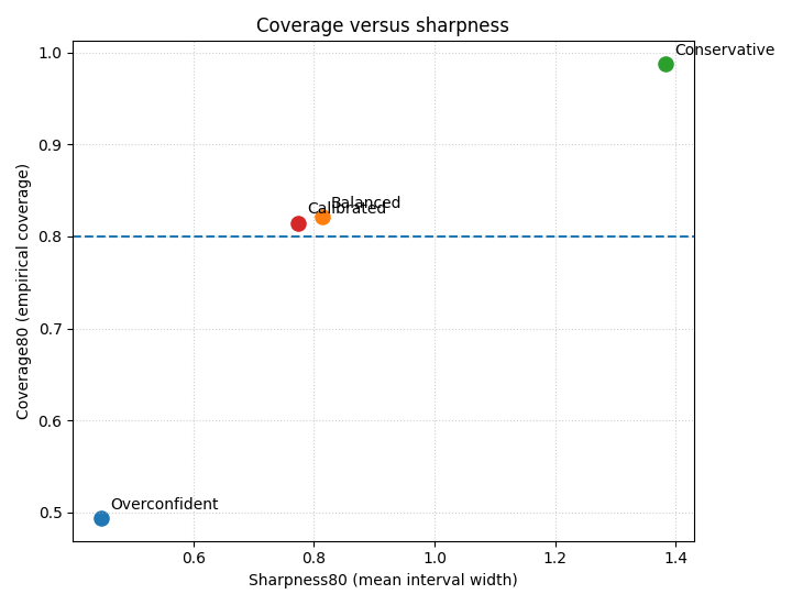
How to read this trade-off#
Typical interpretation:
Overconfident: sharp but under-covered;
Conservative: well-covered but very wide;
Balanced: closer to a useful compromise;
Calibrated: should move upward from the overconfident point, usually with some rightward movement because intervals widen.
Step 8 - Plot horizon-wise coverage and sharpness#
A forecast can look acceptable overall and still behave badly at the longer horizons. So we now inspect the trade-off step by step.
fig, axes = plt.subplots(1, 2, figsize=(11.2, 4.2))

for name, df_step in step_tables.items():
    axes[0].plot(
        df_step["forecast_step"],
        df_step["coverage80"],
        marker="o",
        label=name,
    )
axes[0].axhline(0.80, linestyle="--", linewidth=1.2)
axes[0].set_xlabel("Forecast step")
axes[0].set_ylabel("Coverage80")
axes[0].set_title("Coverage by horizon")
axes[0].grid(True, linestyle=":", alpha=0.6)
axes[0].legend()

for name, df_step in step_tables.items():
    axes[1].plot(
        df_step["forecast_step"],
        df_step["sharpness80"],
        marker="o",
        label=name,
    )
axes[1].set_xlabel("Forecast step")
axes[1].set_ylabel("Sharpness80")
axes[1].set_title("Sharpness by horizon")
axes[1].grid(True, linestyle=":", alpha=0.6)
axes[1].legend()

plt.tight_layout()
plt.show()
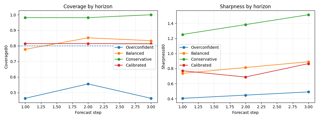
Why this horizon view matters#
This panel often reveals the real uncertainty story.
In many forecasting systems:
later steps need wider intervals,
undercoverage becomes more severe with horizon,
recalibration helps most at the longer steps.
That is exactly why the first uncertainty lesson fit interval factors per horizon instead of using one global factor for the whole forecast.
Step 9 - Add a reliability diagram#
The reliability diagram belongs naturally in this section because it compares nominal interval probability to empirical coverage. The helper can wrap simple DataFrames and draw the diagonal “perfect calibration” reference line.
We compare the overconfident, balanced, conservative, and calibrated forecasts on the same observed outcomes.
y_true_series = pd.Series(df_over["subsidence_actual"].to_numpy())

rel_models = {
    "Overconfident": {
        "forecasts": df_over[
            [f"subsidence_q{int(q * 100):02d}" for q in quantiles]
        ].reset_index(drop=True),
        "marker": "o",
    },
    "Balanced": {
        "forecasts": df_bal[
            [f"subsidence_q{int(q * 100):02d}" for q in quantiles]
        ].reset_index(drop=True),
        "marker": "s",
    },
    "Conservative": {
        "forecasts": df_cons[
            [f"subsidence_q{int(q * 100):02d}" for q in quantiles]
        ].reset_index(drop=True),
        "marker": "^",
    },
    "Calibrated": {
        "forecasts": df_over_cal[
            [f"subsidence_q{int(q * 100):02d}" for q in quantiles]
        ].reset_index(drop=True),
        "marker": "D",
    },
}

plot_reliability_diagram(
    models_data=rel_models,
    y_true=y_true_series.reset_index(drop=True),
    prefix="subsidence",
    figsize=(7, 7),
    title="Reliability diagram across forecast variants",
    plot_style="default",
    verbose=0,
)
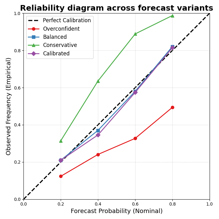
How to read the reliability diagram#
The diagonal represents perfect calibration.
A model below the diagonal is typically overconfident for those nominal probabilities, while a model above it is conservative.
This is why the reliability diagram and the coverage-sharpness scatter complement each other:
the scatter summarizes one chosen interval,
the reliability diagram shows calibration over a range of nominal interval probabilities.
Step 10 - Final practical takeaway#
A good uncertainty analysis should never report coverage alone.
Why?
Because coverage can always be improved by making intervals wider. That is not enough.
The right question is:
how much coverage did we gain,
how much sharpness did we lose,
and does the new forecast sit closer to a useful operating point?
That is why this page belongs early in the uncertainty section: it teaches the core trade-off that the later calibration and exceedance pages build on.
Total running time of the script: (0 minutes 0.645 seconds)