
Note
Go to the end to download the full example code.
Read quantile miscalibration with plot_qce_donut#
This lesson explains how to use
geoprior.plot.evaluation.plot_qce_donut when you
want to understand which quantiles contribute most
to calibration error.
Why this function matters#
A calibration score such as QCE is useful, but it is also compact. Once you know the average error, the next question is usually:
Which quantiles are causing the problem?
That is exactly where the donut view helps.
Instead of showing only one overall number, this helper breaks the calibration mismatch into one contribution per quantile level. That makes it easier to answer practical questions such as:
Are the outer quantiles causing most of the problem?
Is the median reasonably calibrated while the tails are not?
Is one forecast variant globally better only because one bad quantile improved?
Which quantile should I inspect first in a more detailed reliability diagram?
This page is written as a teaching guide, not only as a quick API example. We will build realistic forecast columns, draw donut charts, compare a better and a worse forecast, and finish with a checklist for using this helper on your own saved tables.
from __future__ import annotations

import matplotlib.pyplot as plt
import numpy as np
import pandas as pd

from geoprior.plot.evaluation import plot_qce_donut

pd.set_option("display.max_columns", 20)
pd.set_option("display.width", 110)
pd.set_option(
    "display.float_format",
    lambda v: f"{v:0.4f}",
)
What this function expects#
plot_qce_donut works directly with a DataFrame.
That is an important difference from several other
evaluation helpers in this gallery, which usually take
NumPy arrays.
The required inputs are:
df: a DataFrame containing one column of observed values and several quantile prediction columns,actual_col: the name of the observed-value column,quantile_cols: an ordered list of the quantile prediction columns,quantile_levels: the matching list of quantile levels.
The order matters. If your columns are
['q10', 'q50', 'q90'], the levels must be
[0.10, 0.50, 0.90] in the same order.
The helper then computes, for each quantile, the absolute gap:
| observed proportion - nominal quantile level |
and uses those per-quantile gaps as donut segments.
A key reading rule is simple:
a larger donut segment means that quantile is making a larger contribution to average calibration error,
the number in the center summarizes the average QCE,
and the donut should usually be read with a reliability diagram, not instead of one.
Build a realistic forecast table#
For a teaching page, we want one forecast variant that is reasonably calibrated and one that is visibly biased and too narrow.
We use five quantiles because that is rich enough to show where calibration error lives without making the legend too crowded.
rng = np.random.default_rng(34)

n_samples = 260
quantile_levels = [0.10, 0.25, 0.50, 0.75, 0.90]
quantile_cols = [
    "subsidence_q10",
    "subsidence_q25",
    "subsidence_q50",
    "subsidence_q75",
    "subsidence_q90",
]

# Approximate z-scores for the chosen quantiles.
z = np.array([-1.2816, -0.6745, 0.0, 0.6745, 1.2816])

x = np.linspace(0.0, 5.0 * np.pi, n_samples)
y_true = (
    18.0
    + 2.3 * np.sin(x / 3.0)
    + 0.8 * np.cos(x / 7.0)
    + rng.normal(scale=0.95, size=n_samples)
)

center_good = (
    18.0
    + 2.2 * np.sin(x / 3.0)
    + 0.75 * np.cos(x / 7.0)
)
spread_good = 1.00 + 0.10 * np.sin(x / 4.0)
q_good = center_good[:, None] + spread_good[:, None] * z[None, :]

df_good = pd.DataFrame(
    {
        "subsidence_actual": y_true,
        quantile_cols[0]: q_good[:, 0],
        quantile_cols[1]: q_good[:, 1],
        quantile_cols[2]: q_good[:, 2],
        quantile_cols[3]: q_good[:, 3],
        quantile_cols[4]: q_good[:, 4],
    }
)

center_bad = center_good + 0.35
spread_bad = 0.58 + 0.04 * np.cos(x / 2.4)
q_bad = center_bad[:, None] + spread_bad[:, None] * z[None, :]

df_bad = pd.DataFrame(
    {
        "subsidence_actual": y_true,
        quantile_cols[0]: q_bad[:, 0],
        quantile_cols[1]: q_bad[:, 1],
        quantile_cols[2]: q_bad[:, 2],
        quantile_cols[3]: q_bad[:, 3],
        quantile_cols[4]: q_bad[:, 4],
    }
)

print("Preview of the better-calibrated table")
print(df_good.head(8))
Preview of the better-calibrated table
   subsidence_actual  subsidence_q10  subsidence_q25  subsidence_q50  subsidence_q75  subsidence_q90
0            18.7621         17.4684         18.0755         18.7500         19.4245         20.0316
1            17.6516         17.5109         18.1189         18.7944         19.4700         20.0780
2            21.3382         17.5533         18.1623         18.8388         19.5154         20.1243
3            19.3968         17.5957         18.2055         18.8831         19.5607         20.1705
4            19.5967         17.6379         18.2487         18.9273         19.6058         20.2166
5            18.8338         17.6800         18.2917         18.9713         19.6509         20.2626
6            19.1326         17.7219         18.3346         19.0152         19.6958         20.3084
7            19.4428         17.7637         18.3773         19.0589         19.7406         20.3541
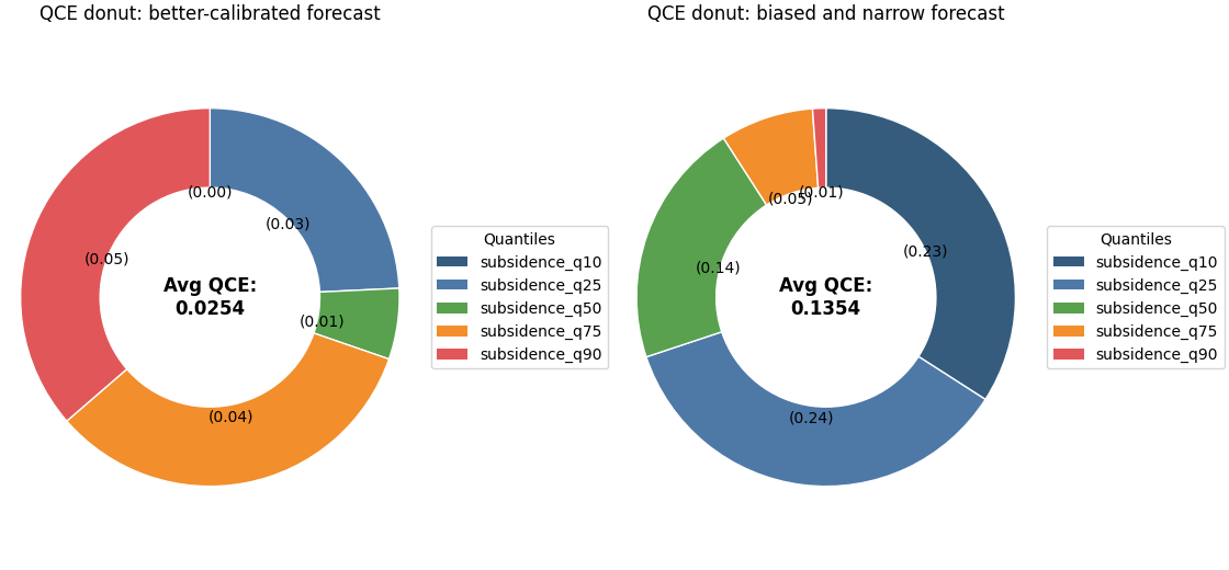
Start with a single donut chart#
A single donut is the easiest way to learn the plot.
Here the colored segments are not showing forecast values themselves. They are showing the size of the calibration mismatch for each quantile level.
If one segment is much larger than the others, that quantile is contributing disproportionately to the average QCE.
fig, axes = plt.subplots(
    1,
    2,
    figsize=(11.2, 5.2),
    constrained_layout=True,
)

plot_qce_donut(
    df_good,
    actual_col="subsidence_actual",
    quantile_cols=quantile_cols,
    quantile_levels=quantile_levels,
    title="QCE donut: better-calibrated forecast",
    colors=[
        "#355C7D",
        "#4E79A7",
        "#59A14F",
        "#F28E2B",
        "#E15759",
    ],
    center_text_format="Avg QCE:\n{:.4f}",
    donut_width=0.42,
    legend_bbox_to_anchor=(1.02, 0.5),
    ax=axes[0],
)

plot_qce_donut(
    df_bad,
    actual_col="subsidence_actual",
    quantile_cols=quantile_cols,
    quantile_levels=quantile_levels,
    title="QCE donut: biased and narrow forecast",
    colors=[
        "#355C7D",
        "#4E79A7",
        "#59A14F",
        "#F28E2B",
        "#E15759",
    ],
    center_text_format="Avg QCE:\n{:.4f}",
    donut_width=0.42,
    legend_bbox_to_anchor=(1.02, 0.5),
    ax=axes[1],
)
<Axes: title={'center': 'QCE donut: biased and narrow forecast'}>
How to read the donut correctly#
A useful reading order is:
read the number in the center,
compare the largest segments,
identify whether the problem is concentrated in the tails or spread across all quantiles,
then move to a reliability diagram if you want to know the direction of the error.
This last point is important.
The donut shows the magnitude of each quantile’s
calibration mismatch, but not its sign. It tells you
how much a quantile is contributing to error, not
whether that quantile is systematically too high or too
low. That is why this plot works best as a companion to
plot_quantile_calibration.
Highlight the practical comparison#
The two donuts above tell a compact story:
the better forecast should show a smaller center QCE,
the worse forecast should usually show one or more visibly dominant segments,
and the dominant segments often live in the lower or upper tails when the forecast is too narrow.
That makes the donut especially useful in reports. It gives a compact answer to: where is the calibration problem concentrated?
To reinforce that idea, we can print the empirical proportions by hand.
def empirical_props(
    df: pd.DataFrame,
    *,
    actual_col: str,
    quantile_cols: list[str],
) -> np.ndarray:
    y = df[actual_col].to_numpy()
    q = df[quantile_cols].to_numpy()
    return np.mean(y[:, None] <= q, axis=0)


summary = pd.DataFrame(
    {
        "quantile": quantile_levels,
        "observed_good": empirical_props(
            df_good,
            actual_col="subsidence_actual",
            quantile_cols=quantile_cols,
        ),
        "observed_bad": empirical_props(
            df_bad,
            actual_col="subsidence_actual",
            quantile_cols=quantile_cols,
        ),
    }
)
summary["abs_gap_good"] = np.abs(
    summary["observed_good"] - summary["quantile"]
)
summary["abs_gap_bad"] = np.abs(
    summary["observed_bad"] - summary["quantile"]
)

print("\nPer-quantile calibration summary")
print(summary)
Per-quantile calibration summary
   quantile  observed_good  observed_bad  abs_gap_good  abs_gap_bad
0    0.1000         0.1000        0.3308        0.0000       0.2308
1    0.2500         0.2192        0.4923        0.0308       0.2423
2    0.5000         0.5077        0.6423        0.0077       0.1423
3    0.7500         0.7923        0.8038        0.0423       0.0538
4    0.9000         0.9462        0.9077        0.0462       0.0077
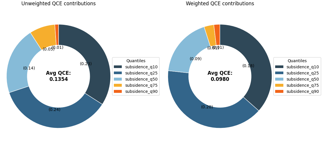
Use a weighted version when some samples matter more#
The helper also accepts sample_weight inside
metric_kws. That is useful when the user wants some
rows to count more heavily, for example:
larger-population zones,
higher-risk locations,
or later forecast steps that matter more in a given decision setting.
Here we simulate weights that put more emphasis on the higher-amplitude part of the series.
weights = 1.0 + 0.8 * (y_true > np.quantile(y_true, 0.70))

fig, axes = plt.subplots(
    1,
    2,
    figsize=(11.0, 5.0),
    constrained_layout=True,
)

plot_qce_donut(
    df_bad,
    actual_col="subsidence_actual",
    quantile_cols=quantile_cols,
    quantile_levels=quantile_levels,
    title="Unweighted QCE contributions",
    colors=[
        "#2F4858",
        "#33658A",
        "#86BBD8",
        "#F6AE2D",
        "#F26419",
    ],
    donut_width=0.40,
    ax=axes[0],
)

plot_qce_donut(
    df_bad,
    actual_col="subsidence_actual",
    quantile_cols=quantile_cols,
    quantile_levels=quantile_levels,
    metric_kws={"sample_weight": weights},
    title="Weighted QCE contributions",
    colors=[
        "#2F4858",
        "#33658A",
        "#86BBD8",
        "#F6AE2D",
        "#F26419",
    ],
    donut_width=0.40,
    ax=axes[1],
)
<Axes: title={'center': 'Weighted QCE contributions'}>
Why the weighted view is worth teaching#
The weighted and unweighted donuts may look similar, but they answer slightly different questions:
the unweighted donut asks how the model calibrates on average across rows,
the weighted donut asks how the model calibrates when some rows are treated as more important.
This distinction is valuable in applied work. A model may look acceptable overall while still misrepresenting uncertainty in the cases that matter most.
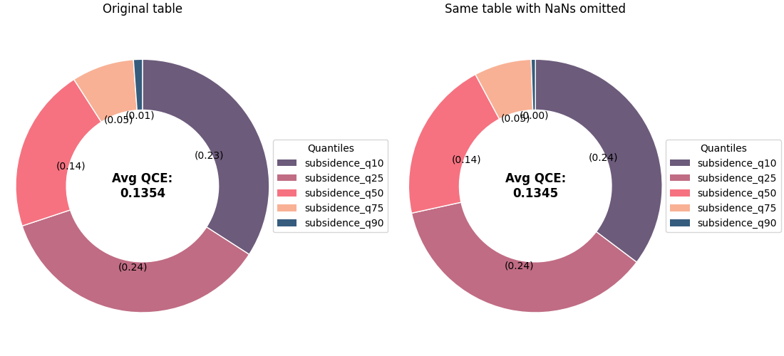
Handle missing values deliberately#
In real forecast tables, a few quantile columns may be
missing for some rows. The helper supports nan_policy
through metric_kws.
For a teaching page, the safest policy to demonstrate is
'omit' because it removes rows with NaNs before the
contributions are calculated.
df_nan = df_bad.copy()
df_nan.loc[5:10, "subsidence_q90"] = np.nan
df_nan.loc[40:44, "subsidence_q10"] = np.nan

fig, axes = plt.subplots(
    1,
    2,
    figsize=(11.0, 5.0),
    constrained_layout=True,
)

plot_qce_donut(
    df_bad,
    actual_col="subsidence_actual",
    quantile_cols=quantile_cols,
    quantile_levels=quantile_levels,
    title="Original table",
    colors=[
        "#6C5B7B",
        "#C06C84",
        "#F67280",
        "#F8B195",
        "#355C7D",
    ],
    donut_width=0.40,
    ax=axes[0],
)

plot_qce_donut(
    df_nan,
    actual_col="subsidence_actual",
    quantile_cols=quantile_cols,
    quantile_levels=quantile_levels,
    metric_kws={"nan_policy": "omit"},
    title="Same table with NaNs omitted",
    colors=[
        "#6C5B7B",
        "#C06C84",
        "#F67280",
        "#F8B195",
        "#355C7D",
    ],
    donut_width=0.40,
    ax=axes[1],
)
<Axes: title={'center': 'Same table with NaNs omitted'}>
How to use this function on your own data#
A practical workflow is:
start from a forecast table with one observed-value column and several quantile columns,
order the quantile columns exactly as their levels,
pass the DataFrame directly to
plot_qce_donut,use custom colors so the same quantile always keeps the same visual identity across pages,
read the center value first,
then inspect the largest donut segments,
then confirm the direction of the problem with
plot_quantile_calibration.
In many reports, that pair works very well:
the donut explains where the calibration error is concentrated,
the reliability diagram explains how it is wrong.
For a saved forecast table, the code often looks like:
df = pd.read_csv("my_forecast_eval.csv")
plot_qce_donut(
`` df,``
`` actual_col=”subsidence_actual”,``
`` quantile_cols=[“subsidence_q10”, “subsidence_q50”,``
`` “subsidence_q90”],``
`` quantile_levels=[0.10, 0.50, 0.90],``
)
That is all you need when the table is already in tidy forecast form.
Total running time of the script: (0 minutes 0.627 seconds)