
Spatial#
This gallery focuses on spatial plotting and mapped interpretation in GeoPrior.
The pages in this section are built as guided lessons for users who already have coordinates, mapped variables, forecast surfaces, or spatially referenced evaluation outputs and now want to answer a practical question:
What is happening across space, where are the important local patterns, and which spatial view best supports the decision I need to make?
That is the central purpose of this gallery.
Unlike the forecasting gallery, which focuses on trajectories, forecast-step tables, and direct forecast displays, and unlike the evaluation gallery, which focuses on score-based judgment, the pages in this section are organized around a different object:
the spatial pattern itself.
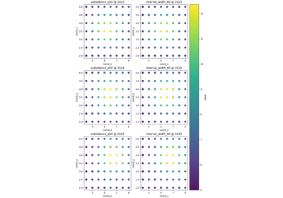
These lessons teach users how to read mapped views such as:
raw point-based spatial scatter maps,
region-of-interest zoom views,
interpolated contour surfaces,
hotspot-focused maps,
Voronoi influence partitions,
and gridded or smoothed heatmaps.
In other words, this gallery is about reasoning from spatial structure. It helps users decide whether a pattern is broad or local, well supported or sparsely sampled, smooth or abrupt, concentrated in a few hotspots or spread across the full domain, and whether a zoomed, partitioned, or smoothed view is the most honest way to present it.
Why this gallery exists#
Spatial data almost always supports more than one visual story.
The same values can be shown as:
individual observed points,
a zoomed subset of a critical subregion,
a smoothed continuous-looking field,
an interpolated contour surface,
a hotspot-only emphasis,
or a nearest-observation partition of influence.
Each of those views is useful, but each answers a different question and carries a different risk of misinterpretation.
For example:
a scatter map is often the most honest first view because it preserves the sampled points,
a contour or heatmap can make broad spatial structure easier to see, but may visually imply smoothness the data do not truly support,
a hotspot map is excellent for identifying operational priority zones, but intentionally hides the rest of the field,
and a Voronoi map is useful when users need to understand local support and nearest-point influence rather than interpolation.
This gallery therefore turns spatial visualization into a sequence of lessons. Each page shows how to:
build a small, stable spatial example,
call one spatial plotting helper,
explain what the map is actually emphasizing,
show what the view is good at and what it can hide,
and finish with a practical rule for using the same logic on real forecast or geospatial tables.
The goal is not only to draw maps. The goal is to teach users how to reason from the map they choose.
What this gallery teaches#
Most lessons in this section follow the same broad structure:
introduce the spatial question the plot helps answer,
prepare a stable table with coordinates, one or more value columns, and optionally time slices,
call the helper in its simplest useful mode,
explain how to read the spatial pattern before interpreting it,
add one or two alternative usage patterns,
finish with a checklist for adapting the helper to real coordinate tables.
That structure matters. It means the examples are not only API demos. They are meant to function as spatial reading lessons for users who want to understand their own mapped outputs later.
What this gallery is not#
This section does not aim to:
replace GIS software for advanced cartographic workflows,
replace the evaluation gallery for metric-based judgment,
replace the forecasting gallery for direct temporal forecast reading,
or imply that interpolation always makes a spatial result more trustworthy.
Instead, it focuses on one practical job:
teach the user which spatial view to choose, what it emphasizes, and what kind of spatial conclusion it can support safely.
A useful rule of thumb is:
forecasting/explains what the forecasts look like over steps or samples,evaluation/explains how good those forecasts are,spatial/explains where the important mapped patterns are and how to display them honestly,diagnostics/explains workflow validity and fit-oriented checks,inspection/explains how to read the saved artifacts generated by those workflows.
Module guide#
Module |
Main output |
Purpose |
|---|---|---|
|
Spatial scatter lesson |
Learn the default full-domain point map, the role of time slices, shared versus per-panel colorbars, and why a raw point view is often the best first spatial inspection. |
|
ROI zoom lesson |
Focus on a bounded subregion across time and compare several mapped variables inside the same local window. |
|
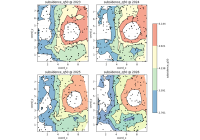
Contour-surface lesson |
Interpolate point values into contour bands, understand how smoothing and contour levels shape interpretation, and learn when contour maps are helpful versus overly suggestive. |
|
Hotspot lesson |
Highlight extreme-value zones using percentile or fixed thresholds and use hotspot overlays for priority-oriented spatial decisions. |
|
Voronoi lesson |
Read nearest-observation influence regions and learn when a partition view is more honest than interpolation. |
|
Heatmap lesson |
Build gridded or smoothed field views and decide when a heatmap clarifies the overall field versus when it hides sparse support. |
Suggested reading paths#
There is no single correct order, but three reading paths are especially useful.
First-look spatial reading path#
Choose this path when you first want to see what the mapped variable is doing across the full study area before making any local or smoothed interpretation.
Recommended order:
plot_spatial_overview.pyplot_spatial_roi_overview.py
This path helps answer questions such as:
What does the full-domain point cloud look like?
Does a local subregion behave differently from the rest of the map?
Should I inspect the whole field first or immediately zoom to a known area of concern?
Surface-shape interpretation path#
Choose this path when you want to understand the spatial field as a continuous-looking surface and compare different ways of summarizing it.
Recommended order:
plot_spatial_contours_overview.pyplot_spatial_heatmap_overview.py
This path helps answer questions such as:
Does the field show broad gradients or sharp local variation?
Would contours or a heatmap communicate the structure more clearly?
Is the apparent smoothness supported by the data density?
Decision-oriented spatial path#
Choose this path when the main task is identifying priority zones or understanding where local support really comes from.
Recommended order:
plot_hotspots_overview.pyplot_spatial_voronoi_overview.py
This path helps answer questions such as:
Where are the strongest or most concerning values?
Are those extremes widespread or confined to a few local cells?
Does the apparent pattern reflect interpolation, or simply nearest sampled influence?
How to use this gallery well#
A strong habit is to begin with the least assumptive map first.
In practice, that usually means:
start with
plot_spatial_overview.pyto see the raw point support,then move to
plot_spatial_roi_overview.pyif a local zone matters,use
plot_spatial_contours_overview.pyorplot_spatial_heatmap_overview.pyonly after checking whether a smoothed surface is visually justified,and use
plot_hotspots_overview.pyorplot_spatial_voronoi_overview.pywhen the task is prioritization or support-aware interpretation.
That reading order helps prevent a common mistake in spatial work: seeing a smooth, attractive surface first and forgetting how sparse, irregular, or local the original support may have been.
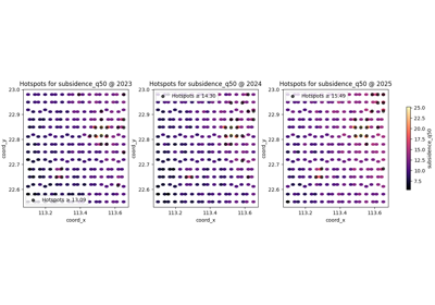
Find and read spatial hotspots before acting on a map
Read smooth spatial structure with plot_spatial_contours
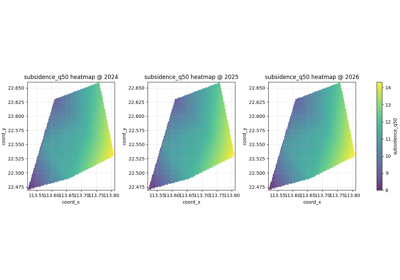
Read smoothed spatial structure with gridded heatmaps
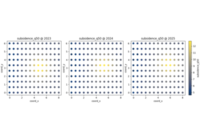
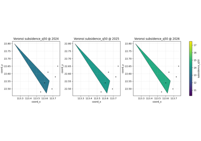
Read nearest-observation spatial influence with Voronoi maps