
Note
Go to the end to download the full example code.
Holdout versus future forecast with plot_eval_future#
This lesson teaches how to compare:
a holdout / evaluation split, where true values exist, and
a future forecast split, where only predictions exist,
using geoprior.plot.plot_eval_future().
Why this figure matters#
Once a forecasting pipeline has produced outputs, users often need to answer two related but different questions:
How well does the model reproduce known-but-held-out values?
What does the model predict beyond the observed period?
These two questions should not be mixed.
The evaluation split is where we assess whether the model’s spatial pattern and central forecasts agree with observed values. The future split is where we inspect the forecasted scenarios beyond the known data window.
That is exactly why plot_eval_future exists.
The function is a convenience wrapper around forecast_view().
It visualizes:
an evaluation split with actual and predicted values shown side-by-side, and
a future split with prediction quantiles only.
What the function expects#
The plotting backend is designed to work with evaluation and future forecast tables that include columns such as:
sample_idxforecast_stepcoord_tfor timecoord_xandcoord_yfor space<target_name>_actualfor the evaluation split<target_name>_qXXor<target_name>_predfor predictions.
In practical terms:
df_evalshould contain actual values and predictions,df_futureshould contain predictions only.
What this lesson teaches#
This page is organized to help the reader interpret the two panels correctly.
We will:
create a compact synthetic evaluation table,
create a compact synthetic future table,
render the real
plot_eval_futurefigure,explain how to read the evaluation panel,
explain how to read the future panel,
connect the visual story to a small numerical summary.
The example is synthetic so it remains fully executable during the documentation build.
Imports#
We use the real public plotting function.
import numpy as np
import pandas as pd

from geoprior.plot import plot_eval_future
from geoprior.scripts import utils as script_utils
Step 1 - Build a compact synthetic evaluation split#
The evaluation split should represent a known year with:
actual values,
lower / median / upper forecast quantiles,
the same spatial support that will also be used later for the future split.
We therefore build one reusable support and one reusable baseline spatial field first, then derive both evaluation and future tables from that same synthetic geography.
rng = np.random.default_rng(123)

eval_year = 2023
future_years = [2025, 2027, 2030]

# Build one reusable support cloud.
#
# Key parameters
# --------------
# city:
#     Only a label for the synthetic lesson.
# center_x, center_y:
#     Center of the projected map coordinates.
# span_x, span_y:
#     Half-width and half-height of the domain.
# nx, ny:
#     Number of candidate points before masking.
# jitter_x, jitter_y:
#     Small coordinate perturbations to avoid an overly rigid grid.
# footprint:
#     Shape of the retained support.
# seed:
#     Ensures full reproducibility across doc builds.

support = script_utils.make_spatial_support(
    script_utils.SpatialSupportSpec(
        city="EvalFutureDemo",
        center_x=6_000.0,
        center_y=4_000.0,
        span_x=5_500.0,
        span_y=3_800.0,
        nx=24,
        ny=18,
        jitter_x=34.0,
        jitter_y=28.0,
        footprint="ellipse",
        seed=123,
    )
)

# Build one baseline central field.
#
# Key parameters
# --------------
# amplitude:
#     Overall magnitude of the spatial response.
# drift_x, drift_y:
#     Broad regional trend.
# phase:
#     Phase of the oscillatory texture.
# local_weight:
#     Small local variation to avoid an overly smooth toy field.

base_mean = script_utils.make_spatial_field(
    support,
    amplitude=2.45,
    drift_x=0.95,
    drift_y=0.42,
    phase=0.58,
    local_weight=0.16,
)

# Build one baseline uncertainty field.
#
# This gives us a spatially varying interval width that can later be
# widened for the future years.
base_scale = script_utils.make_spatial_scale(
    support,
    base=0.32,
    x_weight=0.08,
    hotspot_weight=0.06,
)

# Evaluation-year forecast field.
#
# We keep the evaluation year close to the baseline state so the page
# first reads as a holdout reconstruction of a known spatial pattern.
eval_mean = script_utils.evolve_spatial_field(
    support,
    base_field=base_mean,
    step=0,
    growth=1.00,
)

eval_scale = base_scale * 1.00

# Sample synthetic observed holdout values.
#
# In a real workflow these would be true observations. Here they are
# generated near the evaluation-year central field so the evaluation
# panel remains meaningful.
eval_actual = script_utils.make_noisy_actual(
    eval_mean,
    0.60 * eval_scale,
    rng=rng,
    noise_scale=1.0,
)

# Build the evaluation DataFrame.
df_eval = script_utils.make_spatial_quantile_frame(
    support,
    year=eval_year,
    forecast_step=1,
    mean=eval_mean,
    scale=eval_scale,
    quantiles=(0.1, 0.5, 0.9),
    actual=eval_actual,
    prefix="subsidence",
    unit="mm",
)

print("Evaluation table shape:", df_eval.shape)
print("")
print(df_eval.head(8).to_string(index=False))
Evaluation table shape: (187, 10)

 sample_idx  forecast_step  coord_t   coord_x   coord_y subsidence_unit  subsidence_q10  subsidence_q50  subsidence_q90  subsidence_actual
          0              1     2023 4831.9991 1542.8903              mm          0.6984          1.1496          1.6008             0.9407
          1              1     2023 5338.4299 1508.2737              mm          0.5126          0.9694          1.4263             0.8908
          2              1     2023 5753.1685 1554.4533              mm          0.3868          0.8493          1.3118             1.1281
          3              1     2023 6217.0996 1574.4123              mm          0.2706          0.7404          1.2103             0.7831
          4              1     2023 6707.7567 1508.8057              mm          0.1408          0.6179          1.0951             0.8235
          5              1     2023 7161.8177 1562.3434              mm          0.1175          0.6030          1.0886             0.7342
          6              1     2023 7664.6354 1565.4632              mm          0.0597          0.5518          1.0439             0.4052
          7              1     2023 3359.4583 1998.3793              mm          1.0858          1.5228          1.9598             1.6337
Step 2 - Build a compact synthetic future split#
The future split must extend the same spatial story rather than create a disconnected new one.
We therefore:
keep the same support,
evolve the same central field through time,
widen uncertainty with future year,
and omit actual values because they are unknown in future years.
future_rows: list[pd.DataFrame] = []

for i, year in enumerate(future_years, start=1):
    growth = {
        2025: 1.10,
        2027: 1.38,
        2030: 1.82,
    }[year]

    scale_mult = {
        2025: 1.08,
        2027: 1.22,
        2030: 1.40,
    }[year]

    mean_year = script_utils.evolve_spatial_field(
        support,
        base_field=base_mean,
        step=i,
        growth=growth,
    )

    scale_year = base_scale * scale_mult

    future_rows.append(
        script_utils.make_spatial_quantile_frame(
            support,
            year=year,
            forecast_step=year - eval_year,
            mean=mean_year,
            scale=scale_year,
            quantiles=(0.1, 0.5, 0.9),
            prefix="subsidence",
            unit="mm",
        )
    )

df_future = pd.concat(future_rows, ignore_index=True)

print("")
print("Future table shape:", df_future.shape)
print("")
print(df_future.head(8).to_string(index=False))
Future table shape: (561, 9)

 sample_idx  forecast_step  coord_t   coord_x   coord_y subsidence_unit  subsidence_q10  subsidence_q50  subsidence_q90
          0              2     2025 4831.9991 1542.8903              mm          0.0982          0.5855          1.0729
          1              2     2025 5338.4299 1508.2737              mm         -0.0683          0.4251          0.9186
          2              2     2025 5753.1685 1554.4533              mm         -0.1277          0.3718          0.8713
          3              2     2025 6217.0996 1574.4123              mm         -0.1229          0.3845          0.8920
          4              2     2025 6707.7567 1508.8057              mm         -0.0846          0.4307          0.9460
          5              2     2025 7161.8177 1562.3434              mm          0.0868          0.6112          1.1355
          6              2     2025 7664.6354 1565.4632              mm          0.2559          0.7874          1.3189
          7              2     2025 3359.4583 1998.3793              mm          0.7722          1.2442          1.7162
Step 3 - Inspect the two tables numerically#
Before plotting, it is helpful to confirm:
evaluation has actuals,
future has no actuals,
future median forecasts rise with year,
interval width also grows with year.
df_eval["interval_width"] = (
    df_eval["subsidence_q90"] - df_eval["subsidence_q10"]
)
df_future["interval_width"] = (
    df_future["subsidence_q90"] - df_future["subsidence_q10"]
)

eval_summary = pd.DataFrame(
    [
        {
            "year": eval_year,
            "mean_actual": df_eval["subsidence_actual"].mean(),
            "mean_q50": df_eval["subsidence_q50"].mean(),
            "mean_width": df_eval["interval_width"].mean(),
            "mae_q50_vs_actual": (
                df_eval["subsidence_q50"] - df_eval["subsidence_actual"]
            ).abs().mean(),
        }
    ]
)

future_summary = (
    df_future.groupby("coord_t")
    .agg(
        mean_q50=("subsidence_q50", "mean"),
        mean_width=("interval_width", "mean"),
        q50_max=("subsidence_q50", "max"),
    )
    .reset_index()
    .rename(columns={"coord_t": "year"})
)

print("")
print("Evaluation summary")
print(eval_summary.to_string(index=False))

print("")
print("Future summary")
print(future_summary.to_string(index=False))
Evaluation summary
 year  mean_actual  mean_q50  mean_width  mae_q50_vs_actual
 2023       1.5077    1.4852      0.9501             0.1607

Future summary
 year  mean_q50  mean_width  q50_max
 2025    1.6057      1.0261   3.4468
 2027    2.2324      1.1591   5.3205
 2030    3.2962      1.3301   7.6349
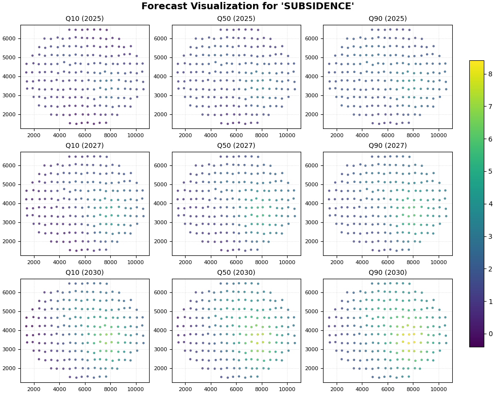
Step 4 - Render the real holdout-versus-future figure#
We now call plot_eval_future.
Key settings:
df_eval=df_evalanddf_future=df_future: provide the two distinct splits;target_name="subsidence": tells the wrapper which prediction prefix to search for;quantiles=[0.1, 0.5, 0.9]: identifies the lower / median / upper forecast columns;eval_years=[2023]: show the evaluation year;future_years=[2025, 2027, 2030]: show the future years;eval_view_quantiles=[0.5]: keep the evaluation panel compact by comparing actual against the median forecast only;future_view_quantiles=[0.1, 0.5, 0.9]: show the full scenario range in the future panel.
Internally, the function forwards the evaluation split to
forecast_view with kind="dual" and the future split with
kind="pred_only".
plot_eval_future(
    df_eval=df_eval,
    df_future=df_future,
    target_name="subsidence",
    quantiles=[0.1, 0.5, 0.9],
    spatial_cols=("coord_x", "coord_y"),
    time_col="coord_t",
    eval_years=[eval_year],
    future_years=future_years,
    eval_view_quantiles=[0.5],
    future_view_quantiles=[0.1, 0.5, 0.9],
    cmap="viridis",
    cbar="uniform",
    axis_off=False,
    show_grid=True,
    grid_props={"linestyle": ":", "alpha": 0.45},
    figsize_eval=(8.2, 3.8),
    figsize_future=(10.2, 8.1),
    spatial_mode="hexbin",
    hexbin_gridsize=38,
    show=True,
    verbose=0,
)
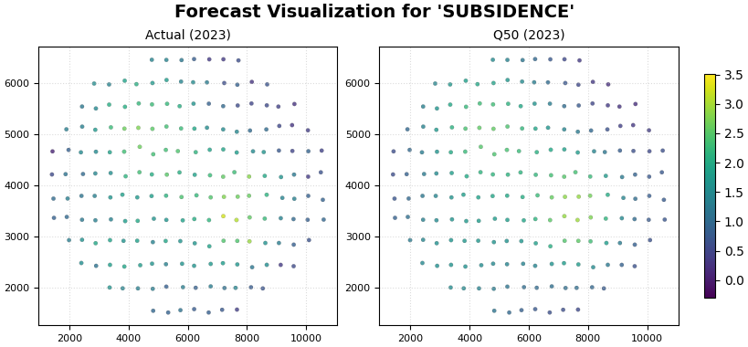
Step 5 - Learn how to read the evaluation panel#
The evaluation side should be read first.
Why?
Because this is the only place where we still know the truth.
The core question is:
does the model place the spatial signal in the right locations?
In the evaluation panel, the most useful comparison is between:
the actual map, and
the median forecast map.
What to look for#
A good evaluation panel should show:
similar hotspot placement,
broadly similar gradients,
similar relative ranking of low and high regions.
A perfect pixel-by-pixel match is not required for a useful model. What matters more is whether the model captures the main structure.
Warning signs include:
a hotspot in the wrong place,
a missing high-response zone,
strong over-smoothing that erases important features,
spatial patterns in the forecast that have no counterpart in the actual data.
Step 6 - Learn how to read the future panel#
After the evaluation panel, move to the future panel.
The future panel answers a different question:
given the model behavior that looked reasonable on holdout data, what does it project for the next years?
Here we no longer compare against actual values. Instead, we compare quantiles and years.
First read down the years#
Moving from 2025 to 2030 should tell you how the forecasted field evolves through time.
Ask:
does the response intensify?
does the footprint expand?
do the highest-risk areas remain stable in location?
Then read across the quantiles#
Within one year:
q10 gives a lower scenario,
q50 gives the central scenario,
q90 gives the upper scenario.
Ask:
is the hotspot already present in q10?
how much stronger does it become in q90?
are high-response zones also high-uncertainty zones?
Step 7 - Connect the visual story to a small accuracy summary#
A lesson becomes more useful when the holdout comparison is paired with a simple metric.
Here we compute:
MAE of q50 against actual on the evaluation split,
empirical coverage of the [q10, q90] interval on the evaluation split.
coverage_10_90 = np.mean(
    (
        df_eval["subsidence_actual"] >= df_eval["subsidence_q10"]
    )
    & (
        df_eval["subsidence_actual"] <= df_eval["subsidence_q90"]
    )
)

mae_q50 = np.mean(
    np.abs(
        df_eval["subsidence_q50"] - df_eval["subsidence_actual"]
    )
)

metric_table = pd.DataFrame(
    [
        {
            "metric": "MAE(q50 vs actual)",
            "value": float(mae_q50),
        },
        {
            "metric": "Coverage[q10, q90]",
            "value": float(coverage_10_90),
        },
    ]
)

print("")
print("Evaluation metrics")
print(metric_table.to_string(index=False))
Evaluation metrics
            metric  value
MAE(q50 vs actual) 0.1607
Coverage[q10, q90] 0.9733
How to interpret these numbers#
These numbers are not a substitute for a full evaluation section, but they do help anchor the figure.
A lower MAE suggests the median forecast is closer to the observed holdout field.
A reasonable interval coverage suggests the uncertainty band is not systematically too narrow.
Together with the map, these numbers answer:
is the median useful?
are the intervals plausible?
is the future panel worth trusting as a scenario view?
Step 8 - Practical reading guide for real workflows#
In a real GeoPrior forecasting workflow, this page is one of the most important transition figures because it connects:
known performance on holdout data,
to unknown projection in future years.
A robust reading sequence is:
Start with the evaluation actual-vs-median comparison.
Confirm the main spatial signal is captured.
Check a compact metric such as MAE or interval coverage.
Then move to future q10 / q50 / q90 maps.
Interpret future hotspots only in the context of the evaluation credibility you established first.
That sequence helps prevent a common mistake: over-interpreting attractive future maps before checking whether the model reproduced known structure at all.
Step 9 - Why this page comes after the first two forecasting lessons#
The forecasting gallery now forms a clear progression:
plot_forecasts: quick-look trajectories and step-wise views;forecast_view: future forecast maps by year and quantile;plot_eval_future: the bridge between holdout validation and future scenarios.
This third page is therefore not just another plotting lesson. It teaches the reader the correct scientific habit:
validate first, then interpret the future.
Total running time of the script: (0 minutes 1.272 seconds)