
Note
Go to the end to download the full example code.
Read quantile reliability with plot_quantile_calibration#
This lesson explains how to use
geoprior.plot.evaluation.plot_quantile_calibration when you want
to check whether predicted quantiles behave like they claim.
Why this function matters#
A quantile forecast does not only need to look reasonable. It also needs to be calibrated.
That means a forecasted 10th percentile should really behave like a 10th percentile, a 50th percentile should behave like a median, and a 90th percentile should really capture about 90 percent of the observed values below it.
This distinction matters in practice:
a forecast may look smooth and convincing while still being too narrow,
a forecast may have good central accuracy while badly representing uncertainty,
and two interval forecasts may look similar even though one is much better calibrated.
This page is written as a teaching guide, not only as a quick API example. We will build small quantile-forecast examples, read the two main plot styles, compare a better and a worse forecast, and end with a simple checklist for adapting the helper to your own arrays or saved forecast tables.
from __future__ import annotations

import matplotlib.pyplot as plt
import numpy as np
import pandas as pd

from geoprior.plot.evaluation import plot_quantile_calibration

pd.set_option("display.max_columns", 20)
pd.set_option("display.width", 110)
pd.set_option(
    "display.float_format",
    lambda v: f"{v:0.4f}",
)
What this function expects#
plot_quantile_calibration is built for quantile predictions.
The required inputs are:
y_truewith shape(N,)for one output or(N, O)for multiple outputs,y_pred_quantileswith shape(N, Q)for one output or(N, O, Q)for multiple outputs,quantileswith shape(Q,).
In other words:
N= number of samples,O= number of outputs,Q= number of quantile levels.
The helper offers two complementary views:
'reliability_diagram'shows nominal quantile levels on the x-axis and the observed proportion on the y-axis,'summary_bar'shows the aggregated Quantile Calibration Error (QCE).
A key reading rule is simple:
a curve close to the diagonal means better calibration,
a lower QCE bar means better calibration,
and calibration should always be read together with interval width or WIS, not in isolation.
Build a realistic single-output example#
For a gallery lesson, we want two forecast behaviours that are easy to distinguish:
a better-calibrated forecast whose quantiles are centered close to the truth and have reasonable spread,
and a worse forecast that is both biased and too narrow.
We use the same quantile levels for both so the comparison is fair.
rng = np.random.default_rng(21)

n_samples = 220
quantiles = np.array([0.10, 0.25, 0.50, 0.75, 0.90])

# Approximate standard-normal quantiles for the chosen levels.
z = np.array([-1.2816, -0.6745, 0.0, 0.6745, 1.2816])

x = np.linspace(0.0, 4.5 * np.pi, n_samples)
y_true = (
    12.0
    + 1.4 * np.sin(x / 2.4)
    + 0.55 * np.cos(x / 5.2)
    + rng.normal(scale=0.75, size=n_samples)
)

center_good = (
    12.0
    + 1.35 * np.sin(x / 2.4)
    + 0.50 * np.cos(x / 5.2)
)
spread_good = 0.82 + 0.08 * np.sin(x / 3.0)
y_pred_q_good = center_good[:, None] + spread_good[:, None] * z[None, :]

center_bad = center_good + 0.35
spread_bad = 0.48 + 0.04 * np.cos(x / 2.8)
y_pred_q_bad = center_bad[:, None] + spread_bad[:, None] * z[None, :]

preview = pd.DataFrame(
    {
        "y_true": y_true[:8],
        "q10_good": y_pred_q_good[:8, 0],
        "q50_good": y_pred_q_good[:8, 2],
        "q90_good": y_pred_q_good[:8, 4],
        "q10_bad": y_pred_q_bad[:8, 0],
        "q50_bad": y_pred_q_bad[:8, 2],
        "q90_bad": y_pred_q_bad[:8, 4],
    }
)

print("Single-output preview")
print(preview)
print("\nShapes")
print(f"y_true shape          : {y_true.shape}")
print(f"y_pred_q_good shape   : {y_pred_q_good.shape}")
print(f"y_pred_q_bad shape    : {y_pred_q_bad.shape}")
print(f"quantiles shape       : {quantiles.shape}")
Single-output preview
   y_true  q10_good  q50_good  q90_good  q10_bad  q50_bad  q90_bad
0 12.8191   11.4491   12.5000   13.5509  12.1836  12.8500  13.5164
1 13.7206   11.4832   12.5363   13.5894  12.2198  12.8863  13.5527
2 11.2854   11.5171   12.5724   13.6278  12.2561  12.9224  13.5888
3 13.9274   11.5509   12.6085   13.6660  12.2922  12.9585  13.6248
4 12.6642   11.5846   12.6443   13.7041  12.3281  12.9943  13.6606
5 12.1367   11.6181   12.6800   13.7420  12.3640  13.0300  13.6961
6 12.1712   11.6514   12.7155   13.7796  12.3996  13.0655  13.7315
7 11.9979   11.6845   12.7508   13.8171  12.4350  13.1008  13.7666

Shapes
y_true shape          : (220,)
y_pred_q_good shape   : (220, 5)
y_pred_q_bad shape    : (220, 5)
quantiles shape       : (5,)
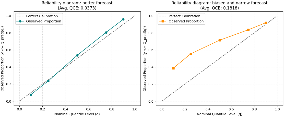
Start with the reliability diagram#
This is the most intuitive entry point.
The x-axis shows the nominal quantile level, for example 0.10 or 0.90. The y-axis shows the fraction of observed values that actually fell below the predicted quantile.
A perfectly calibrated forecast would place the observed curve on the diagonal. Deviations from that line tell you where calibration is off.
fig, axes = plt.subplots(
    1,
    2,
    figsize=(11.6, 4.8),
    constrained_layout=True,
)

plot_quantile_calibration(
    y_true,
    y_pred_q_good,
    quantiles,
    kind="reliability_diagram",
    title="Reliability diagram: better forecast",
    perfect_calib_color="dimgray",
    observed_prop_color="teal",
    observed_prop_marker="o",
    ax=axes[0],
)

plot_quantile_calibration(
    y_true,
    y_pred_q_bad,
    quantiles,
    kind="reliability_diagram",
    title="Reliability diagram: biased and narrow forecast",
    perfect_calib_color="dimgray",
    observed_prop_color="darkorange",
    observed_prop_marker="s",
    ax=axes[1],
)
<Axes: title={'center': 'Reliability diagram: biased and narrow forecast\n(Avg. QCE: 0.1818)'}, xlabel='Nominal Quantile Level (q)', ylabel='Observed Proportion (y <= Q_pred(q))'>
How to read the reliability diagram#
A useful reading habit is to compare the observed curve against the diagonal one quantile at a time.
In practical terms:
if the observed proportion at q=0.90 is much lower than 0.90, the upper quantile is too low or the forecast is too narrow,
if the observed proportion at q=0.10 is much higher than 0.10, the lower quantile is too high,
if the whole curve is shifted upward or downward, that often signals a systematic bias,
and if the middle quantiles look fine while the extremes drift away, the tails are the main problem.
This is why the reliability diagram is often the best first figure for teaching or debugging quantile forecasts: it shows where the calibration problem lives.
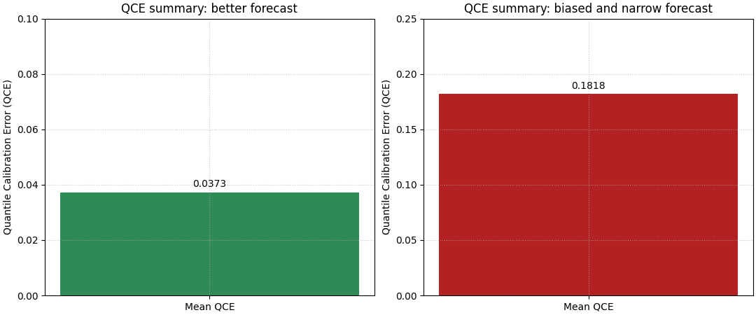
Move to the summary view with QCE bars#
The reliability diagram is diagnostic, but the summary bar gives the quick ranking.
Quantile Calibration Error averages the mismatch between the nominal quantile level and the observed proportion. Lower is better.
The summary bar is especially useful when the user wants a compact report figure or needs to compare several forecast variants.
fig, axes = plt.subplots(
    1,
    2,
    figsize=(10.8, 4.5),
    constrained_layout=True,
)

plot_quantile_calibration(
    y_true,
    y_pred_q_good,
    quantiles,
    kind="summary_bar",
    title="QCE summary: better forecast",
    bar_color="seagreen",
    ax=axes[0],
)

plot_quantile_calibration(
    y_true,
    y_pred_q_bad,
    quantiles,
    kind="summary_bar",
    title="QCE summary: biased and narrow forecast",
    bar_color="firebrick",
    ax=axes[1],
)
<Axes: title={'center': 'QCE summary: biased and narrow forecast'}, ylabel='Quantile Calibration Error (QCE)'>
Why the bar and the diagram should be used together#
The two views answer different questions.
The bar answers:
Which forecast is better calibrated overall?
The reliability diagram answers:
Where exactly is the calibration error coming from?
In practice, this means the bar is the headline and the diagram is the explanation. When both are read together, users can make a much safer decision than with either figure alone.
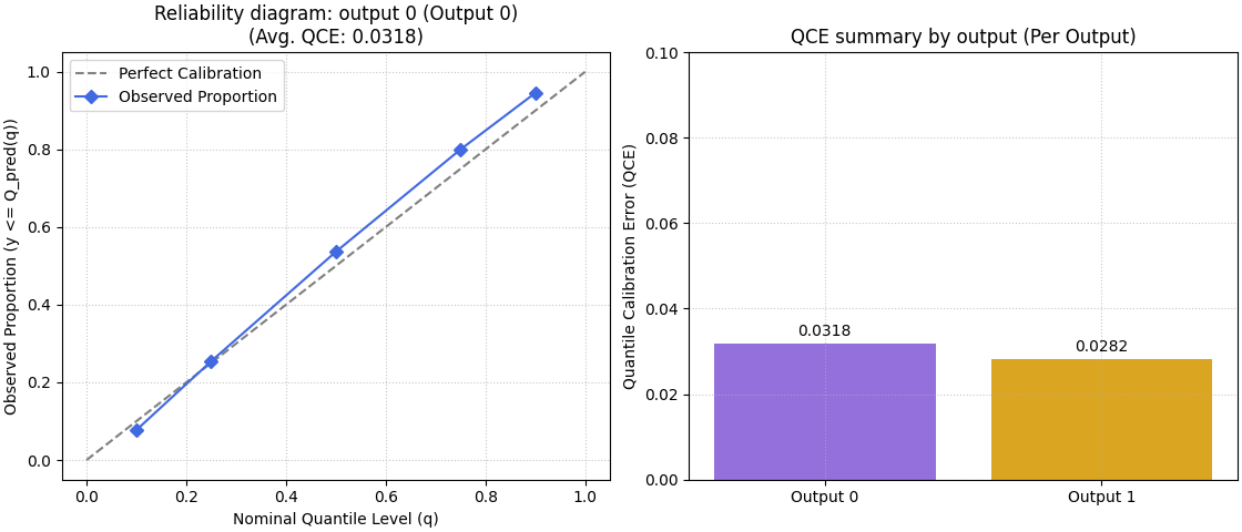
Multi-output forecasts need an explicit output choice#
For multi-output data, the helper supports:
a per-output reliability diagram, where you must provide
output_idx,or a summary bar that can show one bar per output when
metric_kws={'multioutput': 'raw_values'}is used.
We build a small two-output example to show both patterns.
n_outputs = 2

trend_1 = center_good
trend_2 = 4.5 + 0.8 * np.cos(x / 3.2)

y_true_multi = np.column_stack(
    [
        y_true,
        trend_2 + rng.normal(scale=0.55, size=n_samples),
    ]
)

spread_out1 = 0.80 + 0.05 * np.sin(x / 3.4)
spread_out2 = 0.58 + 0.05 * np.cos(x / 4.0)

y_pred_q_multi = np.stack(
    [
        trend_1[:, None] + spread_out1[:, None] * z[None, :],
        trend_2[:, None] + spread_out2[:, None] * z[None, :],
    ],
    axis=1,
)

print("\nMulti-output shapes")
print(f"y_true_multi shape    : {y_true_multi.shape}")
print(f"y_pred_q_multi shape  : {y_pred_q_multi.shape}")
print(f"n_outputs             : {n_outputs}")

fig, axes = plt.subplots(
    1,
    2,
    figsize=(11.2, 4.8),
    constrained_layout=True,
)

plot_quantile_calibration(
    y_true_multi,
    y_pred_q_multi,
    quantiles,
    kind="reliability_diagram",
    output_idx=0,
    title="Reliability diagram: output 0",
    perfect_calib_color="gray",
    observed_prop_color="royalblue",
    observed_prop_marker="D",
    ax=axes[0],
)

plot_quantile_calibration(
    y_true_multi,
    y_pred_q_multi,
    quantiles,
    kind="summary_bar",
    metric_kws={"multioutput": "raw_values"},
    title="QCE summary by output",
    bar_color=["mediumpurple", "goldenrod"],
    ax=axes[1],
)
Multi-output shapes
y_true_multi shape    : (220, 2)
y_pred_q_multi shape  : (220, 2, 5)
n_outputs             : 2

<Axes: title={'center': 'QCE summary by output (Per Output)'}, ylabel='Quantile Calibration Error (QCE)'>
What the multi-output summary teaches#
A single aggregated score can hide differences between targets.
That is why the per-output summary is often the safer reporting view when a model predicts multiple quantities. One output may be well calibrated while another is still weak. The bar chart helps reveal that imbalance immediately.
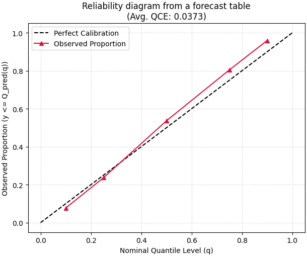
A practical pattern for users with DataFrame forecast tables#
Many users will not start from NumPy arrays. They will start from a saved forecast DataFrame with columns such as:
subsidence_actualsubsidence_q10subsidence_q25subsidence_q50subsidence_q75subsidence_q90
The adaptation is straightforward: extract the actual column, stack the
quantile columns in the same order as the quantiles array, then
call the helper.
forecast_df = pd.DataFrame(
    {
        "subsidence_actual": y_true,
        "subsidence_q10": y_pred_q_good[:, 0],
        "subsidence_q25": y_pred_q_good[:, 1],
        "subsidence_q50": y_pred_q_good[:, 2],
        "subsidence_q75": y_pred_q_good[:, 3],
        "subsidence_q90": y_pred_q_good[:, 4],
    }
)

q_cols = [
    "subsidence_q10",
    "subsidence_q25",
    "subsidence_q50",
    "subsidence_q75",
    "subsidence_q90",
]

y_true_from_df = forecast_df["subsidence_actual"].to_numpy()
y_pred_q_from_df = forecast_df[q_cols].to_numpy()

print("\nDataFrame extraction preview")
print(forecast_df.head())
print("\nExtracted array shapes")
print(f"y_true_from_df shape  : {y_true_from_df.shape}")
print(f"y_pred_q_from_df shape: {y_pred_q_from_df.shape}")

fig, ax = plt.subplots(figsize=(6.1, 5.1), constrained_layout=True)
plot_quantile_calibration(
    y_true_from_df,
    y_pred_q_from_df,
    quantiles,
    kind="reliability_diagram",
    title="Reliability diagram from a forecast table",
    perfect_calib_color="black",
    observed_prop_color="crimson",
    observed_prop_marker="^",
    ax=ax,
)
DataFrame extraction preview
   subsidence_actual  subsidence_q10  subsidence_q25  subsidence_q50  subsidence_q75  subsidence_q90
0            12.8191         11.4491         11.9469         12.5000         13.0531         13.5509
1            13.7206         11.4832         11.9820         12.5363         13.0905         13.5894
2            11.2854         11.5171         12.0170         12.5724         13.1278         13.6278
3            13.9274         11.5509         12.0519         12.6085         13.1650         13.6660
4            12.6642         11.5846         12.0866         12.6443         13.2021         13.7041

Extracted array shapes
y_true_from_df shape  : (220,)
y_pred_q_from_df shape: (220, 5)

<Axes: title={'center': 'Reliability diagram from a forecast table\n(Avg. QCE: 0.0373)'}, xlabel='Nominal Quantile Level (q)', ylabel='Observed Proportion (y <= Q_pred(q))'>
A compact checklist for your own data#
Before trusting the plot, check these points carefully:
the quantile columns are stacked in the same order as
quantiles,the quantile values themselves are in
(0, 1),lower quantiles are really lower than upper quantiles in your forecast generation process,
you choose
output_idxwhenever the data have multiple outputs and you want a reliability diagram,and you read calibration together with width-oriented plots such as mean interval width or WIS.
A final interpretation rule is worth keeping in mind:
good calibration does not automatically mean good forecasting.
A forecast can be calibrated because it is very wide. That is why this page fits naturally after coverage and width lessons and before more advanced calibration summaries.
Total running time of the script: (0 minutes 0.852 seconds)