
Note
Go to the end to download the full example code.
Learn how forecast smoothness behaves with plot_prediction_stability#
This lesson explains how to use
geoprior.plot.evaluation.plot_prediction_stability
when you want to answer a practical forecasting question that is easy to
miss:
Are my predicted trajectories behaving smoothly over time, or are they changing too abruptly from one horizon to the next?
Why this function matters#
A forecast can have acceptable error and still behave in a way that is hard to trust.
For example:
two consecutive horizons may jump too sharply,
a model may look numerically strong but produce jagged trajectories,
one output may be much less stable than another,
and a few unstable samples may hide behind a reasonable mean score.
That is why the Prediction Stability Score (PSS) is useful. It summarizes the average absolute change between successive forecast steps. In this helper:
lower PSS means smoother and more stable predictions,
kind='summary_bar'shows the average stability score,kind='scores_histogram'shows how stability varies across trajectories.
This page is written as a teaching guide, not only as an API demo. We will build realistic forecast arrays, explain the accepted shapes, show why the summary and histogram answer different questions, inspect a multi-output case, and end with a practical checklist for using the helper on your own data.
from __future__ import annotations

import matplotlib.pyplot as plt
import numpy as np
import pandas as pd

from geoprior.plot.evaluation import plot_prediction_stability

pd.set_option("display.max_columns", 20)
pd.set_option("display.width", 110)
pd.set_option(
    "display.float_format",
    lambda v: f"{v:0.4f}",
)
What this function really measures#
plot_prediction_stability works directly on predicted trajectories.
It does not need the true target values.
That is a key teaching point:
this helper is about behavior of the forecast path itself,
not about forecast accuracy against observations.
The accepted input shapes are:
(T,)for one trajectory,(N, T)for many trajectories of one output,(N, O, T)for many trajectories and many outputs.
Conceptually, the Prediction Stability Score is the average absolute step-to-step change:
So a jagged forecast receives a larger score, while a smoother one receives a smaller score.
This is helpful, but it should be interpreted with care:
a very low PSS is not automatically better if the forecast becomes unrealistically flat.
Stability should therefore be read together with accuracy and interval diagnostics, not in isolation.
Build a realistic one-output example#
We start with a one-output setting:
N = 80predicted trajectories,T = 6forecast horizons.
To make the lesson interpretable, we create two forecast families:
a stable family with gradual step-to-step changes,
a jumpy family with stronger oscillations between horizons.
Both are plausible forecast sequences, but their temporal behavior is very different.
rng = np.random.default_rng(2026)

n_samples = 80
n_steps = 6

base_level = rng.normal(loc=11.0, scale=1.3, size=(n_samples, 1))
trend = np.array([0.0, 0.9, 1.7, 2.4, 3.0, 3.5]).reshape(1, -1)

stable_noise = rng.normal(loc=0.0, scale=0.18, size=(n_samples, n_steps))
y_pred_stable = base_level + trend + stable_noise

jump_pattern = np.array([0.0, 1.1, -0.4, 1.7, -0.2, 2.2]).reshape(1, -1)
jumpy_noise = rng.normal(loc=0.0, scale=0.42, size=(n_samples, n_steps))
y_pred_jumpy = base_level + trend + jump_pattern + jumpy_noise

preview = pd.DataFrame(
    {
        "sample_idx": np.repeat(np.arange(4), n_steps),
        "forecast_step": np.tile(np.arange(1, n_steps + 1), 4),
        "stable_pred": y_pred_stable[:4].reshape(-1),
        "jumpy_pred": y_pred_jumpy[:4].reshape(-1),
    }
)

print("Preview of two forecast styles")
print(preview)

print("\nArray shapes used in this lesson")
print(
    {
        "y_pred_stable": y_pred_stable.shape,
        "y_pred_jumpy": y_pred_jumpy.shape,
    }
)
Preview of two forecast styles
    sample_idx  forecast_step  stable_pred  jumpy_pred
0            0              1      10.2439     11.2152
1            0              2      10.7395     12.1759
2            0              3      11.6793     10.4521
3            0              4      12.4527     14.1073
4            0              5      13.0361     13.8488
5            0              6      13.2469     15.7400
6            1              1      11.1932     11.8506
7            1              2      12.1775     13.7790
8            1              3      12.8591     13.1119
9            1              4      13.8347     15.8541
10           1              5      14.4186     14.2315
11           1              6      14.4605     16.9353
12           2              1       8.2098      8.4178
13           2              2       9.2041     10.5853
14           2              3      10.2559     10.0141
15           2              4      11.3007     12.0990
16           2              5      11.4660     11.2170
17           2              6      12.0799     14.2177
18           3              1      12.6231     12.8598
19           3              2      13.5261     14.6844
20           3              3      14.1622     14.4532
21           3              4      15.2094     16.8708
22           3              5      15.9850     15.4568
23           3              6      16.2503     17.9950

Array shapes used in this lesson
{'y_pred_stable': (80, 6), 'y_pred_jumpy': (80, 6)}
Start with the compact summary view#
The fastest first question is:
How stable is this family of trajectories on average?
The summary-bar view answers exactly that. We begin with the stable forecast family.
plot_prediction_stability(
    y_pred_stable,
    kind="summary_bar",
    figsize=(7.2, 5.0),
    title="Average stability of the stable forecast family",
    bar_color="#0F766E",
    score_annotation_format="{:.3f}",
)
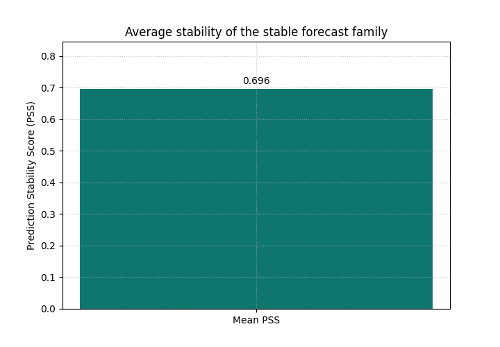
<Axes: title={'center': 'Average stability of the stable forecast family'}, ylabel='Prediction Stability Score (PSS)'>
Why the first bar matters#
This bar is useful as a compact quality signal for forecast-path smoothness.
It is especially helpful when you want a quick comparison across:
different model variants,
different training settings,
different outputs,
or different cities and regions.
But this one number also hides an important detail:
is the average score representative of most trajectories, or is it being distorted by a smaller unstable subset?
That is why the histogram view is the natural next step.
Inspect the distribution, not only the mean#
The histogram shows the PSS value for each trajectory.
This is one of the main teaching ideas of this helper:
the bar answers “what is the mean stability?”
the histogram answers “how is stability distributed?”
If the histogram is narrow, the forecast family behaves consistently. If it is wide or strongly right-skewed, some trajectories are much more unstable than others.
plot_prediction_stability(
    y_pred_stable,
    kind="scores_histogram",
    figsize=(8.4, 5.2),
    title="Distribution of per-trajectory PSS for the stable family",
    hist_bins=16,
    hist_color="#14B8A6",
    hist_edgecolor="#0F172A",
    show_score=True,
)
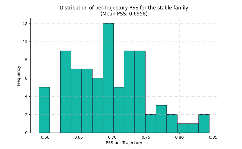
<Axes: title={'center': 'Distribution of per-trajectory PSS for the stable family\n(Mean PSS: 0.6958)'}, xlabel='PSS per Trajectory', ylabel='Frequency'>
How to read the histogram#
Read the plot in this order:
look at the center of the histogram,
check whether the spread is narrow or wide,
look for a long right tail,
then compare that picture with the mean score in the title.
For a stable forecast family, we usually expect:
relatively small PSS values,
moderate spread,
few extreme trajectories.
If you instead see many large values, the model may be producing erratic step-to-step transitions even if the average bar looked fine.
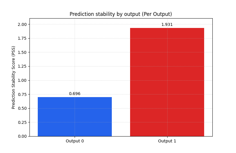
Compare two outputs in one call#
A very common real use case in GeoPrior-style work is multi-output forecasting. For example, the model may predict:
one output for subsidence,
one output for groundwater level or another companion quantity.
To teach that pattern clearly, we stack our two forecast families into
a 3D array with shape (N, O, T):
output 0 behaves smoothly,
output 1 behaves more abruptly.
Then we ask for multioutput='raw_values' so the helper returns one
bar per output instead of a single uniform average.
y_pred_multi = np.stack(
    [y_pred_stable, y_pred_jumpy],
    axis=1,
)

print("\nMulti-output prediction shape")
print(y_pred_multi.shape)

plot_prediction_stability(
    y_pred_multi,
    kind="summary_bar",
    metric_kws={"multioutput": "raw_values"},
    figsize=(8.0, 5.2),
    title="Prediction stability by output",
    bar_color=["#2563EB", "#DC2626"],
    score_annotation_format="{:.3f}",
)
Multi-output prediction shape
(80, 2, 6)

<Axes: title={'center': 'Prediction stability by output (Per Output)'}, ylabel='Prediction Stability Score (PSS)'>
What this multi-output bar is teaching#
This is one of the strongest teaching uses of the helper.
A single model can behave differently across outputs. The per-output bar view helps the user see that immediately.
In a real forecast project, this can reveal that:
one target is inherently less stable,
one output head in the model is noisier,
one variable may need stronger regularization,
or one output may require a closer manual inspection.
It is often much easier to explain this with one two-bar chart than with a long narrative in the text.
Use the histogram on one selected output#
For multi-output data, the histogram requires output_idx.
This is deliberate: a single histogram should correspond to one output
at a time so the interpretation stays clear.
Here we inspect the second output, which is intentionally more jumpy.
plot_prediction_stability(
    y_pred_multi,
    kind="scores_histogram",
    output_idx=1,
    figsize=(8.6, 5.2),
    title="Per-trajectory PSS for the less stable output",
    hist_bins=16,
    hist_color="#F97316",
    hist_edgecolor="#7C2D12",
    show_score=True,
)
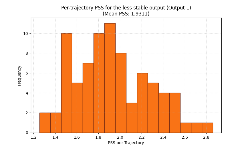
<Axes: title={'center': 'Per-trajectory PSS for the less stable output (Output 1)\n(Mean PSS: 1.9311)'}, xlabel='PSS per Trajectory', ylabel='Frequency'>
Why this second histogram matters#
The bar chart already tells us that output 1 is less stable on average. The histogram now tells us how that instability is distributed.
That distinction matters in practice:
a moderate mean can hide a small cluster of very unstable samples,
two models can have similar means but very different spreads,
and one output may only fail badly in a specific subset of cases.
This is why the histogram is not just a decorative extra. It is the diagnostic view that tells you whether the average score is trustworthy as a summary.
A useful caution: stable does not mean correct#
A model can have a very low PSS simply because it predicts overly flat trajectories. That may look smooth, but it is not necessarily realistic or accurate.
So a good reading habit is:
use PSS to check whether trajectories behave sensibly over time,
then read it together with error metrics,
and for probabilistic forecasts also check calibration and interval width.
In other words:
PSS is a behavioral quality check, not a complete forecast verdict.
How to use this helper on your own predictions#
When you adapt this lesson to real project outputs, the easiest path is usually:
collect your predicted trajectories into one NumPy array,
ensure the time axis is the final axis,
choose
summary_barfor a compact score,choose
scores_histogramwhen you want to inspect distribution,for multi-output data, use
multioutput='raw_values'for the bar view andoutput_idxfor the histogram view.
A practical checklist:
one output, many trajectories: shape
(N, T)many outputs: shape
(N, O, T)want one overall score: keep the default summary behavior
want one bar per output: pass
metric_kws={'multioutput': 'raw_values'}want the spread for one output: use
kind='scores_histogram', output_idx=...want to handle missing values explicitly: pass a suitable
nan_policythroughmetric_kws
This makes plot_prediction_stability a very good companion to the
other evaluation lessons in this gallery:
use horizon metrics for accuracy,
use interval metrics for uncertainty quality,
and use PSS for temporal smoothness of the predicted path.
Final takeaway#
The main idea of this lesson is simple:
a forecast should not only be accurate, it should also behave coherently across consecutive horizons.
plot_prediction_stability helps users inspect that coherence in two
complementary ways:
the bar plot summarizes the mean stability level,
the histogram reveals how that stability is distributed across trajectories.
Used together, they make it much easier to spot forecasts that are numerically acceptable but behaviorally hard to trust.
Total running time of the script: (0 minutes 0.318 seconds)