
Note
Go to the end to download the full example code.
Learn how to read interval reliability with plot_coverage#
This lesson explains how to use
geoprior.plot.evaluation.plot_coverage
when you want to answer a very practical question:
How often does the prediction interval actually contain the truth?
Why this function matters#
Coverage is one of the first checks users make when working with interval forecasts.
That is sensible, but it is also easy to misuse. A very wide interval can achieve high coverage while still being too vague to help decision-making. So coverage should never be read as a complete quality summary by itself.
What coverage does give you is a fast reliability check:
are the intervals clearly too narrow,
are they conservative and probably too wide,
does one output look much less reliable than another,
and which individual cases are inside or outside the claimed uncertainty band.
That is exactly why this helper is useful. It gives two complementary views:
an interval plot for case-level inspection,
and a summary bar for the aggregate coverage rate.
This page is written as a teaching guide, not only as an API demo. We will build realistic arrays, inspect covered and uncovered cases, use custom sample indices, compare multiple outputs, and finish with a checklist for adapting the helper to your own forecast results.
from __future__ import annotations

import matplotlib.pyplot as plt
import numpy as np
import pandas as pd

from geoprior.plot.evaluation import plot_coverage

pd.set_option("display.max_columns", 20)
pd.set_option("display.width", 110)
pd.set_option(
    "display.float_format",
    lambda v: f"{v:0.4f}",
)
What this function really expects#
plot_coverage works directly with three aligned
arrays:
y_truey_lowery_upper
The three arrays must have the same shape, and the implementation accepts only:
(N,)for one output,(N, O)for multiple outputs.
It does not accept 3D forecast tensors here.
The helper then offers two viewing modes:
kind='intervals'kind='summary_bar'
The interval view answers:
Which individual cases are covered or missed?
The summary bar answers:
What fraction of the cases were covered overall?
For multi-output data, one important rule matters:
output_indexis required for the interval view,while the summary bar can show one overall average or one bar per output when
metric_kws={'multioutput': 'raw_values'}is used.
A second important feature is sample_indices.
It lets you replace the default 0..N-1 x-axis with real
case IDs, years, station numbers, or any other aligned
sample labels.
Build a realistic one-output interval example#
We begin with one target and 40 forecast cases. The middle cases will be fairly well covered, while the tail cases become slightly under-covered because we make the intervals too narrow there.
This is a useful teaching setup because the plot becomes easy to interpret: most points are covered, but a visible subset falls outside the band.
rng = np.random.default_rng(2026)

n_samples = 40
sample_ids = np.arange(1001, 1001 + n_samples)

signal = np.linspace(15.0, 26.0, n_samples)
seasonal = 0.9 * np.sin(np.linspace(0, 3 * np.pi, n_samples))
y_true = signal + seasonal + rng.normal(0.0, 0.45, n_samples)

center = y_true + rng.normal(0.0, 0.35, n_samples)
width = np.linspace(1.45, 0.70, n_samples)
y_lower = center - width
y_upper = center + width

covered = ((y_true >= y_lower) & (y_true <= y_upper)).astype(int)

preview = pd.DataFrame(
    {
        "sample_id": sample_ids,
        "y_true": y_true,
        "y_lower": y_lower,
        "y_upper": y_upper,
        "covered": covered,
    }
)

print("One-output preview")
print(preview.head(10))

print("\nEmpirical coverage in this demo")
print(f"{covered.mean():0.2%}")
One-output preview
   sample_id  y_true  y_lower  y_upper  covered
0       1001 14.6431  13.2646  16.1646        1
1       1002 15.6057  13.9551  16.8167        1
2       1003 15.1290  13.4284  16.2515        1
3       1004 17.0711  16.1843  18.9689        1
4       1005 17.1561  15.9909  18.7371        1
5       1006 17.1203  16.0184  18.7261        1
6       1007 17.4454  16.8750  19.5442        1
7       1008 18.0045  16.4036  19.0344        1
8       1009 17.9775  17.5771  20.1694        1
9       1010 18.1775  18.0034  20.5572        1

Empirical coverage in this demo
100.00%
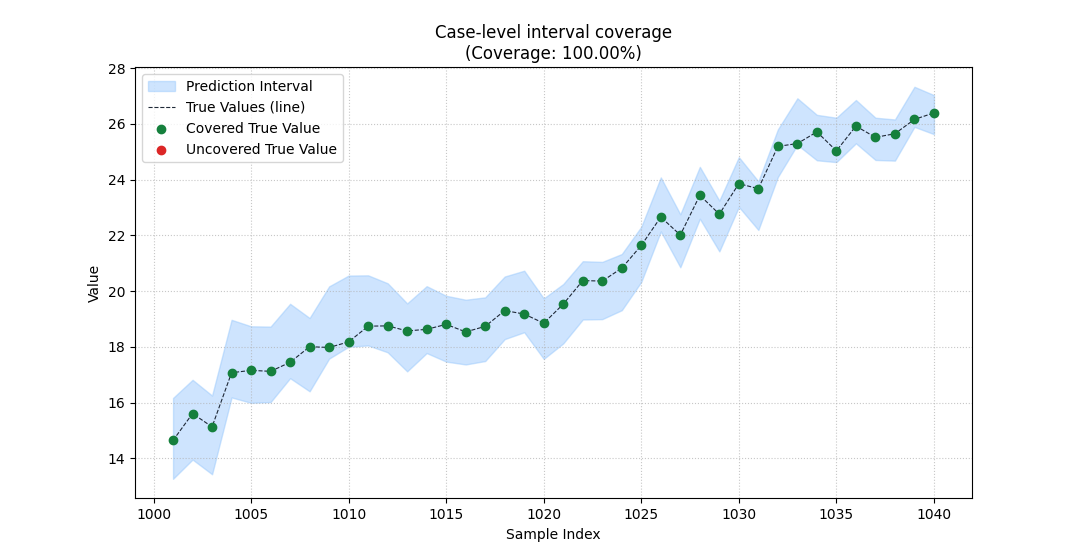
Start with the interval view#
The interval view is the best place to begin when you do not yet trust the summary score.
It shows three things at once:
the prediction interval as a filled band,
the true values as a line,
and covered vs uncovered points in different colors.
That is valuable because a single coverage number cannot
show where failures happen.
In this example, using sample_indices also makes the
x-axis look like real case identifiers rather than simple
array positions.
plot_coverage(
    y_true=y_true,
    y_lower=y_lower,
    y_upper=y_upper,
    sample_indices=sample_ids,
    kind="intervals",
    figsize=(10.8, 5.6),
    title="Case-level interval coverage",
    covered_color="#15803D",
    uncovered_color="#DC2626",
    interval_color="#93C5FD",
    interval_alpha=0.45,
    line_color="#1F2937",
    marker="o",
    marker_size=36,
)
<Axes: title={'center': 'Case-level interval coverage\n(Coverage: 100.00%)'}, xlabel='Sample Index', ylabel='Value'>
How to read the interval plot correctly#
This view is not just decorative. It supports a disciplined reading order:
look for systematic misses above or below the band,
check whether misses cluster in one part of the sample axis,
then compare that visual pattern with the overall coverage rate.
In this demo, most cases are covered, but the misses are not uniformly distributed. They become more frequent where the interval width shrinks.
That is a good reminder that coverage failures often come from interval construction, not only from point forecast bias.
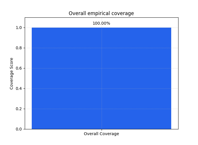
The summary bar gives the aggregate reliability view#
After the case-level inspection, the summary bar answers the global question:
How much of the dataset is covered overall?
This is the compact number you would report in a table or compare across models.
It is especially useful once you have already looked at an interval plot and know the failures are not dominated by a strange artifact.
<Axes: title={'center': 'Overall empirical coverage'}, ylabel='Coverage Score'>
Why the bar is useful but not sufficient#
The summary bar is excellent for comparison, but it hides the distribution of misses.
Two models can have the same coverage score while behaving very differently:
one may miss a few extreme cases,
another may miss many cases in one regime,
and a third may achieve the same coverage only by making the intervals much wider.
So the best habit is:
use
kind='intervals'to understand the pattern,use
kind='summary_bar'to compare models or outputs.
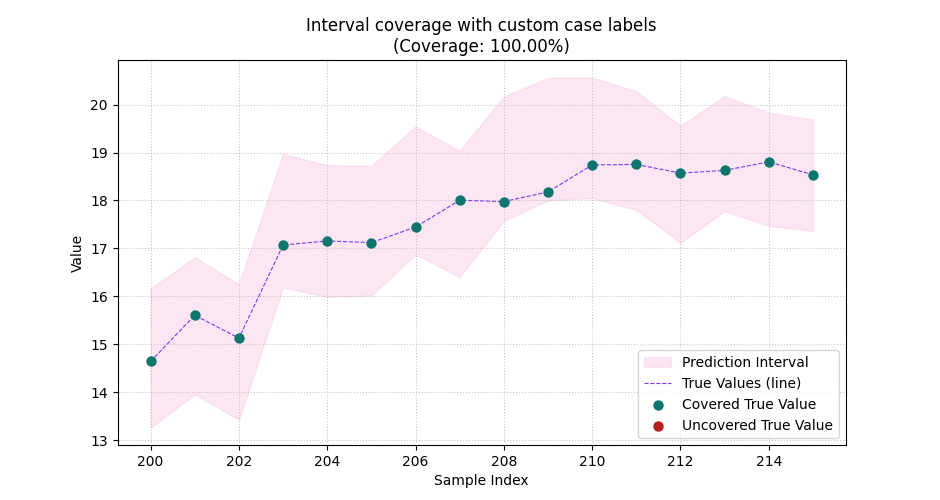
Show why custom sample indices matter#
Many real datasets do not use a simple 0..N-1 ordering.
You may want the x-axis to reflect:
forecast case identifiers,
borehole IDs,
station indices,
ordered year labels,
or any aligned sample numbering already used elsewhere in your report.
Here we zoom to the first 16 cases and use larger spacing between labels so the case positions become easier to read.
plot_coverage(
    y_true=y_true[:16],
    y_lower=y_lower[:16],
    y_upper=y_upper[:16],
    sample_indices=np.arange(200, 216),
    kind="intervals",
    figsize=(9.4, 5.0),
    title="Interval coverage with custom case labels",
    covered_color="#0F766E",
    uncovered_color="#B91C1C",
    interval_color="#FBCFE8",
    line_color="#7C3AED",
    marker_size=42,
)
<Axes: title={'center': 'Interval coverage with custom case labels\n(Coverage: 100.00%)'}, xlabel='Sample Index', ylabel='Value'>
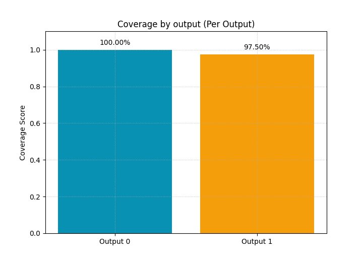
Build a multi-output example#
Now we create two outputs so the lesson can show one of the most useful features of the helper:
comparing reliability output by output.
We intentionally make output 0 reasonably well covered and output 1 noticeably narrower, so their empirical coverage differs enough to be visible in the bar chart.
base_0 = y_true + rng.normal(0.0, 0.25, n_samples)
base_1 = 0.55 * y_true + 4.0 + rng.normal(0.0, 0.30, n_samples)

y_true_multi = np.column_stack([base_0, base_1])

center_0 = y_true_multi[:, 0] + rng.normal(0.0, 0.22, n_samples)
center_1 = y_true_multi[:, 1] + rng.normal(0.0, 0.22, n_samples)

width_0 = np.linspace(1.35, 0.95, n_samples)
width_1 = np.linspace(0.95, 0.42, n_samples)

y_lower_multi = np.column_stack([
    center_0 - width_0,
    center_1 - width_1,
])
y_upper_multi = np.column_stack([
    center_0 + width_0,
    center_1 + width_1,
])

multi_preview = pd.DataFrame(
    {
        "sample_id": sample_ids[:8],
        "output_0_true": y_true_multi[:8, 0],
        "output_0_low": y_lower_multi[:8, 0],
        "output_0_up": y_upper_multi[:8, 0],
        "output_1_true": y_true_multi[:8, 1],
        "output_1_low": y_lower_multi[:8, 1],
        "output_1_up": y_upper_multi[:8, 1],
    }
)

print("\nMulti-output preview")
print(multi_preview)
Multi-output preview
   sample_id  output_0_true  output_0_low  output_0_up  output_1_true  output_1_low  output_1_up
0       1001        15.0250       13.8116      16.5116        12.3893       11.4758      13.3758
1       1002        15.4259       14.7282      17.4076        12.4456       11.5997      13.4726
2       1003        15.1433       14.0206      16.6796        12.1165       11.2016      13.0473
3       1004        17.1874       15.6610      18.2994        13.7008       12.8263      14.6447
4       1005        17.2494       16.5264      19.1444        13.6520       12.8127      14.6039
5       1006        16.8119       15.3107      17.9081        13.8333       13.1557      14.9198
6       1007        17.2794       16.1644      18.7413        13.6586       12.6769      14.4139
7       1008        17.9555       16.8408      19.3972        14.3896       13.7077      15.4174
Compare coverage output by output#
The default summary bar returns one overall average. For multi-output teaching, that can hide important differences.
So we ask the underlying metric to return one value per output by using:
metric_kws={'multioutput': 'raw_values'}
This is often the best choice when one target variable is easier to cover than another.
plot_coverage(
    y_true=y_true_multi,
    y_lower=y_lower_multi,
    y_upper=y_upper_multi,
    kind="summary_bar",
    figsize=(7.2, 5.2),
    title="Coverage by output",
    metric_kws={"multioutput": "raw_values"},
    bar_color=["#0891B2", "#F59E0B"],
    score_annotation_format="{:.2%}",
)
<Axes: title={'center': 'Coverage by output (Per Output)'}, ylabel='Coverage Score'>
Inspect one chosen output in detail#
Once the summary bar reveals a weaker output, the natural next step is to inspect that output alone.
That is why the interval mode requires output_index for
real multi-output arrays. The function needs to know which
output you want to draw.
Below we inspect output 1, the intentionally less reliable target.
plot_coverage(
    y_true=y_true_multi,
    y_lower=y_lower_multi,
    y_upper=y_upper_multi,
    output_index=1,
    sample_indices=sample_ids,
    kind="intervals",
    figsize=(10.8, 5.6),
    title="Detailed coverage view for output 1",
    covered_color="#16A34A",
    uncovered_color="#EA580C",
    interval_color="#FDBA74",
    line_color="#0F172A",
    marker="D",
    marker_size=34,
)
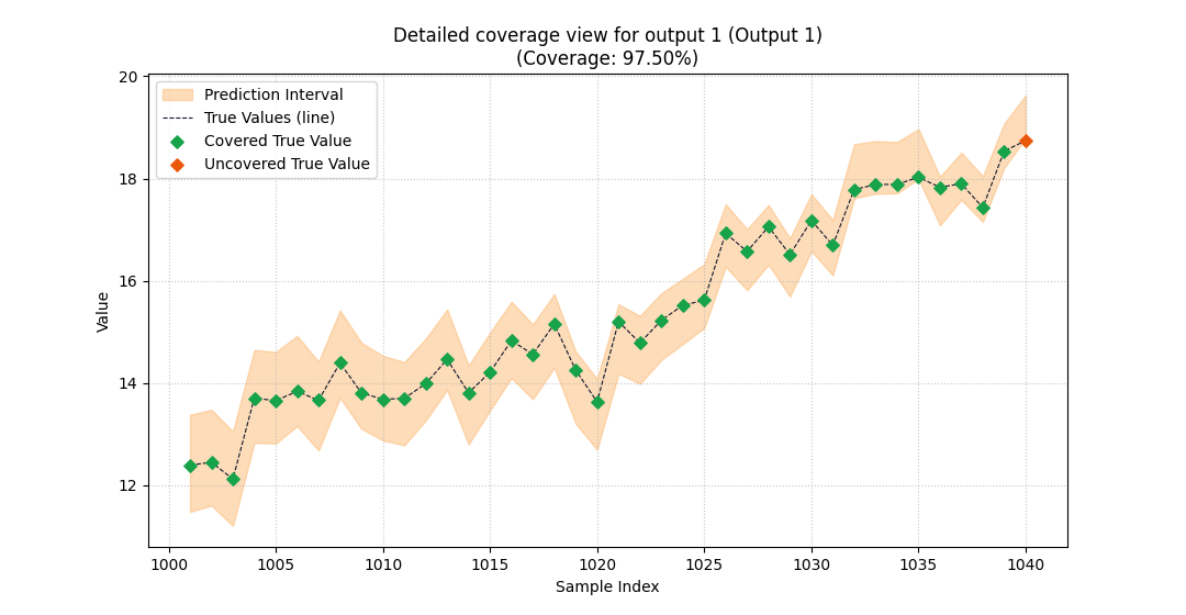
<Axes: title={'center': 'Detailed coverage view for output 1 (Output 1)\n(Coverage: 97.50%)'}, xlabel='Sample Index', ylabel='Value'>
What this output comparison teaches#
This pair of plots shows a very common real workflow:
use the multi-output summary bar to locate the weak target,
then use the interval view to inspect that output’s misses directly.
This is much better than averaging all targets together too early, especially when the outputs have different physical meanings or different uncertainty scales.
A compact checklist for your own data#
When you adapt plot_coverage to real forecast results,
use this checklist.
Build aligned arrays.
y_true,y_lower, andy_uppermust have the same shape.Decide the question first. Choose
kind='intervals'when you want to inspect where misses happen, and choosekind='summary_bar'when you want a compact comparison score.Use real sample labels when helpful.
sample_indicesis worth using whenever the default integer positions are not meaningful enough.For multi-output data, avoid hiding differences. Use
metric_kws={'multioutput': 'raw_values'}for the bar chart, then inspect one output at a time withoutput_index.Never interpret coverage alone. A high-coverage interval can still be too wide. Read it together with sharpness-oriented tools such as weighted interval score and mean interval width.
That final point is the most important lesson on this page:
coverage tells you whether the truth is inside the band, but not whether the band is useful.
plt.show()
Total running time of the script: (0 minutes 0.509 seconds)