
Note
Go to the end to download the full example code.
Learn to compare forecasts visually with plot_forecast_comparison#
This lesson explains how to use
geoprior.plot.evaluation.plot_forecast_comparison
when you want to look at forecasts directly instead of only reading
summary metrics.
Why this function matters#
Metric plots answer questions such as “Which horizon is worse?” or “Which model has lower MAE?”. Those views are essential, but they do not show the shape of the forecast itself.
A forecast can look good numerically while still showing practical problems such as:
a persistent bias above or below the actual values,
a prediction interval that is too narrow or too wide,
specific samples that are much harder than the rest,
or spatial forecast patterns that look implausible.
This plotting helper is therefore a reading tool. It helps users inspect the forecast as a visual object before trusting a metric table. The goal of this page is not only to call the function. It is to teach how to decide:
which sample trajectories deserve closer inspection,
how to read temporal point forecasts,
how to read median-plus-interval forecasts,
and when a spatial view is more informative than a temporal one.
import matplotlib.pyplot as plt
import numpy as np
import pandas as pd

from geoprior.plot.evaluation import plot_forecast_comparison

pd.set_option("display.max_columns", 24)
pd.set_option("display.width", 118)
pd.set_option(
    "display.float_format",
    lambda v: f"{v:0.4f}",
)
What this helper expects#
plot_forecast_comparison is designed around a tidy forecast table
with at least two structural columns:
sample_idxforecast_step
Those two columns tell the function which trajectory to draw and where each point belongs on the horizon axis.
For a simple point-forecast comparison, the key value columns are:
<target>_actual<target>_pred
For a quantile forecast, you typically also provide:
<target>_q10<target>_q50<target>_q90
If you want spatial plots, the table must also contain two coordinate
columns such as coord_x and coord_y.
A practical detail matters here: the current implementation is most
naturally centered on the information already present in
forecast_df. In other words, this lesson focuses on the path that
users can rely on immediately: one long-format table containing
sample-wise forecasts, horizon steps, and optional coordinates.
Build a realistic demo forecast table#
For a gallery lesson, we want one stable table that can support both temporal and spatial examples.
We therefore create a synthetic forecast frame with:
12 spatial locations,
3 forecast steps,
actual values,
point predictions,
10/50/90 quantile columns,
and two coordinate columns for spatial maps.
The demo is intentionally designed so that:
some samples are easier than others,
later horizons drift more,
and interval width grows with forecast step.
That makes the lesson easier to read because the plots tell a coherent forecasting story.
rng = np.random.default_rng(7)
rows: list[dict[str, float | int | str]] = []

n_locations = 12
horizons = [1, 2, 3]

x_coords = np.repeat(np.linspace(113.20, 113.95, 4), 3)
y_coords = np.tile(np.linspace(22.10, 22.70, 3), 4)

for sample_idx, (x_val, y_val) in enumerate(
    zip(x_coords, y_coords, strict=False)
):
    spatial_effect = (
        2.2 * (x_val - x_coords.mean())
        - 1.4 * (y_val - y_coords.mean())
    )
    local_difficulty = 0.35 + 0.12 * (sample_idx % 4)

    for step in horizons:
        baseline = 16.0 + 1.35 * step + spatial_effect
        actual = (
            baseline
            + 0.30 * np.sin(sample_idx / 2.0)
            + rng.normal(0.0, 0.35)
        )

        pred_bias = 0.18 * step
        pred_noise = local_difficulty * (0.80 + 0.25 * step)
        pred = actual + pred_bias + rng.normal(0.0, pred_noise)

        half_width = 0.95 + 0.55 * step
        q10 = pred - half_width
        q50 = pred
        q90 = pred + half_width

        rows.append(
            {
                "sample_idx": sample_idx,
                "forecast_step": step,
                "coord_x": x_val,
                "coord_y": y_val,
                "subsidence_actual": actual,
                "subsidence_pred": pred,
                "subsidence_q10": q10,
                "subsidence_q50": q50,
                "subsidence_q90": q90,
            }
        )

forecast_df = pd.DataFrame(rows)

print("Demo forecast table")
print(forecast_df.head(12))
Demo forecast table
    sample_idx  forecast_step  coord_x  coord_y  subsidence_actual  subsidence_pred  subsidence_q10  subsidence_q50  \
0            0              1 113.2000  22.1000            16.9454          17.2352         15.7352         17.2352
1            0              2 113.2000  22.1000            18.1991          18.1538         16.1038         18.1538
2            0              3 113.2000  22.1000            19.4859          19.4879         16.8879         19.4879
3            1              1 113.2000  22.4000            16.6899          17.5313         16.0313         17.5313
4            1              2 113.2000  22.4000            17.8466          17.8274         15.7774         17.8274
5            1              3 113.2000  22.4000            19.5403          20.3403         17.7403         20.3403
6            2              1 113.2000  22.7000            16.3943          15.9979         14.4979         15.9979
7            2              2 113.2000  22.7000            17.6972          18.5905         16.5405         18.5905
8            2              3 113.2000  22.7000            18.5870          18.7085         16.1085         18.7085
9            3              1 113.4500  22.1000            17.1288          16.3475         14.8475         16.3475
10           3              2 113.4500  22.1000            18.4996          18.6427         16.5927         18.6427
11           3              3 113.4500  22.1000            20.0506          20.8892         18.2892         20.8892

    subsidence_q90
0          18.7352
1          20.2038
2          22.0879
3          19.0313
4          19.8774
5          22.9403
6          17.4979
7          20.6405
8          21.3085
9          17.8475
10         20.6927
11         23.4892
Read the structure before plotting#
A useful habit is to verify the structure explicitly before drawing any figure. This avoids two very common user mistakes:
using the wrong target prefix,
expecting the helper to infer sample trajectories without
sample_idx.
In this lesson the target prefix is subsidence. That is why all
examples below use target_name='subsidence'.
print("\nColumns used in this lesson")
print(list(forecast_df.columns))

print("\nRows per sample")
print(forecast_df.groupby("sample_idx").size().head())

print("\nRows per forecast step")
print(forecast_df.groupby("forecast_step").size())
Columns used in this lesson
['sample_idx', 'forecast_step', 'coord_x', 'coord_y', 'subsidence_actual', 'subsidence_pred', 'subsidence_q10', 'subsidence_q50', 'subsidence_q90']

Rows per sample
sample_idx
0    3
1    3
2    3
3    3
4    3
dtype: int64

Rows per forecast step
forecast_step
1    12
2    12
3    12
dtype: int64
Start with the most important reading: temporal trajectories#
The temporal mode is usually the best place to begin.
Why? Because it answers the most immediate visual question:
For a few concrete samples, how does the predicted trajectory compare to the actual trajectory as the forecast horizon advances?
We begin with point forecasts only. This keeps the figure simple and helps users learn the plotting logic before adding uncertainty bands.
By default, sample_ids='first_n' and num_samples=3 already
give a useful small panel view, so this is a good first call for new
users.
plot_forecast_comparison(
    forecast_df=forecast_df,
    target_name="subsidence",
    kind="temporal",
    sample_ids="first_n",
    num_samples=3,
    output_dim=1,
    max_cols=2,
    figsize_per_subplot=(6.2, 4.2),
    point_plot_kwargs={"color": "tab:blue"},
)
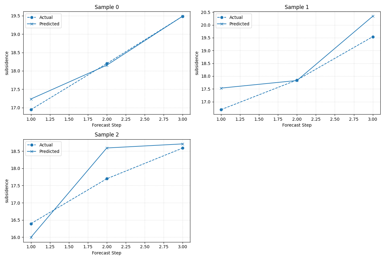
[DEBUG] Selected sample_idx: [0, 1, 2]
[INFO] Forecast visualisation complete.
How to read the temporal point-forecast view#
Each panel corresponds to one sample_idx. The x-axis is
forecast_step and the y-axis is the target value.
When you inspect this view, read it in this order:
Does the prediction follow the overall level of the actual line?
Is there a consistent upward or downward bias?
Does the mismatch get worse at later horizons?
Are some samples much harder than others?
That last question is especially important. A model can have a good average metric while still failing on a small but meaningful subset of samples. This function helps expose those cases.
Select specific difficult or interesting samples#
After a first broad look, users usually want to inspect specific samples rather than only the first few rows.
Here we manually select three samples from different parts of the spatial domain. This is a good pattern when you already know that some sites are operationally important, unusual, or error-prone.
plot_forecast_comparison(
    forecast_df=forecast_df,
    target_name="subsidence",
    kind="temporal",
    sample_ids=[1, 5, 10],
    output_dim=1,
    max_cols=3,
    figsize_per_subplot=(5.2, 4.0),
    titles=[
        "Western site",
        "Central site",
        "Eastern site",
    ],
    point_plot_kwargs={"linewidth": 2.0},
)
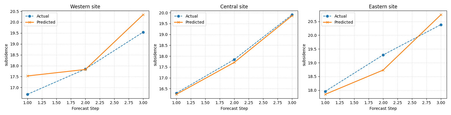
[DEBUG] Selected sample_idx: [1, 5, 10]
[INFO] Forecast visualisation complete.
Why sample-wise selection is important#
A forecast table may contain hundreds or thousands of trajectories. Looking at all of them at once is rarely useful.
The better workflow is usually:
start with the first few samples,
identify cases that deserve more attention,
then pass an explicit list to
sample_ids.
In other words, this helper is strongest when used as a targeted inspection tool, not as an attempt to display every sample at once.
Add uncertainty with quantile bands#
Point forecasts are only part of the story.
When quantile columns are available, the temporal view becomes much more informative because it can show:
the median forecast,
the actual values,
and a prediction interval using the outermost supplied quantiles.
In this demo, the interval is built from q10 and q90, and the median line is q50.
plot_forecast_comparison(
    forecast_df=forecast_df,
    target_name="subsidence",
    quantiles=[0.10, 0.50, 0.90],
    kind="temporal",
    sample_ids=[0, 4, 8],
    output_dim=1,
    max_cols=3,
    figsize_per_subplot=(5.3, 4.1),
    median_plot_kwargs={"color": "tab:green", "linewidth": 2.0},
    fill_between_kwargs={"alpha": 0.25},
)
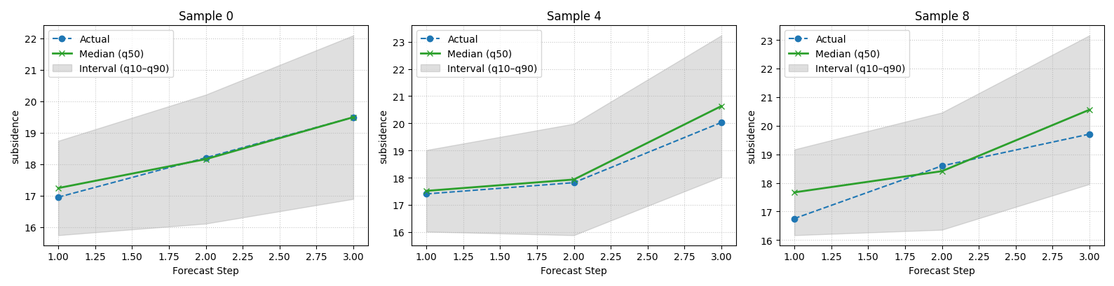
[DEBUG] Selected sample_idx: [0, 4, 8]
[INFO] Forecast visualisation complete.
How to read the interval view#
This is one of the most useful views in the evaluation gallery.
Read it with three questions in mind:
Is the actual line usually inside the interval?
Does the median forecast stay near the actual values?
Does the interval widen sensibly as horizon increases?
A very narrow interval that frequently misses the actual values is not trustworthy. But an interval that becomes excessively wide may also be unhelpful in practice. This plot gives users the visual context behind later coverage and WIS metrics.
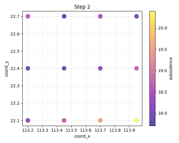
Move from temporal reading to spatial reading#
Temporal plots are best when you want to inspect sample trajectories. Spatial plots are better when you want to inspect patterns across the map at a specific horizon.
In the current implementation, the spatial mode colors each point by the point prediction or, when quantiles are provided, by the median forecast column.
This answers a different question:
At step H1, H2, or H3, what does the forecasted field look like over space?
plot_forecast_comparison(
    forecast_df=forecast_df,
    target_name="subsidence",
    quantiles=[0.10, 0.50, 0.90],
    kind="spatial",
    horizon_steps=[1, 2, 3],
    spatial_cols=["coord_x", "coord_y"],
    output_dim=1,
    max_cols=3,
    figsize_per_subplot=(5.1, 4.2),
    cmap="viridis",
    s=85,
    alpha=0.85,
)
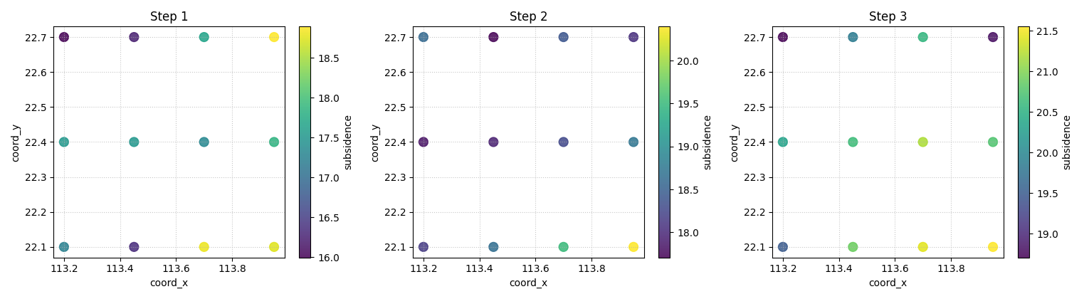
[DEBUG] Selected sample_idx: [0, 1, 2]
[INFO] Forecast visualisation complete.
How to read the spatial view#
Each panel now corresponds to one forecast step instead of one sample. The point locations are fixed, and the color shows the forecast value.
This view is especially useful for checking whether:
the predicted field remains spatially smooth or coherent,
strong hotspots appear where you expect them,
later horizons produce unrealistic spatial jumps,
or the map pattern becomes too noisy.
In a real project, this is often the moment when a user notices that a model is numerically acceptable but spatially unconvincing.
Compare a single horizon in point-forecast mode#
We can also call the spatial view without quantiles. In that case the
color reflects <target>_pred directly.
This is the simplest spatial usage pattern and is a good default when the workflow is deterministic rather than probabilistic.
plot_forecast_comparison(
    forecast_df=forecast_df,
    target_name="subsidence",
    kind="spatial",
    horizon_steps=2,
    spatial_cols=["coord_x", "coord_y"],
    output_dim=1,
    max_cols=1,
    figsize_per_subplot=(6.0, 4.8),
    cmap="plasma",
    s=95,
)
[DEBUG] Selected sample_idx: [0, 1, 2]
[INFO] Forecast visualisation complete.
What this function is best at#
plot_forecast_comparison is strongest when the user wants to see
the forecast rather than only score it.
It is especially good for:
a quick inspection of a few sample trajectories,
visual verification of median-plus-interval behaviour,
checking whether difficult samples look pathological,
and examining horizon-specific spatial forecast maps.
In contrast, it is not the main tool for aggregated comparison across
many groups or many metrics. For those tasks, the evaluation gallery
should usually move next to helpers such as
plot_metric_over_horizon or the calibration/interval plots.
A practical checklist for your own data#
Before applying this helper to a real saved forecast table, check the following:
Does your table contain
sample_idxandforecast_step?Are the target columns named consistently with
target_name?For interval mode, do your quantile columns follow the qXX naming?
For spatial mode, do the coordinate columns exist and have no unexpected missing values?
Are you selecting only a manageable number of samples for temporal inspection?
A simple adaptation pattern is:
replace
forecast_dfwith your saved long-format prediction table,set
target_nameto your real target prefix,pass explicit
sample_idsfor important trajectories,and use
spatial_colsonly when the coordinates are already in the same frame.
That workflow keeps the function honest and readable.
Final lesson takeaway#
A forecast comparison plot is not a replacement for evaluation metrics. It is the visual companion that helps users understand why a forecast is acceptable, suspicious, overconfident, or spatially implausible.
A good workflow is therefore:
inspect a few temporal trajectories,
inspect interval behaviour if quantiles exist,
inspect one or more spatial horizons when coordinates are present,
then move to horizon-wise metrics and calibration summaries.
That combination gives a much more trustworthy evaluation story than metrics alone.
plt.close("all")
Total running time of the script: (0 minutes 1.726 seconds)