
Note
Go to the end to download the full example code.
Forecast by horizon step with plot_forecast_by_step#
This lesson teaches how to inspect forecasts step-by-step
with geoprior.plot.plot_forecast_by_step().
Why this figure matters#
The previous forecasting lessons answered two important questions:
plot_forecasts: how do individual samples evolve through the horizon?forecast_view: what do forecast fields look like across space for each year?plot_eval_future: how should holdout validation be separated from future projection?
This lesson asks a different question:
What changes from one forecast step to the next, and how can we inspect those changes directly?
That is the role of plot_forecast_by_step.
The function is designed for a long-format forecast table where
each row is one sample at one horizon step, and it builds a grid
whose rows correspond to forecast_step values. It supports
spatial scatter plots when coordinate columns are available, and it
falls back to line plots when they are not. That makes it especially
useful for horizon-wise diagnostics and for deterministic or nearly
deterministic forecasts.
What this lesson teaches#
We will:
build a compact synthetic long-format forecast table,
inspect how the forecast changes with step,
render a spatial step-by-step view,
render a line-based step-by-step comparison,
learn how to read rows and columns in the figure,
connect the visual story to a small numerical summary.
The lesson uses synthetic data so it stays fully executable during the documentation build.
Imports#
We use the real public plotting backend.
import numpy as np
import pandas as pd

from geoprior.plot import plot_forecast_by_step
from geoprior.scripts import utils as script_utils
Step 1 - Build a compact long-format forecast table#
plot_forecast_by_step expects a long-format DataFrame with a
forecast_step column and forecast value columns such as
subsidence_q10, subsidence_q50, subsidence_q90,
and optionally subsidence_actual.
Instead of building a plain rectangular grid by hand, we now use
the shared synthetic-spatial helpers from geoprior.scripts.
That gives us:
a more city-like support,
a smoother and more interpretable spatial field,
quantiles generated from one coherent mean-plus-scale model,
cleaner control over how the field changes by horizon.
The parameter comments below are intentionally explicit so the user can understand how spatial synthetic data are constructed.
rng = np.random.default_rng(101)

steps = [1, 2, 3, 4]
years = {
    1: 2024,
    2: 2025,
    3: 2026,
    4: 2027,
}

# Build one reusable support cloud.
#
# Key parameters
# --------------
# city:
#     Only a label for the synthetic support.
# center_x, center_y:
#     Center of the projected coordinate system.
# span_x, span_y:
#     Half-width and half-height of the domain.
# nx, ny:
#     Number of support locations before masking.
# jitter_x, jitter_y:
#     Small perturbations so the grid does not look too artificial.
# footprint:
#     Shape of the retained support. "ellipse" is compact and works
#     well for generic lessons. You can also use "nansha_like" or
#     "zhongshan_like" for more distinctive urban shapes.
# seed:
#     Keeps the support reproducible across doc builds.

support = script_utils.make_spatial_support(
    script_utils.SpatialSupportSpec(
        city="ForecastDemo",
        center_x=5_500.0,
        center_y=3_750.0,
        span_x=5_200.0,
        span_y=3_600.0,
        nx=23,
        ny=17,
        jitter_x=35.0,
        jitter_y=28.0,
        footprint="ellipse",
        seed=101,
    )
)

# Build a baseline median field.
#
# Key parameters
# --------------
# amplitude:
#     Overall signal strength.
# drift_x, drift_y:
#     Large-scale east-west / north-south trend.
# phase:
#     Phase of the smooth oscillatory component.
# local_weight:
#     Adds small local texture so the map is not overly smooth.

base_mean = script_utils.make_spatial_field(
    support,
    amplitude=2.25,
    drift_x=0.95,
    drift_y=0.45,
    phase=0.55,
    local_weight=0.18,
)

# Build a baseline uncertainty field.
#
# Key parameters
# --------------
# base:
#     Global baseline uncertainty.
# x_weight:
#     Lets uncertainty increase gradually across space.
# hotspot_weight:
#     Adds extra spread near the dominant hotspot.
#
# This makes the interval width spatially meaningful rather than
# constant everywhere.

base_scale = script_utils.make_spatial_scale(
    support,
    base=0.26,
    x_weight=0.08,
    hotspot_weight=0.05,
)

rows: list[pd.DataFrame] = []

for step in steps:
    # Horizon growth controls how strongly the response increases from
    # one forecast step to the next.
    growth = {
        1: 1.00,
        2: 1.18,
        3: 1.40,
        4: 1.68,
    }[step]

    # Evolve the central field through the horizon.
    #
    # Key parameters
    # --------------
    # base_field:
    #     The shared spatial pattern that persists over time.
    # step:
    #     Zero-based step index used by the evolution helper.
    # growth:
    #     Multiplies the overall field intensity.
    #
    # This keeps the hotspot in roughly the same place while letting
    # it intensify with lead time.
    mean_step = script_utils.evolve_spatial_field(
        support,
        base_field=base_mean,
        step=step - 1,
        growth=growth,
    )

    # Let uncertainty widen with horizon.
    #
    # Earlier steps are tighter; later steps are wider.
    scale_step = base_scale * {
        1: 0.95,
        2: 1.10,
        3: 1.28,
        4: 1.48,
    }[step]

    # Sample a synthetic "actual" field near the step-specific mean.
    #
    # This is only for the lesson. In a real evaluation table, the
    # actual values would come from observations.
    actual_step = script_utils.make_noisy_actual(
        mean_step,
        0.55 * scale_step,
        rng=rng,
        noise_scale=1.0,
    )

    # Package the step into one forecast-ready table.
    #
    # Quantiles are generated coherently from the same mean and scale,
    # so q10 < q50 < q90 is naturally preserved.
    rows.append(
        script_utils.make_spatial_quantile_frame(
            support,
            year=years[step],
            forecast_step=step,
            mean=mean_step,
            scale=scale_step,
            quantiles=(0.1, 0.5, 0.9),
            actual=actual_step,
            prefix="subsidence",
            unit="mm",
        )
    )

forecast_df = pd.concat(rows, ignore_index=True)

print("Forecast table shape:", forecast_df.shape)
print("")
print(forecast_df.head(10).to_string(index=False))
Forecast table shape: (688, 10)

 sample_idx  forecast_step  coord_t   coord_x   coord_y subsidence_unit  subsidence_q10  subsidence_q50  subsidence_q90  subsidence_actual
          0              1     2024 3533.6146 1520.4101              mm          1.0956          1.4428          1.7899             1.3251
          1              1     2024 3997.0665 1479.4398              mm          0.9786          1.3302          1.6818             1.0232
          2              1     2024 4580.2881 1460.6880              mm          0.7805          1.1380          1.4956             1.2306
          3              1     2024 4989.0848 1479.2293              mm          0.6367          0.9991          1.3615             1.1148
          4              1     2024 5528.1858 1489.3988              mm          0.4679          0.8379          1.2079             0.7887
          5              1     2024 5974.4992 1507.3745              mm          0.3760          0.7534          1.1308             0.8129
          6              1     2024 6454.2211 1524.2988              mm          0.3187          0.7045          1.0902             0.9876
          7              1     2024 6964.8475 1517.4952              mm          0.2468          0.6396          1.0324             0.8184
          8              1     2024 7388.3767 1559.1494              mm          0.2121          0.6099          1.0077             0.7307
          9              1     2024 2654.5779 1958.9284              mm          1.2091          1.5480          1.8870             1.6481
Step 2 - Inspect the table by forecast step#
Before plotting, it helps to summarize how the forecast evolves from one step to the next.
We track:
mean actual value,
mean q50,
mean interval width.
This gives a compact horizon-wise summary of the same story we will inspect visually.
forecast_df["interval_width"] = (
    forecast_df["subsidence_q90"] - forecast_df["subsidence_q10"]
)

step_summary = (
    forecast_df.groupby("forecast_step")
    .agg(
        n_pixels=("sample_idx", "size"),
        mean_actual=("subsidence_actual", "mean"),
        mean_q10=("subsidence_q10", "mean"),
        mean_q50=("subsidence_q50", "mean"),
        mean_q90=("subsidence_q90", "mean"),
        mean_width=("interval_width", "mean"),
    )
    .reset_index()
)

print("")
print("Step summary")
print(step_summary.to_string(index=False))
Step summary
 forecast_step  n_pixels  mean_actual  mean_q10  mean_q50  mean_q90  mean_width
             1       172       1.4177    1.0537    1.4294    1.8051      0.7514
             2       172       1.6544    1.2337    1.6687    2.1037      0.8700
             3       172       2.1937    1.6765    2.1827    2.6889      1.0124
             4       172       2.9651    2.3860    2.9713    3.5566      1.1706
Step 3 - Render the spatial step-by-step figure#
This is the most characteristic use of plot_forecast_by_step.
We set:
kind="spatial"value_prefixes=["subsidence"]spatial_cols=("coord_x", "coord_y")
The function will create:
one row per forecast step,
one column per forecast metric (q10 / q50 / q90),
a shared color scale because we use
cbar="uniform".
This view is ideal when the main question is:
how does the spatial field change from one lead time to the next?
plot_forecast_by_step(
    df=forecast_df,
    value_prefixes=["subsidence"],
    kind="spatial",
    steps=[1, 2, 3, 4],
    step_names={
        1: "Near-horizon",
        2: "Short-term",
        3: "Mid-horizon",
        4: "Late-horizon",
    },
    spatial_cols=("coord_x", "coord_y"),
    cmap="viridis",
    cbar="uniform",
    axis_off=False,
    show_grid=True,
    grid_props={"linestyle": ":", "alpha": 0.45},
    figsize=(10.2, 9.2),
    verbose=0,
)
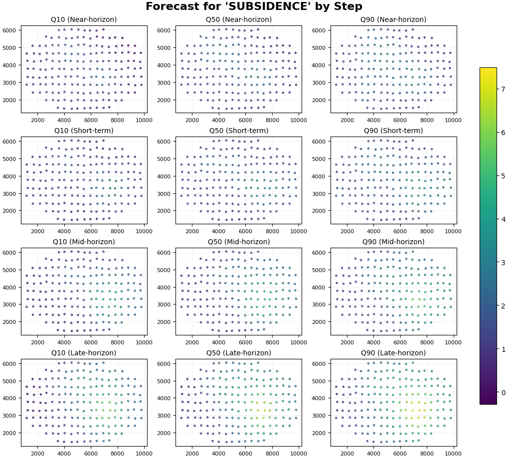
How to read the spatial step-by-step figure#
Read the rows first#
Each row corresponds to one forecast_step.
The row-level question is:
how does the predicted field evolve as the horizon advances?
In this synthetic lesson, later steps should generally show:
stronger median values,
wider plausible range,
a hotspot that stays in roughly the same place but intensifies.
Read the columns second#
Each column corresponds to a forecast metric:
q10: lower scenario,
q50: central scenario,
q90: upper scenario.
The column-level question is:
how much uncertainty surrounds the central forecast at each step?
Why uniform color scaling matters#
Because all panels share one color scale, comparisons across rows and columns remain honest:
brighter colors at Step 4 really indicate larger forecast values than the same colors at Step 1,
apparent changes are not caused by per-panel rescaling.
Step 4 - Render the line-based comparison view#
plot_forecast_by_step can also fall back to line plots.
This is useful when:
you want a compact transect-style comparison,
or when no spatial columns are available.
Since the fallback line plot uses the DataFrame index on the x-axis,
we first sort each step by coord_x. That way, the line view acts
like an ordered left-to-right transect through space.
transect_df = (
    forecast_df.sort_values(
        ["forecast_step", "coord_x", "coord_y"]
    )
    .reset_index(drop=True)
)

plot_forecast_by_step(
    df=transect_df,
    value_prefixes=["subsidence"],
    kind="dual",
    steps=[1, 4],
    step_names={
        1: "Near-horizon transect",
        4: "Late-horizon transect",
    },
    spatial_cols=None,
    max_cols="auto",
    cmap="viridis",
    cbar="uniform",
    axis_off=False,
    show_grid=True,
    grid_props={"linestyle": ":", "alpha": 0.65},
    figsize=(12.0, 5.8),
    verbose=0,
)
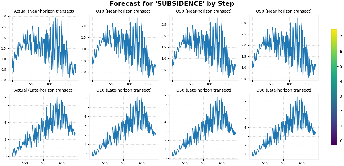
How to read the line-based view#
The line view is not the same as a time-series plot over calendar time. Here, each row is still a forecast step, but the x-axis is simply the DataFrame order.
Because we sorted by coord_x first, the line now behaves like a
horizontal spatial transect.
This view is useful for questions such as:
does the median prediction track the actual signal shape?
are the intervals too narrow or too wide along the transect?
how much stronger is Step 4 than Step 1?
Step 5 - Add a small step-wise comparison table#
A robust lesson usually combines the figure with a small numerical summary.
We compute:
MAE of q50 against actual by step,
empirical coverage of the [q10, q90] interval by step,
fraction of pixels whose q50 exceeds a chosen threshold.
threshold = 5.0

metric_rows: list[dict[str, float | int]] = []

for step, sub in forecast_df.groupby("forecast_step", sort=True):
    mae_q50 = np.mean(
        np.abs(sub["subsidence_q50"] - sub["subsidence_actual"])
    )
    coverage_10_90 = np.mean(
        (
            sub["subsidence_actual"] >= sub["subsidence_q10"]
        )
        & (
            sub["subsidence_actual"] <= sub["subsidence_q90"]
        )
    )
    share_above = np.mean(sub["subsidence_q50"] > threshold)

    metric_rows.append(
        {
            "forecast_step": int(step),
            "mae_q50_vs_actual": float(mae_q50),
            "coverage_q10_q90": float(coverage_10_90),
            "share_q50_above_threshold": float(share_above),
        }
    )

metric_table = pd.DataFrame(metric_rows)

print("")
print("Step-wise evaluation summary")
print(metric_table.to_string(index=False))
Step-wise evaluation summary
 forecast_step  mae_q50_vs_actual  coverage_q10_q90  share_q50_above_threshold
             1             0.1418            0.9767                     0.0000
             2             0.1478            0.9942                     0.0000
             3             0.1792            0.9767                     0.0116
             4             0.1998            0.9709                     0.1105
How to interpret this table#
These numbers help anchor the visual reading:
mae_q50_vs_actual: how close the central forecast is to the observed holdout values;coverage_q10_q90: how often the observed value falls inside the interval;share_q50_above_threshold: how the high-response footprint changes with lead time.
In this synthetic lesson, later steps should generally show:
larger median values,
a larger share of pixels above the threshold,
wider intervals.
Step 6 - Practical interpretation guide#
plot_forecast_by_step is especially useful when the forecast
question is inherently horizon-wise.
Use it when you want to ask:
what changes most from Step 1 to Step 2?
does the hotspot intensify steadily through the horizon?
are later steps substantially more uncertain?
does the spatial footprint expand as lead time increases?
This is why the function complements the earlier forecasting pages:
plot_forecastsis more sample-centric,forecast_viewis more year-centric,plot_eval_futureis more split-centric,plot_forecast_by_stepis explicitly horizon-centric.
Step 7 - When this page is most useful#
This lesson becomes especially valuable in two situations:
Deterministic forecasts When there are no quantile columns, a step-by-step view is often the clearest way to inspect the predicted field.
Horizon diagnostics Even for probabilistic forecasts, this page is often the fastest way to see whether uncertainty or hotspot structure changes smoothly from one step to the next.
So this page should be read as the advanced quick-look diagnostic of the forecasting gallery.
Total running time of the script: (0 minutes 2.188 seconds)