
Note
Go to the end to download the full example code.
Find and read spatial hotspots before acting on a map#
This lesson explains how to use
geoprior.plot.spatial.plot_hotspots().
Why this plot matters#
A spatial scatter map is useful when you want to see the full field, but it can be hard to answer a more practical question:
Where are the unusually high values that deserve attention first?
That is the purpose of a hotspot plot.
plot_hotspots combines two visual layers:
a hexbin background that summarizes the spatial distribution of the mapped variable,
a black-point overlay that marks the observations classified as hotspots.
This makes the function useful when you need to move from general map reading to targeted decision support. For example:
where are the strongest forecasted subsidence pockets,
which year shows the most concentrated high-risk pattern,
whether a hotspot region is isolated or part of a broader high-value belt,
and whether your chosen threshold is identifying a few extreme points or a large fraction of the domain.
The goal of this page is therefore not only to call the function. It is also to teach how to choose the threshold and how to interpret what the hotspot overlay is really saying.
from __future__ import annotations

import matplotlib.pyplot as plt
import numpy as np
import pandas as pd

from geoprior.plot.spatial import plot_hotspots

pd.set_option("display.max_columns", 20)
pd.set_option("display.width", 100)
pd.set_option("display.float_format", lambda v: f"{v:0.3f}")
Build a small, realistic spatial dataset#
A hotspot lesson is easier to understand when the field contains a clear background trend plus a few unusually intense pockets. We create exactly that here:
a smooth east-west / north-south structure,
a broad uplift in later years,
and two localized hotspots that become more visible with time.
This gives us a realistic setting for comparing percentile-based and fixed-threshold hotspot selection.
rng = np.random.default_rng(42)

coords_x = np.linspace(113.10, 113.65, 18)
coords_y = np.linspace(22.55, 22.98, 14)
years = [2023, 2024, 2025]

rows: list[dict[str, float | int]] = []
for year in years:
    for x in coords_x:
        for y in coords_y:
            background = (
                6.5
                + 8.0 * (x - coords_x.min())
                + 5.5 * (y - coords_y.min())
                + 1.3 * (year - 2023)
            )

            hot1 = 15.0 * np.exp(
                -(((x - 113.52) ** 2) / 0.0018)
                -(((y - 22.83) ** 2) / 0.0012)
            )
            hot2 = 10.0 * np.exp(
                -(((x - 113.28) ** 2) / 0.0010)
                -(((y - 22.66) ** 2) / 0.0009)
            )

            noise = rng.normal(0.0, 0.9)
            value = background + hot1 + hot2 + noise

            rows.append(
                {
                    "coord_x": x,
                    "coord_y": y,
                    "year": year,
                    "subsidence_q50": value,
                }
            )

spatial_df = pd.DataFrame(rows)

print("Spatial table head")
print(spatial_df.head())
Spatial table head
   coord_x  coord_y  year  subsidence_q50
0  113.100   22.550  2023           6.774
1  113.100   22.583  2023           5.746
2  113.100   22.616  2023           7.539
3  113.100   22.649  2023           7.892
4  113.100   22.682  2023           5.472
What the function needs#
plot_hotspots expects:
a DataFrame,
one mapped numeric column,
two spatial columns,
and either a time column plus time values, or explicit
dt_values.
The function then builds a panel of time slices. In each slice:
a hexbin map summarizes the spatial field,
a threshold is computed,
points at or above that threshold are overlaid as hotspots.
The threshold can come from:
a fixed value via
threshold=, ora percentile via
percentile=whenthresholdis left asNone.
This choice is the heart of the lesson: it changes the meaning of a hotspot.
Start with percentile-based hotspots#
A percentile threshold is usually the best first pass when the user wants to find the top tail of the current distribution without first deciding on a physical cutoff.
Here, percentile=92 means that each yearly slice will mark roughly
the top 8 percent of values as hotspots.
This is useful for exploratory analysis because it adapts naturally to the scale of each time slice.
figs = plot_hotspots(
    spatial_df,
    value_col="subsidence_q50",
    dt_col="year",
    dt_values=years,
    percentile=92,
    grid_size=28,
    cmap="magma",
    marker_size=32,
    alpha=0.70,
    cbar="uniform",
    max_cols=3,
    show_grid=True,
    grid_props={"linestyle": ":", "alpha": 0.35},
)

plt.show()
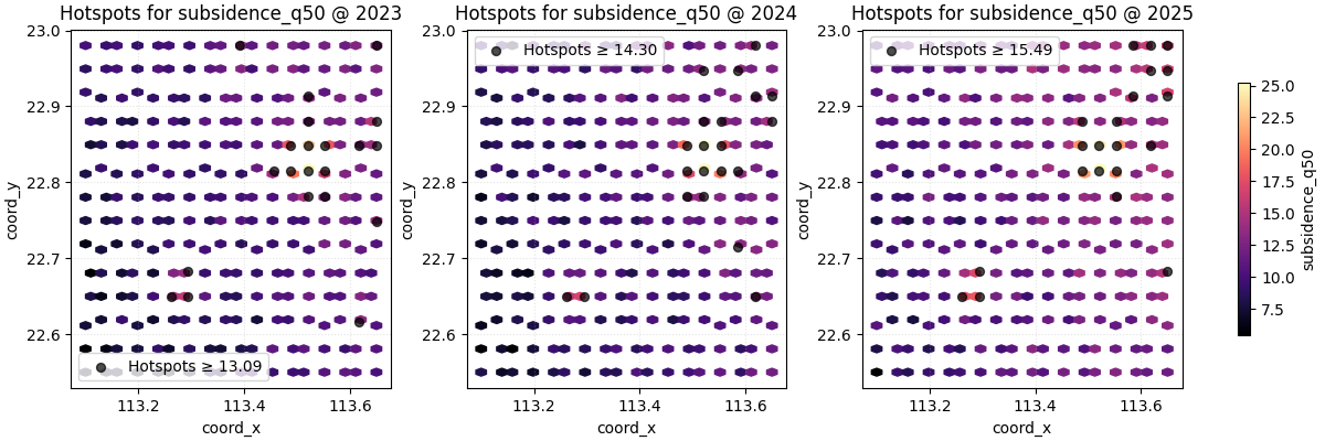
How to read the first hotspot map#
A good reading order is:
inspect the hexbin background first,
then see where the black hotspot points cluster,
then compare whether those hotspots stay in the same region or move between years.
In this demo, the hotspot overlay should not look random. It should concentrate around the stronger synthetic pockets, showing that the threshold is isolating meaningful local extremes instead of scattered noise.
This is exactly why the hexbin layer matters: it helps you judge whether the hotspots are part of a coherent high-value zone.
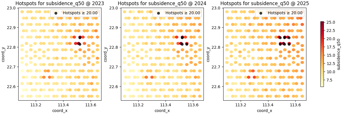
Fixed thresholds answer a different question#
A percentile threshold asks:
Which values are unusually high relative to the current slice?
A fixed threshold asks a different and often more operational question:
Which locations exceed a user-defined level of concern?
That is often the better choice when your team already has a reporting, engineering, or alert threshold.
figs = plot_hotspots(
    spatial_df,
    value_col="subsidence_q50",
    dt_col="year",
    dt_values=years,
    threshold=20.0,
    grid_size=(26, 20),
    cmap="YlOrRd",
    marker_size=36,
    alpha=0.75,
    cbar="uniform",
    max_cols=3,
    show_grid=False,
)

plt.show()
Percentile vs fixed threshold: when to use each#
A simple practical rule is:
use
percentilefor exploration,use
thresholdfor decision-oriented communication.
Percentiles are easier when the variable scale changes from slice to slice or from city to city. Fixed thresholds are better when the message is tied to a concrete level, such as an engineering trigger or a target exceedance value.
Another important nuance is comparability:
percentile hotspots show relative extremeness,
fixed-threshold hotspots show absolute exceedance.
Those are not the same question, so they should not be interpreted as interchangeable.
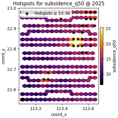
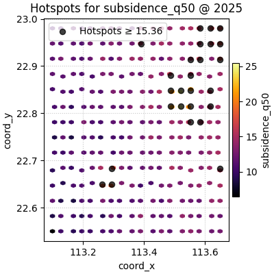
Grid size controls the background texture#
The hotspot points are based on the raw observations, but the hexbin
background depends strongly on grid_size.
Smaller grids produce broader cells and a smoother background. Larger grids reveal more local structure but can make the map feel visually busier.
It is a good habit to try at least two grid sizes before deciding that the hotspot pattern is truly clear.
figs = plot_hotspots(
    spatial_df,
    value_col="subsidence_q50",
    dt_col="year",
    dt_values=[2025],
    percentile=90,
    grid_size=16,
    cmap="inferno",
    marker_size=34,
    alpha=0.75,
    cbar="individual",
    max_cols=1,
)
plt.show()

figs = plot_hotspots(
    spatial_df,
    value_col="subsidence_q50",
    dt_col="year",
    dt_values=[2025],
    percentile=90,
    grid_size=40,
    cmap="inferno",
    marker_size=34,
    alpha=0.75,
    cbar="individual",
    max_cols=1,
)
plt.show()
The colorbar choice changes the comparison task#
Like the earlier spatial lessons, plot_hotspots supports:
cbar='uniform'for one shared colorbar,cbar='individual'for one colorbar per subplot.
The shared colorbar is usually better for comparing intensity across years, because every panel stays on the same color scale.
The individual colorbar is more forgiving when one slice has a very different numeric range, but it weakens direct visual comparison across panels.
For a time-comparison hotspot lesson, shared colorbars are usually the most honest default.
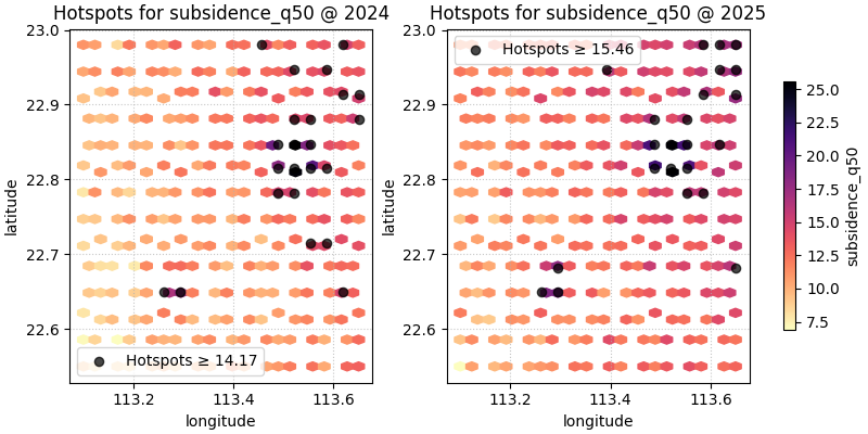
You can use your own coordinate names#
Real tables often use names such as longitude and latitude.
The helper supports that through spatial_cols.
spatial_named = spatial_df.rename(
    columns={
        "coord_x": "longitude",
        "coord_y": "latitude",
    }
)

figs = plot_hotspots(
    spatial_named,
    value_col="subsidence_q50",
    spatial_cols=("longitude", "latitude"),
    dt_col="year",
    dt_values=[2024, 2025],
    percentile=91,
    grid_size=24,
    cmap="magma_r",
    marker_size=35,
    alpha=0.72,
    cbar="uniform",
    max_cols=2,
    show_axis="on",
)

plt.show()
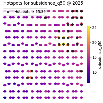
Presentation-style maps can hide the axes#
When the audience already understands the map frame, show_axis='off'
can make the hotspot pattern stand out more clearly.
This is often useful for reports or slide decks where the main message is where the hot zones are, not the exact coordinate labels.
figs = plot_hotspots(
    spatial_df,
    value_col="subsidence_q50",
    dt_col="year",
    dt_values=[2025],
    percentile=90,
    grid_size=28,
    cmap="plasma",
    marker_size=38,
    alpha=0.75,
    cbar="individual",
    max_cols=1,
    show_axis="off",
)

plt.show()
How to use this on your own data#
The most common real workflow is:
start from a forecast or evaluation table,
choose one mapped value column such as
subsidence_q50or an exceedance probability,decide whether hotspots should be relative (percentile) or absolute (threshold),
compare a few time slices with a shared colorbar,
then move to ROI or contour views if one region needs deeper study.
A minimal real-data call often looks like this:
plot_hotspots(df, value_col='subsidence_q50', dt_col='coord_t',
dt_values=[2025, 2027, 2030], percentile=95)
or, with a physical alert level:
plot_hotspots(df, value_col='subsidence_q50', dt_col='coord_t',
dt_values=[2025, 2027, 2030], threshold=25.0)
The most important decision is not the colormap. It is whether your hotspot definition should mean “top tail of this slice” or “crosses a meaningful level”.
A final reading checklist#
Before trusting a hotspot map, ask:
Are the hotspots clustered in a coherent spatial region?
Did I use a percentile when I actually needed a fixed threshold?
Is the background grid size hiding local structure or exaggerating it?
Is the shared color scale appropriate for comparing slices?
Do the hotspot points support the same story suggested by the hexbin background?
When the answer is yes, plot_hotspots becomes a strong bridge
between broad spatial exploration and targeted follow-up analysis.
Total running time of the script: (0 minutes 1.655 seconds)