
Note
Go to the end to download the full example code.
Spatial forecasts: how to read observed maps, fitted maps, and future forecast maps together#
This example teaches you how to read the GeoPrior spatial forecast figure.
The goal of this figure is not only to show a future forecast. It is to place that forecast in context.
A good spatial forecast page should let the reader answer three questions:
What was observed in the reference year?
How closely does the model reproduce that same year?
How does the spatial pattern evolve into the forecast years?
That is exactly what the plotting backend in
plot_spatial_forecasts.py is designed to do.
What the figure layout means#
The plotting function builds a panel grid with:
one row per city,
a first column for the observed map in
year_val,a second column for the predicted median map in that same year,
and the remaining columns for the future forecast years.
So the reader can move from left to right:
observation -> fitted reconstruction -> future evolution
Why this matters#
A future map on its own can be visually impressive but scientifically incomplete.
If we do not compare the forecast against the observed spatial pattern in a reference year, we do not know whether the model has learned the right geography of the process.
This is why the spatial-forecast figure is useful: it joins calibration-year interpretation with future-year interpretation in one page.
In the real script, the backend can accept one city or two
cities, can work in cumulative or non-cumulative mode, and can
add hotspot contours. The command-line interface also supports
artifact discovery from --ns-src and --zh-src, manual
CSV overrides, forecast-year selection, clipping, colormap
choice, and hotspot export.
Imports#
We use the real figure backend from the project plotting module. This gallery page is therefore a teaching wrapper around the real plotting function, not a disconnected demo.
import tempfile
from pathlib import Path

import matplotlib.image as mpimg
import matplotlib.pyplot as plt
import numpy as np
import pandas as pd

from geoprior.scripts.plot_spatial_forecasts import (
    plot_fig6_spatial_forecasts,
)
from geoprior.scripts import utils as script_utils
Step 1 - Understand the figure we want to teach#
The real backend builds a row for each city and a sequence of columns that should be read from left to right:
observed map in the reference year,
predicted median map in that same year,
future forecast maps for selected forecast years.
That makes the figure much more than a future-only plot. It is a spatial comparison page that asks:
What did the city actually look like in the reference year?
Did the model reconstruct that geography credibly?
How does the spatial pattern evolve into the future?
A good teaching page therefore needs spatial inputs that are rich enough to make those panel-to-panel comparisons easy.
year_val = 2022
years_fore = [2025, 2027, 2030]
Step 2 - Build a denser city-shaped spatial support#
We do not use a tiny rectangular grid here. Instead, we create denser projected point clouds and keep only points inside a synthetic city mask. That makes the gallery page look closer to a real urban spatial domain.
The masks below are not real city boundaries. They are only teaching devices that help the reader see compact cores, corridors, and cut-out regions.
def _city_mask(
    xn: np.ndarray,
    yn: np.ndarray,
    *,
    city: str,
) -> np.ndarray:
    e1 = ((xn - 0.50) / 0.44) ** 2 + ((yn - 0.48) / 0.34) ** 2 <= 1.0
    e2 = ((xn - 0.70) / 0.22) ** 2 + ((yn - 0.58) / 0.18) ** 2 <= 1.0
    cut = ((xn - 0.16) / 0.12) ** 2 + ((yn - 0.74) / 0.14) ** 2 <= 1.0

    if city.lower().startswith("nan"):
        band = (
            (xn > 0.10)
            & (xn < 0.92)
            & (yn > 0.24)
            & (yn < 0.82)
        )
        return (e1 | e2 | band) & (~cut)

    e3 = ((xn - 0.34) / 0.18) ** 2 + ((yn - 0.30) / 0.15) ** 2 <= 1.0
    corridor = (
        (xn > 0.22)
        & (xn < 0.88)
        & (yn > 0.18)
        & (yn < 0.72)
    )
    return (e1 | e3 | corridor) & (~cut)
Step 3 - Build reference-year spatial patterns#
The lesson becomes more readable when the synthetic cities have different but still interpretable spatial structures.
We therefore combine:
a dominant hotspot,
a secondary lobe,
a weak ridge,
directional drift,
and small local texture.
That gives us surfaces whose geography is easy to compare from the observed panel to the fitted panel and then into the future.
def _multi_lobe_surface(
    xn: np.ndarray,
    yn: np.ndarray,
    *,
    amp: float,
    drift_x: float,
    drift_y: float,
    phase: float,
) -> np.ndarray:
    g1 = np.exp(
        -(((xn - 0.66) ** 2) / 0.020 + ((yn - 0.42) ** 2) / 0.032)
    )
    g2 = np.exp(
        -(((xn - 0.38) ** 2) / 0.042 + ((yn - 0.64) ** 2) / 0.022)
    )
    ridge = np.exp(-((yn - (0.30 + 0.24 * xn)) ** 2) / 0.020)
    wave = 0.22 * np.sin(2.4 * np.pi * xn + phase)
    wave = wave * np.cos(1.7 * np.pi * yn)
    trend = drift_x * xn + drift_y * yn
    return amp * (0.92 * g1 + 0.54 * g2 + 0.16 * ridge + 0.10 * wave)
    + trend
Step 4 - Package the calibration-year tables#
The plotting backend expects one calibration DataFrame per city with at least these columns:
sample_idxforecast_stepcoord_tcoord_xcoord_ysubsidence_actualsubsidence_q50
The future DataFrame uses the same spatial columns but does not
need subsidence_actual. We keep that exact schema here so
the lesson teaches the real workflow.
def _make_city_frames(
    city: str,
    *,
    x0: float,
    y0: float,
    span_x: float,
    span_y: float,
    amp: float,
    drift_x: float,
    drift_y: float,
    seed: int,
) -> tuple[pd.DataFrame, pd.DataFrame]:
    rng = np.random.default_rng(seed)

    nx = 60
    ny = 44

    xs = np.linspace(x0 - span_x, x0 + span_x, nx)
    ys = np.linspace(y0 - span_y, y0 + span_y, ny)

    X, Y = np.meshgrid(xs, ys)
    X = X + rng.normal(0.0, 36.0, size=X.shape)
    Y = Y + rng.normal(0.0, 32.0, size=Y.shape)

    xn = (X - X.min()) / (X.max() - X.min())
    yn = (Y - Y.min()) / (Y.max() - Y.min())

    keep = _city_mask(xn, yn, city=city)

    X = X[keep]
    Y = Y[keep]
    xn = xn[keep]
    yn = yn[keep]

    base = _multi_lobe_surface(
        xn,
        yn,
        amp=amp,
        drift_x=drift_x,
        drift_y=drift_y,
        phase=0.7 if city.lower().startswith("nan") else 1.5,
    )

    local = 1.5 * np.sin(4.8 * xn) + 1.2 * np.cos(3.7 * yn)
    actual_ref = base + local + rng.normal(0.0, 0.55, size=X.size)
    fitted_ref = 0.975 * base + 0.7 * np.sin(2.0 * np.pi * xn)
    fitted_ref = fitted_ref + rng.normal(0.0, 0.38, size=X.size)

    calib_df = pd.DataFrame(
        {
            "sample_idx": np.arange(X.size, dtype=int),
            "forecast_step": np.zeros(X.size, dtype=int),
            "coord_t": np.full(X.size, year_val, dtype=int),
            "coord_x": X.astype(float),
            "coord_y": Y.astype(float),
            "subsidence_actual": actual_ref.astype(float),
            "subsidence_q50": fitted_ref.astype(float),
            "subsidence_unit": ["mm"] * X.size,
        }
    )

    rows: list[pd.DataFrame] = []
    growths = [1.10, 1.24, 1.40]

    for i, (yy, g) in enumerate(zip(years_fore, growths)):
        wave = 0.7 * np.sin(2.0 * np.pi * (xn + 0.18 * i))
        drift = 0.65 * i * (0.34 * xn + 0.20 * yn)
        vals = fitted_ref * g + wave + drift

        rows.append(
            pd.DataFrame(
                {
                    "sample_idx": np.arange(X.size, dtype=int),
                    "forecast_step": np.full(X.size, i + 1, dtype=int),
                    "coord_t": np.full(X.size, yy, dtype=int),
                    "coord_x": X.astype(float),
                    "coord_y": Y.astype(float),
                    "subsidence_q50": vals.astype(float),
                    "subsidence_unit": ["mm"] * X.size,
                }
            )
        )

    future_df = pd.concat(rows, ignore_index=True)
    return calib_df, future_df


ns_calib, ns_future = _make_city_frames(
    "Nansha",
    x0=6200.0,
    y0=4300.0,
    span_x=3900.0,
    span_y=2900.0,
    amp=37.0,
    drift_x=7.0,
    drift_y=3.0,
    seed=10,
)

zh_calib, zh_future = _make_city_frames(
    "Zhongshan",
    x0=5900.0,
    y0=4100.0,
    span_x=3700.0,
    span_y=2800.0,
    amp=31.0,
    drift_x=4.5,
    drift_y=6.4,
    seed=22,
)

print("Reference-year rows")
print(f"  Nansha:    {len(ns_calib)}")
print(f"  Zhongshan: {len(zh_calib)}")
print("")
print("Future rows")
print(f"  Nansha:    {len(ns_future)}")
print(f"  Zhongshan: {len(zh_future)}")
Reference-year rows
  Nansha:    1315
  Zhongshan: 1237

Future rows
  Nansha:    3945
  Zhongshan: 3711
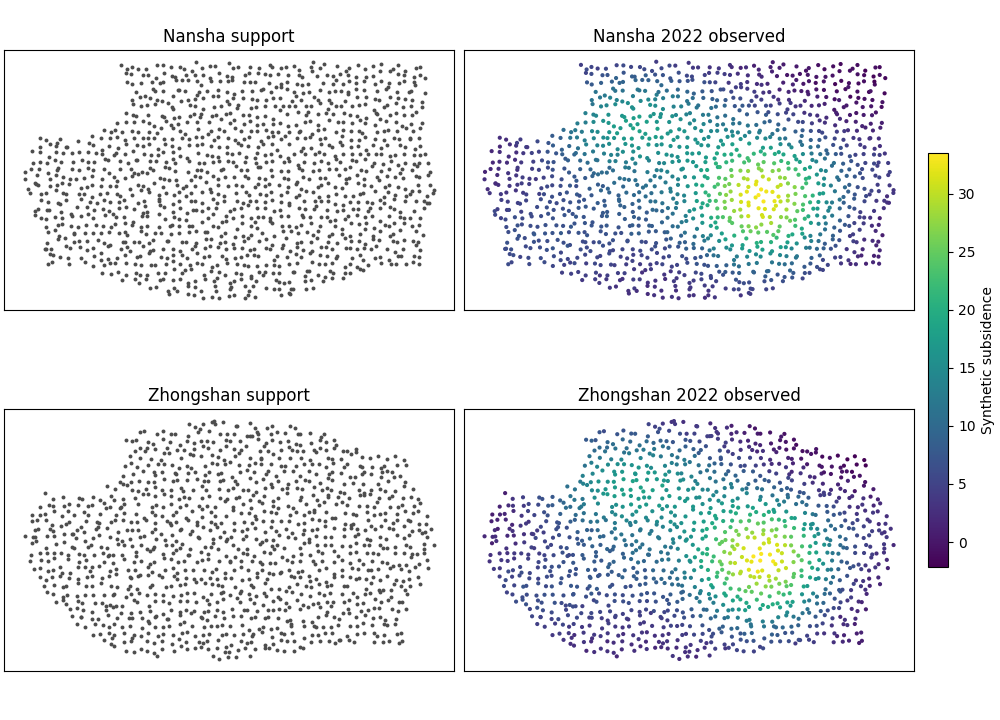
Step 5 - Preview the synthetic geography before plotting#
Before we run the real backend, it helps to look at the spatial support and the reference-year pattern directly.
The preview below is intentionally simple. It lets the reader check two things:
the city footprints are no longer plain rectangles,
the reference-year signal already has a geography worth reconstructing and forecasting.
fig, axes = plt.subplots(
    2,
    2,
    figsize=(10.0, 7.2),
    constrained_layout=True,
)

preview_specs = [
    (axes[0, 0], ns_calib, "Nansha support", False),
    (axes[0, 1], ns_calib, "Nansha 2022 observed", True),
    (axes[1, 0], zh_calib, "Zhongshan support", False),
    (axes[1, 1], zh_calib, "Zhongshan 2022 observed", True),
]

sc_obs = None

for ax, df, ttl, is_observed in preview_specs:
    if is_observed:
        sc_obs = ax.scatter(
            df["coord_x"],
            df["coord_y"],
            c=df["subsidence_actual"],
            s=9,
            cmap="viridis",
            linewidths=0,
        )
    else:
        ax.scatter(
            df["coord_x"],
            df["coord_y"],
            s=8,
            color="0.30",   # dark gray, always visible
            linewidths=0,
        )

    ax.set_title(ttl)
    ax.set_xticks([])
    ax.set_yticks([])
    ax.set_aspect("equal", adjustable="box")

if sc_obs is not None:
    cbar = fig.colorbar(
        sc_obs,
        ax=[axes[0, 1], axes[1, 1]],
        fraction=0.046,
        pad=0.03,
    )
    cbar.set_label("Synthetic subsidence")
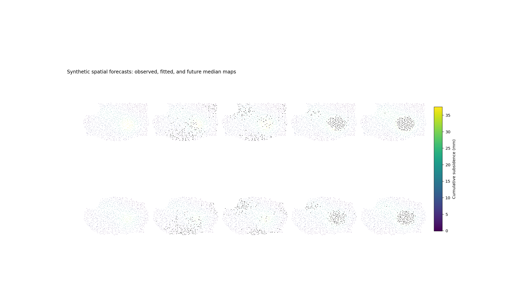
Step 6 - Run the real backend and summarize the story#
The backend expects a list of city dictionaries. Each city must provide at least:
a city name,
a display color,
one calibration DataFrame,
one future DataFrame.
We also turn panel titles off here because dense multi-panel gallery figures can become cramped when every axis repeats a long city-year title.
cities = [
    {
        "name": "Nansha",
        "color": "#2a6f97",
        "calib_df": ns_calib,
        "future_df": ns_future,
    },
    {
        "name": "Zhongshan",
        "color": "#c26d3d",
        "calib_df": zh_calib,
        "future_df": zh_future,
    },
]

# Step 7 - Render the spatial forecast figure
# -------------------------------------------
# The plotting backend creates:
#
# - column 1: observed map in ``year_val``,
# - column 2: predicted q50 map in ``year_val``,
# - remaining columns: q50 future maps for the requested years.
#
# If cumulative mode is enabled, the backend switches to
# cumulative quantities. It also computes a common color scale
# across all cities and panels, which is important because visual
# comparison is only fair when the color range is shared.

tmp_dir = Path(tempfile.mkdtemp(prefix="gp_sg_spatial_lesson_"))
out_base = str(tmp_dir / "spatial_forecasts_lesson")

plot_fig6_spatial_forecasts(
    cities=cities,
    year_val=year_val,
    years_fore=years_fore,
    cumulative=True,
    subsidence_kind="cumulative",
    grid_res=220,
    clip=98.0,
    cmap_name="viridis",
    hotspot_mode="delta",
    hotspot_q=0.90,
    out=out_base,
    out_hotspots=None,
    dpi=160,
    font=9,
    show_legend=True,
    show_title=True,
    show_panel_titles=False,
    title=(
        "Synthetic spatial forecasts: observed, fitted, "
        "and future median maps"
    ),
)

print("")
print("Spatial-forecast figure written to:")
print(f"  {out_base}")
[OK] wrote /tmp/gp_sg_spatial_lesson_54br94nm/spatial_forecasts_lesson.png/.svg
[OK] wrote /home/docs/checkouts/readthedocs.org/user_builds/geoprior-v3/checkouts/latest/scripts/out/fig6-hotspot-points.csv

Spatial-forecast figure written to:
  /tmp/gp_sg_spatial_lesson_54br94nm/spatial_forecasts_lesson
Show the saved figure inside the gallery page#
The backend writes PNG/SVG outputs. We load the PNG back into a small display figure so Sphinx-Gallery always shows the rendered result on the page.
script_utils.show_gallery_saved_figure(
    out_base=out_base,
    figsize=(10.8, 6.4),
)

def _city_summary(
    city: str,
    calib_df: pd.DataFrame,
    fut_df: pd.DataFrame,
) -> pd.DataFrame:
    rows: list[dict[str, float | str | int]] = []

    rows.append(
        {
            "city": city,
            "panel": f"{year_val} observed",
            "median_value": float(
                calib_df["subsidence_actual"].median()
            ),
            "q90_value": float(
                calib_df["subsidence_actual"].quantile(0.90)
            ),
        }
    )
    rows.append(
        {
            "city": city,
            "panel": f"{year_val} predicted",
            "median_value": float(
                calib_df["subsidence_q50"].median()
            ),
            "q90_value": float(
                calib_df["subsidence_q50"].quantile(0.90)
            ),
        }
    )

    for yy in years_fore:
        sub = fut_df.loc[fut_df["coord_t"].eq(yy)]
        rows.append(
            {
                "city": city,
                "panel": f"{yy} forecast",
                "median_value": float(
                    sub["subsidence_q50"].median()
                ),
                "q90_value": float(
                    sub["subsidence_q50"].quantile(0.90)
                ),
            }
        )

    return pd.DataFrame(rows)
Step 8 - Build the city objects expected by the backend#
The plotting function expects a list of city dictionaries. Each
city contains at least a name, a color, a calibration DataFrame,
and a future DataFrame. That is the same structure assembled by
the real CLI helper _resolve_city(...) before plotting.
Median and upper-tail spatial summary
     city          panel  median_value  q90_value
   Nansha  2022 observed        8.5300    23.4500
   Nansha 2022 predicted        7.7800    22.6100
   Nansha  2025 forecast        8.6700    24.3300
   Nansha  2027 forecast        9.6400    27.6000
   Nansha  2030 forecast       11.0800    32.0000
Zhongshan  2022 observed        7.8500    19.7500
Zhongshan 2022 predicted        7.0700    18.5100
Zhongshan  2025 forecast        7.9800    20.3200
Zhongshan  2027 forecast        8.8600    22.6600
Zhongshan  2030 forecast       10.1500    26.5500
Step 9 - How to read the figure#
Here is the teaching logic I would want a user to follow when reading the spatial-forecast page.
First column: observed map#
This tells you what the spatial pattern actually looked like in the chosen reference year. Before you trust any forecast, you should understand this panel first. Where are the strongest zones? Is the pattern compact, diffuse, elongated, coastal, or multi-centered?
Second column: predicted median for the same year#
This is the fitted reconstruction. It is not yet the future. It is the model’s spatial summary for the same year as the observation panel. The question here is:
“Did the model learn the right geography?”
If the hotspot moves to the wrong place, becomes too diffuse, or misses the major gradients, then the future panels should be read more cautiously.
Remaining columns: future years#
Once the fitted reference-year panel is credible, the future columns become much more meaningful. Now we can ask:
Does the hotspot intensify?
Does it expand or contract?
Does a new secondary hotspot appear?
Does the regional gradient remain stable?
In this synthetic lesson, the dominant hotspot remains in a similar location but strengthens over time. That is the kind of visual story a decision-maker or scientific reader can understand quickly.
What hotspot contours add#
The script can also add hotspot contours using modes such as
none, absolute, or delta together with a hotspot
quantile threshold. That is useful when you want the reader to
see the highest-risk zones immediately, without relying only on
color perception.
Step 10 - Practical takeaway#
The strongest use of this figure is not merely “show me the future map.”
Its real strength is:
it grounds the forecast in a known observed year,
it tests whether the learned spatial structure is believable,
and it lets the user compare spatial evolution across multiple forecast years in one visual frame.
In other words, it teaches both forecast content and forecast credibility.
Command-line version#
The same figure can be produced from the command line.
The project CLI supports two ways to provide data:
artifact discovery from result folders such as
--ns-srcand--zh-src,or direct CSV overrides using
--ns-calib/--ns-futureand--zh-calib/--zh-future.
It also supports:
--splitwithauto,val, ortest,--year-valfor the reference year,--years-forecastfor the future columns,--cumulativeand--subsidence-kind,--grid-res,--clip, and--cmap,hotspot controls such as
--hotspot,--hotspot-quantile, and--hotspot-out.
A typical run from discovered artifacts looks like this:
python -m scripts plot-spatial-forecasts \
  --ns-src results/nansha_run \
  --zh-src results/zhongshan_run \
  --split auto \
  --year-val 2022 \
  --years-forecast 2025 2027 2030 \
  --cumulative \
  --subsidence-kind cumulative \
  --grid-res 300 \
  --clip 98 \
  --cmap viridis \
  --hotspot delta \
  --hotspot-quantile 0.90 \
  --show-title true \
  --show-panel-titles true \
  --out fig6-spatial-forecasts
And if you want to bypass artifact discovery completely:
python -m scripts plot-spatial-forecasts \
  --ns-calib results/ns_calib.csv \
  --ns-future results/ns_future.csv \
  --zh-calib results/zh_calib.csv \
  --zh-future results/zh_future.csv \
  --year-val 2022 \
  --years-forecast 2025 2027 2030 \
  --hotspot delta \
  --out fig6-spatial-forecasts
The gallery page teaches the figure. The command line reproduces it in a workflow.
Total running time of the script: (0 minutes 0.976 seconds)