
Note
Go to the end to download the full example code.
Read forecast quality horizon by horizon with plot_metric_over_horizon#
This lesson explains how to use
geoprior.plot.evaluation.plot_metric_over_horizon
when you want to understand how forecast quality changes with lead time.
Why this function matters#
A single global score can hide the real forecast story. A model may look strong overall while already degrading at later horizons. That matters in practice because many decisions depend more on where performance starts to weaken than on one averaged metric.
This plotting helper answers questions such as:
Is the first horizon much easier than the third or fourth?
Do two cities or model variants degrade in the same way?
Is interval coverage stable across horizons?
Does the forecast stay reliable only for short-range use?
This page is therefore written as a teaching guide, not only as an API demo. We will build a small forecast table, inspect the required column layout, plot several horizon-wise views, and end with a simple checklist for applying the function to your own saved evaluation data.
import matplotlib.pyplot as plt
import numpy as np
import pandas as pd

from geoprior.plot.evaluation import plot_metric_over_horizon

pd.set_option("display.max_columns", 24)
pd.set_option("display.width", 112)
pd.set_option(
    "display.float_format",
    lambda v: f"{v:0.4f}",
)
What this function expects#
plot_metric_over_horizon works on a tidy forecast-evaluation
table. The single most important required column is
forecast_step. The helper computes one metric value per horizon.
For a point-forecast workflow, the minimal columns usually look like:
forecast_step<target>_actual<target>_pred
For probabilistic evaluation, you also provide quantile columns such
as <target>_q10, <target>_q50, and <target>_q90.
Extra columns are welcome. They become useful when you want to group the curves by city, split, model variant, or any other label.
Build a realistic demo forecast table#
A gallery lesson should behave like a real evaluation table without needing a full training run. Here we create one long-format table with:
3 forecast horizons,
2 cities,
2 model families,
point predictions,
and calibrated-style quantile columns.
We intentionally make the later horizons harder. That way the lesson tells a coherent story when we plot MAE, RMSE, and coverage.
rng = np.random.default_rng(42)
rows: list[dict[str, float | int | str]] = []

cities = ["Nansha", "Zhongshan"]
models = ["GeoPriorSubsNet", "XTFT"]
horizons = [1, 2, 3]

for city in cities:
    city_shift = 0.25 if city == "Zhongshan" else 0.0

    for model in models:
        model_bias = 0.0 if model == "GeoPriorSubsNet" else 0.45
        model_noise_scale = (
            0.90 if model == "GeoPriorSubsNet" else 1.15
        )

        for sample_idx in range(48):
            base = 18.0 + city_shift + 0.10 * sample_idx

            for step in horizons:
                trend = 1.65 * step
                seasonal = 0.35 * np.sin(sample_idx / 6.0)
                y_true = base + trend + seasonal

                err_scale = model_noise_scale * (0.55 + 0.55 * step)
                y_pred = y_true + model_bias + rng.normal(
                    loc=0.0,
                    scale=err_scale,
                )

                interval_half_width = 0.90 + 0.60 * step
                q10 = y_pred - interval_half_width
                q50 = y_pred
                q90 = y_pred + interval_half_width

                rows.append(
                    {
                        "sample_idx": sample_idx,
                        "city": city,
                        "model_family": model,
                        "forecast_step": step,
                        "subsidence_actual": y_true,
                        "subsidence_pred": y_pred,
                        "subsidence_q10": q10,
                        "subsidence_q50": q50,
                        "subsidence_q90": q90,
                    }
                )

forecast_df = pd.DataFrame(rows)

print("Demo forecast table")
print(forecast_df.head(10))
Demo forecast table
   sample_idx    city     model_family  forecast_step  subsidence_actual  subsidence_pred  subsidence_q10  \
0           0  Nansha  GeoPriorSubsNet              1            19.6500          19.9517         18.4517
1           0  Nansha  GeoPriorSubsNet              2            21.3000          19.7556         17.6556
2           0  Nansha  GeoPriorSubsNet              3            22.9500          24.4359         21.7359
3           1  Nansha  GeoPriorSubsNet              1            19.8081          20.7392         19.2392
4           1  Nansha  GeoPriorSubsNet              2            21.4581          18.5608         16.4608
5           1  Nansha  GeoPriorSubsNet              3            23.1081          20.5297         17.8297
6           2  Nansha  GeoPriorSubsNet              1            19.9645          20.0911         18.5911
7           2  Nansha  GeoPriorSubsNet              2            21.6145          21.1449         19.0449
8           2  Nansha  GeoPriorSubsNet              3            23.2645          23.2313         20.5313
9           3  Nansha  GeoPriorSubsNet              1            20.1178          19.2733         17.7733

   subsidence_q50  subsidence_q90
0         19.9517         21.4517
1         19.7556         21.8556
2         24.4359         27.1359
3         20.7392         22.2392
4         18.5608         20.6608
5         20.5297         23.2297
6         20.0911         21.5911
7         21.1449         23.2449
8         23.2313         25.9313
9         19.2733         20.7733
Read the table structure before plotting#
A good habit is to inspect the table before you call the helper. This makes the naming convention visible and helps users adapt the example to their own files.
Notice the two important design ideas:
each row is one forecasted sample at one horizon,
the target prefix here is
subsidence.
That prefix is why we will later call the function with
target_name='subsidence'.
print("\nColumns used in this lesson")
print(list(forecast_df.columns))

print("\nRows per city, model, and horizon")
print(
    forecast_df.groupby(
        ["city", "model_family", "forecast_step"]
    ).size()
)
Columns used in this lesson
['sample_idx', 'city', 'model_family', 'forecast_step', 'subsidence_actual', 'subsidence_pred', 'subsidence_q10', 'subsidence_q50', 'subsidence_q90']

Rows per city, model, and horizon
city       model_family     forecast_step
Nansha     GeoPriorSubsNet  1                48
                            2                48
                            3                48
           XTFT             1                48
                            2                48
                            3                48
Zhongshan  GeoPriorSubsNet  1                48
                            2                48
                            3                48
           XTFT             1                48
                            2                48
                            3                48
dtype: int64
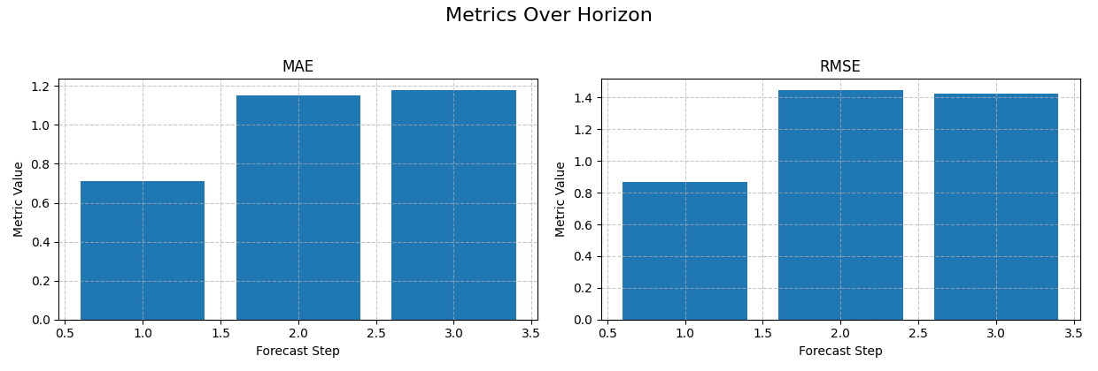
Start with the simplest reading: one model, point metrics only#
The first use case should be as simple as possible.
Here we isolate one city and one model, then ask a very direct question:
How do MAE and RMSE evolve from horizon 1 to horizon 3?
This is the most natural first plot because users immediately see whether the forecast deteriorates smoothly or sharply.
With no extra grouping columns, bar charts are a clean default.
single_view = forecast_df.loc[
    (forecast_df["city"] == "Nansha")
    & (forecast_df["model_family"] == "GeoPriorSubsNet")
].copy()

print("\nSingle-view preview")
print(single_view.head())

plot_metric_over_horizon(
    forecast_df=single_view,
    target_name="subsidence",
    metrics=["mae", "rmse"],
    plot_kind="bar",
    figsize_per_subplot=(6.2, 4.2),
    max_cols_metrics=2,
)
Single-view preview
   sample_idx    city     model_family  forecast_step  subsidence_actual  subsidence_pred  subsidence_q10  \
0           0  Nansha  GeoPriorSubsNet              1            19.6500          19.9517         18.4517
1           0  Nansha  GeoPriorSubsNet              2            21.3000          19.7556         17.6556
2           0  Nansha  GeoPriorSubsNet              3            22.9500          24.4359         21.7359
3           1  Nansha  GeoPriorSubsNet              1            19.8081          20.7392         19.2392
4           1  Nansha  GeoPriorSubsNet              2            21.4581          18.5608         16.4608

   subsidence_q50  subsidence_q90
0         19.9517         21.4517
1         19.7556         21.8556
2         24.4359         27.1359
3         20.7392         22.2392
4         18.5608         20.6608

<Axes: title={'center': 'RMSE'}, xlabel='Forecast Step', ylabel='Metric Value'>
How to read the first figure#
When you look at the MAE and RMSE bars, read them in order:
Is error already high at H1?
Does it rise steadily with horizon?
Is one step disproportionately harder than the others?
In this demo, the later horizons are clearly harder. That is not a bug in the plot. It is exactly the kind of behaviour this helper is designed to reveal.
A global mean score would flatten this structure. The horizon plot keeps it visible.
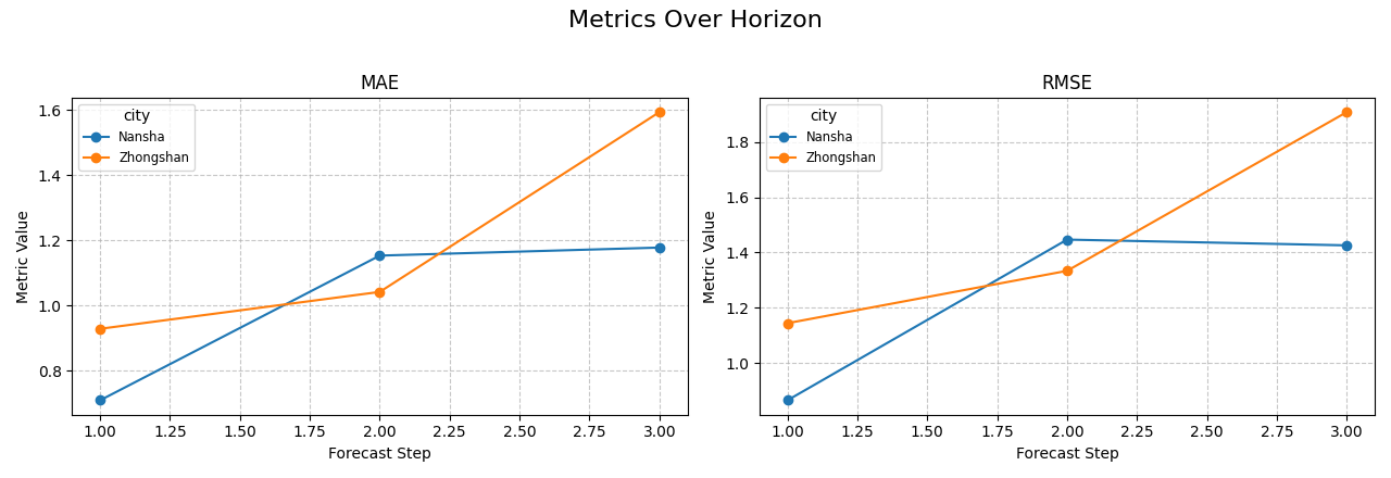
Compare groups directly with line plots#
The next step is usually comparison.
Suppose the user wants to know whether the same model behaves
differently across cities. We keep one model family fixed and group by
city.
When grouping is used, line plots are usually easier to read than bars because each group becomes a separate trajectory over the horizon.
same_model = forecast_df.loc[
    forecast_df["model_family"] == "GeoPriorSubsNet"
].copy()

plot_metric_over_horizon(
    forecast_df=same_model,
    target_name="subsidence",
    metrics=["mae", "rmse"],
    group_by_cols=["city"],
    plot_kind="line",
    figsize_per_subplot=(6.4, 4.4),
    max_cols_metrics=2,
)
<Axes: title={'center': 'RMSE'}, xlabel='Forecast Step', ylabel='Metric Value'>
Why grouped horizon plots are important#
This view helps answer a more operational question:
Is the degradation pattern consistent across contexts, or does one area become unreliable earlier?
If the curves stay close, the model behaves similarly across the groups. If one curve separates strongly at later horizons, the user learns where extra calibration, retraining, or feature review may be needed.
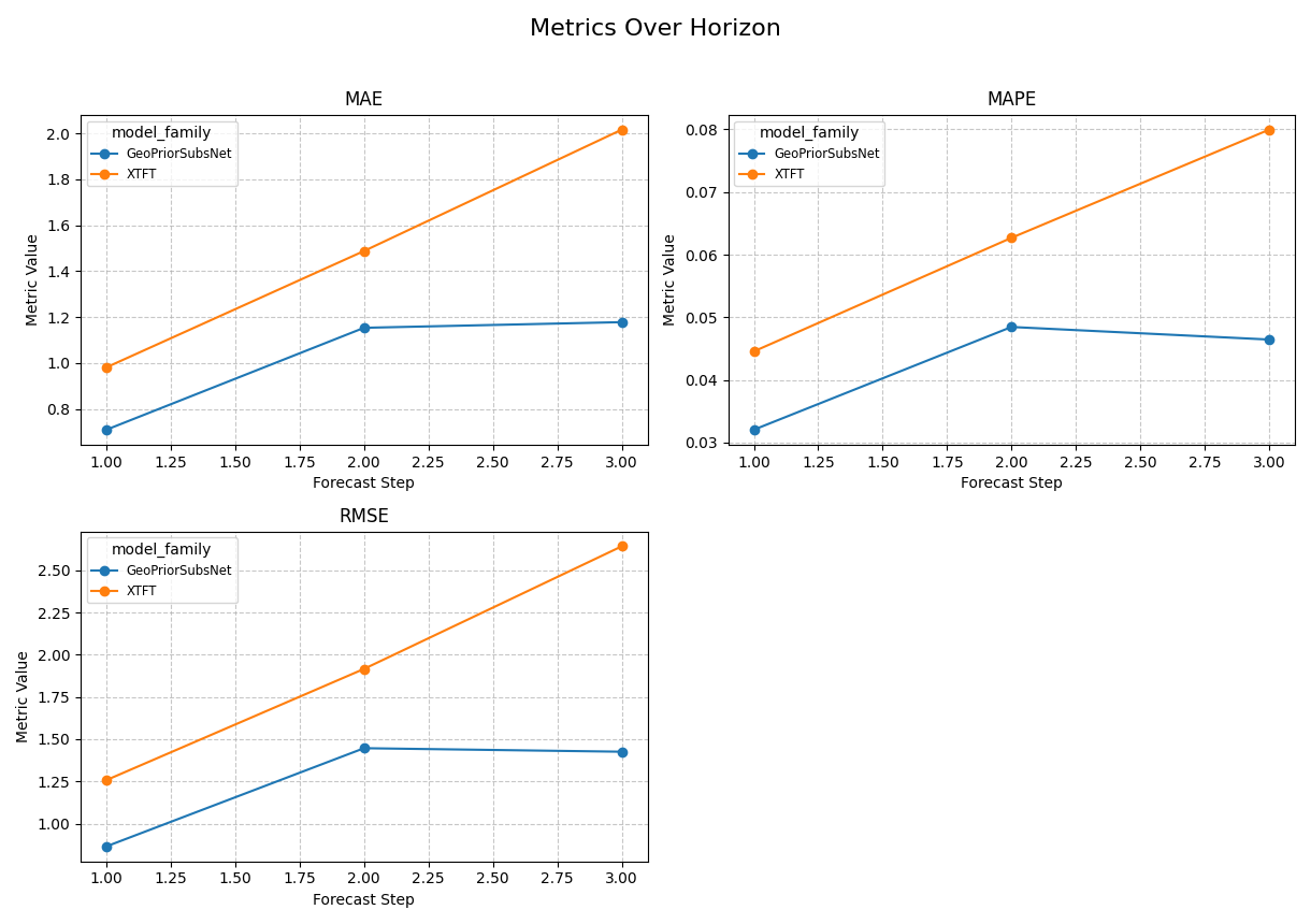
Compare model families on the same horizons#
Another common use case is model comparison. The logic is exactly the same: keep the table long, then group by the comparison label.
Here we focus on one city so the model-family contrast stays easy to interpret.
single_city = forecast_df.loc[
    forecast_df["city"] == "Nansha"
].copy()

plot_metric_over_horizon(
    forecast_df=single_city,
    target_name="subsidence",
    metrics=["mae", "rmse", "mape"],
    group_by_cols=["model_family"],
    plot_kind="line",
    figsize_per_subplot=(6.1, 4.3),
    max_cols_metrics=2,
)
<Axes: title={'center': 'RMSE'}, xlabel='Forecast Step', ylabel='Metric Value'>
Add a probabilistic reading with coverage#
plot_metric_over_horizon is not limited to point metrics. If your
table contains quantile columns, the helper can also inspect interval
behaviour.
Coverage is a very important next step because a point forecast can still look acceptable while the uncertainty intervals are poorly calibrated.
In this example, we pass the available quantiles and request
coverage. The helper uses the lowest and highest quantiles to
compute interval coverage at each horizon.
plot_metric_over_horizon(
    forecast_df=single_city,
    target_name="subsidence",
    metrics=["coverage"],
    quantiles=[0.10, 0.50, 0.90],
    group_by_cols=["model_family"],
    plot_kind="line",
    figsize_per_subplot=(6.2, 4.3),
    max_cols_metrics=1,
)
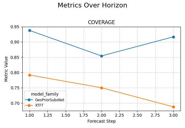
<Axes: title={'center': 'COVERAGE'}, xlabel='Forecast Step', ylabel='Metric Value'>
Read point error and coverage together#
This is where the function becomes especially useful in practice.
A model may have:
low MAE at short horizons,
rising RMSE later,
and coverage that drifts away from the intended interval behaviour.
That combination tells a fuller story than any single metric alone.
A good reading habit is:
inspect point error first,
inspect coverage second,
then decide whether the later horizons are still trustworthy.
Use a custom metric when your project needs one#
The helper also accepts a callable. That is useful when the built-in metric names are not enough for your workflow.
Here we define a compact bias metric. Positive values mean the model tends to over-predict; negative values mean under-prediction.
def signed_bias(y_true: pd.Series, y_pred: pd.Series) -> float:
    return float(np.mean(np.asarray(y_pred) - np.asarray(y_true)))


plot_metric_over_horizon(
    forecast_df=single_city,
    target_name="subsidence",
    metrics=[signed_bias],
    group_by_cols=["model_family"],
    plot_kind="line",
    figsize_per_subplot=(6.2, 4.1),
    max_cols_metrics=1,
)
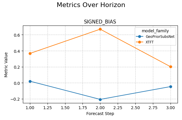
<Axes: title={'center': 'SIGNED_BIAS'}, xlabel='Forecast Step', ylabel='Metric Value'>
Build a small interpretation table beside the plots#
The plotting helper already computes the visual summary, but it is often helpful in a lesson to also calculate a compact table manually. That makes the relationship between the raw data and the figure completely transparent.
Below, we compute a simple per-horizon MAE table for one city. This is not required by the function. It is included to teach the reader what the plot is aggregating.
Manual per-horizon MAE table
      model_family  forecast_step    mae
0  GeoPriorSubsNet              1 0.7098
1  GeoPriorSubsNet              2 1.1535
2  GeoPriorSubsNet              3 1.1781
3             XTFT              1 0.9813
4             XTFT              2 1.4877
5             XTFT              3 2.0158
How to adapt this lesson to your own data#
In a real workflow, the adaptation usually looks like this:
load your saved forecast-evaluation table,
identify the target prefix,
check that
forecast_stepis present,decide whether you want point metrics, interval metrics, or both,
add grouping columns only when comparison is needed.
The most common replacements are:
target_name='subsidence'-> your own target prefix,group_by_cols=['model_family']->['city']or['split'],metrics=['mae', 'rmse']-> the metrics that match your decision.
For example, a user table named eval_df may be plotted like this:
plot_metric_over_horizon(
    forecast_df=eval_df,
    target_name="gwl",
    metrics=["mae", "coverage"],
    quantiles=[0.1, 0.5, 0.9],
    group_by_cols=["model_name"],
    plot_kind="line",
)
A practical reading rule#
A compact decision rule for this helper is:
start with MAE or RMSE,
look for a smooth or abrupt horizon degradation,
compare groups only after the single-series view is clear,
add coverage when quantiles are available,
and treat later horizons cautiously if both point error and uncertainty quality degrade together.
This turns the function into more than a plotting utility. It becomes a quick diagnostic for forecast usability across lead times.
summary = (
    single_city.groupby(["model_family", "forecast_step"])
    .agg(
        mae=(
            "subsidence_pred",
            lambda s: float(
                np.mean(
                    np.abs(
                        s.to_numpy()
                        - single_city.loc[s.index, "subsidence_actual"]
                        .to_numpy()
                    )
                )
            ),
        ),
        mean_width=(
            "subsidence_q90",
            lambda s: float(
                np.mean(
                    s.to_numpy()
                    - single_city.loc[s.index, "subsidence_q10"]
                    .to_numpy()
                )
            ),
        ),
    )
    .reset_index()
)

print("\nCompact reading summary")
print(summary)

print("\nDecision note")
for model_name, part in summary.groupby("model_family"):
    part = part.sort_values("forecast_step")
    mae_rising = part["mae"].is_monotonic_increasing
    width_rising = part["mean_width"].is_monotonic_increasing

    if mae_rising and width_rising:
        print(
            f"- {model_name}: later horizons are clearly harder and "
            "the intervals also widen, so long-range use should be "
            "reviewed carefully."
        )
    else:
        print(
            f"- {model_name}: horizon behaviour is more mixed and "
            "deserves a closer manual look."
        )

# Keep gallery rendering tidy.
plt.close("all")
Compact reading summary
      model_family  forecast_step    mae  mean_width
0  GeoPriorSubsNet              1 0.7098      3.0000
1  GeoPriorSubsNet              2 1.1535      4.2000
2  GeoPriorSubsNet              3 1.1781      5.4000
3             XTFT              1 0.9813      3.0000
4             XTFT              2 1.4877      4.2000
5             XTFT              3 2.0158      5.4000

Decision note
- GeoPriorSubsNet: later horizons are clearly harder and the intervals also widen, so long-range use should be reviewed carefully.
- XTFT: later horizons are clearly harder and the intervals also widen, so long-range use should be reviewed carefully.
Total running time of the script: (0 minutes 1.365 seconds)