
Note
Go to the end to download the full example code.
Focus on a local map window with plot_spatial_roi#
This lesson explains how to use
geoprior.plot.spatial.plot_spatial_roi when the full study area is
too large and you want to inspect a smaller rectangular region of
interest (ROI).
Why this function matters#
A full-domain spatial map is good for the first overview, but many real questions are local:
Which neighborhood contains the strongest hotspot?
Does the same small zone stay active across years?
How do two mapped variables compare in the same local window?
Is a local anomaly still visible once we zoom into the ROI?
This helper answers those questions by extracting a rectangular spatial window and plotting a grid where:
rows represent time slices,
columns represent different value columns,
and every panel shows only the requested ROI.
This page is therefore written as a teaching guide, not only as an API demo. We will build a realistic table, define a local bounding box, inspect how the helper arranges the ROI grid, compare shared and per-panel colorbars, and finish with a checklist for using the function on your own data.
from __future__ import annotations

import matplotlib.pyplot as plt
import numpy as np
import pandas as pd

from geoprior.plot.spatial import plot_spatial_roi

pd.set_option("display.max_columns", 20)
pd.set_option("display.width", 110)
pd.set_option(
    "display.float_format",
    lambda v: f"{v:0.4f}",
)
What this function expects#
plot_spatial_roi expects a tidy DataFrame with:
two spatial coordinate columns,
one time column,
one or more numeric
value_colsto display,and a rectangular ROI defined by
x_rangeandy_range.
Compared with plot_spatial, the main conceptual difference is that
this helper plots multiple value columns at once. The figure is a
matrix:
one row per time slice,
one column per value column.
The function returns a list containing one figure. That single figure can still be large, because it holds the full time-by-variable grid.
Build a realistic demo table#
A good ROI lesson needs two things:
a field with a broad background trend,
a stronger local hotspot worth zooming into.
We create two map-ready variables:
subsidence_q50as the main forecasted value,interval_width_80as a local uncertainty companion.
We then define a local window around the moving hotspot so the zoomed view has something meaningful to teach.
rng = np.random.default_rng(19)

x_coords = np.linspace(0.0, 10.0, 21)
y_coords = np.linspace(0.0, 7.0, 15)
years = [2023, 2024, 2025]

rows: list[dict[str, float | int]] = []

for year in years:
    shift_x = 0.28 * (year - 2023)
    shift_y = 0.12 * (year - 2023)

    for x in x_coords:
        for y in y_coords:
            regional_plane = 3.8 + 0.22 * x + 0.10 * y
            hotspot = 7.0 * np.exp(
                -((x - (6.1 + shift_x)) ** 2) / 1.8
                -((y - (3.6 + shift_y)) ** 2) / 1.2
            )
            ridge = 1.1 * np.exp(-((x - 3.1) ** 2) / 4.8) * np.cos(y / 1.2)
            noise = rng.normal(0.0, 0.18)

            value = regional_plane + hotspot + ridge + noise
            width80 = 0.9 + 0.15 * value + 0.08 * np.exp(
                -((x - (6.1 + shift_x)) ** 2) / 1.2
                -((y - (3.6 + shift_y)) ** 2) / 0.9
            )

            rows.append(
                {
                    "coord_x": x,
                    "coord_y": y,
                    "year": year,
                    "subsidence_q50": value,
                    "interval_width_80": width80,
                }
            )

roi_df = pd.DataFrame(rows)

print("Demo ROI table")
print(roi_df.head(10))
Demo ROI table
   coord_x  coord_y  year  subsidence_q50  interval_width_80
0   0.0000   0.0000  2023          3.8820             1.4823
1   0.0000   0.5000  2023          4.1648             1.5247
2   0.0000   1.0000  2023          4.0747             1.5112
3   0.0000   1.5000  2023          3.8856             1.4828
4   0.0000   2.0000  2023          4.1068             1.5160
5   0.0000   2.5000  2023          3.7161             1.4574
6   0.0000   3.0000  2023          4.0878             1.5132
7   0.0000   3.5000  2023          3.9041             1.4856
8   0.0000   4.0000  2023          4.1678             1.5252
9   0.0000   4.5000  2023          4.2071             1.5311
Inspect the structure before zooming in#
Before using an ROI helper, it is worth checking:
which variables are available,
how many time slices exist,
and what the full coordinate extent looks like.
This helps the user choose a bounding box that is meaningful rather than arbitrary.
print("\nColumns")
print(list(roi_df.columns))

print("\nRows per year")
print(roi_df.groupby("year").size())

print("\nFull spatial extent")
print(
    roi_df[["coord_x", "coord_y"]].agg(["min", "max"])
)

print("\nVariable summary by year")
print(
    roi_df.groupby("year")[["subsidence_q50", "interval_width_80"]]
    .mean()
)
Columns
['coord_x', 'coord_y', 'year', 'subsidence_q50', 'interval_width_80']

Rows per year
year
2023    315
2024    315
2025    315
dtype: int64

Full spatial extent
     coord_x  coord_y
min   0.0000   0.0000
max  10.0000   7.0000

Variable summary by year
      subsidence_q50  interval_width_80
year
2023          5.6537             1.7514
2024          5.6575             1.7519
2025          5.6423             1.7497
Define a local window of interest#
The ROI is a simple rectangular bounding box. A good teaching habit is to make that choice explicit in the lesson, because users often have one of two goals:
zoom into a domain expert’s known area,
or focus on the neighborhood around a hotspot seen in the full map.
Here we choose a box that captures the strongest moving hotspot.
Chosen ROI
{'x_range': (4.6, 7.8), 'y_range': (2.2, 5.1)}
Start with the most useful ROI comparison: time by variable#
This is the main strength of plot_spatial_roi.
In one figure, we can compare:
how the local hotspot evolves over time,
and how two different variables behave inside exactly the same ROI.
We use cbar='uniform' first, because shared color meaning is often
the cleanest way to compare the same variable across rows.
figs_roi_uniform = plot_spatial_roi(
    df=roi_df,
    value_cols=["subsidence_q50", "interval_width_80"],
    x_range=x_range,
    y_range=y_range,
    dt_col="year",
    dt_values=years,
    cmap="viridis",
    marker_size=62,
    alpha=0.92,
    cbar="uniform",
    grid_props={"linestyle": ":", "alpha": 0.30},
)

print("\nNumber of returned figures:", len(figs_roi_uniform))
print(
    "Axes in the first figure (including colorbar axes):",
    len(figs_roi_uniform[0].axes),
)
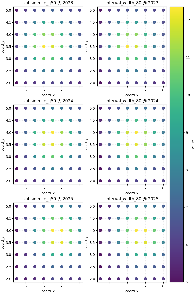
Number of returned figures: 1
Axes in the first figure (including colorbar axes): 7
How to read the ROI grid#
A good reading order is:
move down one column to compare the same variable through time,
then move across one row to compare variables in the same year,
and finally check whether the uncertainty field follows the same local structure as the main forecast field.
In this demo, the highest subsidence zone stays inside the ROI and shifts slightly across years. The width field broadly follows that same zone, which is a realistic pattern: the area with stronger signal can also be the area with wider intervals.
Why this function is ideal for local side-by-side reading#
If we tried to do this with plot_spatial alone, we would need one
separate call per variable and then mentally align the subplots. Here,
the helper gives us a direct time × variable matrix, which is much
better for focused local comparison.
This makes the function especially useful when the user wants to ask:
“Inside this specific area, do the forecast level and uncertainty tell the same story?”
Compare shared and per-panel colorbars#
Just as in the full-domain spatial lesson, the colorbar choice changes the comparison logic.
cbar='uniform'emphasizes direct comparison across panels,per-panel colorbars emphasize local contrast inside each panel.
The second option can be helpful when one variable has a much tighter numeric range than another.
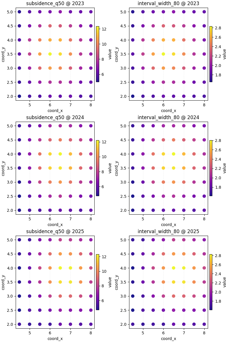
Teach the user when each colorbar mode is better#
Use a shared colorbar when your goal is statements such as:
“the hotspot is clearly stronger in 2025 than in 2023”,
“the right column is narrower in magnitude than the left column”.
Use individual colorbars when your goal is statements such as:
“show me the internal structure of each panel clearly”,
“this variable has subtle variation that disappears under a shared scale”.
The key teaching point is that the same data can answer different questions depending on the colorbar logic.
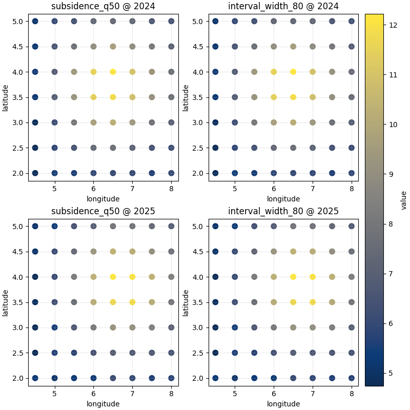
Use custom coordinate names when your data does not use defaults#
Real project tables often store spatial coordinates as longitude and
latitude, Easting/Northing, or some custom export names. The helper is
flexible enough to accept those names through spatial_cols.
roi_df_ll = roi_df.rename(
    columns={"coord_x": "longitude", "coord_y": "latitude"}
)

_ = plot_spatial_roi(
    df=roi_df_ll,
    value_cols=["subsidence_q50", "interval_width_80"],
    x_range=x_range,
    y_range=y_range,
    spatial_cols=("longitude", "latitude"),
    dt_col="year",
    dt_values=[2024, 2025],
    cmap="cividis",
    marker_size=58,
    alpha=0.95,
    cbar="uniform",
)
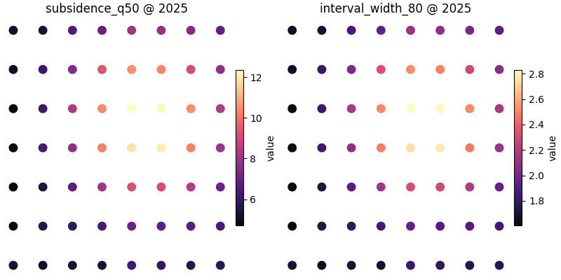
Hide axes when the figure is mainly for presentation#
Axis ticks are useful during analysis, but sometimes the user wants a clean visual panel for a report or slide. In that case, the helper can suppress the axes while preserving the overall grid structure.
Practical checklist for your own data#
When adapting this helper to your own results, use this checklist:
Start from a tidy DataFrame with two coordinate columns and one time column.
Decide which local window matters scientifically, not only visually.
Put variables you want to compare side by side into
value_cols.Use
cbar='uniform'when cross-panel comparison matters most.Use
cbar='individual'when each panel needs its own contrast.Keep the same ROI when comparing variables, otherwise the columns do not tell a fair story.
If your column names differ from
coord_xandcoord_y, pass them withspatial_cols.
A compact real-data pattern usually looks like:
plot_spatial_roi(df, ['subsidence_q50', 'interval_width_80'],
x_range=(xmin, xmax), y_range=(ymin, ymax), dt_col='year')
That makes this helper one of the best local-reading tools in the spatial plotting family.
plt.show()
Total running time of the script: (0 minutes 2.379 seconds)