
Note
Go to the end to download the full example code.
Compare raw and calibrated reliability with plot_calibration_comparison#
This lesson explains how to use
geoprior.plot.forecast.plot_calibration_comparison when you want to
go one step beyond a standard reliability diagram.
A reliability diagram answers:
How well calibrated is the forecast right now?
This helper answers a stronger question:
Did the calibration step actually improve the forecast reliability?
Why this function matters#
Once a model produces quantiles or direct probabilities, many workflows apply a calibration step. But calibration is not automatically useful. It can help a lot, help a little, or change the curve in ways that are not worth adopting downstream.
This helper overlays:
the raw reliability curve,
and the calibrated reliability curve.
It supports both:
quantile-based forecasts via the quantile calibration workflow,
probability forecasts via isotonic or logistic calibration.
This makes it a natural bridge lesson for the uncertainty gallery: the page connects saved forecast tables to a practical calibration decision.
This page is written as a teaching guide, not only as a quick API demo. We will start with the required input layout, then compare raw and calibrated quantile reliability, then move to direct probabilities, and finally end with a checklist for adapting the helper to real saved forecast tables.
from __future__ import annotations

import matplotlib.pyplot as plt
import numpy as np
import pandas as pd

from geoprior.plot.forecast import plot_calibration_comparison

pd.set_option("display.max_columns", 20)
pd.set_option("display.width", 110)
pd.set_option(
    "display.float_format",
    lambda v: f"{v:0.4f}",
)
What this function expects#
plot_calibration_comparison accepts one or more forecast tables as:
one DataFrame,
several DataFrames,
a list of DataFrames,
or a dict of named DataFrames.
It supports two workflows:
quantile mode
Required inputs:
quantiles=[...]q_prefix='subsidence'actual_col='subsidence_actual'
The helper calibrates the quantile forecasts and overlays the raw and calibrated empirical reliability curves.
probability mode
Required inputs:
prob_col='p_event'actual_col='event_flag'
The helper calibrates the direct probabilities with
method='isotonic'ormethod='logistic'and compares the raw and calibrated curves.
A useful habit is:
compare the raw curve to the diagonal,
compare the calibrated curve to the diagonal,
and only then decide whether calibration helped enough to matter.
Build a quantile-forecast example#
We begin with a quantile table. This is the most direct way to show the difference between a raw reliability problem and its post-processed version.
The forecast below is intentionally slightly too narrow and shifted, so the calibration step has a real job to do.
rng = np.random.default_rng(7)

n = 240
x = np.linspace(0.0, 4.8 * np.pi, n)

y_true = (
    6.0
    + 1.25 * np.sin(x / 2.1)
    + 0.38 * np.cos(x / 4.0)
    + rng.normal(scale=0.78, size=n)
)

quantiles = [0.10, 0.50, 0.90]
z10, z50, z90 = -1.2816, 0.0, 1.2816

center_raw = 6.1 + 1.20 * np.sin(x / 2.1) + 0.34 * np.cos(x / 4.0)
spread_raw = 0.48 + 0.04 * np.sin(x / 3.2)

quant_df = pd.DataFrame(
    {
        "subsidence_q10": center_raw + spread_raw * z10,
        "subsidence_q50": center_raw + spread_raw * z50,
        "subsidence_q90": center_raw + spread_raw * z90,
        "subsidence_actual": y_true,
    }
)

print("Quantile-table preview")
print(quant_df.head(8))
Quantile-table preview
   subsidence_q10  subsidence_q50  subsidence_q90  subsidence_actual
0          5.8248          6.4400          7.0552             6.3810
1          5.8598          6.4760          7.0922             6.6505
2          5.8947          6.5119          7.1291             6.2411
3          5.9294          6.5476          7.1658             5.7974
4          5.9640          6.5832          7.2024             6.1745
5          5.9983          6.6185          7.2388             5.7924
6          6.0324          6.6536          7.2749             6.6493
7          6.0662          6.6885          7.3107             7.6840
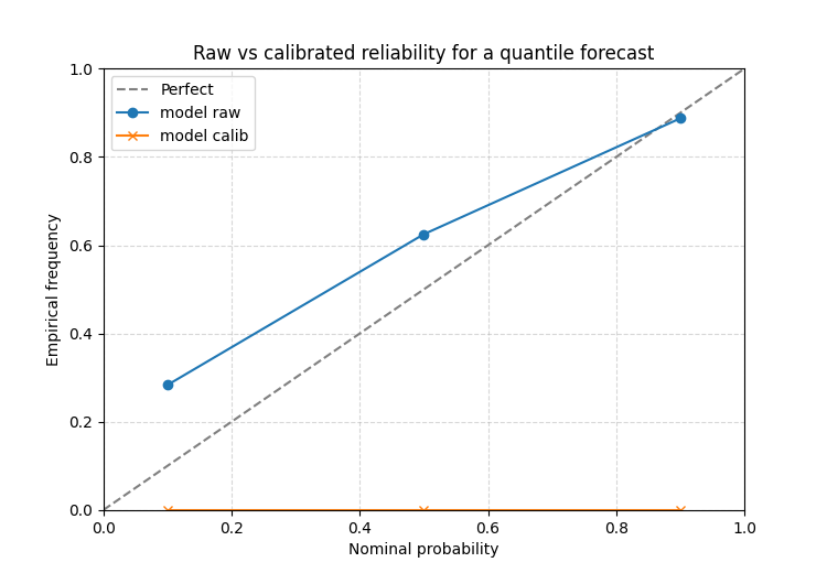
Read raw versus calibrated reliability for quantiles#
The raw curve tells you what the original forecast implied. The calibrated curve tells you how the reliability changed after the post-processing step.
The function itself adds the default title
'Raw vs Calibrated Reliability', which is why this helper works
best as a dedicated one-figure teaching page rather than a multi-panel
subplot helper.
ax = plot_calibration_comparison(
    quant_df,
    quantiles=quantiles,
    q_prefix="subsidence",
    actual_col="subsidence_actual",
    method="isotonic",
    figsize=(7.5, 5.2),
    grid_props={"linestyle": "--", "alpha": 0.5},
)
ax.set_title("Raw vs calibrated reliability for a quantile forecast")
[INFO] Processing model 'model'

Text(0.5, 1.0, 'Raw vs calibrated reliability for a quantile forecast')
How to read this comparison#
A practical reading order is:
where is the raw curve relative to the diagonal?
where is the calibrated curve relative to the diagonal?
which parts of the curve improved most?
This shows whether calibration mainly fixed:
the tails,
the center,
or only a small part of the reliability problem.
If the calibrated curve still sits far from the diagonal, then the original forecast may need deeper model or spread changes, not only a post-processing fix.
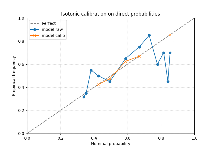
Direct probabilities: isotonic calibration#
In the probability mode the function compares raw and calibrated event probabilities rather than quantile coverage.
We build a slightly overconfident forecast first.
p_signal = 1.0 / (1.0 + np.exp(-(0.9 * np.sin(x / 2.6) + 0.2)))
event_flag = rng.binomial(1, np.clip(p_signal, 0.03, 0.97), size=n)

prob_df = pd.DataFrame(
    {
        "p_event": np.clip(1.25 * p_signal - 0.08, 0.01, 0.99),
        "event_flag": event_flag,
    }
)

print("\nProbability-table preview")
print(prob_df.head(8))

ax = plot_calibration_comparison(
    prob_df,
    prob_col="p_event",
    actual_col="event_flag",
    bins=12,
    bin_strategy="quantile",
    method="isotonic",
    figsize=(7.5, 5.2),
    grid_props={"linestyle": ":", "alpha": 0.6},
)
ax.set_title("Isotonic calibration on direct probabilities")
Probability-table preview
   p_event  event_flag
0   0.6073           0
1   0.6140           1
2   0.6208           1
3   0.6275           1
4   0.6341           0
5   0.6408           0
6   0.6474           1
7   0.6539           1
[INFO] Processing model 'model'

Text(0.5, 1.0, 'Isotonic calibration on direct probabilities')
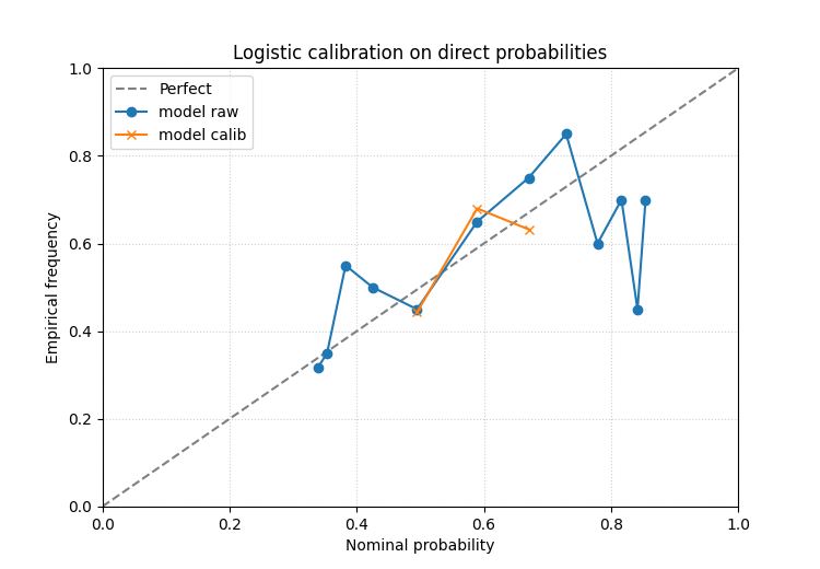
Direct probabilities: logistic calibration#
It is often useful to compare isotonic calibration with a smoother, more parametric logistic calibration.
The same forecast table can therefore be inspected twice with different calibration methods before choosing a workflow.
ax = plot_calibration_comparison(
    prob_df,
    prob_col="p_event",
    actual_col="event_flag",
    bins=12,
    bin_strategy="quantile",
    method="logistic",
    figsize=(7.5, 5.2),
    grid_props={"linestyle": ":", "alpha": 0.6},
)
ax.set_title("Logistic calibration on direct probabilities")
[INFO] Processing model 'model'

Text(0.5, 1.0, 'Logistic calibration on direct probabilities')
What to look for in the probability case#
In direct-probability mode, the most useful questions are:
did the calibrated curve move toward the diagonal over the whole range or only at one end?
are the highest-probability bins still overconfident?
does isotonic help more than logistic, or vice versa?
This comparison helper is valuable precisely because it makes the effect of calibration visible, not only the original problem.
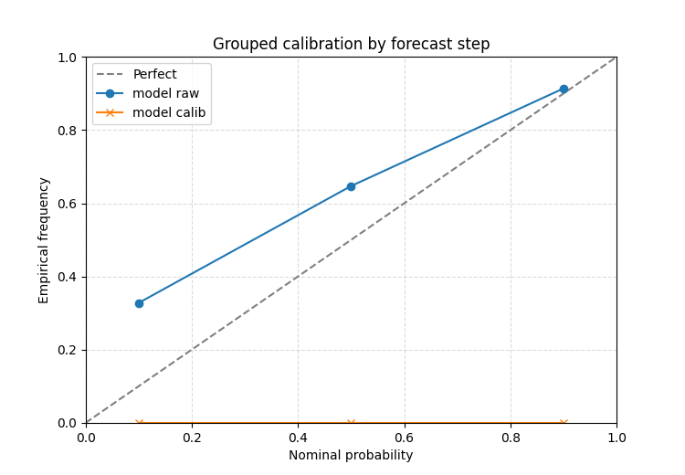
A forecast-step teaching pattern#
The quantile calibration workflow also accepts group_by. This is
helpful when a long-format forecast table contains a step or horizon
column and calibration should be learned separately per group.
The plot still returns one overall raw-versus-calibrated comparison, but the grouped fitting stage is often the right modeling choice when early and late horizons have different uncertainty behaviour.
frames = []
for step, bias, spread_scale in [
    (1, 0.05, 0.62),
    (2, 0.14, 0.54),
    (3, 0.26, 0.46),
]:
    center = 6.0 + 1.16 * np.sin(x / 2.1) + bias
    spread = spread_scale + 0.03 * np.cos(x / 3.5)
    frame = pd.DataFrame(
        {
            "forecast_step": step,
            "subsidence_q10": center + spread * z10,
            "subsidence_q50": center + spread * z50,
            "subsidence_q90": center + spread * z90,
            "subsidence_actual": y_true,
        }
    )
    frames.append(frame)

step_df = pd.concat(frames, ignore_index=True)

ax = plot_calibration_comparison(
    step_df,
    quantiles=quantiles,
    q_prefix="subsidence",
    actual_col="subsidence_actual",
    method="isotonic",
    group_by="forecast_step",
    figsize=(7.5, 5.2),
    grid_props={"linestyle": "--", "alpha": 0.45},
)
ax.set_title("Grouped calibration by forecast step")
[INFO] Processing model 'model'

Text(0.5, 1.0, 'Grouped calibration by forecast step')
Why this page belongs in uncertainty teaching#
plot_reliability_diagram asks:
how reliable is the forecast now?
plot_calibration_comparison asks:
did calibration improve that reliability enough to justify using the calibrated outputs?
That makes this helper ideal for a bridge page in the uncertainty gallery:
it starts from saved forecast tables,
it teaches a calibration workflow,
and it encourages evaluation-minded judgment instead of assuming calibration is always beneficial.
Practical checklist for your own data#
When adapting this helper to a real project:
decide whether you are calibrating quantiles or direct probabilities,
confirm the required forecast columns exist,
compare the raw and calibrated curves against the diagonal,
inspect both
method='isotonic'andmethod='logistic'when direct probabilities are available,consider
group_byfor long-format quantile tables.
For quantile forecasts:
pass the nominal levels in
quantiles,set
q_prefixto the shared quantile column family,and point
actual_colto the observed target.
For direct probabilities:
pass
prob_coland the binary event column,choose sensible bins,
and judge the improvement, not only the existence of a calibrated curve.
This function is most useful after a reliability problem has already been found and you need to decide whether calibration genuinely solved it.
Total running time of the script: (0 minutes 0.339 seconds)