
Note
Go to the end to download the full example code.
Read smoothed spatial structure with gridded heatmaps#
This lesson explains how to use
geoprior.plot.spatial.plot_spatial_heatmap().
Why this plot matters#
A scatter map shows sampled values at the observation locations. A heatmap goes one step further: it turns those values into a gridded surface that is easier to scan as a field.
That makes this view especially useful when you want to:
read broad spatial gradients quickly,
compare the same field across several time slices,
communicate a smooth spatial pattern in reports,
contrast interpolation with point-based maps such as Voronoi cells.
This page is therefore not only an API demo. It is a reading lesson. It explains what the helper expects, how the two available gridding modes differ, and how to decide whether a heatmap is an honest summary for your data.
from __future__ import annotations

import matplotlib.pyplot as plt
import numpy as np
import pandas as pd

from geoprior.plot.spatial import plot_spatial_heatmap

pd.set_option("display.max_columns", 20)
pd.set_option("display.width", 100)
pd.set_option("display.float_format", lambda v: f"{v:0.4f}")
Build a compact spatial demo table#
plot_spatial_heatmap expects a DataFrame with:
two spatial columns,
one numeric value column,
and either a time column
dt_color an explicit list ofdt_values.
The helper creates a regular grid for each time slice and then fills
that grid either by linear interpolation (method='grid') or by a
weighted kernel density surface (method='kde').
We create a small irregular station pattern so the smoothing effect is visible without becoming visually crowded.
rng = np.random.default_rng(25)
stations = pd.DataFrame(
{
"coord_x": [113.52, 113.57, 113.61, 113.66, 113.71, 113.76, 113.81],
"coord_y": [22.47, 22.55, 22.63, 22.49, 22.58, 22.66, 22.53],
"station_id": [f"P{i}" for i in range(1, 8)],
}
)
years = [2024, 2025, 2026]
records: list[dict[str, float | int | str]] = []
for year in years:
year_shift = (year - 2024) * 1.8
for i, row in stations.iterrows():
east_grad = 14.0 * (row["coord_x"] - stations["coord_x"].min())
north_grad = 10.0 * (row["coord_y"] - stations["coord_y"].min())
wave = 1.8 * np.sin(2.4 * i)
records.append(
{
"coord_x": row["coord_x"],
"coord_y": row["coord_y"],
"station_id": row["station_id"],
"year": year,
"subsidence_q50": 8.0 + east_grad + north_grad + wave + year_shift,
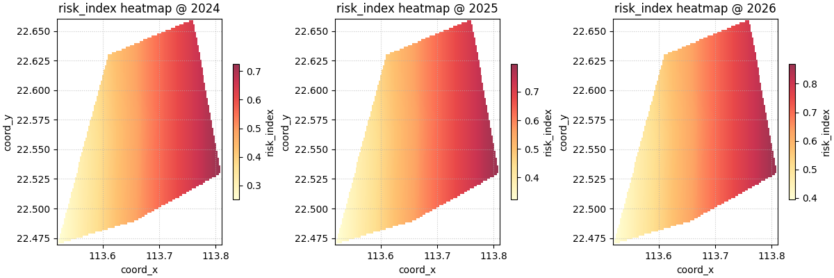
"risk_index": 0.25 + 0.08 * i + 0.04 * year_shift,
}
)
df = pd.DataFrame.from_records(records)
print("Input table")
print(df.head(12))
Input table
    coord_x  coord_y station_id  year  subsidence_q50  risk_index
0  113.5200  22.4700         P1  2024          8.0000      0.2500
1  113.5700  22.5500         P2  2024         10.7158      0.3300
2  113.6100  22.6300         P3  2024          9.0669      0.4100
3  113.6600  22.4900         P4  2024         11.5886      0.4900
4  113.7100  22.5800         P5  2024         11.4462      0.5700
5  113.7600  22.6600         P6  2024         12.2942      0.6500
6  113.8100  22.5300         P7  2024         14.3982      0.7300
7  113.5200  22.4700         P1  2025          9.8000      0.3220
8  113.5700  22.5500         P2  2025         12.5158      0.4020
9  113.6100  22.6300         P3  2025         10.8669      0.4820
10 113.6600  22.4900         P4  2025         13.3886      0.5620
11 113.7100  22.5800         P5  2025         13.2462      0.6420
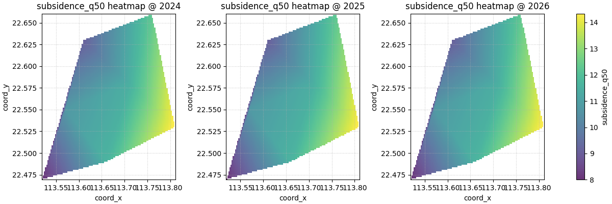
Start with the default gridded interpolation#
The simplest question is:
What broad spatial field do these sampled values suggest at each time slice?
With method='grid', the helper uses linear interpolation on a
regular mesh. This usually feels like the most natural starting point
because it keeps the mapped values close to the original observations
while still producing a readable surface.
The function returns a list containing one figure. That figure may
contain several subplots, depending on the selected time slices and
max_cols.
Returned figure count
1
What the grid is really showing#
A heatmap is smoother than a scatter map, but it is still only an interpretation of sparse values. So the right reading order is usually:
identify broad highs and lows,
check whether those features are supported by nearby observations,
avoid over-reading fine detail when the sample geometry is sparse.
This matters because a smooth color field can easily look more certain than the data really are. Heatmaps are excellent for pattern reading, but they should still be judged against point support.
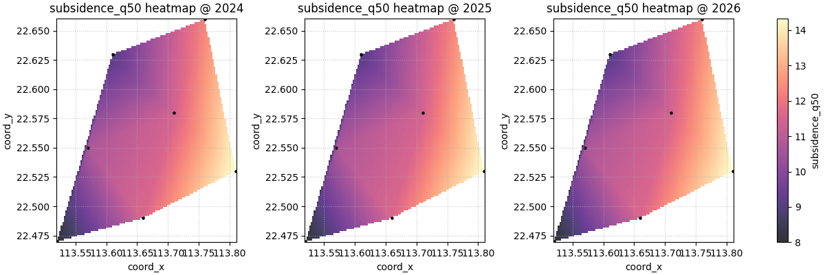
Show the original points when you want support made explicit#
show_points=True overlays the original sampled locations on top of
the gridded field. This is often the safest exploratory setting,
especially when the user wants to communicate the surface without
hiding where the measurements actually came from.
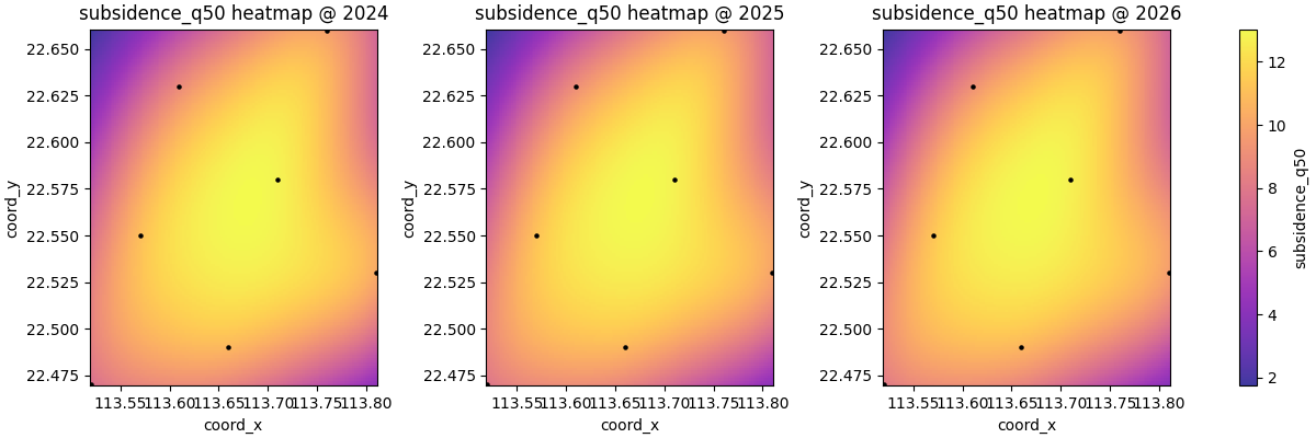
Compare grid and kde carefully#
The helper supports two surface-building modes:
method='grid'uses linear interpolation,method='kde'builds a weighted kernel density surface.
These answer slightly different questions.
grid is usually better when the user wants a value field that
respects the original observations more directly.
kde is more like a smooth intensity view. It can be useful for a
broad hotspot-style reading, but it should not be confused with a
strictly interpolated physical surface.
Understand the role of grid_res#
grid_res controls the number of grid points along each axis.
Higher values create a finer raster and a visually smoother panel.
Lower values create a coarser field that is faster and sometimes more
honest when the original sample count is small.
A good teaching habit is to show both a coarse and a fine version so the user understands that visual smoothness is partly a plotting decision, not only a property of the data.
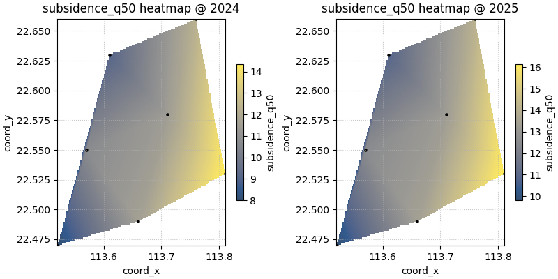
plot_spatial_heatmap(
    df=df,
    value_col="subsidence_q50",
    dt_col="year",
    dt_values=[2024, 2025],
    grid_res=50,
    method="grid",
    cmap="cividis",
    show_points=True,
    cbar="individual",
    show_grid=True,
    max_cols=2,
)

plt.show()

plot_spatial_heatmap(
    df=df,
    value_col="subsidence_q50",
    dt_col="year",
    dt_values=[2024, 2025],
    grid_res=180,
    method="grid",
    cmap="cividis",
    show_points=True,
    cbar="individual",
    show_grid=True,
    max_cols=2,
)

plt.show()
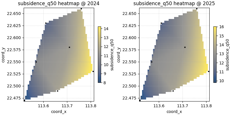
Compare colorbar strategies#
cbar='uniform' shares one scale across the visible panels. This is
usually the best choice when the user wants direct time-to-time
comparison.
cbar='individual' gives each panel its own scale. That is useful
when the absolute range changes a lot and the goal is to emphasise the
internal spatial structure of each slice.
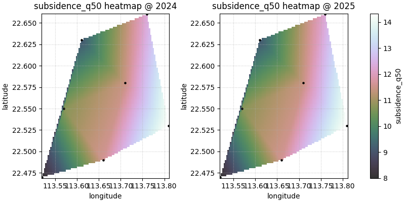
Custom coordinate names also work#
Many real forecast tables use names like longitude and
latitude instead of coord_x and coord_y. The helper lets
you pass your own names through spatial_cols as long as those
columns exist in the DataFrame.
custom_df = df.rename(
    columns={
        "coord_x": "longitude",
        "coord_y": "latitude",
    }
)

plot_spatial_heatmap(
    df=custom_df,
    value_col="subsidence_q50",
    spatial_cols=("longitude", "latitude"),
    dt_col="year",
    dt_values=[2024, 2025],
    grid_res=100,
    method="grid",
    cmap="cubehelix",
    cbar="uniform",
    show_points=True,
    show_grid=True,
    max_cols=2,
)

plt.show()
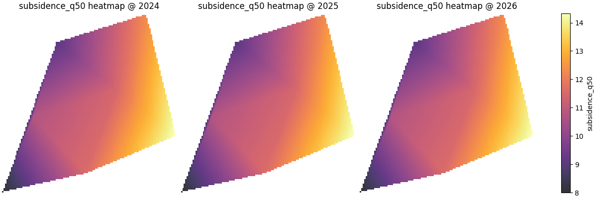
When hiding axes helps#
For exploratory work, axes are usually helpful. But for compact report
panels, especially when every subplot shares the same spatial frame,
show_axis='off' can make the color field easier to scan.
When this plot is the right choice#
plot_spatial_heatmap is strongest when the user wants to read a
broad field quickly and compare its structure across time slices.
It is usually a good choice when:
the domain is sampled densely enough to justify smoothing,
the communication goal is a readable field rather than raw points,
and the user wants faster pattern reading than a scatter map offers.
It is usually not the safest final choice when:
the sample geometry is very sparse,
fine-scale structure would be mostly invented by smoothing,
or the scientific question is about exact nearest-observation support rather than a continuous-looking field.
How to adapt this lesson to your own data#
A simple checklist:
prepare one row per location and time slice,
make sure the spatial columns are numeric,
choose one numeric
value_col,pass
dt_colif the table contains several years or steps,start with
method='grid'andshow_points=True,use
grid_resonly as large as the point density can justify,keep
cbar='uniform'when direct comparison matters,switch to
cbar='individual'when within-slice contrast matters more than absolute comparability.
In many forecast tables, the mapping is as simple as:
spatial_cols=('coord_x', 'coord_y')dt_col='coord_t'ordt_col='forecast_year'value_col='subsidence_q50'or another forecast summary column.
Total running time of the script: (0 minutes 3.310 seconds)