
Note
Go to the end to download the full example code.
Learn how to judge interval forecasts with plot_weighted_interval_score#
This lesson explains how to use
geoprior.plot.evaluation.plot_weighted_interval_score
when you want to answer a deeper question than simple
coverage:
Are my predictive intervals both reliable and sharp, or are they only wide enough to hide errors?
Why this function matters#
Weighted Interval Score (WIS) is one of the most useful summary tools for probabilistic forecasting.
It is valuable because it does not reward one-sided behavior:
very narrow intervals are punished when they miss the truth,
very wide intervals are punished because they are not sharp,
and biased medians are also penalized.
That makes WIS a much more complete diagnostic than a single coverage percentage.
A model can look “safe” under coverage simply because the intervals are too wide. Another can look “confident” with narrow intervals but fail badly on important cases. WIS is helpful precisely because it scores the trade-off between those two extremes.
This page is written as a teaching guide rather than a minimal API demo. We will:
start with the simplest one-interval case,
compare good and poor uncertainty designs,
inspect the distribution of per-sample WIS values,
move to multiple central intervals,
show a multi-output setup,
and finish with a checklist for adapting the helper to real forecast tables.
from __future__ import annotations

import matplotlib.pyplot as plt
import numpy as np
import pandas as pd

from geoprior.plot.evaluation import plot_weighted_interval_score

pd.set_option("display.max_columns", 24)
pd.set_option("display.width", 110)
pd.set_option(
    "display.float_format",
    lambda v: f"{v:0.4f}",
)
What this function really expects#
plot_weighted_interval_score works with five aligned
inputs:
y_truey_mediany_lowery_upperalphas
The helper is intentionally flexible, but it is important to understand the shape rules.
For one output:
y_trueandy_mediancan be(N,)for a single interval (
K = 1),y_lowerandy_uppermay also be(N,)for multiple intervals, the bounds become
(N, K)
For multiple outputs:
y_trueandy_medianbecome(N, O)for a single interval, bounds may be
(N, O)for multiple intervals, bounds become
(N, O, K)
The alphas array has length K and defines which
central intervals you are scoring.
A common source of confusion is the meaning of alpha:
alpha = 0.2corresponds to an 80% central interval,alpha = 0.4corresponds to a 60% central interval.
The helper offers two complementary views:
kind='summary_bar'for the aggregate WIS,kind='scores_histogram'for the distribution of per-sample WIS values.
A final interpretation rule matters most:
lower WIS is better.
A lower score usually means the predictive median is closer to the truth, the intervals are sharper, and the miss penalties are smaller.
Build a realistic single-interval example#
We begin with one target and one interval only. This is the easiest place to understand WIS because the shape is simple and the trade-off is visible.
We will create two uncertainty designs around the same median forecast:
a well-balanced interval,
a too-narrow interval.
The second design is intentionally overconfident. It will look sharp, but its miss penalties should increase.
rng = np.random.default_rng(2026)

n_samples = 72
sample_ids = np.arange(3001, 3001 + n_samples)

trend = np.linspace(18.0, 33.0, n_samples)
seasonal = 1.8 * np.sin(np.linspace(0, 4 * np.pi, n_samples))
y_true = trend + seasonal + rng.normal(0.0, 0.55, n_samples)

y_median = y_true + rng.normal(0.0, 0.42, n_samples)

balanced_width = 1.35 + 0.18 * np.cos(np.linspace(0, 3 * np.pi, n_samples))
narrow_width = 0.70 + 0.10 * np.cos(np.linspace(0, 3 * np.pi, n_samples))

y_lower_balanced = y_median - balanced_width
y_upper_balanced = y_median + balanced_width

y_lower_narrow = y_median - narrow_width
y_upper_narrow = y_median + narrow_width

alphas_single = np.array([0.2])

preview = pd.DataFrame(
    {
        "sample_id": sample_ids,
        "y_true": y_true,
        "y_median": y_median,
        "lower_balanced": y_lower_balanced,
        "upper_balanced": y_upper_balanced,
        "lower_narrow": y_lower_narrow,
        "upper_narrow": y_upper_narrow,
    }
)

print("Single-interval preview")
print(preview.head(10))
Single-interval preview
   sample_id  y_true  y_median  lower_balanced  upper_balanced  lower_narrow  upper_narrow
0       3001 17.5638   18.5107         16.9807         20.0407       17.7107       19.3107
1       3002 18.6605   18.4157         16.8872         19.9441       17.6165       19.2148
2       3003 18.0035   18.4739         16.9502         19.9976       17.6774       19.2704
3       3004 20.3129   20.5041         18.9882         22.0200       19.7119       21.2962
4       3005 20.3667   20.3024         18.7972         21.8076       19.5162       21.0886
5       3006 20.2887   20.0148         18.5230         21.5066       19.2361       20.7936
6       3007 20.6680   21.2085         19.7326         22.6843       20.4386       21.9784
7       3008 21.3478   21.2733         19.8155         22.7310       20.5134       22.0331
8       3009 21.3214   21.9629         20.5252         23.4006       21.2142       22.7116
9       3010 21.5767   21.2747         19.8586         22.6908       20.5380       22.0114
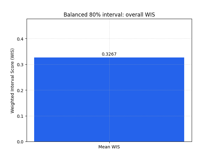
Start with the overall WIS summary#
The summary bar is the best first step when you want one compact score for a whole forecast set.
We first plot the balanced interval design. Because there is only one output, the chart has one bar. The exact number matters less than the comparison logic:
lower is better,
and the score already mixes median error, interval width, and miss penalties.
plot_weighted_interval_score(
    y_true=y_true,
    y_median=y_median,
    y_lower=y_lower_balanced,
    y_upper=y_upper_balanced,
    alphas=alphas_single,
    kind="summary_bar",
    figsize=(6.8, 5.1),
    title="Balanced 80% interval: overall WIS",
    bar_color="#2563EB",
    score_annotation_format="{:.4f}",
)
<Axes: title={'center': 'Balanced 80% interval: overall WIS'}, ylabel='Weighted Interval Score (WIS)'>
Compare it with an overconfident interval design#
Now we keep the same median forecast but shrink the interval width aggressively.
This is an excellent teaching contrast because many users are tempted by narrow intervals. Narrower looks more precise, but WIS reminds us that precision without enough coverage can be costly.
When you compare this bar with the previous one, a larger score means the apparent sharpness was not worth the extra miss penalties.
plot_weighted_interval_score(
    y_true=y_true,
    y_median=y_median,
    y_lower=y_lower_narrow,
    y_upper=y_upper_narrow,
    alphas=alphas_single,
    kind="summary_bar",
    figsize=(6.8, 5.1),
    title="Too-narrow 80% interval: overall WIS",
    bar_color="#DC2626",
    score_annotation_format="{:.4f}",
)
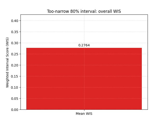
<Axes: title={'center': 'Too-narrow 80% interval: overall WIS'}, ylabel='Weighted Interval Score (WIS)'>
Why the histogram matters#
A single WIS value is helpful, but it still hides the distribution of errors.
The histogram answers a more diagnostic question:
Are most cases reasonably scored, with a few hard cases, or is the model weak almost everywhere?
This is the same logic you already used for coverage and prediction-stability lessons: always inspect the shape of the distribution before trusting the mean.
plot_weighted_interval_score(
    y_true=y_true,
    y_median=y_median,
    y_lower=y_lower_balanced,
    y_upper=y_upper_balanced,
    alphas=alphas_single,
    kind="scores_histogram",
    figsize=(8.8, 5.4),
    title="Balanced interval: distribution of per-sample WIS",
    hist_bins=16,
    hist_color="#14B8A6",
    hist_edgecolor="#0F172A",
    show_score_on_title=True,
)
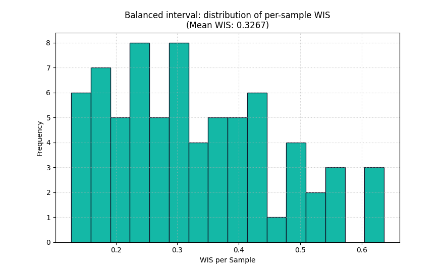
<Axes: title={'center': 'Balanced interval: distribution of per-sample WIS\n(Mean WIS: 0.3267)'}, xlabel='WIS per Sample', ylabel='Frequency'>
Read the histogram as a diagnostic, not only as decoration#
A useful reading order is:
look at the center of the histogram,
then check how long the right tail is,
and finally compare histograms across competing models.
A long right tail usually means a minority of difficult cases contribute a large fraction of the total penalty. That can happen because:
the median misses badly,
the interval is too narrow for a subset of cases,
or both happen at the same time.
In practice, that is where WIS becomes especially useful: it tells you not only that uncertainty matters, but where the uncertainty strategy may be failing.
Move to multiple central intervals#
WIS becomes more expressive when you score several nested intervals together.
Here we create a 60% and an 80% central interval around the same median. That means:
alpha = 0.4for the 60% band,alpha = 0.2for the 80% band.
The inner interval is narrower and should miss more often; the outer interval is wider and should miss less often. WIS combines those nested interval penalties in one score.
inner_width = 0.95 + 0.12 * np.sin(np.linspace(0, 2 * np.pi, n_samples))
outer_width = 1.55 + 0.16 * np.cos(np.linspace(0, 2 * np.pi, n_samples))

y_lower_multi = np.column_stack(
    [
        y_median - inner_width,
        y_median - outer_width,
    ]
)
y_upper_multi = np.column_stack(
    [
        y_median + inner_width,
        y_median + outer_width,
    ]
)

alphas_multi = np.array([0.4, 0.2])

multi_preview = pd.DataFrame(
    {
        "sample_id": sample_ids[:8],
        "y_true": y_true[:8],
        "q20": y_lower_multi[:8, 1],
        "q40": y_lower_multi[:8, 0],
        "q50": y_median[:8],
        "q60": y_upper_multi[:8, 0],
        "q80": y_upper_multi[:8, 1],
    }
)

print("\nNested-interval preview")
print(multi_preview)
Nested-interval preview
   sample_id  y_true     q20     q40     q50     q60     q80
0       3001 17.5638 16.8007 17.5607 18.5107 19.4607 20.2207
1       3002 18.6605 16.7063 17.4551 18.4157 19.3763 20.1250
2       3003 18.0035 16.7664 17.5028 18.4739 19.4450 20.1814
3       3004 20.3129 18.7997 19.5226 20.5041 21.4856 22.2085
4       3005 20.3667 18.6023 19.3108 20.3024 21.2940 22.0025
5       3006 20.2887 18.3202 19.0134 20.0148 21.0162 21.7094
6       3007 20.6680 19.5205 20.1977 21.2085 22.2193 22.8965
7       3008 21.3478 19.5930 20.2536 21.2733 22.2929 22.9535
Score the nested interval design#
This is closer to real probabilistic forecasting practice, because many models produce several quantile levels rather than one interval only.
The resulting WIS is often more informative than a single interval score, because it judges the forecast over a range of uncertainty widths.
plot_weighted_interval_score(
    y_true=y_true,
    y_median=y_median,
    y_lower=y_lower_multi,
    y_upper=y_upper_multi,
    alphas=alphas_multi,
    kind="summary_bar",
    figsize=(6.8, 5.1),
    title="Nested 60% and 80% intervals: overall WIS",
    bar_color="#7C3AED",
    score_annotation_format="{:.4f}",
)
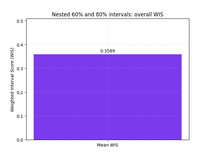
<Axes: title={'center': 'Nested 60% and 80% intervals: overall WIS'}, ylabel='Weighted Interval Score (WIS)'>
Use WIS on multi-output forecasts#
Many GeoPrior-style workflows predict more than one target, or at least more than one output channel. The helper handles that cleanly.
For a two-output example, we build arrays with shape:
y_trueandy_median:(N, 2)y_lowerandy_upper:(N, 2, 2)
The summary bar can then show one bar per output when we ask the metric for raw values.
subs_true = y_true
subs_med = y_median

water_true = 52.0 + 0.65 * np.cos(np.linspace(0, 4 * np.pi, n_samples))
water_true += rng.normal(0.0, 0.30, n_samples)
water_med = water_true + rng.normal(0.0, 0.24, n_samples)

subs_lower = np.column_stack(
    [subs_med - 0.90, subs_med - 1.45]
)
subs_upper = np.column_stack(
    [subs_med + 0.90, subs_med + 1.45]
)

water_lower = np.column_stack(
    [water_med - 0.55, water_med - 0.92]
)
water_upper = np.column_stack(
    [water_med + 0.55, water_med + 0.92]
)

y_true_multiout = np.column_stack([subs_true, water_true])
y_median_multiout = np.column_stack([subs_med, water_med])
y_lower_multiout = np.stack([subs_lower, water_lower], axis=1)
y_upper_multiout = np.stack([subs_upper, water_upper], axis=1)

plot_weighted_interval_score(
    y_true=y_true_multiout,
    y_median=y_median_multiout,
    y_lower=y_lower_multiout,
    y_upper=y_upper_multiout,
    alphas=alphas_multi,
    kind="summary_bar",
    figsize=(7.8, 5.2),
    title="Per-output WIS on a two-output forecast",
    bar_color=["#F97316", "#0891B2"],
    metric_kws={"multioutput": "raw_values"},
    score_annotation_format="{:.4f}",
)
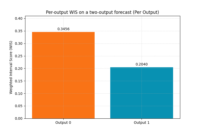
<Axes: title={'center': 'Per-output WIS on a two-output forecast (Per Output)'}, ylabel='Weighted Interval Score (WIS)'>
The histogram needs one output at a time#
For multi-output data, the histogram view requires
output_idx.
That design is sensible: a histogram must correspond to one distribution. Mixing all outputs into one histogram would be much harder to interpret.
Here we inspect the second output only.
plot_weighted_interval_score(
    y_true=y_true_multiout,
    y_median=y_median_multiout,
    y_lower=y_lower_multiout,
    y_upper=y_upper_multiout,
    alphas=alphas_multi,
    kind="scores_histogram",
    output_idx=1,
    figsize=(8.8, 5.4),
    title="Output 1 only: per-sample WIS distribution",
    hist_bins=14,
    hist_color="#F59E0B",
    hist_edgecolor="#7C2D12",
)
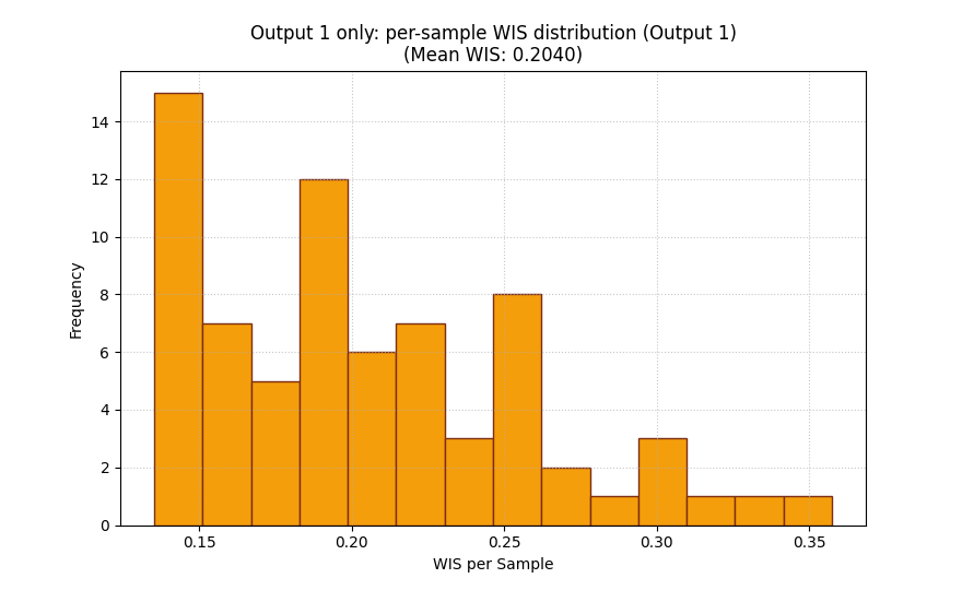
<Axes: title={'center': 'Output 1 only: per-sample WIS distribution (Output 1)\n(Mean WIS: 0.2040)'}, xlabel='WIS per Sample', ylabel='Frequency'>
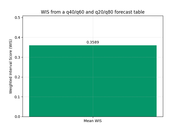
How to adapt this helper to your own forecast tables#
In real work, your predictions usually live in a table with quantile columns such as:
target_q10target_q20target_q50target_q80target_q90target_actual
The conversion rule is straightforward:
y_true<- actual columny_median<- q50 columny_lower<- stack of lower quantilesy_upper<- stack of matching upper quantilesalphas<- alpha values that correspond to each central interval
For example:
q20/q80 gives a 60% central interval, so
alpha = 0.4q10/q90 gives an 80% central interval, so
alpha = 0.2
The order of alphas must match the last dimension of
y_lower and y_upper.
forecast_table = pd.DataFrame(
    {
        "sample_id": sample_ids,
        "subsidence_actual": y_true,
        "subsidence_q20": y_lower_multi[:, 1],
        "subsidence_q40": y_lower_multi[:, 0],
        "subsidence_q50": y_median,
        "subsidence_q60": y_upper_multi[:, 0],
        "subsidence_q80": y_upper_multi[:, 1],
    }
)

print("\nHow the helper maps from a real forecast table")
print(forecast_table.head(10))

mapped_y_true = forecast_table["subsidence_actual"].to_numpy()
mapped_y_median = forecast_table["subsidence_q50"].to_numpy()
mapped_y_lower = forecast_table[
    ["subsidence_q40", "subsidence_q20"]
].to_numpy()
mapped_y_upper = forecast_table[
    ["subsidence_q60", "subsidence_q80"]
].to_numpy()
mapped_alphas = np.array([0.4, 0.2])

plot_weighted_interval_score(
    y_true=mapped_y_true,
    y_median=mapped_y_median,
    y_lower=mapped_y_lower,
    y_upper=mapped_y_upper,
    alphas=mapped_alphas,
    kind="summary_bar",
    figsize=(6.9, 5.0),
    title="WIS from a q40/q60 and q20/q80 forecast table",
    bar_color="#059669",
)
How the helper maps from a real forecast table
   sample_id  subsidence_actual  subsidence_q20  subsidence_q40  subsidence_q50  subsidence_q60  \
0       3001            17.5638         16.8007         17.5607         18.5107         19.4607
1       3002            18.6605         16.7063         17.4551         18.4157         19.3763
2       3003            18.0035         16.7664         17.5028         18.4739         19.4450
3       3004            20.3129         18.7997         19.5226         20.5041         21.4856
4       3005            20.3667         18.6023         19.3108         20.3024         21.2940
5       3006            20.2887         18.3202         19.0134         20.0148         21.0162
6       3007            20.6680         19.5205         20.1977         21.2085         22.2193
7       3008            21.3478         19.5930         20.2536         21.2733         22.2929
8       3009            21.3214         20.2914         20.9349         21.9629         22.9909
9       3010            21.5767         19.6128         20.2389         21.2747         22.3105

   subsidence_q80
0         20.2207
1         20.1250
2         20.1814
3         22.2085
4         22.0025
5         21.7094
6         22.8965
7         22.9535
8         23.6345
9         22.9366

<Axes: title={'center': 'WIS from a q40/q60 and q20/q80 forecast table'}, ylabel='Weighted Interval Score (WIS)'>
A practical reading checklist#
When using WIS on your own results, a good inspection order is:
start with
summary_barto compare models quickly,then inspect
scores_histogramto see whether a few hard cases dominate the score,compare one-interval and multi-interval designs if your model exports several quantiles,
for multi-output forecasts, use raw per-output bars before averaging,
and always read WIS together with coverage or mean interval width when you want to explain why one score is lower.
The important mindset is this:
WIS is not only a number to minimize. It is a compact way to reason about the quality of the whole uncertainty design.
plt.show()
Total running time of the script: (0 minutes 0.486 seconds)