
Uncertainty#
This gallery focuses on uncertainty calibration, reliability, and risk-interpretation workflows in GeoPrior.
Unlike the forecasting gallery, which explains how forecast tables are built, read, and compared, the pages collected here are organized around a different practical question:
How should a user judge whether probabilistic forecasts are honest, useful, and trustworthy?
The emphasis is therefore on uncertainty quality. These examples show how GeoPrior turns forecast tables into interpretable uncertainty artifacts such as:
calibrated interval forecasts,
coverage-versus-sharpness summaries,
exceedance-probability diagnostics,
reliability diagrams,
raw-versus-calibrated reliability comparisons,
recalibrated quantile forecast columns.
In other words, this gallery is about working with predictive uncertainty: not only plotting it, but also understanding how to calibrate it, evaluate it, and interpret its trade-offs.
What this gallery teaches#
Most pages in this section follow the same broad pattern:
create a compact synthetic probabilistic forecast example,
call the real GeoPrior calibration or evaluation helper,
inspect the returned tables, statistics, or plots,
explain how to read and interpret the uncertainty result.
Even when a page prints small tables or metric summaries, the main goal remains the same: to explain the uncertainty artifact and its interpretation.
Module guide#
Module |
Main output |
Purpose |
|---|---|---|
|
Interval calibration workflow |
Fit and apply horizon-wise interval calibration factors, then compare forecast coverage and interval width before and after calibration. |
|
Coverage-sharpness diagnostics |
Compare how different uncertainty systems trade interval honesty against interval width, and explain why both quantities must be read together. |
|
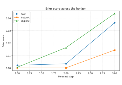
Exceedance probability diagnostics |
Calibrate event probabilities, inspect Brier scores, and explain risk-oriented exceedance forecasting for critical thresholds. |
|
Reliability curves |
Read nominal probability against empirical frequency for one or more forecast systems and learn how under- and over-confidence appear in a reliability diagram. |
|
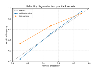
Raw-versus-calibrated reliability |
Compare the original reliability curve against the calibrated one so users can judge whether post-processing improved honesty without hiding the calibration cost. |
|
Recalibrated quantile columns |
Recalibrate individual quantile forecast columns and inspect how quantile calibration changes across groups such as forecast horizons. |
Reading path#
A useful way to move through this gallery is to follow the logic of a complete uncertainty workflow:
begin by calibrating forecast intervals,
compare coverage against sharpness,
move to exceedance-event probabilities and Brier score,
inspect the raw reliability curve,
compare raw reliability against calibrated reliability,
finish with direct quantile-column recalibration.
That is why the examples are grouped by uncertainty workflow purpose rather than only by plotting function.
Gallery organization#
Interval calibration#
These examples are the best place to start when the main issue is that forecast intervals appear too narrow or too wide.
They focus on questions such as:
whether the q10-q90 interval covers the truth often enough,
how much the interval must widen to meet a target coverage,
whether calibration should be applied separately by horizon.
The main page in this group is:
plot_interval_calibration.py
Coverage and sharpness trade-offs#
These examples focus on the central uncertainty trade-off between:
coverage: does the interval contain the truth often enough?
sharpness: is the interval still narrow enough to be informative?
They are most useful when you want to compare uncertainty systems and decide whether a forecast became more honest at an acceptable cost in interval width.
The main page in this group is:
plot_coverage_vs_sharpness.py
Exceedance-risk probabilities#
These examples focus on event-based uncertainty rather than interval uncertainty.
They are especially useful when the question is not:
how wide is the uncertainty band?
but instead:
what is the probability that an important threshold will be exceeded?
The main page in this group is:
plot_brier_exceedance.py
Reliability analysis#
These examples focus on probabilistic honesty across a range of nominal probabilities.
They are most useful when you want to inspect:
whether a nominal 80% interval really covers about 80% of outcomes,
whether calibration differs across forecast systems,
whether a recalibrated forecast moves closer to perfect reliability.
The main pages in this group are:
plot_reliability_diagram_overview.pyplot_calibration_comparison_overview.py
The first page teaches how to read a reliability curve on its own. The second teaches how to compare the raw and calibrated curves so the user can judge whether calibration actually improved the forecast.
Quantile-column recalibration#
These examples focus on recalibrating the quantile columns themselves, rather than only widening or shrinking one selected interval.
They are particularly useful when you want to inspect:
whether q10, q30, q50, q70, and q90 are individually calibrated,
whether recalibration should be global or horizon-specific,
how recalibration changes the quantile surfaces used downstream.
The main page in this group is:
calibrate_forecasts.py
Why this separation matters#
This gallery deliberately keeps four concerns distinct:
uncertainty calibration,
uncertainty evaluation,
uncertainty visualization,
uncertainty interpretation.
That separation makes the workflow easier to understand. It also helps users distinguish between:
helpers that recalibrate interval or probability forecasts,
evaluators that summarize coverage, sharpness, and Brier behavior,
visual tools that expose reliability and trade-offs,
lesson pages that explain what those uncertainty artifacts actually mean.
Notes#
These examples are intentionally compact and lesson-oriented.
The pages in this section are uncertainty-first: they may print small metric tables or summaries, but their main purpose is to explain how probabilistic forecasts should be calibrated, checked, and interpreted.
A useful rule of thumb is:
forecasting/explains how forecast outputs are built, read, and compared,uncertainty/explains calibration, reliability, and event-risk interpretation,evaluation/explains how forecast quality is judged with metric plots and summary views,diagnostics/explains workflow and training diagnostics,spatial/explains how mapped outputs and spatial structures should be read,tables_and_summaries/builds reusable analysis artifacts.
A practical reading sequence is:
first calibrate the intervals,
then inspect the coverage-versus-sharpness trade-off,
then study exceedance probabilities and Brier score,
then read the reliability diagram,
then compare raw and calibrated reliability directly,
then inspect direct quantile recalibration in more detail.
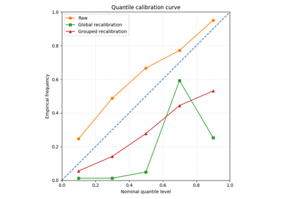
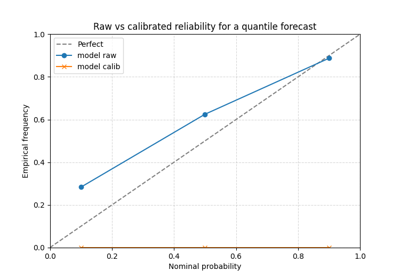
Compare raw and calibrated reliability with plot_calibration_comparison
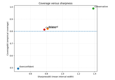
Coverage versus sharpness in probabilistic forecasts
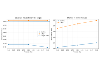
Interval calibration with calibrate_quantile_forecasts
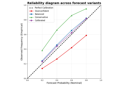
Read forecast reliability with plot_reliability_diagram