
Note
Go to the end to download the full example code.
Hotspot analytics: turning future forecasts into decision-ready priority maps#
This example teaches you how to read the GeoPrior hotspot-analytics figure.
Many forecast figures answer:
where the model predicts large change,
or how uncertainty behaves.
This figure asks a more practical planning question:
Where are the most decision-relevant future hotspot areas, how persistent are they, and which clusters should be prioritized first?
That is why this figure is useful. It takes forecast outputs and turns them into a compact risk-and-priority summary.
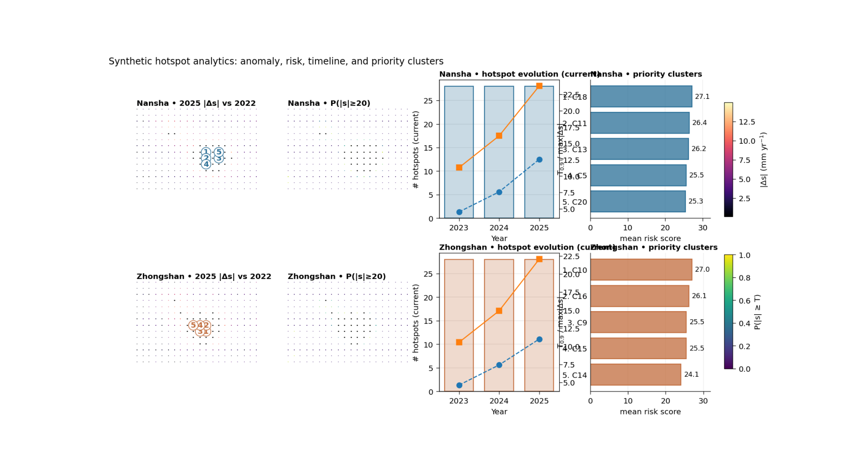
What the figure shows#
The real plotting backend builds one row per city and four main panels per row:
hotspot anomaly map \(|\Delta s|\) relative to the base year,
exceedance-risk map \(P(|s| \ge T)\) from forecast quantiles,
hotspot timeline hotspot counts together with \(T_{0.9}\) and maximum anomaly,
priority clusters ranked hotspot clusters using either anomaly or risk.
The script can also add an optional persistence panel and an optional scenario A-vs-B comparison panel. Here we keep the first lesson focused on the core 2×4 design.
Why this matters#
A spatial forecast can look impressive but still be hard to act on.
Hotspot analytics makes the forecast easier to use by answering:
where are the strongest anomaly zones,
how likely are they to exceed a threshold,
do those zones persist across years,
and which clusters deserve first attention?
This gallery page builds a compact synthetic workflow so the lesson is fully executable during the docs build.
Imports#
We use the real hotspot table builder and the real plotting backend from the project script.
from __future__ import annotations

import tempfile
from pathlib import Path

import matplotlib.image as mpimg
import matplotlib.pyplot as plt
import numpy as np
import pandas as pd

from geoprior.scripts.plot_hotspot_analytics import (
    build_hotspot_tables,
    plot_hotspot_analytics,
)
Step 1 - Build compact synthetic city tables#
The real script needs, for each city:
one evaluation table with sample_idx, coord_t, coord_x, coord_y, subsidence_actual, subsidence_q50
one future table with sample_idx, coord_t, coord_x, coord_y, subsidence_q10, subsidence_q50, subsidence_q90
For the lesson, we create two synthetic cities with:
a baseline hotspot zone,
a future intensification pattern,
and slightly different city behavior.
rng = np.random.default_rng(9)


def make_city_tables(
    *,
    city: str,
    x0: float,
    y0: float,
    amp: float,
    shift_x: float,
    shift_y: float,
    seed: int,
) -> tuple[pd.DataFrame, pd.DataFrame]:
    rr = np.random.default_rng(seed)

    nx = 20
    ny = 14

    xs = np.linspace(x0, x0 + 12000.0, nx)
    ys = np.linspace(y0, y0 + 8000.0, ny)

    X, Y = np.meshgrid(xs, ys)
    xn = (X - X.min()) / (X.max() - X.min())
    yn = (Y - Y.min()) / (Y.max() - Y.min())

    # Main anomaly basin + one shoulder.
    bowl1 = np.exp(
        -(
            ((xn - (0.62 + shift_x)) ** 2) / 0.030
            + ((yn - (0.38 + shift_y)) ** 2) / 0.050
        )
    )
    bowl2 = np.exp(
        -(
            ((xn - 0.30) ** 2) / 0.020
            + ((yn - 0.72) ** 2) / 0.035
        )
    )

    signal = (
        amp * bowl1
        + 0.45 * amp * bowl2
        + 5.0 * xn
        + 2.5 * yn
    )

    sample_idx = np.arange(X.size, dtype=int)

    # Evaluation year for the base comparison.
    eval_year = 2022

    actual_eval = (
        0.70 * signal.ravel()
        + rr.normal(0.0, 1.0, size=signal.size)
    )
    pred_eval = (
        0.68 * signal.ravel()
        + 0.4
        + rr.normal(0.0, 0.8, size=signal.size)
    )

    eval_df = pd.DataFrame(
        {
            "sample_idx": sample_idx,
            "coord_t": eval_year,
            "coord_x": X.ravel(),
            "coord_y": Y.ravel(),
            "subsidence_actual": actual_eval,
            "subsidence_q50": pred_eval,
        }
    )

    # Future forecasts for three years.
    fut_rows: list[pd.DataFrame] = []

    scales = {
        2023: 0.92,
        2024: 1.10,
        2025: 1.34,
    }

    for yy, mult in scales.items():
        q50 = (
            mult * signal.ravel()
            + 0.5 * np.sin(2.0 * np.pi * xn).ravel()
            + rr.normal(0.0, 0.9, size=signal.size)
        )

        spread = (
            2.0
            + 0.06 * q50
            + np.maximum(0.0, q50 - np.median(q50)) * 0.03
        )

        fut_rows.append(
            pd.DataFrame(
                {
                    "sample_idx": sample_idx,
                    "coord_t": yy,
                    "coord_x": X.ravel(),
                    "coord_y": Y.ravel(),
                    "subsidence_q10": q50 - spread,
                    "subsidence_q50": q50,
                    "subsidence_q90": q50 + spread,
                }
            )
        )

    fut_df = pd.concat(fut_rows, ignore_index=True)
    return eval_df, fut_df


ns_eval, ns_future = make_city_tables(
    city="Nansha",
    x0=0.0,
    y0=0.0,
    amp=36.0,
    shift_x=0.00,
    shift_y=0.00,
    seed=11,
)

zh_eval, zh_future = make_city_tables(
    city="Zhongshan",
    x0=18000.0,
    y0=5000.0,
    amp=31.0,
    shift_x=-0.06,
    shift_y=0.05,
    seed=27,
)

print("Rows")
print(f"  Nansha eval:    {len(ns_eval)}")
print(f"  Nansha future:  {len(ns_future)}")
print(f"  Zhongshan eval: {len(zh_eval)}")
print(f"  Zhongshan future: {len(zh_future)}")
Rows
  Nansha eval:    280
  Nansha future:  840
  Zhongshan eval: 280
  Zhongshan future: 840
Step 2 - Add a simple exposure layer#
The real script can weight hotspot risk by an exposure table
keyed on sample_idx. This is useful because the same
physical anomaly may matter more in places with greater assets,
population, or infrastructure.
Here we create a simple synthetic exposure table for each city.
expo_ns = pd.DataFrame(
    {
        "sample_idx": np.arange(ns_eval["sample_idx"].nunique()),
        "exposure": np.linspace(
            0.9,
            1.8,
            ns_eval["sample_idx"].nunique(),
        ),
    }
)

expo_zh = pd.DataFrame(
    {
        "sample_idx": np.arange(zh_eval["sample_idx"].nunique()),
        "exposure": np.linspace(
            1.0,
            1.6,
            zh_eval["sample_idx"].nunique(),
        )[::-1],
    }
)
Step 3 - Build the real hotspot tables#
This is the key data-preparation step.
The script converts the forecast quantiles into:
annual anomaly magnitude
delta_abs,exceedance probability
p_exceed,exposure-weighted
risk_score,per-year threshold
T_q,hotspot flags,
and ranked cluster summaries.
We keep the lesson on the default “percentile” hotspot rule.
years = [2023, 2024, 2025]
base_year = 2022

city_ns = build_hotspot_tables(
    city="Nansha",
    color="#2a6f97",
    eval_df=ns_eval,
    fut_df=ns_future,
    years=years,
    base_year=base_year,
    subsidence_kind="increment",
    hotspot_q=0.90,
    risk_threshold=20.0,
    use_abs_risk=True,
    hotspot_rule="percentile",
    hotspot_abs=None,
    risk_min=None,
    exposure_df=expo_ns,
    exposure_col="exposure",
    exposure_default=1.0,
)

city_zh = build_hotspot_tables(
    city="Zhongshan",
    color="#c26d3d",
    eval_df=zh_eval,
    fut_df=zh_future,
    years=years,
    base_year=base_year,
    subsidence_kind="increment",
    hotspot_q=0.90,
    risk_threshold=20.0,
    use_abs_risk=True,
    hotspot_rule="percentile",
    hotspot_abs=None,
    risk_min=None,
    exposure_df=expo_zh,
    exposure_col="exposure",
    exposure_default=1.0,
)

print("")
print("Year summaries")
print(city_ns.df_years.to_string(index=False))
print("")
print(city_zh.df_years.to_string(index=False))
Year summaries
  city  year     T_q  n_hotspots  n_hotspots_ever  n_hotspots_new  n_hotspots_pct  n_hotspots_abs  n_hotspots_risk  delta_mean  delta_max  p_mean  risk_sum
Nansha  2023  4.5102          28               28              28              28              -1               -1      2.1459    11.2867  0.1749  222.1163
Nansha  2024  7.5823          28               36               8              28              -1               -1      3.5851    16.1517  0.1939  470.6045
Nansha  2025 12.5583          28               38               2              28              -1               -1      5.5883    23.7788  0.2331  893.5692

     city  year     T_q  n_hotspots  n_hotspots_ever  n_hotspots_new  n_hotspots_pct  n_hotspots_abs  n_hotspots_risk  delta_mean  delta_max  p_mean  risk_sum
Zhongshan  2023  4.6332          28               28              28              28              -1               -1      2.0955    10.5448  0.1689  210.4087
Zhongshan  2024  7.4226          28               35               7              28              -1               -1      3.4000    14.9014  0.1865  424.5150
Zhongshan  2025 10.9944          28               36               1              28              -1               -1      5.3170    22.0423  0.2250  796.4163
Step 4 - Render the real hotspot figure#
We now call the actual plotting backend.
Important note: for this script we only pass arguments that the real function actually supports:
show_legend
show_title
show_panel_titles
and not the panel-label or generic text flags used by some other figures.
tmp_dir = Path(
    tempfile.mkdtemp(prefix="gp_sg_hotspot_")
)

out_base = tmp_dir / "hotspot_analytics_gallery"
out_points = tmp_dir / "hotspot_points.csv"
out_years = tmp_dir / "hotspot_years.csv"
out_clusters = tmp_dir / "hotspot_clusters.csv"

plot_hotspot_analytics(
    cities=[city_ns, city_zh],
    focus_year=2025,
    grid_res=160,
    clip=98.0,
    cmap_metric="magma",
    cmap_prob="viridis",
    persistence_mode="fraction",
    cluster_top=5,
    risk_threshold=20.0,
    show_legend=True,
    show_title=True,
    show_panel_titles=True,
    title=(
        "Synthetic hotspot analytics: anomaly, risk, "
        "timeline, and priority clusters"
    ),
    out=str(out_base),
    out_points=str(out_points),
    out_years=str(out_years),
    out_clusters=str(out_clusters),
    timeline_mode="current",
    timeline_overlay_current=True,
    dpi=160,
    font=9,
    cluster_rank="risk",
    add_persistence=False,
    add_compare=False,
    compare_metric="risk",
    hotspot_rule="percentile",
    hotspot_abs=None,
    risk_min=None,
    ns_future_b=None,
    zh_future_b=None,
    gdf=None,
)
[OK] wrote /tmp/gp_sg_hotspot_1gt7h1vm/hotspot_analytics_gallery (eps,pdf,png,svg)
[OK] wrote /tmp/gp_sg_hotspot_1gt7h1vm/hotspot_points.csv
[OK] wrote /tmp/gp_sg_hotspot_1gt7h1vm/hotspot_years.csv
[OK] wrote /tmp/gp_sg_hotspot_1gt7h1vm/hotspot_clusters.csv
Step 5 - Show the PNG produced by the backend#
The plotting backend writes the figure to disk. For the gallery lesson, we surface the PNG directly on the page.
img = mpimg.imread(str(out_base) + ".png")

fig, ax = plt.subplots(figsize=(10.6, 5.8))
ax.imshow(img)
ax.axis("off")
(np.float64(-0.5), np.float64(1727.5), np.float64(940.5), np.float64(-0.5))
Step 6 - Read the exported hotspot tables#
The real script exports three audit-friendly tables:
per-point hotspot values
per-year hotspot summaries
per-cluster ranked priorities
pts_df = pd.read_csv(out_points)
yrs_df = pd.read_csv(out_years)
clu_df = pd.read_csv(out_clusters)

print("")
print("Per-year summary")
print(yrs_df.to_string(index=False))

print("")
print("Top priority clusters")
print(
    clu_df.sort_values(
        ["city", "priority_rank"]
    ).groupby("city").head(5).to_string(index=False)
)
Per-year summary
     city  year     T_q  n_hotspots  n_hotspots_ever  n_hotspots_new  n_hotspots_pct  n_hotspots_abs  n_hotspots_risk  delta_mean  delta_max  p_mean  risk_sum
   Nansha  2023  4.5102          28               28              28              28              -1               -1      2.1459    11.2867  0.1749  222.1163
   Nansha  2024  7.5823          28               36               8              28              -1               -1      3.5851    16.1517  0.1939  470.6045
   Nansha  2025 12.5583          28               38               2              28              -1               -1      5.5883    23.7788  0.2331  893.5692
Zhongshan  2023  4.6332          28               28              28              28              -1               -1      2.0955    10.5448  0.1689  210.4087
Zhongshan  2024  7.4226          28               35               7              28              -1               -1      3.4000    14.9014  0.1865  424.5150
Zhongshan  2025 10.9944          28               36               1              28              -1               -1      5.3170    22.0423  0.2250  796.4163

Top priority clusters
     city  year  cluster_id  n_cells  metric_mean  metric_max  risk_mean  risk_max  centroid_x  centroid_y  priority_rank
   Nansha  2025          18        1      22.7903     22.7903    27.1279   27.1279   6937.5000   3675.0000              1
   Nansha  2025          11        1      23.3256     23.3256    26.4106   26.4106   6937.5000   3075.0000              2
   Nansha  2025          13        1      23.0110     23.0110    26.1880   26.1880   8212.5000   3075.0000              3
   Nansha  2025           5        1      23.7788     23.7788    25.5430   25.5430   6937.5000   2475.0000              4
   Nansha  2025          20        1      21.1861     21.1861    25.3413   25.3413   8212.5000   3675.0000              5
Zhongshan  2025          10        1      22.0423     22.0423    27.0054   27.0054  24937.5000   8075.0000              1
Zhongshan  2025          16        1      22.0328     22.0328    26.1409   26.1409  24937.5000   8675.0000              2
Zhongshan  2025           9        1      20.7904     20.7904    25.5119   25.5119  24337.5000   8075.0000              3
Zhongshan  2025          15        1      21.4576     21.4576    25.4999   25.4999  24337.5000   8675.0000              4
Zhongshan  2025          14        1      20.2246     20.2246    24.0738   24.0738  23662.5000   8675.0000              5
Step 7 - Learn how to read panel 1#
The first panel is the anomaly map:
\(|\Delta s|\) relative to the base year
This panel tells you where the forecast differs most strongly from the baseline state.
It is often the fastest visual answer to:
“Where is the physical change largest?”
The contour outlines and cluster labels make the panel more useful than a plain heatmap, because they turn a continuous map into discrete priority regions.
Step 8 - Learn how to read panel 2#
The second panel is the exceedance-risk map:
\(P(|s| \ge T)\)
This is not the same thing as anomaly magnitude.
A point may have a large median anomaly but still lower exceedance confidence, or vice versa. That is why the anomaly panel and the probability panel belong together.
In practice:
panel 1 shows where change is large,
panel 2 shows where threshold exceedance is credible.
Step 9 - Learn how to read panel 3#
The timeline panel is especially useful for planning.
It shows three kinds of information together:
hotspot counts,
the hotspot threshold T_q,
and the maximum anomaly in each year.
This helps the reader see not only where hotspots appear, but whether they are expanding, intensifying, or stabilizing over time.
The script can also switch the count logic between:
current hotspots,
ever hotspots,
new hotspots.
That is useful because persistence and emergence are different policy questions.
Step 10 - Learn how to read panel 4#
The priority panel translates hotspot geometry into an action list.
Each bar is one hotspot cluster, ranked either by:
mean anomaly, or
mean risk score.
This is often the most decision-facing panel in the whole figure, because it moves from:
“interesting map”
to:
“which clusters should be inspected first?”
In this lesson we ranked by risk.
Step 11 - Practical takeaway#
This figure is useful because it compresses several layers of forecast interpretation into one page:
anomaly magnitude,
threshold risk,
temporal evolution,
and cluster prioritization.
That makes it one of the strongest “decision-maker” figures in the whole gallery.
Command-line version#
The same figure can be produced from the command line.
The real script supports:
--ns-src/--zh-srcfor artifact discovery, or--ns-eval/--ns-futureand--zh-eval/--zh-futurefor direct CSV inputs,--split,--yearsand--base-year,--focus-year,--subsidence-kindwithincrement | rate | cumulative,--hotspot-quantileand--risk-threshold,--hotspot-rulewithpercentile | abs | risk | combo,optional exposure with
--exposure,--exposure-col, and--exposure-default,timeline controls, cluster ranking, persistence, boundaries, and optional scenario comparison,
plus the shared plot text arguments added by
utils.add_plot_text_args(..., default_out="hotspot_analytics").
Legacy dispatcher:
python -m scripts plot-hotspot-analytics \
  --ns-src results/nansha_run \
  --zh-src results/zhongshan_run \
  --split auto \
  --years 2023 2024 2025 \
  --base-year 2022 \
  --focus-year 2025 \
  --subsidence-kind increment \
  --hotspot-quantile 0.90 \
  --risk-threshold 20 \
  --hotspot-rule percentile \
  --timeline-mode current \
  --cluster-rank risk \
  --out hotspot_analytics
With exposure and persistence:
python -m scripts plot-hotspot-analytics \
  --ns-src results/nansha_run \
  --zh-src results/zhongshan_run \
  --years 2023 2024 2025 \
  --base-year 2022 \
  --focus-year 2025 \
  --exposure data/exposure.csv \
  --exposure-col exposure \
  --add-persistence \
  --persistence-mode fraction \
  --out hotspot_analytics
Modern CLI:
geoprior plot hotspot-analytics \
  --ns-src results/nansha_run \
  --zh-src results/zhongshan_run \
  --years 2023 2024 2025 \
  --base-year 2022 \
  --focus-year 2025 \
  --out hotspot_analytics
The gallery page teaches the figure. The command line reproduces it in a workflow.
Total running time of the script: (0 minutes 4.400 seconds)