
Note
Go to the end to download the full example code.
Read ensemble forecast quality with plot_crps#
This lesson explains how to use
geoprior.plot.evaluation.plot_crps when you want to judge the
quality of ensemble forecasts instead of only a single point
prediction.
Why this function matters#
A probabilistic forecast is not only about getting the center right. It must also represent uncertainty well. Two ensemble forecasts may have a similar mean prediction while behaving very differently:
one may be sharp but overconfident,
another may be wide but realistic,
and a third may simply be noisy without adding useful information.
The Continuous Ranked Probability Score (CRPS) helps summarize that trade-off. Lower CRPS is better because it rewards ensembles that stay close to the truth while also avoiding unnecessary spread.
This page is written as a teaching guide, not only as an API demo. We will build a small ensemble-forecast example, inspect the required array shapes, use the three main plotting modes, and end with a simple checklist for adapting the helper to your own data.
from __future__ import annotations

import matplotlib.pyplot as plt
import numpy as np
import pandas as pd

from geoprior.plot.evaluation import plot_crps

pd.set_option("display.max_columns", 20)
pd.set_option("display.width", 108)
pd.set_option(
    "display.float_format",
    lambda v: f"{v:0.4f}",
)
What this function expects#
plot_crps works with observed values and an ensemble of
predictions.
The accepted shapes are simple but important:
y_truecan be(N,)for one output or(N, O)for multiple outputs,y_pred_ensemblecan be(N, M)for one output or(N, O, M)for multiple outputs,where
Nis the number of samples,Ois the number of outputs,and
Mis the number of ensemble members.
The helper offers three complementary views:
'summary_bar'for one overall score,'scores_histogram'for the distribution of sample-wise CRPS,'ensemble_ecdf'for a single-sample visual inspection.
A good habit is to treat these as three different questions:
How good is the ensemble overall?
Is performance stable across samples?
What does one concrete ensemble look like against the truth?
Build a realistic single-output ensemble example#
For a gallery lesson, we want an ensemble that behaves like a real forecast rather than a random cloud.
We therefore create:
one observed target series,
a “better” ensemble that is centered near the truth,
and a noisier ensemble that spreads too widely.
This gives the lesson a meaningful comparison because CRPS should prefer the first ensemble over the second.
rng = np.random.default_rng(7)

n_samples = 140
n_members = 25

x = np.linspace(0.0, 6.0 * np.pi, n_samples)
y_true = 22.0 + 1.8 * np.sin(x / 2.2) + 0.5 * np.cos(x / 5.0)

ensemble_good = (
    y_true[:, None]
    + rng.normal(loc=0.0, scale=0.65, size=(n_samples, n_members))
)
ensemble_wide = (
    y_true[:, None]
    + 0.30
    + rng.normal(loc=0.0, scale=1.25, size=(n_samples, n_members))
)

preview = pd.DataFrame(
    {
        "y_true": y_true[:8],
        "ens_mean_good": ensemble_good[:8].mean(axis=1),
        "ens_std_good": ensemble_good[:8].std(axis=1),
        "ens_mean_wide": ensemble_wide[:8].mean(axis=1),
        "ens_std_wide": ensemble_wide[:8].std(axis=1),
    }
)

print("Single-output preview")
print(preview)
print("\nShapes")
print(f"y_true shape          : {y_true.shape}")
print(f"ensemble_good shape   : {ensemble_good.shape}")
print(f"ensemble_wide shape   : {ensemble_wide.shape}")
Single-output preview
   y_true  ens_mean_good  ens_std_good  ens_mean_wide  ens_std_wide
0 22.5000        22.2596        0.5090        22.5760        1.2165
1 22.6107        22.4706        0.6307        22.6413        1.1233
2 22.7206        22.7012        0.5601        23.0352        0.9607
3 22.8293        22.7796        0.5426        23.3260        1.3125
4 22.9364        22.8317        0.5382        22.7034        1.1575
5 23.0414        22.9823        0.6353        23.4183        1.1686
6 23.1440        22.9329        0.5193        23.8532        1.4453
7 23.2438        23.3822        0.4943        23.4207        1.3120

Shapes
y_true shape          : (140,)
ensemble_good shape   : (140, 25)
ensemble_wide shape   : (140, 25)
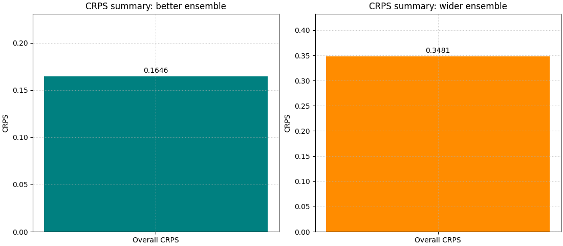
Start with the headline view: one overall CRPS bar#
The simplest reading is the overall summary.
This is the right first step when the user wants to compare two ensemble designs quickly. A lower bar means the ensemble distribution is, on average, more useful.
We draw the two cases side by side by calling the helper twice on two axes. The contrast is more instructive than looking at a single run.
fig, axes = plt.subplots(1, 2, figsize=(11, 4.8), constrained_layout=True)

plot_crps(
    y_true,
    ensemble_good,
    kind="summary_bar",
    title="CRPS summary: better ensemble",
    bar_color="teal",
    ax=axes[0],
)

plot_crps(
    y_true,
    ensemble_wide,
    kind="summary_bar",
    title="CRPS summary: wider ensemble",
    bar_color="darkorange",
    ax=axes[1],
)
<Axes: title={'center': 'CRPS summary: wider ensemble'}, ylabel='CRPS'>
How to read the summary bar#
This first figure answers a direct ranking question:
Which ensemble is better overall?
But it does not yet explain why one score is better.
That is why CRPS is best read in layers:
start with the summary bar,
inspect the histogram of sample-wise scores,
then inspect one concrete ensemble with the ECDF view.
The bar gives the verdict. The next two views explain the verdict.
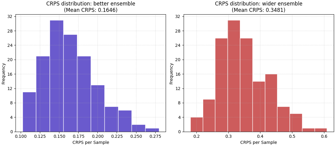
Move to the distribution view with a histogram#
The histogram reveals whether the average score is stable across samples or dominated by a few very bad cases.
This matters because two ensembles can share a similar mean CRPS while one behaves consistently and the other alternates between excellent and poor uncertainty estimates.
fig, axes = plt.subplots(1, 2, figsize=(11, 4.8), constrained_layout=True)

plot_crps(
    y_true,
    ensemble_good,
    kind="scores_histogram",
    title="CRPS distribution: better ensemble",
    hist_color="slateblue",
    hist_edgecolor="white",
    ax=axes[0],
)

plot_crps(
    y_true,
    ensemble_wide,
    kind="scores_histogram",
    title="CRPS distribution: wider ensemble",
    hist_color="indianred",
    hist_edgecolor="white",
    ax=axes[1],
)
<Axes: title={'center': 'CRPS distribution: wider ensemble\n(Mean CRPS: 0.3481)'}, xlabel='CRPS per Sample', ylabel='Frequency'>
What the histogram teaches that the mean cannot#
The histogram helps answer a different operational question:
Is the ensemble usually reasonable, or only good on average?
A compact histogram concentrated near lower values suggests more stable probabilistic behaviour.
A wide right tail usually means some samples are much harder, or the ensemble is poorly matched to those cases. In practice, this is often the figure that tells you whether a good average score is trustworthy.
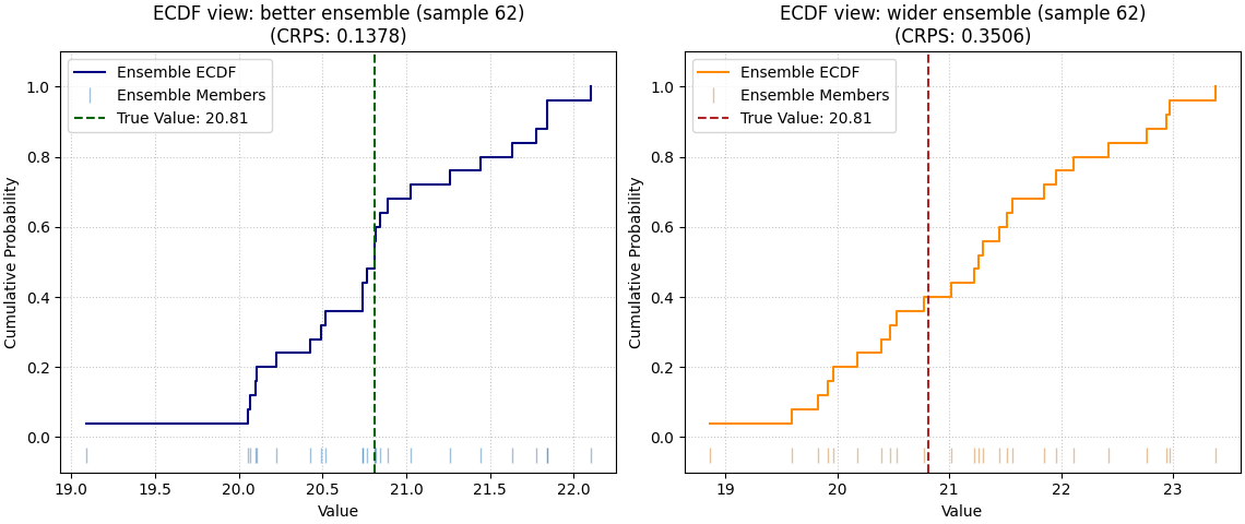
Inspect one concrete sample with the ECDF view#
The ECDF mode is the most intuitive teaching view because it shows one ensemble directly against the true value.
Use it when you want to explain what a “good” or “bad” probabilistic forecast looks like for one case. Here we inspect the same sample in both ensembles.
sample_idx = 62

fig, axes = plt.subplots(1, 2, figsize=(11.4, 4.8), constrained_layout=True)

plot_crps(
    y_true,
    ensemble_good,
    kind="ensemble_ecdf",
    sample_idx=sample_idx,
    title=f"ECDF view: better ensemble (sample {sample_idx})",
    ecdf_color="navy",
    true_value_color="darkgreen",
    ensemble_marker_color="steelblue",
    ax=axes[0],
)

plot_crps(
    y_true,
    ensemble_wide,
    kind="ensemble_ecdf",
    sample_idx=sample_idx,
    title=f"ECDF view: wider ensemble (sample {sample_idx})",
    ecdf_color="darkorange",
    true_value_color="firebrick",
    ensemble_marker_color="peru",
    ax=axes[1],
)
<Axes: title={'center': 'ECDF view: wider ensemble (sample 62)\n(CRPS: 0.3506)'}, xlabel='Value', ylabel='Cumulative Probability'>
How to interpret the ECDF view#
Read this plot in a simple order:
Where is the vertical true-value line?
Does it fall inside the bulk of the ensemble members?
Is the ensemble tightly concentrated or excessively spread?
A useful ensemble is not necessarily the narrowest one. It should be appropriately spread around the truth. If the truth sits far from most ensemble members, CRPS usually worsens. If the ensemble is much wider than needed, CRPS also worsens because unnecessary dispersion is penalized.
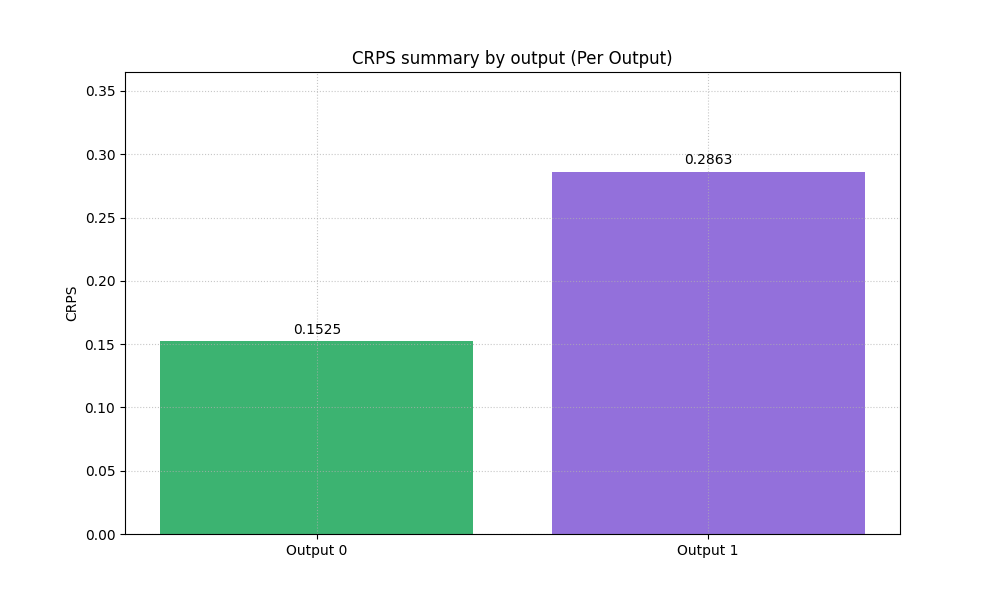
Multi-output data: the shape changes, not the idea#
Many real workflows have more than one target. The helper supports
that directly by moving from (N,) and (N, M) to (N, O) and
(N, O, M).
Here we create two outputs:
output 0 behaves like a cleaner target,
output 1 is noisier and intentionally harder.
This is useful because the summary bar can then show per-output CRPS.
output_0 = y_true
output_1 = 11.0 + 0.6 * y_true + 0.4 * np.sin(x / 1.8)
y_true_multi = np.column_stack([output_0, output_1])

ensemble_multi = np.empty((n_samples, 2, n_members), dtype=float)
ensemble_multi[:, 0, :] = (
    output_0[:, None]
    + rng.normal(loc=0.0, scale=0.60, size=(n_samples, n_members))
)
ensemble_multi[:, 1, :] = (
    output_1[:, None]
    + 0.15
    + rng.normal(loc=0.0, scale=1.10, size=(n_samples, n_members))
)

print("\nMulti-output shapes")
print(f"y_true_multi shape      : {y_true_multi.shape}")
print(f"ensemble_multi shape    : {ensemble_multi.shape}")

plot_crps(
    y_true_multi,
    ensemble_multi,
    kind="summary_bar",
    metric_kws={"multioutput": "raw_values"},
    title="CRPS summary by output",
    bar_color=["mediumseagreen", "mediumpurple"],
)
Multi-output shapes
y_true_multi shape      : (140, 2)
ensemble_multi shape    : (140, 2, 25)

<Axes: title={'center': 'CRPS summary by output (Per Output)'}, ylabel='CRPS'>
Why the per-output summary matters#
A single combined CRPS can hide important structure across targets. When users work with more than one output, a per-output summary is a much safer first diagnostic.
In a real project, this plot helps answer questions such as:
Is groundwater uncertainty modeled better than subsidence?
Does one target need recalibration while another already behaves well?
Is a single global uncertainty setting hurting one output more than another?
Histogram for a chosen output#
For multi-output data, the histogram becomes easier to interpret when
we focus on one output at a time. The helper supports that through
output_idx.
fig, axes = plt.subplots(1, 2, figsize=(11, 4.8), constrained_layout=True)

plot_crps(
    y_true_multi,
    ensemble_multi,
    kind="scores_histogram",
    output_idx=0,
    title="CRPS histogram: output 0",
    hist_color="royalblue",
    hist_edgecolor="white",
    ax=axes[0],
)

plot_crps(
    y_true_multi,
    ensemble_multi,
    kind="scores_histogram",
    output_idx=1,
    title="CRPS histogram: output 1",
    hist_color="mediumorchid",
    hist_edgecolor="white",
    ax=axes[1],
)
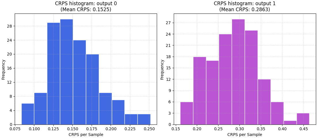
<Axes: title={'center': 'CRPS histogram: output 1\n(Mean CRPS: 0.2863)'}, xlabel='CRPS per Sample', ylabel='Frequency'>
Using precomputed CRPS values in reports#
Sometimes the user already computed CRPS elsewhere and only wants the
plotting helper for presentation. The helper supports that through
crps_values.
Here we mimic that reporting workflow with two precomputed values. The point of this section is not to replace the internal computation. It is to show that the plotting API can also act as a presentation layer.
precomputed_scores = np.array([0.4120, 0.7280])

plot_crps(
    y_true_multi,
    ensemble_multi,
    crps_values=precomputed_scores,
    kind="summary_bar",
    title="Precomputed CRPS report by output",
    bar_color=["cadetblue", "tomato"],
)
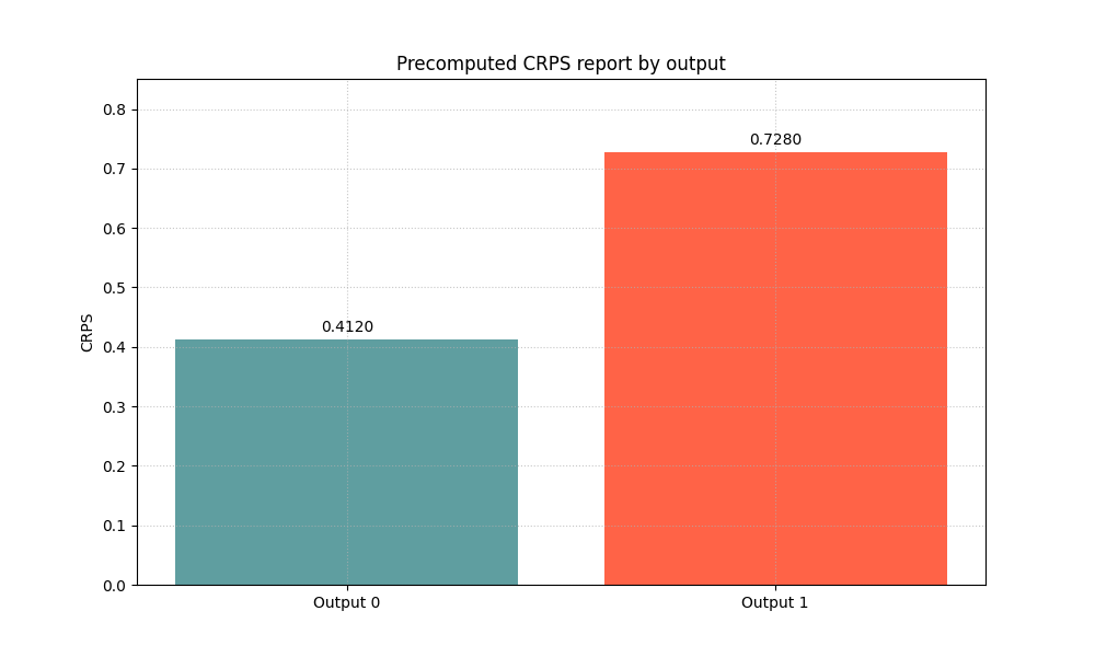
<Axes: title={'center': 'Precomputed CRPS report by output'}, ylabel='CRPS'>
How to adapt this lesson to your own data#
In a real project, you usually already have arrays from your model output. The practical mapping is simple:
observed values ->
y_trueensemble draws or members ->
y_pred_ensemble
Then choose the plot based on your question:
use
kind='summary_bar'for a quick overall comparison,use
kind='scores_histogram'when you want to inspect the spread of sample-wise forecast quality,use
kind='ensemble_ecdf'when you want to teach or diagnose one concrete example.
A good workflow is therefore:
compare overall CRPS,
inspect the distribution,
inspect one or two representative samples,
then decide whether the ensemble needs recalibration, more members, or a better predictive distribution.
The key idea is simple: CRPS is not only a number. With the three plot modes together, it becomes a small visual language for judging whether uncertainty forecasts are believable and useful.
plt.show()
Total running time of the script: (0 minutes 1.371 seconds)