
Note
Go to the end to download the full example code.
Compare compact score profiles with plot_radar_scores#
This lesson explains how to use
geoprior.plot.evaluation.plot_radar_scores when you
want to summarize several scores as one compact profile.
Why this function matters#
Many evaluation plots in this gallery answer one question at a time:
how error changes by horizon,
how wide intervals are,
how well quantiles are calibrated,
how stable trajectories remain.
That is exactly the right way to diagnose a forecast. But once those individual checks are available, users usually want one more view:
Can I look at several summary scores together and read an overall performance shape?
That is where plot_radar_scores helps.
This helper is useful when you already have a small set
of interpretable summary values and you want to compare
profiles quickly. It can also compute those values from
y_true and y_pred directly when you give it one or
more metric functions.
This page is written as a teaching guide, not only as an API example. We will show both supported workflows:
passing precomputed values directly,
letting the helper compute metric scores from
y_trueandy_pred.
We will also finish with practical advice on when radar plots are useful and when a bar chart is the safer choice.
from __future__ import annotations

import matplotlib.pyplot as plt
import numpy as np
from sklearn.metrics import mean_absolute_error, mean_squared_error

from geoprior.plot.evaluation import plot_radar_scores
What this function expects#
plot_radar_scores supports two main workflows.
- Workflow 1: direct values
Pass
data_valuesas:a dict such as
{"MAE": 3.4, "RMSE": 5.1, ...},a list/array of values plus
category_names.
- Workflow 2: compute scores from data
Pass:
y_trueandy_pred,metric_functionsas one callable or a list of callables,and optional
category_names.
A few practical rules matter when teaching this helper:
each radar axis must correspond to one scalar value,
the current helper draws one radar line per call,
if you want to compare several models, the cleanest pattern is usually one subplot per model,
and radar plots become much easier to read when all models share the same category order.
The implementation also warns that radar plots are not ideal for fewer than three categories. That is good advice in practice too.
Build realistic regression-style data#
For the lesson, we create one observed series and three prediction variants:
a stronger model,
a moderate model,
and a weaker model.
We will use them twice:
first to compute scores from
y_trueandy_pred,then to build a manual score table for direct-value radar plots.
rng = np.random.default_rng(27)

n_samples = 240
x = np.linspace(0.0, 6.0 * np.pi, n_samples)
y_true = (
    20.0
    + 3.0 * np.sin(x / 2.5)
    + 1.3 * np.cos(x / 5.0)
    + rng.normal(scale=0.8, size=n_samples)
)

y_pred_strong = (
    20.0
    + 2.95 * np.sin(x / 2.55)
    + 1.2 * np.cos(x / 5.1)
    + rng.normal(scale=0.55, size=n_samples)
)

y_pred_mid = (
    20.2
    + 2.75 * np.sin(x / 2.7)
    + 1.0 * np.cos(x / 4.8)
    + rng.normal(scale=0.95, size=n_samples)
)

y_pred_weak = (
    20.7
    + 2.35 * np.sin(x / 3.0)
    + 0.7 * np.cos(x / 4.2)
    + rng.normal(scale=1.35, size=n_samples)
)
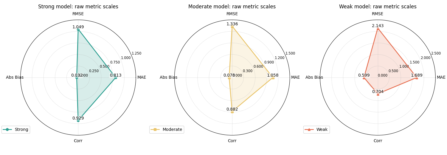
Start with metric-driven radar plots#
The most educational starting point is to let the helper compute scores for us from the raw arrays.
We define four metric functions:
MAE,
RMSE,
Bias magnitude,
correlation.
Using four axes is a good teaching choice because the shape becomes easy to read without clutter.
def rmse_metric(yt, yp):
    return np.sqrt(mean_squared_error(yt, yp))


rmse_metric.__name__ = "RMSE"


def bias_abs_metric(yt, yp):
    return float(np.abs(np.mean(yp - yt)))


bias_abs_metric.__name__ = "Abs Bias"


def corr_metric(yt, yp):
    return float(np.corrcoef(yt, yp)[0, 1])


corr_metric.__name__ = "Corr"


metric_functions = [
    mean_absolute_error,
    rmse_metric,
    bias_abs_metric,
    corr_metric,
]

category_names = ["MAE", "RMSE", "Abs Bias", "Corr"]

fig, axes = plt.subplots(
    1,
    3,
    figsize=(15.0, 5.2),
    subplot_kw={"polar": True},
    constrained_layout=True,
)

plot_radar_scores(
    y_true=y_true,
    y_pred=y_pred_strong,
    metric_functions=metric_functions,
    category_names=category_names,
    title="Strong model: raw metric scales",
    line_color="#2A9D8F",
    fill_alpha=0.18,
    marker="o",
    annotation_format="{:.3f}",
    legend_label="Strong",
    ax=axes[0],
)

plot_radar_scores(
    y_true=y_true,
    y_pred=y_pred_mid,
    metric_functions=metric_functions,
    category_names=category_names,
    title="Moderate model: raw metric scales",
    line_color="#E9C46A",
    fill_alpha=0.18,
    marker="s",
    annotation_format="{:.3f}",
    legend_label="Moderate",
    ax=axes[1],
)

plot_radar_scores(
    y_true=y_true,
    y_pred=y_pred_weak,
    metric_functions=metric_functions,
    category_names=category_names,
    title="Weak model: raw metric scales",
    line_color="#E76F51",
    fill_alpha=0.18,
    marker="^",
    annotation_format="{:.3f}",
    legend_label="Weak",
    ax=axes[2],
)
<PolarAxes: title={'center': 'Weak model: raw metric scales'}>
How to read the raw-scale version#
A very important reading rule comes first:
not all radar axes have the same meaning.
In this example:
MAE, RMSE, and Abs Bias are better when smaller,
correlation is better when larger.
That means the polygon is a quick profile, not a single “bigger is always better” score.
This is why raw-scale radar plots are useful mainly for compact expert reading, not for casual ranking.
Still, they are informative:
the stronger model stays close to zero on the three error-like axes,
while keeping a high correlation,
the weaker model expands more strongly on MAE, RMSE, and bias,
and its correlation drops.
That already tells a clean comparative story.
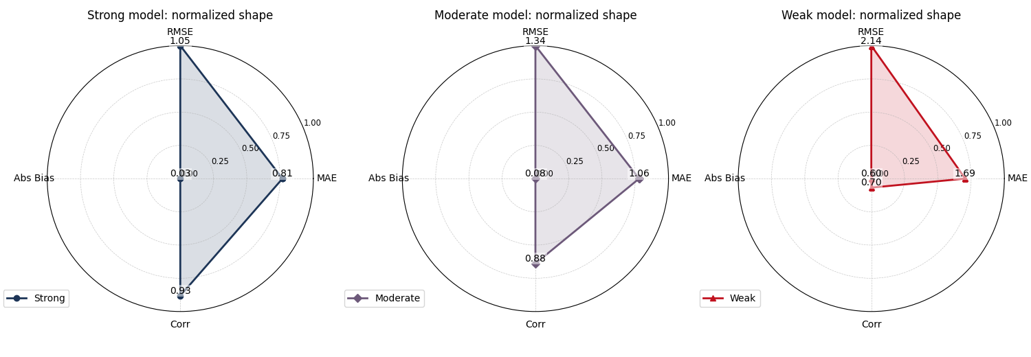
Normalize the values to compare shapes more easily#
The helper also supports normalize_values=True.
This does not mean the metrics become statistically
comparable in a deep sense. It only rescales the chosen
values to a common [0, 1] range within each radar so
the shape is easier to inspect visually.
This is helpful when some axes are naturally much larger in scale than others.
fig, axes = plt.subplots(
    1,
    3,
    figsize=(15.0, 5.2),
    subplot_kw={"polar": True},
    constrained_layout=True,
)

plot_radar_scores(
    y_true=y_true,
    y_pred=y_pred_strong,
    metric_functions=metric_functions,
    category_names=category_names,
    normalize_values=True,
    title="Strong model: normalized shape",
    line_color="#1D3557",
    fill_alpha=0.16,
    marker="o",
    r_ticks_count=4,
    legend_label="Strong",
    ax=axes[0],
)

plot_radar_scores(
    y_true=y_true,
    y_pred=y_pred_mid,
    metric_functions=metric_functions,
    category_names=category_names,
    normalize_values=True,
    title="Moderate model: normalized shape",
    line_color="#6D597A",
    fill_alpha=0.16,
    marker="D",
    r_ticks_count=4,
    legend_label="Moderate",
    ax=axes[1],
)

plot_radar_scores(
    y_true=y_true,
    y_pred=y_pred_weak,
    metric_functions=metric_functions,
    category_names=category_names,
    normalize_values=True,
    title="Weak model: normalized shape",
    line_color="#C1121F",
    fill_alpha=0.16,
    marker="^",
    r_ticks_count=4,
    legend_label="Weak",
    ax=axes[2],
)
<PolarAxes: title={'center': 'Weak model: normalized shape'}>
Why normalization can help#
Normalization is often useful when one axis dominates the visual range.
In forecast evaluation, RMSE can easily be numerically larger than MAE or correlation-style quantities, so a raw radar may visually over-emphasize that axis.
The normalized view is therefore helpful for seeing the balance of strengths and weaknesses inside one model.
But it should not replace the raw-scale reading. The normalized plot is about shape, not about original units.
Use direct values when scores are already summarized#
In many real workflows you already have a compact score
table from earlier analysis. In that case, it is simpler
to pass the values directly instead of recomputing them
from y_true and y_pred.
That is exactly what data_values is for.
score_dict_strong = {
    "MAE": float(mean_absolute_error(y_true, y_pred_strong)),
    "RMSE": float(rmse_metric(y_true, y_pred_strong)),
    "Abs Bias": float(bias_abs_metric(y_true, y_pred_strong)),
    "Corr": float(corr_metric(y_true, y_pred_strong)),
    "Skill": 0.92,
}

score_dict_mid = {
    "MAE": float(mean_absolute_error(y_true, y_pred_mid)),
    "RMSE": float(rmse_metric(y_true, y_pred_mid)),
    "Abs Bias": float(bias_abs_metric(y_true, y_pred_mid)),
    "Corr": float(corr_metric(y_true, y_pred_mid)),
    "Skill": 0.84,
}

print("Direct-value summary for the stronger model")
for k, v in score_dict_strong.items():
    print(f"{k:>8s}: {v:0.4f}")

fig, axes = plt.subplots(
    1,
    2,
    figsize=(10.8, 5.0),
    subplot_kw={"polar": True},
    constrained_layout=True,
)

plot_radar_scores(
    data_values=score_dict_strong,
    normalize_values=False,
    title="Direct-value radar: stronger summary",
    line_color="#118AB2",
    fill_alpha=0.20,
    marker="o",
    annotation_format="{:.3f}",
    legend_label="Strong summary",
    ax=axes[0],
)

plot_radar_scores(
    data_values=score_dict_mid,
    normalize_values=False,
    title="Direct-value radar: moderate summary",
    line_color="#EF476F",
    fill_alpha=0.20,
    marker="s",
    annotation_format="{:.3f}",
    legend_label="Moderate summary",
    ax=axes[1],
)
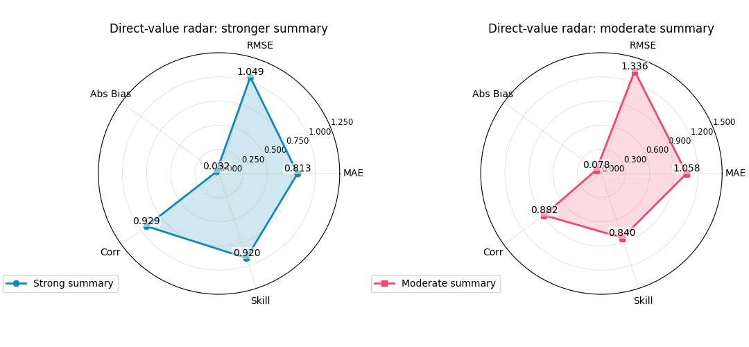
Direct-value summary for the stronger model
     MAE: 0.8133
    RMSE: 1.0493
Abs Bias: 0.0320
    Corr: 0.9285
   Skill: 0.9200

<PolarAxes: title={'center': 'Direct-value radar: moderate summary'}>
When direct values are the best choice#
Passing data_values directly is usually the best
pattern when:
the scores were computed elsewhere,
different categories are not all derived from the same raw arrays,
or you want to include a manually curated score such as an operational utility index, a domain-specific skill number, or a calibrated acceptance score.
In other words, plot_radar_scores can work as a pure
visualization helper once the score table already exists.
A practical model-comparison reading pattern#
Because the current helper draws one radar line per call, the cleanest comparison pattern is often:
create one polar subplot per model,
keep the same category order,
keep the same radial limits when possible,
use distinct colors,
and read the radars next to a bar chart or horizon plot rather than in isolation.
This is especially important in evaluation work. Radar plots are compact and attractive, but they are not always the clearest quantitative comparison tool.
They work best when the user already understands the underlying metrics.
How to adapt this helper to your own data#
In a real workflow, you will usually be in one of these situations.
Situation 1: you already have arrays
collect
y_trueandy_pred,choose a small list of metric functions,
pass them in
metric_functions,and keep
category_namesin the same order.
Situation 2: you already have a score table
create an ordered dict of values,
or pass a list/array plus
category_names,then use
data_values=...directly.
Situation 3: you want to compare models
call the helper once per model,
create one polar subplot per model,
and use different colors rather than relying on Matplotlib defaults.
In all three cases, keep the number of categories small. Four to six axes is usually a comfortable range for a readable radar plot.
Final teaching summary#
plot_radar_scores is best understood as a compact
profile view.
It is not the first plot to draw when diagnosing a model. Instead, it becomes useful after you already know which metrics matter and want to summarize them visually.
A good practice is therefore:
diagnose with clearer plots first,
compute or collect a small set of meaningful scores,
then use this radar helper to compare the summary profile.
That way the radar plot becomes a helpful synthesis, not a decorative replacement for real diagnosis.
Total running time of the script: (0 minutes 1.312 seconds)