
Note
Go to the end to download the full example code.
Compare independent regression pairs with plot_r2_in#
This lesson explains how to use
geoprior.plot.r2.plot_r2_in() when you do not have one shared
truth vector, but instead several separate (y_true, y_pred) pairs.
Why this function matters#
There are many situations where each prediction task has its own target vector:
train vs validation predictions,
city A vs city B,
one forecast year vs another,
one output variable vs another,
or one experiment split vs another.
In those cases, the helper plot_r2() is not the most natural fit,
because it assumes one common y_true and many competing prediction
arrays.
plot_r2_in solves that problem by accepting an alternating sequence
of pairs:
y_true_1, y_pred_1, y_true_2, y_pred_2, ...
and then building one diagnostic subplot for each pair.
What makes this helper special#
Compared with plot_r2, this version adds one useful diagnostic
feature: an optional fitted regression line and displayed line equation.
That turns the page into more than a score report. It also helps users
see whether a pair suffers from:
slope shrinkage,
amplitude inflation,
offset bias,
or broader scatter.
from __future__ import annotations

import matplotlib.pyplot as plt
import numpy as np

from geoprior.plot.r2 import plot_r2_in
Build three independent regression tasks#
To make the purpose of plot_r2_in clear, we create three different
truth/prediction pairs rather than one shared truth vector.
Here we mimic:
a training split,
a validation split,
and a more difficult external split.
This is exactly the kind of situation where alternating pairs are more
natural than the single-truth design of plot_r2.
rng = np.random.default_rng(7)

n_train = 110
n_valid = 90
n_external = 100

x_train = np.linspace(0.0, 1.0, n_train)
x_valid = np.linspace(0.0, 1.0, n_valid)
x_external = np.linspace(0.0, 1.0, n_external)

y_true_train = 12.0 + 45.0 * x_train + 4.0 * np.sin(3.0 * np.pi * x_train)
y_true_valid = 11.0 + 46.0 * x_valid + 4.5 * np.sin(3.0 * np.pi * x_valid)
y_true_external = 10.0 + 48.0 * x_external + 5.5 * np.sin(3.2 * np.pi * x_external)

y_pred_train = y_true_train + rng.normal(0.0, 1.8, n_train)
y_pred_valid = 0.95 * y_true_valid + 1.2 + rng.normal(0.0, 2.8, n_valid)
y_pred_external = 0.86 * y_true_external + 3.0 + rng.normal(0.0, 4.5, n_external)
Start with the simplest independent-pairs comparison#
The first lesson use is to pass alternating pairs directly. This is the core mental model of the function.
Read the resulting figure in this order:
compare the R² annotations,
compare the width of the scatter clouds,
check whether the fitted line stays close to the perfect-fit line,
inspect whether slope and intercept suggest systematic bias.
fig = plot_r2_in(
    y_true_train,
    y_pred_train,
    y_true_valid,
    y_pred_valid,
    y_true_external,
    y_pred_external,
    titles=["Training split", "Validation split", "External split"],
    xlabel="Observed subsidence",
    ylabel="Predicted subsidence",
    scatter_colors=["#1f77b4", "#ff7f0e", "#d62728"],
    line_colors=["#3b3b3b", "#3b3b3b", "#3b3b3b"],
    line_styles=["--", "--", "--"],
    annotate=True,
    fit_eq=True,
    fit_line_color="#2ca02c",
    show_grid=True,
    max_cols=2,
)
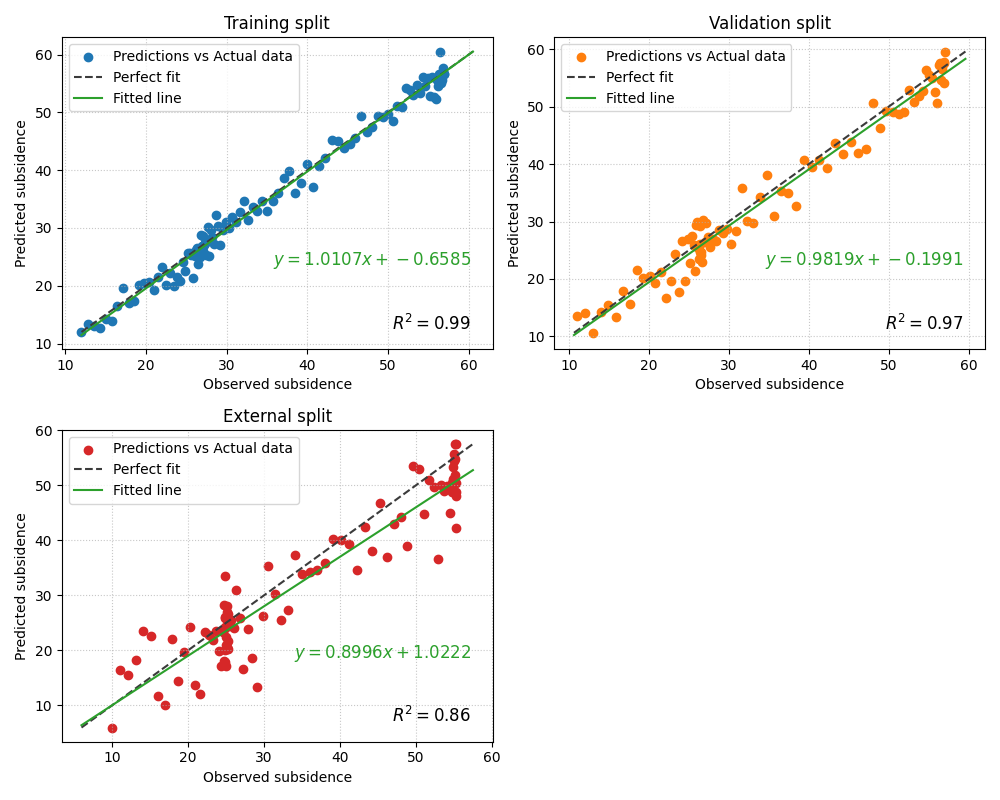
Why the fitted line matters#
This helper is especially valuable when the fitted line tells a story that the R² score alone does not.
For example:
a slope clearly below 1 suggests amplitude compression,
a large intercept suggests offset bias,
and a fitted line that diverges from the 1:1 line reveals systematic distortion even when the cloud still looks correlated.
In the external split above, the fitted line is often the fastest way to notice that the model is not only noisier, but also less well calibrated in amplitude.
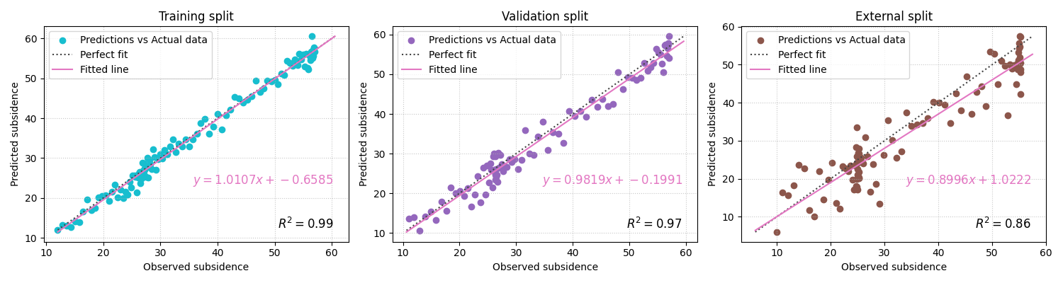
Add RMSE and MAE to each pair#
plot_r2_in can annotate extra metrics on each subplot. This is
useful when each pair represents a different operational condition and
you want a compact diagnostic card for each one.
fig = plot_r2_in(
    y_true_train,
    y_pred_train,
    y_true_valid,
    y_pred_valid,
    y_true_external,
    y_pred_external,
    titles=["Training split", "Validation split", "External split"],
    xlabel="Observed subsidence",
    ylabel="Predicted subsidence",
    scatter_colors=["#17becf", "#9467bd", "#8c564b"],
    line_colors=["#444444", "#444444", "#444444"],
    line_styles=[":", ":", ":"],
    other_metrics=["rmse", "mae"],
    annotate=True,
    fit_eq=True,
    fit_line_color="#e377c2",
    show_grid=True,
    max_cols=3,
)
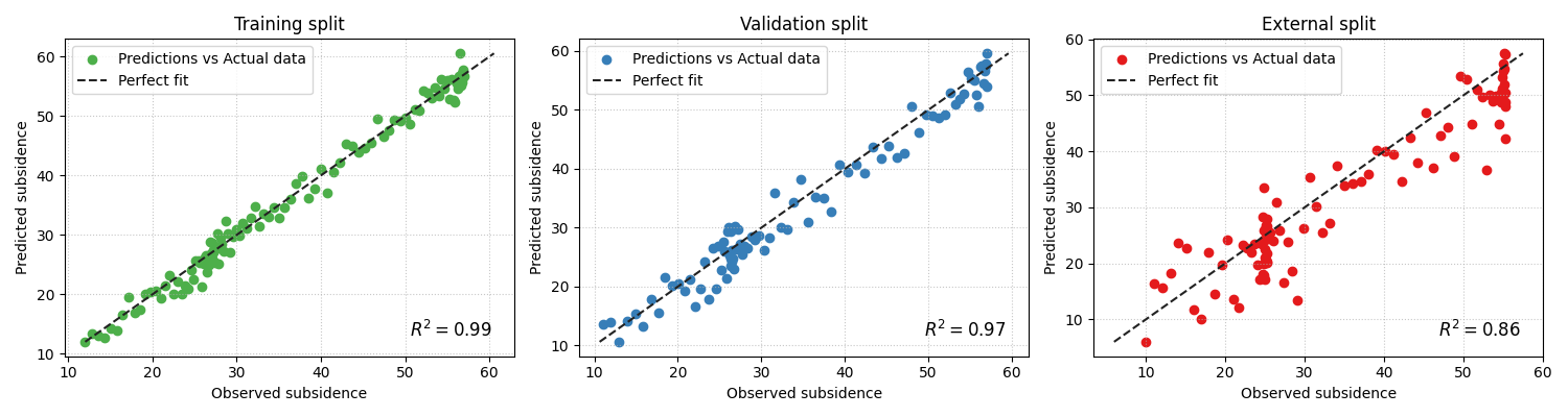
Use the function without the fitted equation when you want a cleaner page#
When many pairs are compared, the figure can become text-heavy. In that case, disabling the fitted equation is often the better teaching and reporting choice.
fig = plot_r2_in(
    y_true_train,
    y_pred_train,
    y_true_valid,
    y_pred_valid,
    y_true_external,
    y_pred_external,
    titles=["Training split", "Validation split", "External split"],
    xlabel="Observed subsidence",
    ylabel="Predicted subsidence",
    scatter_colors=["#4daf4a", "#377eb8", "#e41a1c"],
    line_colors=["#222222", "#222222", "#222222"],
    line_styles=["--", "--", "--"],
    other_metrics=["rmse"],
    annotate=True,
    fit_eq=False,
    show_grid=True,
    max_cols=3,
)
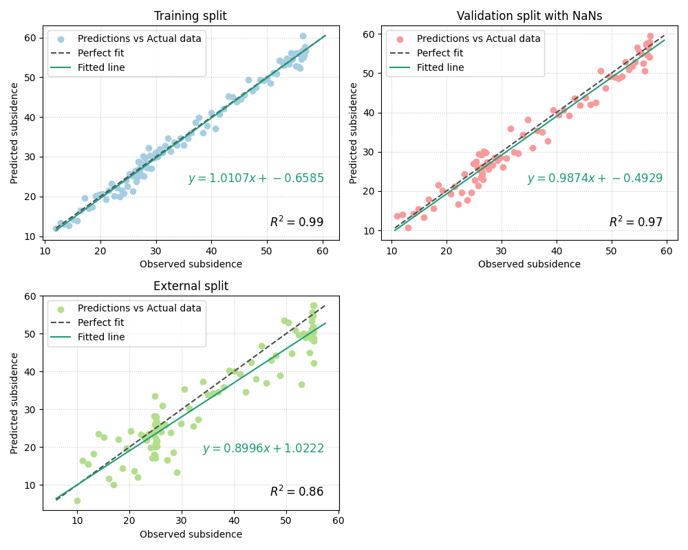
Demonstrate pair-wise cleaning with imperfect arrays#
The implementation uses process_y_pairs to validate and clean the
alternating pairs. That is helpful when one pair contains missing
values but the others remain usable.
Here we introduce a few NaNs into one pair only.
y_true_valid_nan = y_true_valid.copy()
y_pred_valid_nan = y_pred_valid.copy()
y_true_valid_nan[[10, 17]] = np.nan
y_pred_valid_nan[[17, 25]] = np.nan

fig = plot_r2_in(
    y_true_train,
    y_pred_train,
    y_true_valid_nan,
    y_pred_valid_nan,
    y_true_external,
    y_pred_external,
    titles=["Training split", "Validation split with NaNs", "External split"],
    xlabel="Observed subsidence",
    ylabel="Predicted subsidence",
    scatter_colors=["#a6cee3", "#fb9a99", "#b2df8a"],
    line_colors=["#4c4c4c", "#4c4c4c", "#4c4c4c"],
    line_styles=["--", "--", "--"],
    other_metrics=["rmse"],
    annotate=True,
    fit_eq=True,
    fit_line_color="#1b9e77",
    show_grid=True,
    max_cols=2,
)
When should you choose plot_r2_in instead of plot_r2?#
Use plot_r2_in when each subplot should represent its own
independent diagnostic pair.
Good examples:
train, validation, and test predictions,
Nansha, Zhongshan, and an external city,
groundwater and subsidence outputs,
different forecast years evaluated separately.
A simple rule is:
shared truth, many predictions ->
plot_r2many independent truth/prediction pairs ->
plot_r2_in
How to use it on your own data#
A realistic workflow might look like this:
plot_r2_in(
    train_df["subsidence_actual"].to_numpy(),
    train_df["subsidence_q50"].to_numpy(),
    valid_df["subsidence_actual"].to_numpy(),
    valid_df["subsidence_q50"].to_numpy(),
    test_df["subsidence_actual"].to_numpy(),
    test_df["subsidence_q50"].to_numpy(),
    titles=["Train", "Validation", "Test"],
    other_metrics=["rmse", "mae"],
    fit_eq=True,
    max_cols=2,
)
This is particularly useful in diagnostics pages because it makes the quality difference across operating conditions visible at a glance.
A compact reading checklist#
When reading a plot_r2_in figure, ask:
Which pair has the strongest R²?
Which pair has the narrowest scatter cloud?
Does the fitted line remain close to the perfect-fit line?
Is the slope near 1 and the intercept near 0?
Do RMSE and MAE confirm the same ranking?
That combination gives a much richer diagnostic than a single R² table.
plt.show()
Total running time of the script: (0 minutes 1.680 seconds)