
Note
Go to the end to download the full example code.
Reliability diagrams for probabilistic forecasts#
This lesson teaches how to use
geoprior.utils.forecast_utils.plot_reliability_diagram()
to inspect the calibration of probabilistic forecast intervals.
Why this page matters#
A coverage number such as 0.74 for an intended 80% interval is useful, but it is still only one number.
A reliability diagram answers a richer question:
Across a range of nominal interval probabilities, how often did the forecast intervals actually contain the truth?
That is the role of plot_reliability_diagram.
The real helper draws:
a diagonal baseline representing perfect calibration,
one curve per model,
the empirical coverage obtained from the model’s quantile forecast columns.
It can read either:
forecast DataFrames directly, or
precomputed reliability points via
nominal_probsandobserved_probs.
What the function expects#
The helper accepts models_data as a mapping from model names to
either:
a pandas DataFrame, or
a nested dict containing at least
forecastsand optionally styling such ascolor,marker, andstyle.
When forecast tables are provided, the helper uses the target
prefix to look for quantile columns such as
subsidence_q10 or subsidence_q90, compares them with
y_true, and plots nominal-versus-observed coverage.
What this lesson teaches#
We will:
create a synthetic spatial evaluation dataset,
build several forecast variants with different interval behavior,
compute compact reliability tables numerically,
plot the real reliability diagram,
demonstrate the helper’s alternative precomputed-point mode.
This page is synthetic so it remains fully executable during the documentation build.
Imports#
We use the real reliability helper, and one calibration helper to produce a calibrated comparison curve.
import numpy as np
import pandas as pd

from geoprior.utils.calibrate import calibrate_quantile_forecasts
from geoprior.utils.forecast_utils import plot_reliability_diagram
Step 1 - Build a compact spatial evaluation dataset#
We mimic a small city-like spatial grid observed over three forecast steps. Each location-step pair becomes one row in the evaluation table.
We generate one latent continuous truth field and then build several quantile-forecast variants around it.
rng = np.random.default_rng(52)

nx = 9
ny = 6
steps = [1, 2, 3]
years = {1: 2024, 2: 2025, 3: 2026}

xv = np.linspace(0.0, 12_000.0, nx)
yv = np.linspace(0.0, 8_000.0, ny)
X, Y = np.meshgrid(xv, yv)

x_flat = X.ravel()
y_flat = Y.ravel()
n_sites = x_flat.size

xn = (x_flat - x_flat.min()) / (x_flat.max() - x_flat.min())
yn = (y_flat - y_flat.min()) / (y_flat.max() - y_flat.min())

hotspot = np.exp(
    -(
        ((xn - 0.72) ** 2) / 0.020
        + ((yn - 0.34) ** 2) / 0.032
    )
)
ridge = 0.55 * np.exp(
    -(
        ((xn - 0.28) ** 2) / 0.028
        + ((yn - 0.74) ** 2) / 0.050
    )
)
gradient = 0.46 * xn + 0.20 * (1.0 - yn)

# Quantiles we want to expose in the forecast tables.
# The reliability helper works with quantile suffixes like q10/q90.
quantiles = [0.05, 0.10, 0.20, 0.30, 0.40, 0.50,
             0.60, 0.70, 0.80, 0.90, 0.95]

# Approximate z-scores for a symmetric Gaussian-style quantile family.
z_map = {
    0.05: -1.6449,
    0.10: -1.2816,
    0.20: -0.8416,
    0.30: -0.5244,
    0.40: -0.2533,
    0.50: 0.0,
    0.60: 0.2533,
    0.70: 0.5244,
    0.80: 0.8416,
    0.90: 1.2816,
    0.95: 1.6449,
}

truth_rows: list[dict[str, float | int]] = []

for step in steps:
    scale = {1: 1.00, 2: 1.18, 3: 1.42}[step]

    mu = (
        2.1
        + 1.45 * gradient
        + 2.1 * hotspot
        + 0.95 * ridge
    ) * scale

    sigma_true = (
        0.28
        + 0.08 * xn
        + 0.04 * hotspot
        + 0.04 * step
    )

    actual = mu + rng.normal(0.0, sigma_true, size=n_sites)

    for i in range(n_sites):
        truth_rows.append(
            {
                "sample_idx": i,
                "forecast_step": step,
                "coord_t": years[step],
                "coord_x": float(x_flat[i]),
                "coord_y": float(y_flat[i]),
                "subsidence_actual": float(actual[i]),
                "mu_latent": float(mu[i]),
                "sigma_true": float(sigma_true[i]),
            }
        )

truth_df = pd.DataFrame(truth_rows)

print("Truth table shape:", truth_df.shape)
print("")
print(truth_df.head(8).to_string(index=False))
Truth table shape: (162, 8)

 sample_idx  forecast_step  coord_t    coord_x  coord_y  subsidence_actual  mu_latent  sigma_true
          0              1     2024     0.0000   0.0000             2.1257     2.3900      0.3200
          1              1     2024  1500.0000   0.0000             2.5534     2.4734      0.3300
          2              1     2024  3000.0000   0.0000             2.5351     2.5568      0.3400
          3              1     2024  4500.0000   0.0000             2.6073     2.6403      0.3500
          4              1     2024  6000.0000   0.0000             2.8450     2.7285      0.3601
          5              1     2024  7500.0000   0.0000             3.0898     2.8430      0.3707
          6              1     2024  9000.0000   0.0000             3.0166     2.9444      0.3810
          7              1     2024 10500.0000   0.0000             3.0603     2.9907      0.3903
Step 2 - Build several quantile forecast variants#
We create three different uncertainty behaviors:
Overconfident: intervals too narrow;
Balanced: intervals close to the latent truth spread;
Conservative: intervals too wide.
Then we calibrate the overconfident one so the reliability diagram can show how calibration changes the curve.
def make_quantile_forecast_df(
    truth_data: pd.DataFrame,
    *,
    width_scale: float,
    median_bias: float = 0.0,
) -> pd.DataFrame:
    out = truth_data[
        [
            "sample_idx",
            "forecast_step",
            "coord_t",
            "coord_x",
            "coord_y",
            "subsidence_actual",
            "mu_latent",
            "sigma_true",
        ]
    ].copy()

    mu = out["mu_latent"].to_numpy(float) + float(median_bias)
    sigma = out["sigma_true"].to_numpy(float) * float(width_scale)

    for q in quantiles:
        col = f"subsidence_q{int(q * 100)}"
        out[col] = mu + z_map[q] * sigma

    # keep the canonical median column users will expect
    # from downstream tooling
    return out.drop(columns=["mu_latent", "sigma_true"])


df_over = make_quantile_forecast_df(truth_df, width_scale=0.55)
df_bal = make_quantile_forecast_df(truth_df, width_scale=1.00)
df_cons = make_quantile_forecast_df(truth_df, width_scale=1.65)

print("")
print("Overconfident forecast head")
print(df_over.head(6).to_string(index=False))
Overconfident forecast head
 sample_idx  forecast_step  coord_t   coord_x  coord_y  subsidence_actual  subsidence_q5  subsidence_q10  subsidence_q20  subsidence_q30  subsidence_q40  subsidence_q50  subsidence_q60  subsidence_q70  subsidence_q80  subsidence_q90  subsidence_q95
          0              1     2024    0.0000   0.0000             2.1257         2.1005          2.1644          2.2419          2.2977          2.3454          2.3900          2.4346          2.4823          2.5381          2.6156          2.6795
          1              1     2024 1500.0000   0.0000             2.5534         2.1748          2.2408          2.3206          2.3782          2.4274          2.4734          2.5194          2.5686          2.6261          2.7060          2.7719
          2              1     2024 3000.0000   0.0000             2.5351         2.2492          2.3171          2.3994          2.4587          2.5094          2.5568          2.6041          2.6548          2.7141          2.7964          2.8644
          3              1     2024 4500.0000   0.0000             2.6073         2.3236          2.3936          2.4783          2.5393          2.5915          2.6403          2.6890          2.7412          2.8023          2.8870          2.9569
          4              1     2024 6000.0000   0.0000             2.8450         2.4028          2.4747          2.5619          2.6247          2.6784          2.7285          2.7787          2.8324          2.8952          2.9824          3.0543
          5              1     2024 7500.0000   0.0000             3.0898         2.5076          2.5817          2.6714          2.7360          2.7913          2.8430          2.8946          2.9499          3.0145          3.1043          3.1783
Step 3 - Calibrate the overconfident forecast#
We use the real interval-calibration workflow from the uncertainty utilities. This gives us a fourth comparison curve:
Calibrated overconfident forecast
The calibration helper fits horizon-wise factors from the evaluation table and rescales quantiles around the median. That makes it a natural companion for a reliability page.
df_over_cal, _, cal_stats = calibrate_quantile_forecasts(
    df_eval=df_over,
    df_future=None,
    target_name="subsidence",
    step_col="forecast_step",
    interval=(0.1, 0.9),
    target_coverage=0.8,
    median_q=0.5,
    use="auto",
    keep_original=True,
    enforce_monotonic="cummax",
    verbose=0,
)

print("")
print("Calibration stats")
print(cal_stats)
Calibration stats
{'target': 0.8, 'interval': [0.1, 0.9], 'f_max': 5.0, 'tol': 0.02, 'overall_key': '__overall__', 'factors_source': 'fit', 'factors': {'1': 1.8629894256591797, '2': 1.3924503326416016, '3': 1.911332130432129}, 'eval_before': {'coverage': 0.5864197530864198, 'sharpness': 0.5672223460842876, 'per_horizon': {'1': {'coverage': 0.5925925925925926, 'sharpness': 0.5108319460842875}, '2': {'coverage': 0.6296296296296297, 'sharpness': 0.5672223460842875}, '3': {'coverage': 0.5370370370370371, 'sharpness': 0.6236127460842877}}}, 'eval_after': {'coverage': 0.8148148148148148, 'sharpness': 0.9778115122895517, 'per_horizon': {'1': {'coverage': 0.8148148148148148, 'sharpness': 0.9516745138439275}, '2': {'coverage': 0.8148148148148148, 'sharpness': 0.7898289444868157}, '3': {'coverage': 0.8148148148148148, 'sharpness': 1.1919310785379116}}}}
Step 4 - Build a compact numerical reliability table#
Before plotting, it helps to compute empirical coverage manually.
We use a handful of symmetric intervals:
90% -> q05 to q95
80% -> q10 to q90
60% -> q20 to q80
40% -> q30 to q70
20% -> q40 to q60
These are exactly the kinds of nominal-versus-observed comparisons that a reliability diagram visualizes.
interval_pairs = {
    0.90: (5, 95),
    0.80: (10, 90),
    0.60: (20, 80),
    0.40: (30, 70),
    0.20: (40, 60),
}


def reliability_table(
    df: pd.DataFrame,
    *,
    actual_col: str = "subsidence_actual",
    prefix: str = "subsidence",
) -> pd.DataFrame:
    rows = []
    y_true = df[actual_col].to_numpy(float)

    for nominal, (lo_q, hi_q) in interval_pairs.items():
        lo_col = f"{prefix}_q{lo_q}"
        hi_col = f"{prefix}_q{hi_q}"

        lo = df[lo_col].to_numpy(float)
        hi = df[hi_col].to_numpy(float)

        covered = (y_true >= lo) & (y_true <= hi)

        rows.append(
            {
                "nominal_prob": float(nominal),
                "observed_freq": float(np.mean(covered)),
                "mean_width": float(np.mean(hi - lo)),
                "calibration_gap": float(np.mean(covered) - nominal),
            }
        )

    return pd.DataFrame(rows).sort_values("nominal_prob")


rel_over = reliability_table(df_over)
rel_bal = reliability_table(df_bal)
rel_cons = reliability_table(df_cons)
rel_cal = reliability_table(df_over_cal)

print("")
print("Balanced model reliability table")
print(rel_bal.to_string(index=False))
Balanced model reliability table
 nominal_prob  observed_freq  mean_width  calibration_gap
       0.2000         0.2407      0.2038           0.0407
       0.4000         0.4568      0.4220           0.0568
       0.6000         0.6543      0.6772           0.0543
       0.8000         0.8210      1.0313           0.0210
       0.9000         0.8889      1.3237          -0.0111
Step 5 - Summarize calibration error numerically#
A compact scalar summary can help readers compare the curves before they inspect the figure.
We compute the mean absolute deviation from the perfect-calibration diagonal across the available nominal probabilities.
def mean_abs_reliability_gap(df_rel: pd.DataFrame) -> float:
    return float(
        np.mean(
            np.abs(
                df_rel["observed_freq"].to_numpy(float)
                - df_rel["nominal_prob"].to_numpy(float)
            )
        )
    )


df_summary = pd.DataFrame(
    [
        {
            "model": "Overconfident",
            "mean_abs_gap": mean_abs_reliability_gap(rel_over),
        },
        {
            "model": "Balanced",
            "mean_abs_gap": mean_abs_reliability_gap(rel_bal),
        },
        {
            "model": "Conservative",
            "mean_abs_gap": mean_abs_reliability_gap(rel_cons),
        },
        {
            "model": "Calibrated",
            "mean_abs_gap": mean_abs_reliability_gap(rel_cal),
        },
    ]
)

print("")
print("Mean absolute reliability gap")
print(df_summary.to_string(index=False))
Mean absolute reliability gap
        model  mean_abs_gap
Overconfident        0.1640
     Balanced        0.0368
 Conservative        0.1891
   Calibrated        0.0232
How to read these numbers#
A smaller mean absolute gap means the curve lies closer to the perfect-calibration line on average.
This is not the only calibration summary one could use, but it is a simple way to connect the later figure to a numerical comparison.
Step 6 - Plot the real reliability diagram#
We now call the actual GeoPrior helper.
The helper accepts a mapping from model names to either DataFrames or nested dicts. Here we use nested dicts so the lesson can also show the styling hooks documented by the function.
y_true = df_over["subsidence_actual"].reset_index(drop=True)

models_data = {
    "Overconfident": {
        "forecasts": df_over.reset_index(drop=True),
        "marker": "o",
        "style": "-",
    },
    "Balanced": {
        "forecasts": df_bal.reset_index(drop=True),
        "marker": "s",
        "style": "-",
    },
    "Conservative": {
        "forecasts": df_cons.reset_index(drop=True),
        "marker": "^",
        "style": "-",
    },
    "Calibrated": {
        "forecasts": df_over_cal.reset_index(drop=True),
        "marker": "D",
        "style": "-",
    },
}

plot_reliability_diagram(
    models_data=models_data,
    y_true=y_true,
    prefix="subsidence",
    figsize=(7.2, 7.2),
    title="Reliability diagram across forecast variants",
    plot_style="default",
    verbose=0,
)
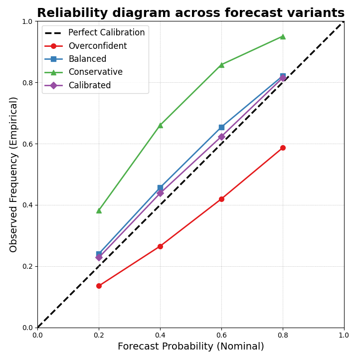
How to read the figure#
The diagonal represents perfect calibration:
a nominal 80% interval should contain the truth 80% of the time,
a nominal 40% interval should contain the truth 40% of the time,
and so on.
Curves below the diagonal are typically overconfident: the forecast intervals are too narrow for the actual uncertainty.
Curves above the diagonal are conservative: the intervals are wide enough to cover more often than they claim.
In this synthetic example, the overconfident model should sit below the diagonal more often, the conservative model should tend above it, and the calibrated model should move closer to the diagonal.
Step 7 - Compare reliability by forecast horizon#
Reliability can change with lead time. So we also build a compact per-horizon table for the most common interval, q10-q90.
def coverage80_by_step(df: pd.DataFrame) -> pd.DataFrame:
    rows = []
    for step, g in df.groupby("forecast_step", sort=True):
        y_true = g["subsidence_actual"].to_numpy(float)
        lo = g["subsidence_q10"].to_numpy(float)
        hi = g["subsidence_q90"].to_numpy(float)

        covered = (y_true >= lo) & (y_true <= hi)

        rows.append(
            {
                "forecast_step": int(step),
                "coverage80": float(np.mean(covered)),
                "mean_width80": float(np.mean(hi - lo)),
            }
        )

    return pd.DataFrame(rows)


print("")
print("Coverage80 by step: calibrated model")
print(coverage80_by_step(df_over_cal).to_string(index=False))
Coverage80 by step: calibrated model
 forecast_step  coverage80  mean_width80
             1      0.8148        0.9517
             2      0.8148        0.7898
             3      0.8148        1.1919
Why this matters#
A model can look well calibrated overall and still degrade at later horizons. Reliability diagrams give the broad probability-level view, while simple per-step tables help show where the calibration problem is strongest.
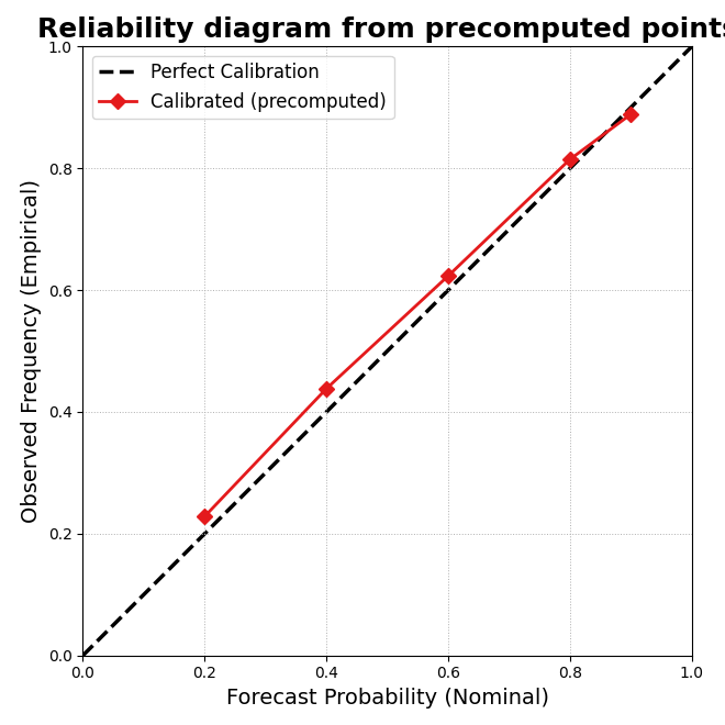
Step 8 - Demonstrate the precomputed-point mode#
The helper can also work from precomputed reliability points instead of forecast tables.
This is useful when:
the reliability points were computed elsewhere,
or when you want to compare a stored summary rather than reprocess the forecast table.
Here we pass the calibrated model that way.
precomputed_models = {
    "Calibrated (precomputed)": {
        "nominal_probs": rel_cal["nominal_prob"].tolist(),
        "observed_probs": rel_cal["observed_freq"].tolist(),
        "marker": "D",
        "style": "-",
    }
}

plot_reliability_diagram(
    models_data=precomputed_models,
    y_true=None,
    prefix="subsidence",
    figsize=(6.6, 6.6),
    title="Reliability diagram from precomputed points",
    plot_style="default",
    verbose=0,
)
Final takeaway#
Reliability diagrams answer a different question from Brier score or interval width alone.
They show whether probabilistic intervals are honest across a range of nominal probabilities.
That is why this page belongs in the uncertainty gallery:
interval calibration teaches how to adjust intervals,
coverage versus sharpness teaches the main trade-off,
reliability diagrams show whether the probabilistic statements themselves line up with reality.
Total running time of the script: (0 minutes 0.304 seconds)