
Note
Go to the end to download the full example code.
Read smooth spatial structure with plot_spatial_contours#
This lesson explains how to use
geoprior.plot.spatial.plot_spatial_contours when you want a
smoothed map view rather than a raw scatter view.
Why this function matters#
A scatter map is excellent for showing the actual sampled locations, but it can become visually noisy when the real question is about spatial structure: ridges, gradients, bowls, fronts, and migrating hotspots.
Contour maps answer a different family of questions:
Where is the field increasing or decreasing smoothly?
Is the hotspot compact or broad?
Does the high-value region shift with time?
Are there natural bands or shells in the mapped quantity?
Does interpolation reveal a coherent pattern or mostly scattered noise?
This page is therefore written as a teaching guide, not only as an
API demo. We will build a realistic scattered spatial table, start with
basic contour mapping across time slices, then compare interpolation
styles, explain the meaning of levels, and end with a practical
checklist for using the helper on your own data.
from __future__ import annotations

import matplotlib.pyplot as plt
import numpy as np
import pandas as pd

from geoprior.plot.spatial import plot_spatial_contours

pd.set_option("display.max_columns", 20)
pd.set_option("display.width", 110)
pd.set_option(
    "display.float_format",
    lambda v: f"{v:0.4f}",
)
What this function expects#
plot_spatial_contours expects a tidy DataFrame with:
one numeric column to contour,
two spatial coordinate columns,
and either
dt_color an explicitdt_valueslist.
Unlike plot_spatial, this helper first interpolates the scattered
data onto a regular grid and only then draws filled contours and black
contour lines.
Two details are especially important to teach early:
grid_rescontrols how fine the interpolation grid is.levelsare interpreted as quantile positions inside each time slice, not as fixed physical thresholds.
That second point matters a lot. If you pass levels=[0.1, 0.5, 0.9],
the helper computes the 10th, 50th, and 90th percentiles of the mapped
values for each slice, then draws contours at those values.
Build a realistic scattered spatial table#
A contour lesson works best with irregularly scattered points because that is the situation where interpolation becomes meaningful.
Here we generate:
scattered 2D coordinates,
four yearly slices,
one central mapped variable
subsidence_q50,and a smooth drifting hotspot plus a broad background gradient.
The field is intentionally structured so the contour lines tell a real story instead of just tracing random noise.
rng = np.random.default_rng(21)

years = [2023, 2024, 2025, 2026]
rows: list[dict[str, float | int]] = []

for year in years:
    shift_x = 0.30 * (year - 2023)
    shift_y = 0.22 * (year - 2023)

    x = rng.uniform(0.0, 10.0, 220)
    y = rng.uniform(0.0, 8.0, 220)

    base = 2.5 + 0.22 * x + 0.08 * y
    hotspot = 4.8 * np.exp(
        -((x - (6.5 + shift_x)) ** 2) / 3.0
        -((y - (4.0 + shift_y)) ** 2) / 1.9
    )
    ridge = 1.2 * np.exp(-((y - 2.0) ** 2) / 0.9) * np.sin(x / 1.7)
    trough = -0.9 * np.exp(-((x - 2.2) ** 2) / 1.8)
    noise = rng.normal(0.0, 0.18, size=x.shape[0])

    z = base + hotspot + ridge + trough + noise

    for xi, yi, zi in zip(x, y, z, strict=False):
        rows.append(
            {
                "coord_x": float(xi),
                "coord_y": float(yi),
                "year": year,
                "subsidence_q50": float(zi),
            }
        )

contour_df = pd.DataFrame(rows)

print("Demo contour table")
print(contour_df.head(10))
Demo contour table
   coord_x  coord_y  year  subsidence_q50
0   7.8112   2.6035  2023          4.3781
1   6.0585   4.0043  2023          8.5917
2   7.0980   2.5716  2023          4.6109
3   0.8910   7.3823  2023          2.8705
4   6.3071   0.0856  2023          4.0491
5   9.8081   6.9932  2023          5.4355
6   4.2341   2.0911  2023          4.5621
7   1.1240   1.1736  2023          2.8029
8   9.5827   6.7173  2023          4.9711
9   6.7598   6.3352  2023          4.9231
Read the structure before plotting#
Before drawing contours, it is worth checking the basic slice summary. This helps the user see whether later contour movement reflects a real value shift or just interpolation cosmetics.
print("\nColumns")
print(list(contour_df.columns))

print("\nRows per year")
print(contour_df.groupby("year").size())

print("\nValue summary by year")
print(
    contour_df.groupby("year")["subsidence_q50"].agg(
        ["min", "mean", "median", "max"]
    )
)
Columns
['coord_x', 'coord_y', 'year', 'subsidence_q50']

Rows per year
year
2023    220
2024    220
2025    220
2026    220
dtype: int64

Value summary by year
        min   mean  median    max
year
2023 2.1643 4.1578  4.0516 8.9987
2024 2.2554 4.1692  4.0150 8.6606
2025 1.9636 4.1322  3.9013 8.9936
2026 1.9784 4.1578  3.7591 9.1768
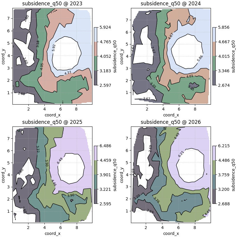
Start with the standard contour reading across time#
The most useful first call is usually:
one mapped variable, several time slices, shared colorbar, visible raw points.
This gives the user both kinds of evidence at once:
the smoothed spatial field from interpolation,
and the original sample locations from the point overlay.
We use non-default levels here so the map shows several nested bands.
figs_contours = plot_spatial_contours(
    df=contour_df,
    value_col="subsidence_q50",
    dt_col="year",
    dt_values=years,
    grid_res=120,
    levels=[0.15, 0.35, 0.55, 0.75, 0.92],
    method="linear",
    cmap="Spectral_r",
    show_points=True,
    max_cols=2,
    cbar="uniform",
    grid_props={"linestyle": ":", "alpha": 0.25},
)

print("\nNumber of figures returned:", len(figs_contours))
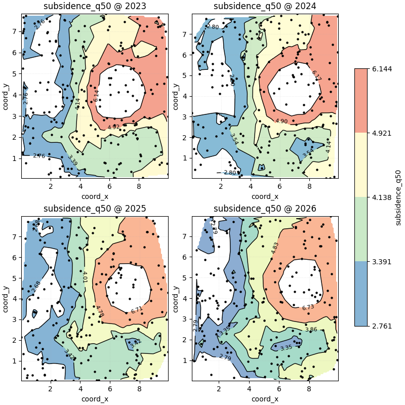
Number of figures returned: 1
How to read this first contour sequence#
A good reading order is:
find the innermost high-value contour,
check whether it drifts through time,
inspect the spacing between contour bands,
compare the broad outer bands to see whether the whole field is rising or whether change is localized.
Tight contour spacing usually means a sharper gradient. Wide spacing means a smoother field transition.
In this demo, the main hotspot moves gradually through the domain, while the larger outer bands remain smoother and more stable.
Teach the meaning of levels carefully#
This helper does not treat levels as direct z-values.
Instead, it converts them through np.quantile(z, levels) inside
each time slice.
That means:
levels=[0.5]follows the slice-wise median contour,levels=[0.9]traces a high-value shell,and the exact contour values may differ from year to year.
This is excellent for learning the relative structure of each slice, but it is not the same thing as drawing one fixed physical threshold.
for year in years:
    z_year = contour_df.loc[
        contour_df["year"] == year,
        "subsidence_q50",
    ].to_numpy()
    q_values = np.quantile(z_year, [0.15, 0.35, 0.55, 0.75, 0.92])
    print(f"Year {year} contour values:")
    print(np.round(q_values, 3))
Year 2023 contour values:
[2.761 3.391 4.138 4.921 6.144]
Year 2024 contour values:
[2.797 3.543 4.143 4.9   6.168]
Year 2025 contour values:
[2.682 3.419 4.013 4.781 6.709]
Year 2026 contour values:
[2.787 3.354 3.858 4.829 6.727]
Compare interpolation methods on one slice#
The method argument changes how the regular grid is filled from the
scattered points.
linearis a strong default for many scientific maps,nearestis more blocky but robust,cubiccan look smoother, but may exaggerate local behaviour when sampling is uneven.
A good teaching habit is to compare methods on one representative slice before deciding which style to trust for a report.
one_year_df = contour_df[contour_df["year"] == 2025].copy()

figs_linear = plot_spatial_contours(
    df=one_year_df,
    value_col="subsidence_q50",
    dt_col="year",
    dt_values=[2025],
    grid_res=140,
    levels=[0.20, 0.50, 0.80, 0.95],
    method="linear",
    cmap="viridis",
    show_points=False,
    max_cols=1,
    cbar="uniform",
)

figs_nearest = plot_spatial_contours(
    df=one_year_df,
    value_col="subsidence_q50",
    dt_col="year",
    dt_values=[2025],
    grid_res=140,
    levels=[0.20, 0.50, 0.80, 0.95],
    method="nearest",
    cmap="YlGnBu",
    show_points=False,
    max_cols=1,
    cbar="uniform",
)

figs_cubic = plot_spatial_contours(
    df=one_year_df,
    value_col="subsidence_q50",
    dt_col="year",
    dt_values=[2025],
    grid_res=140,
    levels=[0.20, 0.50, 0.80, 0.95],
    method="cubic",
    cmap="PuOr_r",
    show_points=False,
    max_cols=1,
    cbar="uniform",
)
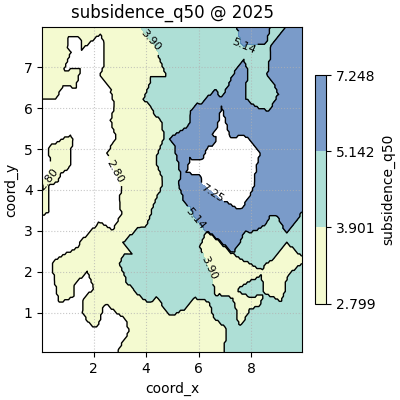
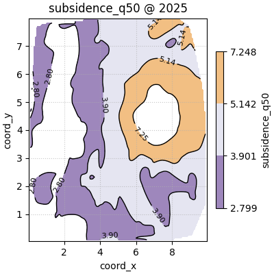
How to choose the interpolation method#
The safest choice is often linear because it is smooth without
becoming too decorative.
Use nearest when:
you want interpolation to stay conservative,
sampling is sparse,
or you do not want the surface to imply more smoothness than the data really support.
Use cubic carefully when:
sampling is dense enough,
the field is genuinely smooth,
and the goal is visual interpretation rather than conservative reporting.
In scientific reporting, it is good practice to decide the method based on the sampling pattern, not only on appearance.
Compare point-overlay and contour-only reading#
The show_points flag changes what kind of trust cue the figure
provides.
show_points=Truereminds the viewer where the data really came from.show_points=Falsegives a cleaner presentation when the point cloud would distract from the spatial bands.
For exploratory work, showing the points is usually better. For a polished figure after the sampling pattern is already understood, a clean contour-only view can be more readable.
figs_points_off = plot_spatial_contours(
    df=contour_df,
    value_col="subsidence_q50",
    dt_col="year",
    dt_values=years,
    grid_res=120,
    levels=[0.10, 0.30, 0.50, 0.70, 0.90],
    method="linear",
    cmap="cubehelix",
    show_points=False,
    max_cols=2,
    cbar="panel",
    show_axis="on",
)
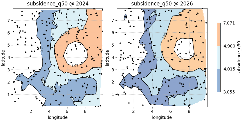
Use custom coordinate names when your table is not standardized#
Many saved outputs use longitude and latitude rather than
coord_x and coord_y. The helper supports that cleanly through
spatial_cols.
lonlat_df = contour_df.rename(
    columns={
        "coord_x": "longitude",
        "coord_y": "latitude",
    }
)

figs_lonlat = plot_spatial_contours(
    df=lonlat_df,
    value_col="subsidence_q50",
    spatial_cols=("longitude", "latitude"),
    dt_col="year",
    dt_values=[2024, 2026],
    grid_res=100,
    levels=[0.25, 0.50, 0.75, 0.95],
    method="linear",
    cmap="RdYlBu_r",
    show_points=True,
    max_cols=2,
    cbar="uniform",
)
Practical checklist for your own data#
When using plot_spatial_contours on your own forecast or observed
tables, work through this checklist:
Confirm that one numeric column represents the field you want to map.
Confirm the coordinate columns and pass them through
spatial_colsif they are notcoord_xandcoord_y.Decide whether your interpretation should be based on slice-wise relative bands (this helper’s default behaviour) or on fixed physical thresholds.
Start with
method='linear'andshow_points=True.Keep
cbar='uniform'when comparing time slices directly.Increase
grid_resonly as much as needed for readability.Inspect whether the contours reveal a coherent field or only interpolation artefacts.
A good contour plot should make the spatial structure easier to read than a scatter plot, not hide the data behind a smoother-looking map.
plt.show()
Total running time of the script: (0 minutes 2.285 seconds)