
Note
Go to the end to download the full example code.
Exceedance probabilities and Brier score#
This lesson teaches how to work with exceedance probabilities
in GeoPrior and how to calibrate them with
geoprior.utils.calibrate.calibrate_probability_forecast().
Why this page matters#
Not every uncertainty question is about an interval such as q10-q90.
In many practical risk settings, the question is event-based:
What is the probability that subsidence exceeds a critical threshold?
Which zones have high exceedance risk next year?
Are those probabilities trustworthy?
That is the setting of exceedance probability forecasts.
For binary events, a natural accuracy measure is the Brier score:
where:
\(p_i\) is the forecast probability of exceedance,
\(y_i \in \{0,1\}\) is the observed event outcome.
Smaller Brier scores are better.
What the real utility does#
GeoPrior provides
geoprior.utils.calibrate.calibrate_probability_forecast()
to calibrate a probability column against a binary outcome column.
It supports:
method="isotonic": non-parametric monotonic calibration,method="logistic": Platt-style logistic calibration,
and returns a copy of the input DataFrame with an added calibrated probability column. This makes it the right core helper for an exceedance-oriented uncertainty lesson.
What this lesson teaches#
We will:
build a synthetic spatial exceedance-risk dataset,
create deliberately miscalibrated raw probabilities,
compute Brier scores before calibration,
calibrate the probabilities with isotonic and logistic methods,
compare Brier scores after calibration,
build explanatory plots for: - reliability, - Brier score by horizon, - exceedance risk maps.
This page is synthetic so it stays fully executable during the documentation build.
Imports#
We use the real GeoPrior calibration helper and build the rest of the lesson around it.
import numpy as np
import pandas as pd
import matplotlib.pyplot as plt

from geoprior.utils.calibrate import calibrate_probability_forecast
Step 1 - Build a compact synthetic spatial exceedance dataset#
We mimic a spatial forecasting problem with three forecast steps.
The target is no longer a continuous forecast value. Instead, we focus on whether the realized subsidence exceeds a critical threshold.
rng = np.random.default_rng(33)

nx = 10
ny = 7
steps = [1, 2, 3]
years = {1: 2024, 2: 2025, 3: 2026}

xv = np.linspace(0.0, 12_000.0, nx)
yv = np.linspace(0.0, 8_000.0, ny)
X, Y = np.meshgrid(xv, yv)

x_flat = X.ravel()
y_flat = Y.ravel()
n_sites = x_flat.size

xn = (x_flat - x_flat.min()) / (x_flat.max() - x_flat.min())
yn = (y_flat - y_flat.min()) / (y_flat.max() - y_flat.min())

hotspot = np.exp(
    -(
        ((xn - 0.72) ** 2) / 0.020
        + ((yn - 0.34) ** 2) / 0.030
    )
)
ridge = 0.50 * np.exp(
    -(
        ((xn - 0.28) ** 2) / 0.030
        + ((yn - 0.74) ** 2) / 0.050
    )
)
gradient = 0.45 * xn + 0.20 * (1.0 - yn)

threshold = 5.5

rows: list[dict[str, float | int]] = []

for step in steps:
    scale = {1: 1.00, 2: 1.20, 3: 1.45}[step]

    # latent mean field
    mu = (
        2.4
        + 1.5 * gradient
        + 2.1 * hotspot
        + 0.9 * ridge
    ) * scale

    # true uncertainty for realized outcomes
    sigma = (
        0.40
        + 0.10 * xn
        + 0.05 * hotspot
        + 0.04 * step
    )

    actual = mu + rng.normal(0.0, sigma, size=n_sites)

    # binary exceedance event
    exceed = (actual > threshold).astype(int)

    # "True" event probability under a latent Gaussian idea.
    # We avoid scipy here and use a logistic-style approximation.
    z = (mu - threshold) / np.maximum(sigma, 1e-6)
    p_true = 1.0 / (1.0 + np.exp(-1.7 * z))

    # Deliberately overconfident raw forecast probabilities:
    # push values too hard toward 0 and 1.
    p_raw = np.clip(p_true ** 0.65, 0.0, 1.0)

    for i in range(n_sites):
        rows.append(
            {
                "sample_idx": i,
                "forecast_step": step,
                "coord_t": years[step],
                "coord_x": float(x_flat[i]),
                "coord_y": float(y_flat[i]),
                "subsidence_actual": float(actual[i]),
                "exceed_event": int(exceed[i]),
                "prob_exceed_raw": float(p_raw[i]),
                "prob_exceed_true_latent": float(p_true[i]),
            }
        )

df = pd.DataFrame(rows)

print("Dataset shape:", df.shape)
print("")
print(df.head(10).to_string(index=False))
Dataset shape: (210, 9)

 sample_idx  forecast_step  coord_t    coord_x  coord_y  subsidence_actual  exceed_event  prob_exceed_raw  prob_exceed_true_latent
          0              1     2024     0.0000   0.0000             2.8753             0           0.0009                   0.0000
          1              1     2024  1333.3333   0.0000             2.5211             0           0.0013                   0.0000
          2              1     2024  2666.6667   0.0000             3.1222             0           0.0018                   0.0001
          3              1     2024  4000.0000   0.0000             2.9450             0           0.0025                   0.0001
          4              1     2024  5333.3333   0.0000             2.2400             0           0.0033                   0.0002
          5              1     2024  6666.6667   0.0000             3.5832             0           0.0046                   0.0003
          6              1     2024  8000.0000   0.0000             3.1390             0           0.0065                   0.0004
          7              1     2024  9333.3333   0.0000             3.5842             0           0.0085                   0.0007
          8              1     2024 10666.6667   0.0000             4.2826             0           0.0103                   0.0009
          9              1     2024 12000.0000   0.0000             3.5208             0           0.0129                   0.0012
Step 2 - Understand the event we are forecasting#
The binary event column is the main target for this lesson:
exceed_event = 1if subsidence > thresholdexceed_event = 0otherwise
We summarize the event rate by forecast step.
event_summary = (
    df.groupby("forecast_step")
    .agg(
        year=("coord_t", "first"),
        event_rate=("exceed_event", "mean"),
        mean_prob_raw=("prob_exceed_raw", "mean"),
        mean_actual=("subsidence_actual", "mean"),
    )
    .reset_index()
)

print("")
print("Event summary")
print(event_summary.to_string(index=False))
Event summary
 forecast_step  year  event_rate  mean_prob_raw  mean_actual
             1  2024      0.0000         0.0134       3.0872
             2  2025      0.0286         0.0535       3.6562
             3  2026      0.0714         0.1740       4.4622
Step 3 - Define a small Brier score helper#
The Brier score is the mean squared error for probabilities.
It is ideal for exceedance forecasting because it rewards:
high probability when the event occurs,
low probability when the event does not occur,
and penalizes overconfident mistakes strongly.
def brier_score(y_true: np.ndarray, p: np.ndarray) -> float:
    y_true = np.asarray(y_true, dtype=float)
    p = np.asarray(p, dtype=float)
    m = np.isfinite(y_true) & np.isfinite(p)
    if not np.any(m):
        return float("nan")
    return float(np.mean((p[m] - y_true[m]) ** 2))


raw_brier = brier_score(
    df["exceed_event"].to_numpy(),
    df["prob_exceed_raw"].to_numpy(),
)

print("")
print("Overall raw Brier score:", raw_brier)
Overall raw Brier score: 0.013873097981654217
Step 4 - Calibrate the probabilities with the real helper#
We apply the actual GeoPrior utility twice:
isotonic calibration,
logistic calibration.
The helper adds a calibrated probability column to a copy of the input DataFrame.
df_iso = calibrate_probability_forecast(
    df,
    prob_col="prob_exceed_raw",
    actual_col="exceed_event",
    method="isotonic",
    out_col="prob_exceed_iso",
)

df_log = calibrate_probability_forecast(
    df,
    prob_col="prob_exceed_raw",
    actual_col="exceed_event",
    method="logistic",
    out_col="prob_exceed_log",
)

print("")
print("Columns after isotonic calibration")
print(df_iso.columns.tolist())
Columns after isotonic calibration
['sample_idx', 'forecast_step', 'coord_t', 'coord_x', 'coord_y', 'subsidence_actual', 'exceed_event', 'prob_exceed_raw', 'prob_exceed_true_latent', 'prob_exceed_iso']
Step 5 - Compare Brier scores before and after calibration#
This is the first key numerical check.
score_rows = [
    {
        "model": "Raw probability",
        "brier": brier_score(
            df["exceed_event"].to_numpy(),
            df["prob_exceed_raw"].to_numpy(),
        ),
    },
    {
        "model": "Isotonic calibrated",
        "brier": brier_score(
            df_iso["exceed_event"].to_numpy(),
            df_iso["prob_exceed_iso"].to_numpy(),
        ),
    },
    {
        "model": "Logistic calibrated",
        "brier": brier_score(
            df_log["exceed_event"].to_numpy(),
            df_log["prob_exceed_log"].to_numpy(),
        ),
    },
]

df_scores = pd.DataFrame(score_rows)

print("")
print("Overall Brier score comparison")
print(df_scores.to_string(index=False))
Overall Brier score comparison
              model  brier
    Raw probability 0.0139
Isotonic calibrated 0.0048
Logistic calibrated 0.0201
How to read these numbers#
Lower Brier score is better.
A calibration method is useful here when it reduces the Brier score without destroying the ranking of risk across the map.
Step 6 - Compare Brier score by forecast horizon#
Overall accuracy can hide horizon-specific problems.
So we also compute Brier score separately for each forecast step.
step_rows = []
for step, g in df.groupby("forecast_step", sort=True):
    g_iso = df_iso[df_iso["forecast_step"] == step]
    g_log = df_log[df_log["forecast_step"] == step]

    step_rows.append(
        {
            "forecast_step": int(step),
            "year": int(g["coord_t"].iloc[0]),
            "brier_raw": brier_score(
                g["exceed_event"].to_numpy(),
                g["prob_exceed_raw"].to_numpy(),
            ),
            "brier_iso": brier_score(
                g_iso["exceed_event"].to_numpy(),
                g_iso["prob_exceed_iso"].to_numpy(),
            ),
            "brier_log": brier_score(
                g_log["exceed_event"].to_numpy(),
                g_log["prob_exceed_log"].to_numpy(),
            ),
        }
    )

df_step_scores = pd.DataFrame(step_rows)

print("")
print("Brier score by horizon")
print(df_step_scores.to_string(index=False))
Brier score by horizon
 forecast_step  year  brier_raw  brier_iso  brier_log
             1  2024     0.0021     0.0000     0.0005
             2  2025     0.0033     0.0000     0.0163
             3  2026     0.0362     0.0143     0.0436
Step 7 - Build a simple reliability table#
For probability forecasts, we also want a coarse reliability view:
group probabilities into bins,
compare forecast probability with observed event frequency.
This is not a replacement for a dedicated reliability diagram page, but it helps explain calibration visually.
def reliability_bins(
    y_true: np.ndarray,
    p: np.ndarray,
    *,
    n_bins: int = 8,
) -> pd.DataFrame:
    y_true = np.asarray(y_true, dtype=float)
    p = np.asarray(p, dtype=float)

    bins = np.linspace(0.0, 1.0, n_bins + 1)
    idx = np.digitize(p, bins, right=True)
    idx = np.clip(idx, 1, n_bins)

    rows = []
    for b in range(1, n_bins + 1):
        m = idx == b
        if not np.any(m):
            continue
        rows.append(
            {
                "bin": b,
                "forecast_prob": float(np.mean(p[m])),
                "observed_freq": float(np.mean(y_true[m])),
                "count": int(np.sum(m)),
            }
        )

    return pd.DataFrame(rows)


rel_raw = reliability_bins(
    df["exceed_event"].to_numpy(),
    df["prob_exceed_raw"].to_numpy(),
)

rel_iso = reliability_bins(
    df_iso["exceed_event"].to_numpy(),
    df_iso["prob_exceed_iso"].to_numpy(),
)

rel_log = reliability_bins(
    df_log["exceed_event"].to_numpy(),
    df_log["prob_exceed_log"].to_numpy(),
)

print("")
print("Reliability bins for isotonic calibration")
print(rel_iso.to_string(index=False))
Reliability bins for isotonic calibration
 bin  forecast_prob  observed_freq  count
   1         0.0000         0.0000    201
   4         0.5000         0.5000      4
   8         1.0000         1.0000      5
Step 8 - Plot Brier score by horizon#
This first figure shows whether calibration helps consistently across the horizon.
fig, ax = plt.subplots(figsize=(7.4, 4.6))

ax.plot(
    df_step_scores["forecast_step"],
    df_step_scores["brier_raw"],
    marker="o",
    label="Raw",
)
ax.plot(
    df_step_scores["forecast_step"],
    df_step_scores["brier_iso"],
    marker="s",
    label="Isotonic",
)
ax.plot(
    df_step_scores["forecast_step"],
    df_step_scores["brier_log"],
    marker="^",
    label="Logistic",
)

ax.set_xlabel("Forecast step")
ax.set_ylabel("Brier score")
ax.set_title("Brier score across the horizon")
ax.grid(True, linestyle=":", alpha=0.6)
ax.legend()

plt.tight_layout()
plt.show()
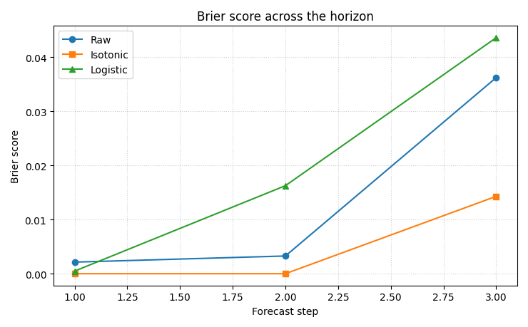
How to read this panel#
Lower is better.
A useful uncertainty calibration should reduce the Brier score at least for the steps where the raw forecast is clearly overconfident.
Step 9 - Plot reliability before and after calibration#
This second figure shows the calibration effect directly.
the diagonal is perfect reliability,
points below the diagonal are overconfident,
points above the diagonal are conservative.
fig, ax = plt.subplots(figsize=(6.6, 6.2))

ax.plot([0, 1], [0, 1], linestyle="--", linewidth=1.5)

ax.plot(
    rel_raw["forecast_prob"],
    rel_raw["observed_freq"],
    marker="o",
    label="Raw",
)
ax.plot(
    rel_iso["forecast_prob"],
    rel_iso["observed_freq"],
    marker="s",
    label="Isotonic",
)
ax.plot(
    rel_log["forecast_prob"],
    rel_log["observed_freq"],
    marker="^",
    label="Logistic",
)

ax.set_xlim(0, 1)
ax.set_ylim(0, 1)
ax.set_aspect("equal", adjustable="box")
ax.set_xlabel("Forecast probability")
ax.set_ylabel("Observed frequency")
ax.set_title("Reliability of exceedance probabilities")
ax.grid(True, linestyle=":", alpha=0.6)
ax.legend()

plt.tight_layout()
plt.show()
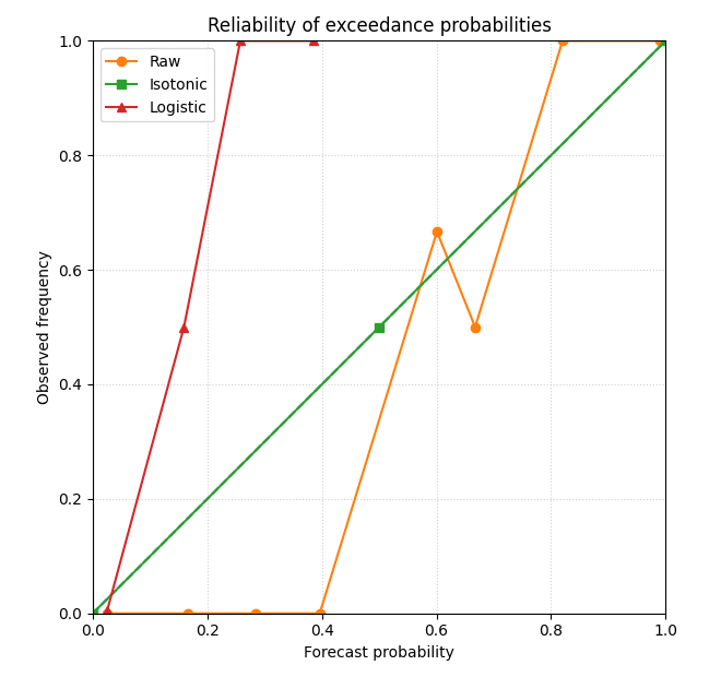
Why this plot matters#
Brier score is a single summary number.
Reliability reveals how the probabilities are wrong.
For example:
a model may systematically overstate high probabilities,
or it may compress everything toward the center.
Calibration is useful when it moves the points closer to the diagonal while keeping the risk ranking meaningful.
Step 10 - Plot spatial exceedance risk maps#
A good uncertainty lesson should connect the scores back to the map.
We now compare:
raw exceedance probability,
isotonic calibrated probability,
observed event outcome.
We show the last horizon because event risk usually becomes most interesting there.
step_to_plot = 3

g_raw = df[df["forecast_step"] == step_to_plot].copy()
g_iso = df_iso[df_iso["forecast_step"] == step_to_plot].copy()

fig, axes = plt.subplots(1, 3, figsize=(12.5, 4.1))

sc0 = axes[0].scatter(
    g_raw["coord_x"],
    g_raw["coord_y"],
    c=g_raw["prob_exceed_raw"],
    s=28,
)
axes[0].set_title("Raw exceedance probability")
axes[0].set_xlabel("coord_x")
axes[0].set_ylabel("coord_y")
axes[0].grid(True, linestyle=":", alpha=0.4)

sc1 = axes[1].scatter(
    g_iso["coord_x"],
    g_iso["coord_y"],
    c=g_iso["prob_exceed_iso"],
    s=28,
)
axes[1].set_title("Isotonic calibrated probability")
axes[1].set_xlabel("coord_x")
axes[1].set_ylabel("coord_y")
axes[1].grid(True, linestyle=":", alpha=0.4)

sc2 = axes[2].scatter(
    g_raw["coord_x"],
    g_raw["coord_y"],
    c=g_raw["exceed_event"],
    s=28,
)
axes[2].set_title("Observed exceedance event")
axes[2].set_xlabel("coord_x")
axes[2].set_ylabel("coord_y")
axes[2].grid(True, linestyle=":", alpha=0.4)

fig.colorbar(sc0, ax=axes[0], shrink=0.85)
fig.colorbar(sc1, ax=axes[1], shrink=0.85)
fig.colorbar(sc2, ax=axes[2], shrink=0.85)

plt.tight_layout()
plt.show()
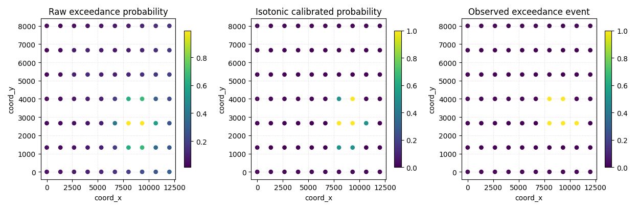
How to read the map view#
The raw and calibrated maps should not be read the same way as a binary classification map.
They express risk intensity:
0.1 means low exceedance probability,
0.8 means high exceedance probability.
Calibration changes how trustworthy those numbers are, not just how pretty the map looks.
That is why the Brier and reliability panels should be read before over-interpreting any single risk map.
Step 11 - Compare event-rate calibration numerically#
One final compact table helps connect the forecast means to the actual event frequency by horizon.
summary_rows = []
for step, g in df.groupby("forecast_step", sort=True):
    g_iso = df_iso[df_iso["forecast_step"] == step]
    g_log = df_log[df_log["forecast_step"] == step]

    summary_rows.append(
        {
            "forecast_step": int(step),
            "year": int(g["coord_t"].iloc[0]),
            "observed_event_rate": float(g["exceed_event"].mean()),
            "mean_raw_prob": float(g["prob_exceed_raw"].mean()),
            "mean_iso_prob": float(g_iso["prob_exceed_iso"].mean()),
            "mean_log_prob": float(g_log["prob_exceed_log"].mean()),
        }
    )

df_prob_summary = pd.DataFrame(summary_rows)

print("")
print("Event-rate summary by horizon")
print(df_prob_summary.to_string(index=False))
Event-rate summary by horizon
 forecast_step  year  observed_event_rate  mean_raw_prob  mean_iso_prob  mean_log_prob
             1  2024               0.0000         0.0134         0.0000         0.0214
             2  2025               0.0286         0.0535         0.0286         0.0292
             3  2026               0.0714         0.1740         0.0714         0.0495
Final takeaway#
This page teaches a different uncertainty question from interval calibration.
Instead of asking:
“how wide should the interval be?”
it asks:
“how good are the probabilities of an important event?”
That is why exceedance probability analysis deserves its own page.
Once users understand this lesson, they are ready for:
dedicated probability calibration comparisons,
quantile-to-probability calibration utilities,
and richer reliability-diagram pages.
Total running time of the script: (0 minutes 0.699 seconds)